Design & Code Better Web Typography
A free web typography course for designers and web developers by Matej Latin.


Sign up for free
Loved by designers and developers
20,000+ designers and developers are already learning about better web typography, including people from these companies:

-
“Really well structured and so easy to follow. Split in small sections not hard to chew to, it’s sure to make anyone a better designer in a week.”

Emin Grbo
@emin_roblack -
“Concepts are explained in ways that are super easy to understand. Many good examples and great external resources for references.”

Tram Tran
@halshinta -
“This has been a great resource not only to me, but also to the friends that I shared it with. We’re going to be building a better web :)”

Mario Rocchi
@mario_rocchi
Typography lessons straight to your inbox
-
01
 Receive a lesson per day
Straight to your inbox.
-
02
 Read the lesson
A five to ten-minute read.
-
03
 Explore further
Articles and website suggestions.
On joining, you’ll also get access to our #DESIGNR Slack community.
Introduction to typography
DAY 1 / 7
Is typography a science or an art? In the first lesson, we start by looking for a definition of typography, why it’s important and why web developers should learn about it too.
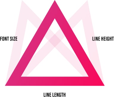
Equilateral triangle of a perfect paragraph
DAY 2 / 7
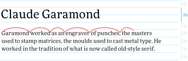
Shaping typographically perfect paragraphs could be an art of its own. But in this lesson, we boil it down to balancing three key things: font size, line height and line length. We conclude with an interactive learning game that will help you sharpen your paragraph shaping skills.
Anatomy of a typeface
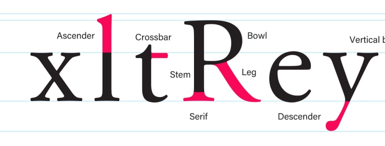
DAY 3 / 7
In the third lesson, we explore our main tool—the typeface. Understanding the anatomy of a typeface, different styles of typefaces and things like type contrast and weight will be your foundations for the topics we’ll cover in lessons 4 and 5.
Choosing typefaces
DAY 4 / 7
How do you go about choosing typefaces? Do you just pick one that you kinda like? Do you use one that a friend recommended to you? Or do you even use a typeface because it’s a popular one? Your choice should primarily be based on one thing—the content.
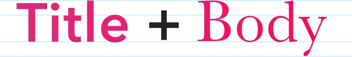
Combining typefaces
DAY 5 / 7
Combining typefaces is one of the most dreaded but equally captivating topics in typography. In this lesson you’ll learn the basic rules of combining typefaces. The rules that you can choose to follow… or break.
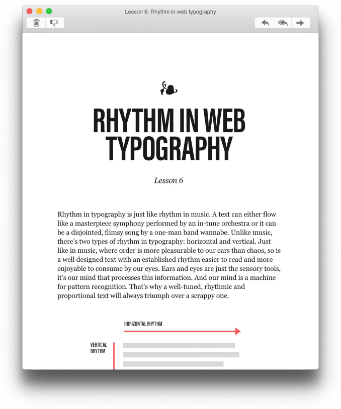
Rhythm in web typography
DAY 6 / 7
Rhythm in typography is a popular topic among web designers. In its essence, it’s a way of creating visual hierarchy and cohesion on our websites. When done well, it drastically improves the reading experience.
Modular scale & meaningful web typography
DAY 7 / 7
How do you choose font sizes? Just randomly pick numbers or whatever “looks best”? If you do, there’s no meaning behind your decisions and what’s worst, this randomness can easily turn into chaos. Modular scales help bring meaning and order into your web typography.
About the author
Hey, I’m Matej. I’m a self-taught designer from Slovenia but I lived in Germany, London, and Edinburgh to build my career. My journey towards being a designer began when I was 13. I joined an after-school class called Web Design where I learned the basics of HTML and handcrafted my first website. I never studied design so typography was one of the many things that I had to explore by myself. And once I started exploring, I couldn’t stop. The gray area between design and web development attracted me the most, so I created things like Gutenberg—The Meaningful Web Typography Starter Kit and now Better Web Type. I decided to create a web typography course because there’s little content online that would be practical, concise and aimed at both — designers and web developers.