AI vs Designer: Who’s better at pairing fonts?
![]()
~ 7 min read

Recent posts
-
Articles
8 more micro tips for remarkably better typography
8 more micro tips in less than 8 minutes to make your typography stand out in excellence.
-
Articles
An analysis of 5 monospaced fonts with coding ligatures
Which font do you use for coding? If you’re a part of the majority who use Visual Studio as their IDE, you probably use Consolas, granted that you haven’t changed it. And that’s a good font, why would you want to change it? Well, it comes down to personal preference.
-
Articles
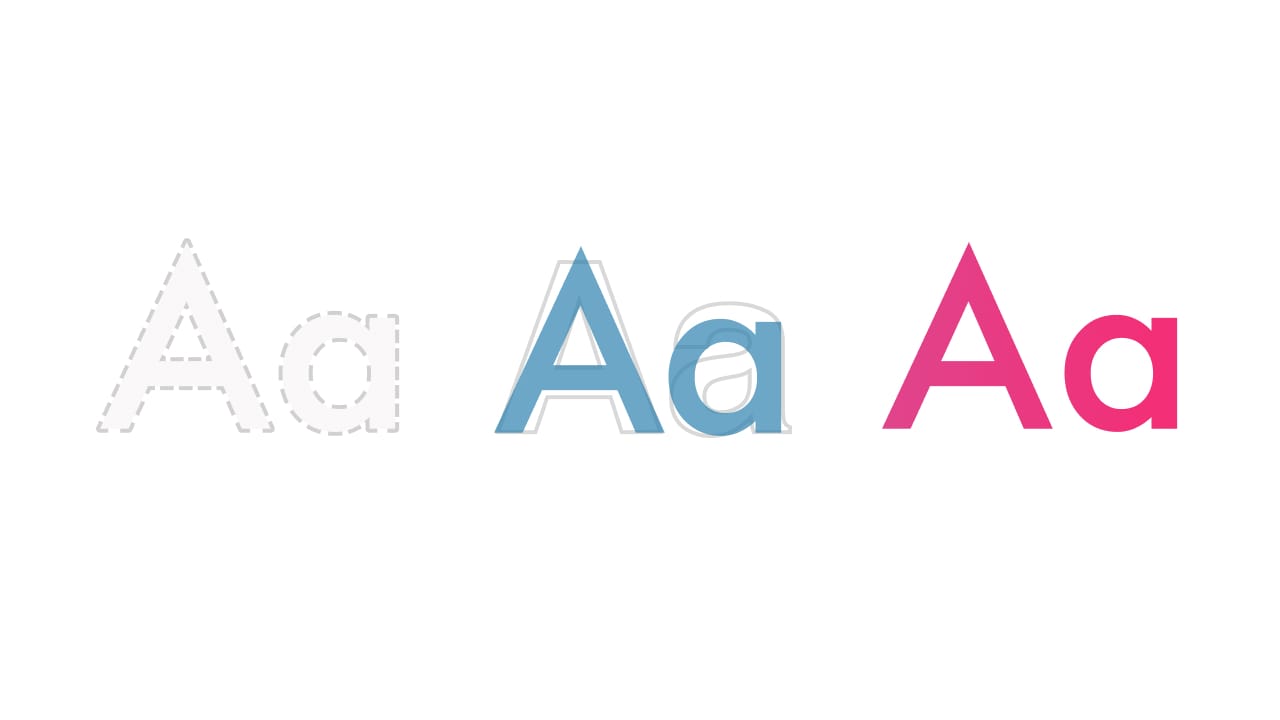
Is AI better at picking and pairing fonts than you?
An exploration of AI’s typographic capability and what you can learn from it
-
Articles
8 micro tips for remarkably better typography
Typography is so much more than picking a font and deciding what sizes to use for headings and body text. It could be regarded as its own branch of science. And it’s not just science either, it’s a mix between science and art.
-
Articles
All you need is 5 fonts
There weren’t as many web fonts to pick from when I started my freelance career in the early 2000s, still I was always overwhelmed by the number of fonts to choose from. With no formal education in design or typography, my choices were uninformed and limited.
-
Articles
5 free monospaced fonts with coding ligatures
I’d always used the Monaco font and Sublime Text for coding but I recently decided to switch to VS Code. That change also led me to explore monospaced fonts suitable for coding as I worked on customising my VS Code theme.
-
Articles
Preloading fonts: when does it make sense?
In the past, when loading custom fonts we couldn’t really avoid the flash of unstyled text (FOUT)—you know that split second when the website is loading and it uses a substitute font until it loads your custom one?
-
Articles
How to choose a font for a project
I recently received an email from a designer called Jared. He went through the typography lessons that I offer as part of the free course and he was very grateful for them. He said he learned a lot but also had one important question: how do I go about choosing a font for my project?
-
Articles
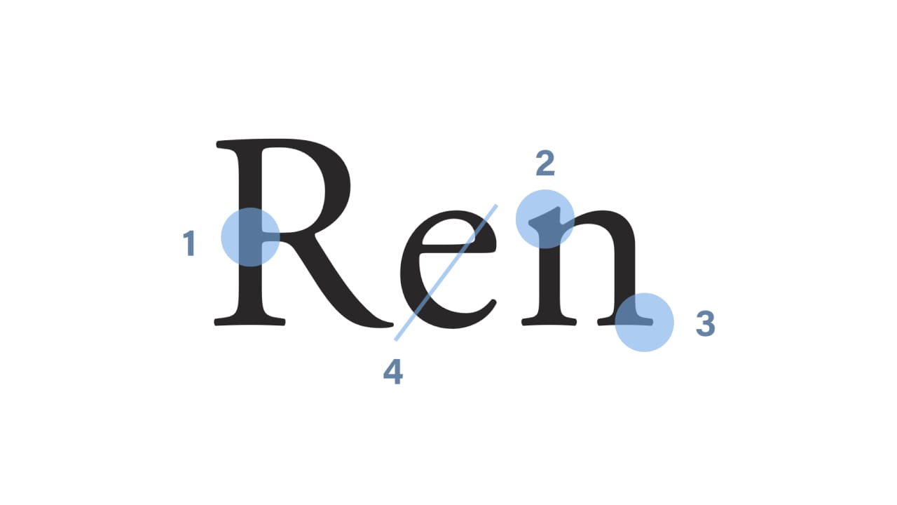
A Guide to Recognising Font Styles
Telling font styles apart was one of the hardest things to do when I started working as a designer. Being self-taught, the only major difference I could see was that a font was either a serif or a sans-serif. But the more I explored, the more I realised how vast the universe of font styles actually is.
-
Articles
Vertical Rhythm in Sketch
Designing with a baseline grid in Sketch speeds up the visual design process, enables designers to produce consistent mockups and establishes a consistent vertical rhythm in the designs.
-
Articles
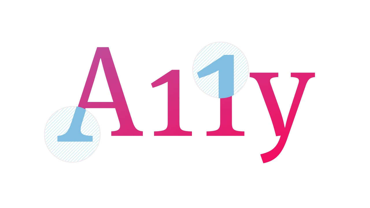
5 Keys to Accessible Web Typography
I wrote about fluid web typography in last month’s blog post and I realised that a lot of the popular implementation techniques come with accessibility issues. So I wanted to go back and revisit the basics and the best practices of accessible web typography.
-
Articles
The State of Fluid Web Typography
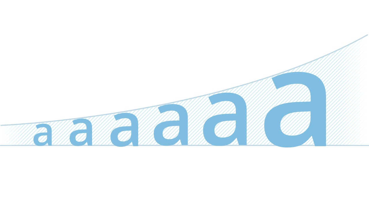
Fluid typography gives us so many opportunities to better design the reading experiences on the web but, at the same time, it introduces problems of font sizes scaling uncontrollably and potential accessibility issues. Is fluid web typography ready to be used?
-
Articles
Rhythm in Web Typography
Horizontal rhythm mostly impacts the legibility, while vertical rhythm impacts the readability of the text and establishes a sense of visual hierarchy.
-
Articles
A Guide to Combining Fonts
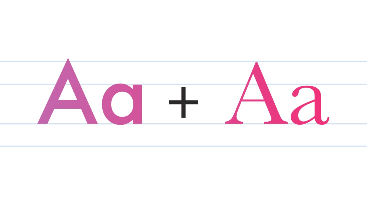
Combining fonts is one of the trickiest parts of typography. Here’s a guide, combined with an example to help you get font combinations right.