Perfect Paragraph
A web typography learning game
What is this?
The Equilateral Triangle of a Perfect Paragraph is a theory developed by Matej Latin in the Better Web Type course about web typography for web designers and web developers. Too many of them still set line-height, font size and line width as independent features when in fact they should all be considered together. The equilateral triangle is a perfect representation of how the three features work in harmony. The theory is explained in details in an article on CSS-Tricks.
This game elaborates on the theory and puts it into practice. Its goal is to teach you about the three features that need to be considered for a perfect paragraph and help you train your eye.
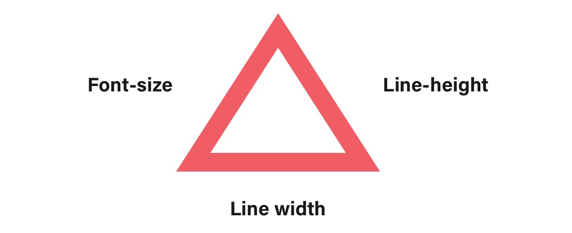
The Equilateral Triangle
In an equilateral triangle, all sides are equal. All three internal angles are also congruent to each other and are each 60°. Therefore, an equilateral triangle is a great representation of three things that are in perfect balance.

Font size & Line-height
In this theory, font size is represented by the left side of the triangle and the line-height by the right side. The triangle is perfectly balanced when the ratio between the two is ideal. If the font is too large, the left side grows. The font is too large for the line-height or the line-height to small for the font size. The tipping point moves to the right side and skews the triangle.
Contrary, when line-height is too large the right side of the triangle grows. The font size is too small and the tipping point moves to the left. The further the tipping point from the center, the further is the ratio from being in perfect balance.

Line width
The width of the line is perfectly represented by the bottom side. Adjusting the line width changes the width of the bottom size equally on both sides, so the ratio between the font size and line-height doesn't get affected.


Baskerville, designed in 1754, is most known for its crisp edges, high contrast and generous proportions. The typeface was heavily influenced by the processes of the Birmingham-bred John Baskerville, a master type-founder and printer, who owed much of his career to his beginnings. As a servant in a clergyman’s house, it was his employer that discovered his penmanship talents and sent him to learn writing. Baskerville was illiterate but became very interested in calligraphy, and practised handwriting and inscription that was later echoed in strokes and embellishments in his printed typeface.