Is AI better at picking and pairing fonts than you?
![]()
~ 9 min read
How do you go about picking fonts for a project? Do you just “wing it?” Pick something that looks good and is somewhat aligned with the requirements of the project? Or do you always use the same fonts again and again, regardless of requirements? Maybe you have a personal preference for some of these fonts?
And how do you pair fonts? Just pick two that look relatively good together? Or do you make an effort to use the basic font pairing guidelines by trying to match their x-height, for example? Do you go for a safe choice and just use a superfamily of fonts like Roboto and Roboto Serif?
Picking and pairing fonts really well is hard. It takes a lot of time too, especially if you don’t have experience with it. Can AI tools help you do this task better and quicker? Can it teach you how to do it well, if you’re less experienced?
Let’s take a look at a couple of tools that use AI for font picking and pairing. How good are they? Are they better than you and can you learn from them?
Fontjoy
Fontjoy uses machine learning and a deep learning model to map font features and come up with pairings. Its’ description of how it works isn’t very detailed and it doesn’t disclose how many font features the tool uses for evaluation.
I can pick a font that I want to start with for headings or body text. I picked Raleway Bold for headings. Then I can lock the font I picked, and decide what type of pairing I want — a contrasting one or a similar one. There are five options: high contrast, more contrast, balanced, more similar, and very similar. I chose high contrast and hit the Generate button with high expectations.
The first pairing it gives me is… surprisingly good. It suggests I combine it with Arapey for subtitles and Hind Guntur for body text (Fig 1).
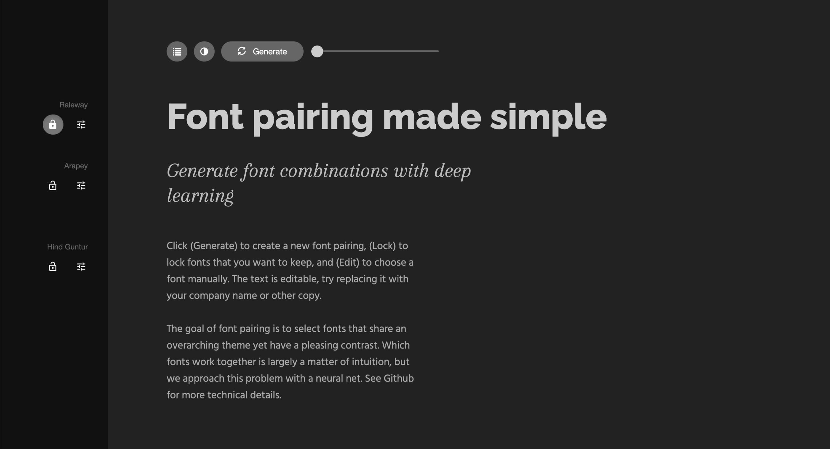
Fig 1: The first recommendation from Fontjoy is surprisignly good. It recommends to pair Raleway with Arapey and Hind Guntur.
I click Generate again and complete disappointment follows. It now says that I should use Snowburst One for subtitles and Scope One for body text (Fig 2). The latter is a decent recommendation, but the one for the subtitles is a total miss. I can’t help but lose confidence in the capabilities of the tool.
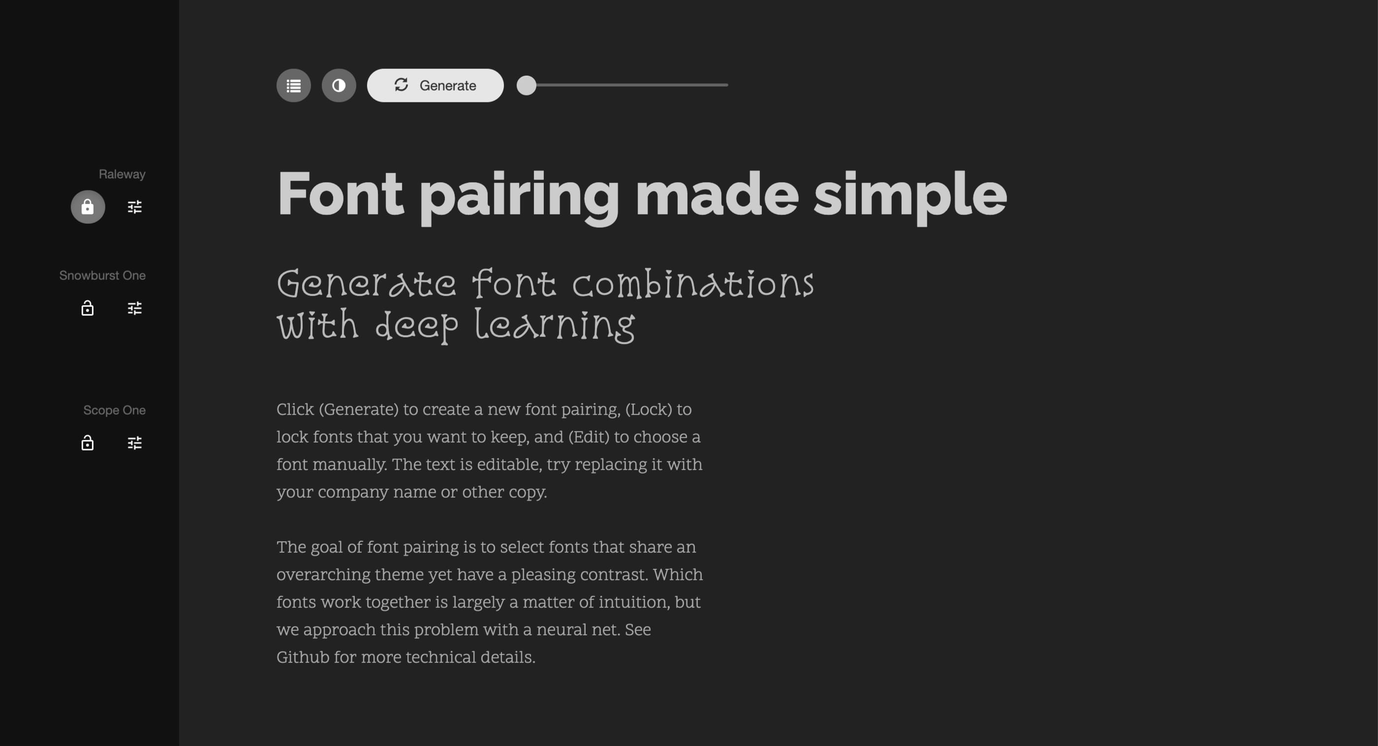
Fig 2: The second recommendation is a total miss.
I click the Generate button a couple more times. The tool gives more options but they feel somewhat limited. I’m not sure whether that’s good or bad. Some font suggestions repeat numerous times. I guess it’s good because the tool zeroed into the font pairings that work well. It feels that one in six suggestions includes a total miss. I define a total miss as something I would never use, mostly because it suggests a decorative font, like Snowburst One above (Fig 2).
I also consider a total miss the suggestion to use Montserrat Alternatives for body text (Fig 3). It has too much character to be used for that.
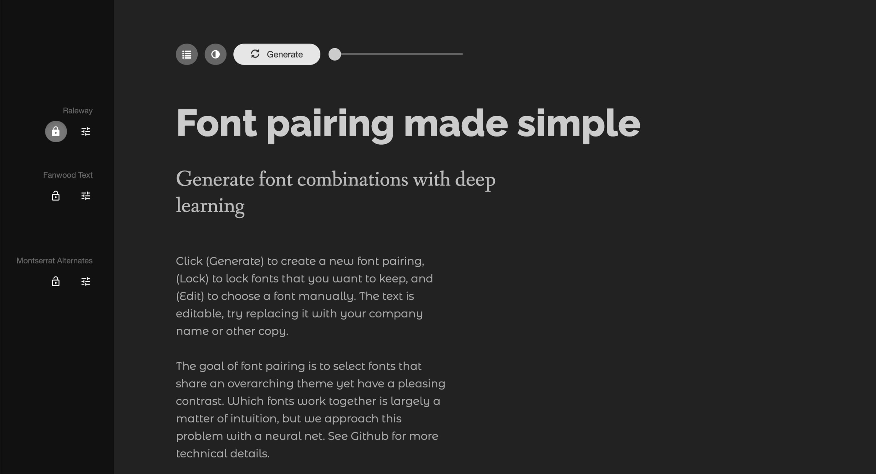
Fig 3: The third recommendation is also a total miss.
But how could the tool know something like this? Is character design one of the features considered? It can’t be. That’s something an experienced designer considers — the tiniest details in the letter design of a font. Is it legible and will it improve the readability? In the case of Montserrat Alternatives, it does the opposite.
Fontjoy Pros:
- Can come up with decent font pairings suggestions once you already have one font picked (for either headings or body text)
Fontjoy Cons:
- Starting completely from scratch, without a font already picked, isn’t very useful
- No font picking capabilities, just pairing
- Includes low-quality fonts which are the main contributors to “total miss” pairings
- There’s no meaning to the choices, the tool pairs fonts based on the contrast settings provided
- No way to tell the tool what the fonts will be used for — there’s no context to its suggestions
Other similar tools
There are two more similar tools, but it’s unclear how they work so I didn’t explore them in detail:
ChatGPT
Now let’s take a closer look at the tool that everyone has been raving about — ChatGPT. Can it pick and pair fonts well? Is it comparable to a designer’s capabilities?
Font pairing
I came up with a simple prompt to test the ChatGPT’s capabilities of font pairing:
Come up with a pairing of two fonts for a website of a female author writing about motherhood. It needs to feel modern and candid.
I generated five suggestions, let’s take a closer look at the first three. The first one that ChatGPT suggested was Montserrat Bold for headings and Cormorant Garamond Regular for body text. Here’s how it explained its decision (Fig 4).
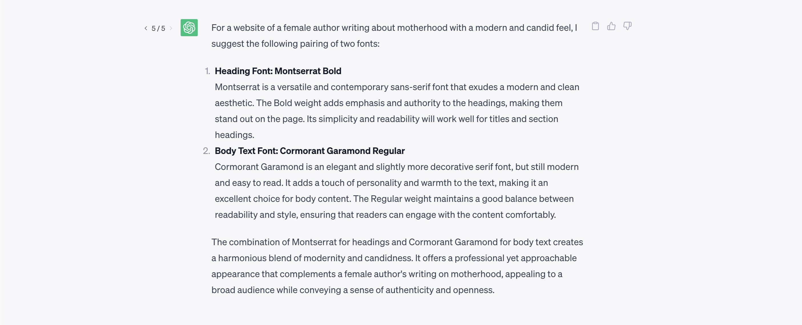
Fig 4: An explanation of ChatGPT’s recommendation to pair Montserrat and Cormorant Garamond.
And this is what this font pairing would look like (Fig 5).
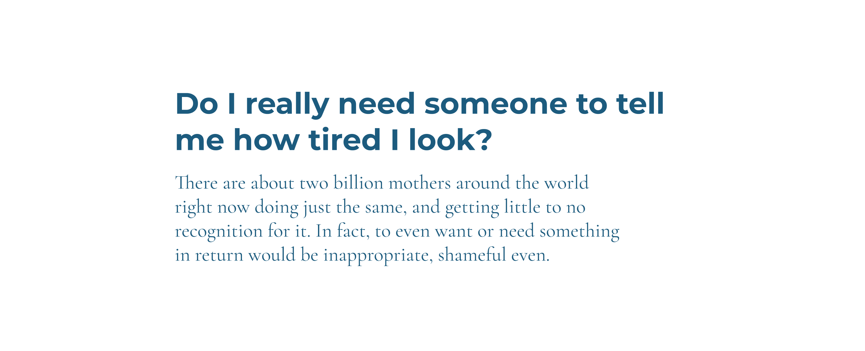
Fig 5: What ChatGPT’s recommendation to pair Montserrat and Cormorant Garamond looks like.
The second suggestion was Playfair Display Italic for headings and Raleway Regular or Light for body text. Here’s why it chose these fonts (Fig 6).
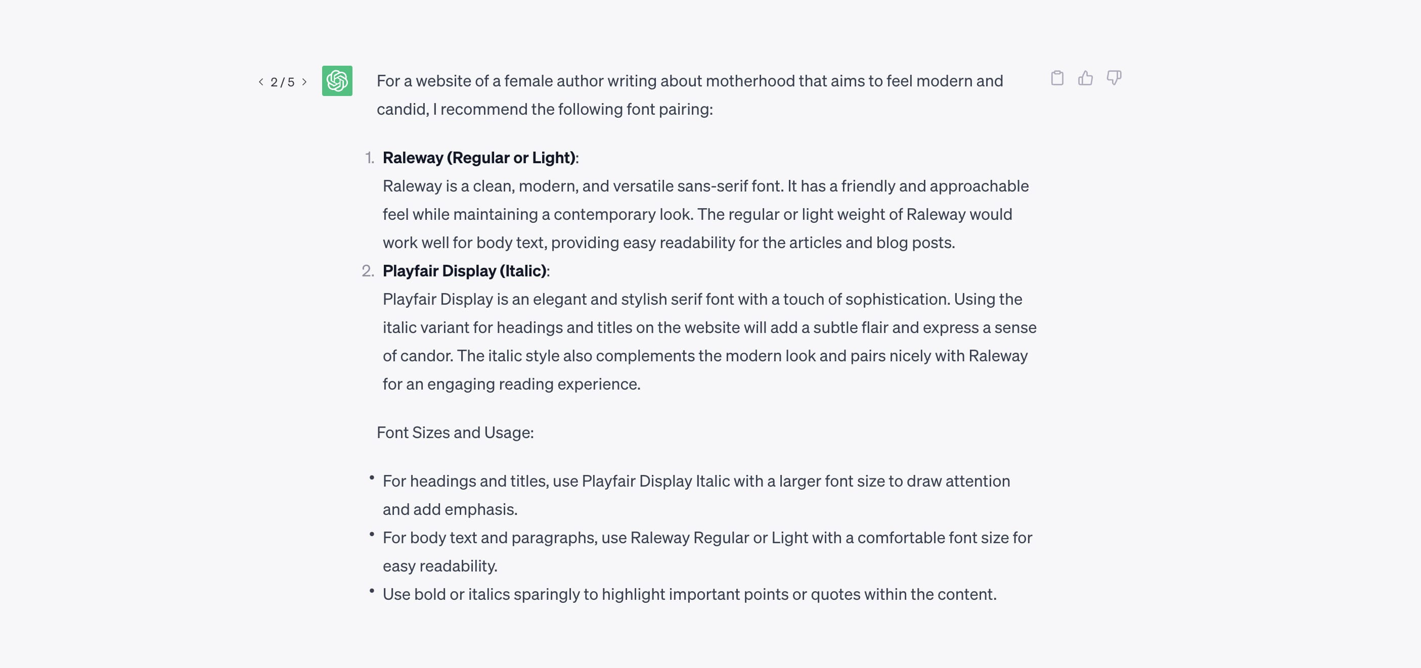
Fig 6: An explanation of ChatGPT’s recommendation to pair Playfair Display and Raleway.
I could count the Light weight for body text as a “total miss” because light fonts aren’t good for longer texts. They’re too hard to read. Let’s use the regular weight, here’s what this font pairing would look like (Fig 7).
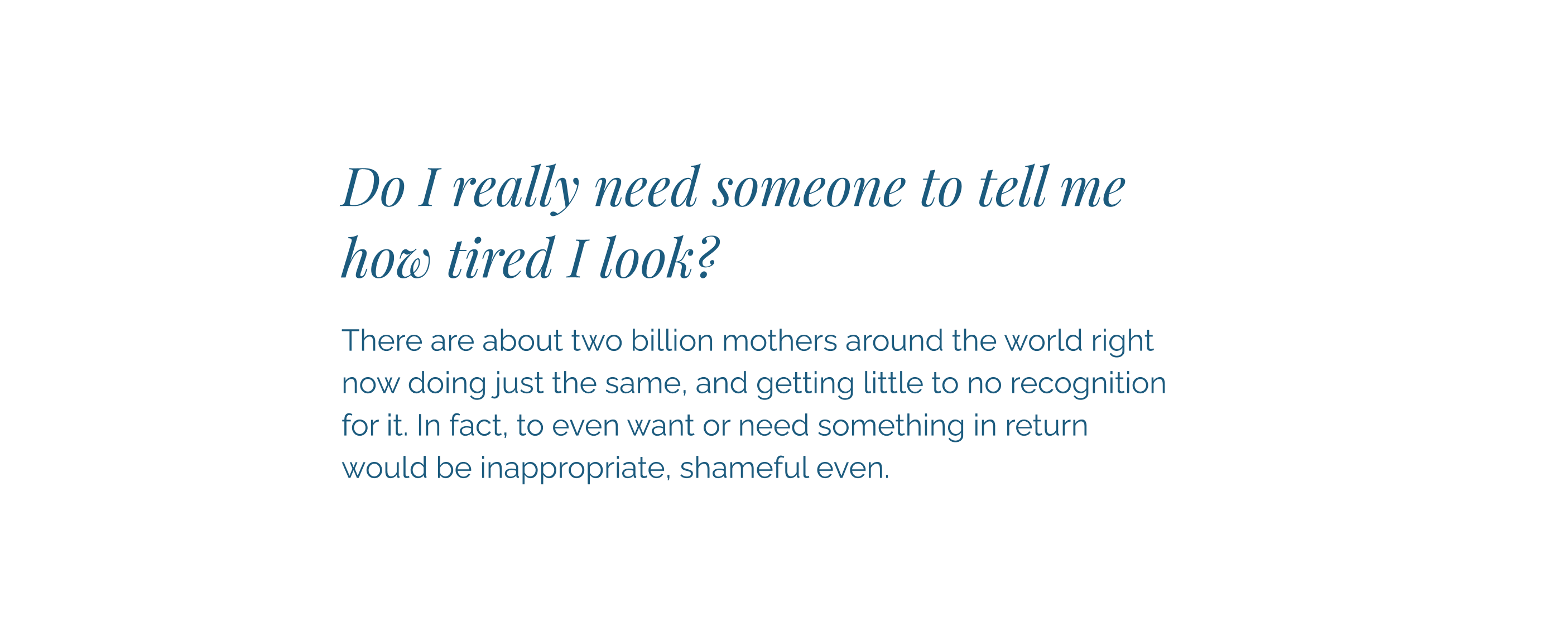
Fig 7: What ChatGPT’s recommendation to pair Playfair Display and Raleway looks like.
The last suggestion that we’ll examine is Montserrat for headings and Lora for body text. Here’s why ChatGPT thinks this is a good combination for this prompt (Fig 8).
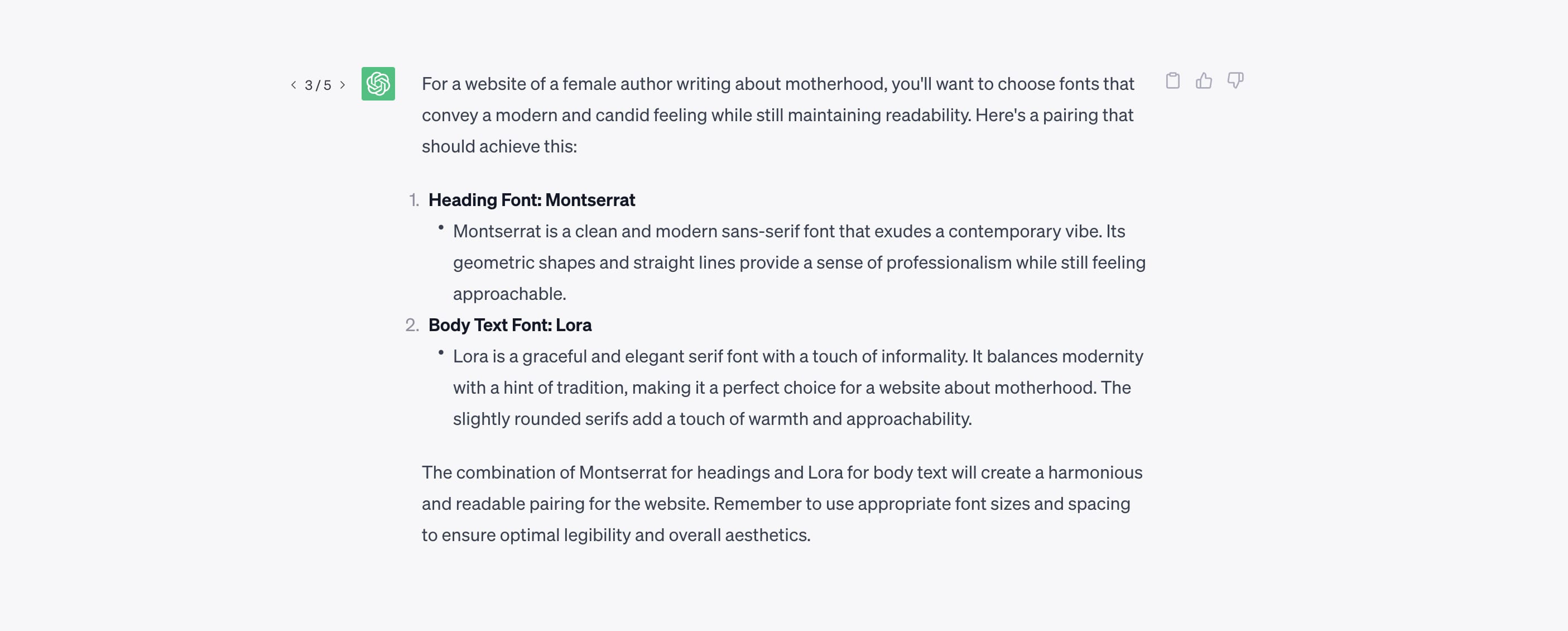
Fig 8: An explanation of ChatGPT’s recommendation to pair Montserrat and Lora.
It doesn’t specify the weights in this suggestion so I used Regular for both. This is what it would look like (Fig 9).
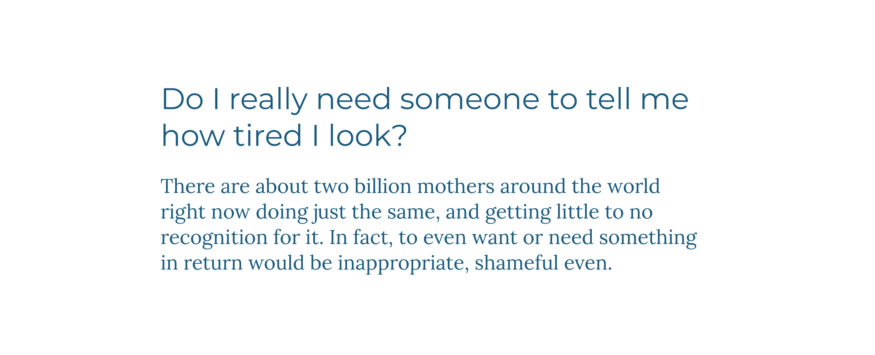
Fig 9: What ChatGPT’s recommendation to pair Montserrat and Lora looks like.
All these font pairing suggestions are good, except for the “total miss” where it suggested a light font for body text. They’re not very original, and they’re somewhat repetitive (it really likes Montserrat for this prompt), but they could be a good starting point for a designer learning to get better at this. For a non-designer, these could be good to go.
Here’s what I like about it. If a non-designer used ChatGPT they would come up with a good font selection and pairing, probably a much better one than if they did it themselves. New websites where designers aren’t involved with their creation would finally have decent typography.
Font picking
The last thing I wanted to test was ChatGPT’s font-picking capabilities. I came up with a prompt — What is a good open-source font for headings that can be described as feminine, modern, and candid?
I generated three answers, two of them were Quicksand (Top in Fig 10), and the other one was Cormorant (Bottom in Fig 10).
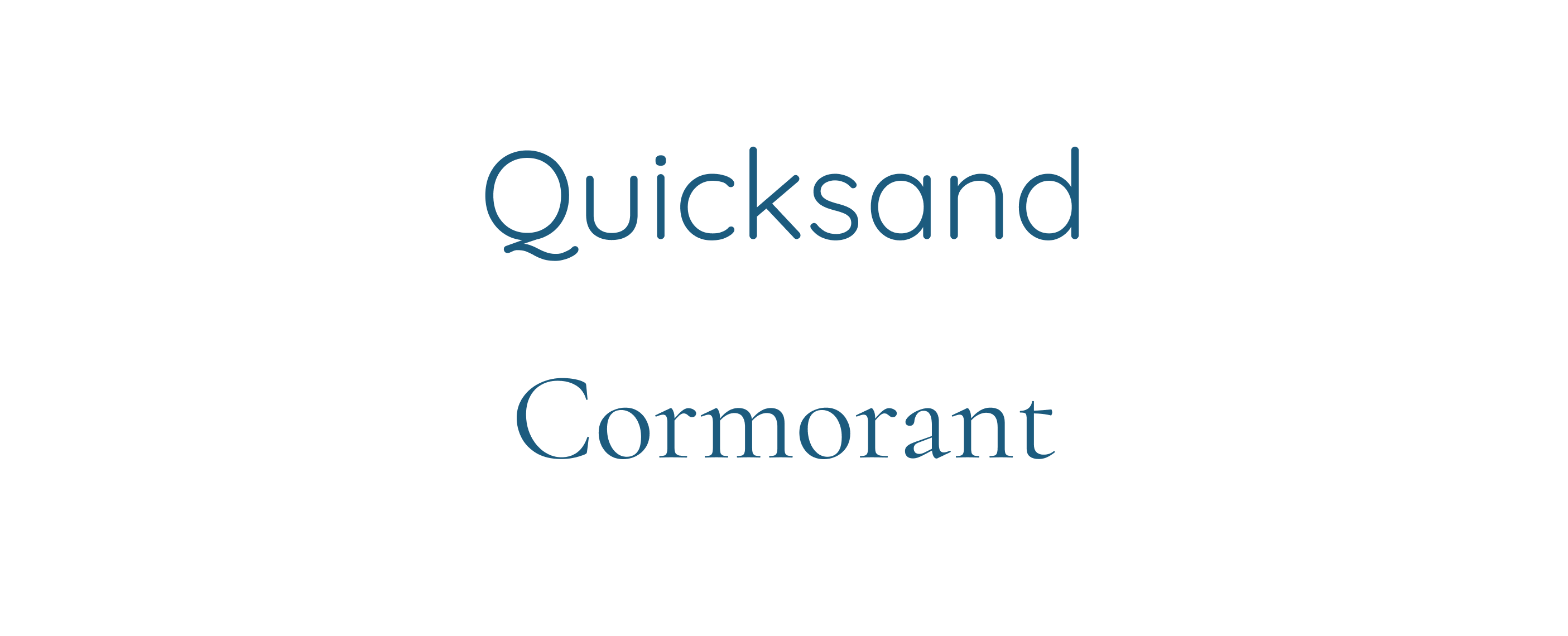
Fig 10: ChatGPT’s recommendation of pairing Quicksand with Cormorant.
Quicksand is not what I had imagined at all but it’s a viable option, not a “total miss.” Cormorant on the other hand is an interesting recommendation. Here’s what this pairing looks like (Fig 11):
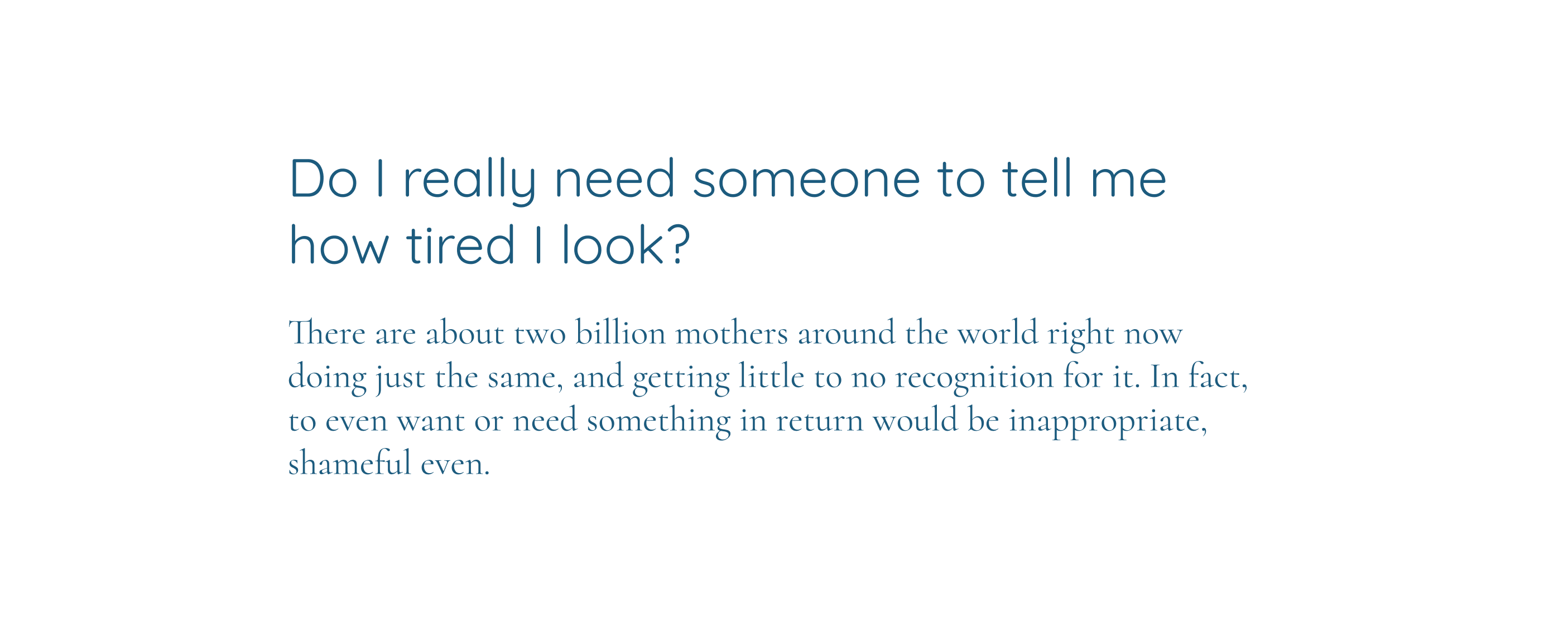
Fig 11: A pairing of Quicksand for headings and Cormorant for body text.
And here are ChatGPT’s explanations on why it picked these fonts (Fig 12).
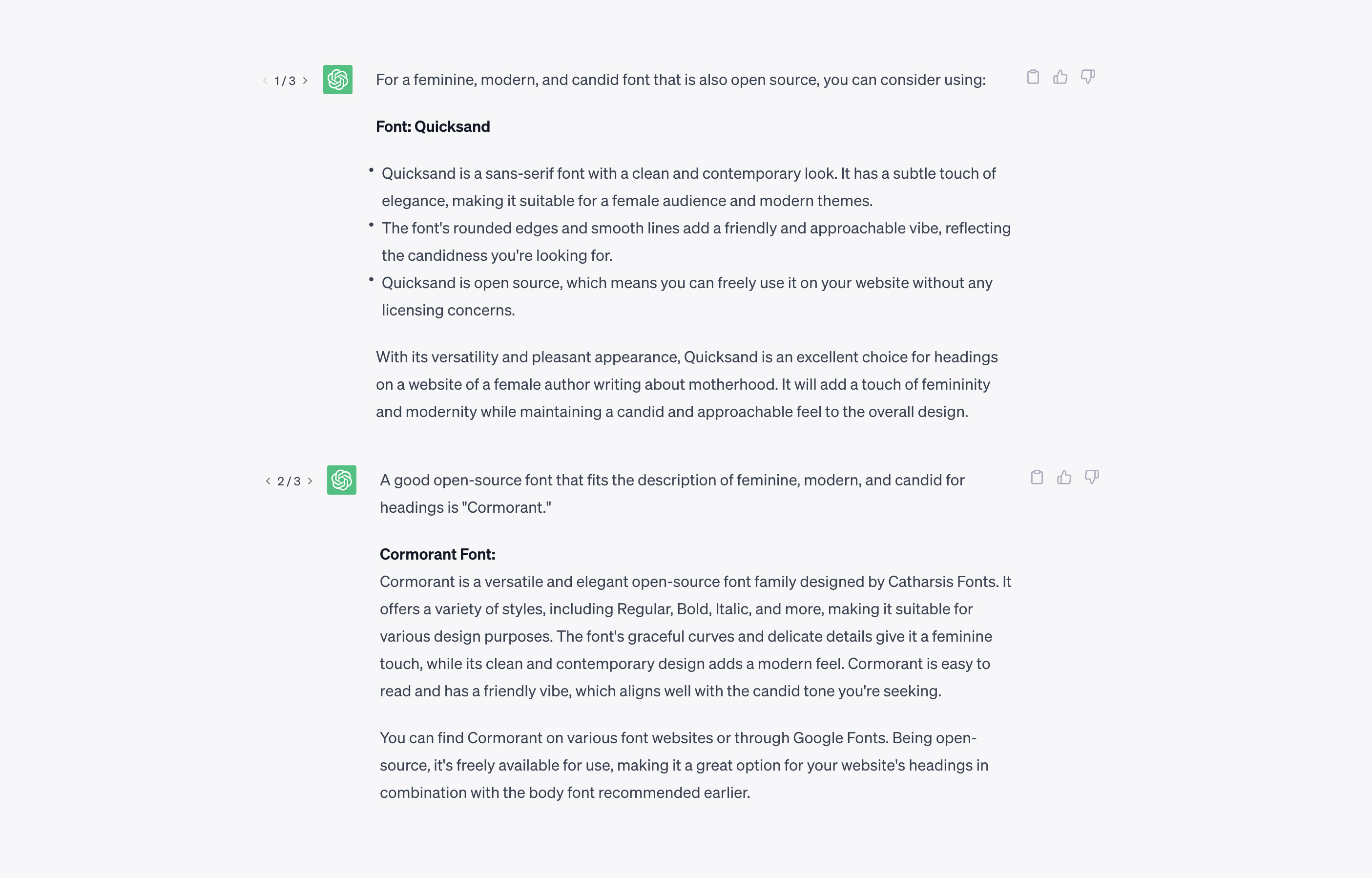
Fig 12: ChatGPT’s Explanations on why it chose Quicksand and Cormorant fonts to be paired.
A less experienced designer could explore further and try out different weights of Cormorant. Again, it’s a good starting point, but does this replace an experienced designer?
To become truly powerful ChatGPT would need to be trained on knowledge from experienced designers. But right now it can’t know what knowledge is good, it just learns from everything it was given to train on. Here’s a short description of how ChatGPT learns:
All the tokens came from a massive corpus of data written by humans. That includes books, articles, and other documents across all different topics, styles, and genres—and an unbelievable amount of content scraped from the open internet. Basically, it was allowed to crunch through the sum total of human knowledge.
(Source)
ChatGPT Pros:
- Very few “total misses”
- Unlike other tools, it can give meaningful recommendations based on what you’re designing for
- A decent starting point for non-designers and less experienced designers
ChatGPT Cons:
- It’s limited — based on the knowledge it was trained on up to September 2021
- Based on vast data of human knowledge — not all of it is good
- The font picks and pairings are basic and not very original
Conclusion: Can AI pick and pair fonts well?
Let’s try to answer the question from the beginning of the article — can AI do this task well for us? In other words, can AI come up with original, contextual, and high-quality font picks and pairings? My answer right now is no. Not yet, at least. I predict that AI’s capabilities will continue to grow and one day it’ll be able to do it well. Will it be able to replace an experienced designer? I don’t think so. Not fully. And at least not very soon. But it may help speed up that experienced designer’s work and it will speed up the learning process for less experienced ones.
Font pairing is more than just fonts. Fontjoy picks font pairings based on font characteristics, like font weight and obliqueness. That’s not enough.
Here’s what an experienced designer will consider when choosing a font:
- What is the goal of the text/website?
- What feelings does the author want to evoke?
- How do the visual font properties align with the message of the content?
- Does it look original but still follow the main typographic conventions?
- The overall construction of the font
- The construction of key characters — are they legible?
- What it looks like with the actual content and language to be used
- What it looks like at larger sizes (for headings), different weights and styles
- Is it readable at body text size?
- Does a visual font property stand out in a bad way?
Notice how the questions go from broad to very specific. That’s because font picking is an involved decision process, not a quick act based on some font characteristics like it is in Fontjoy.
Font picking is an involved decision process, not a quick act based on some font characteristics like it is in Fontjoy.
All this culminates in two major aspects of evaluating font choices — meaning (questions 1–4) and visual (questions 5–10). Because fonts are tools for visual communication, accessibility belongs to the visual aspects. Tools like Fontjoy are completely focused (and stronger) on the visual side, and ChatGPT is somewhere between meaning and visual (Fig 12). Fontjoy actually compares the characteristics of fonts to pair them, ChatGPT doesn’t. It assumes that fonts go well together because humans have paired them in the past. A mix between the two tools would be ideal.
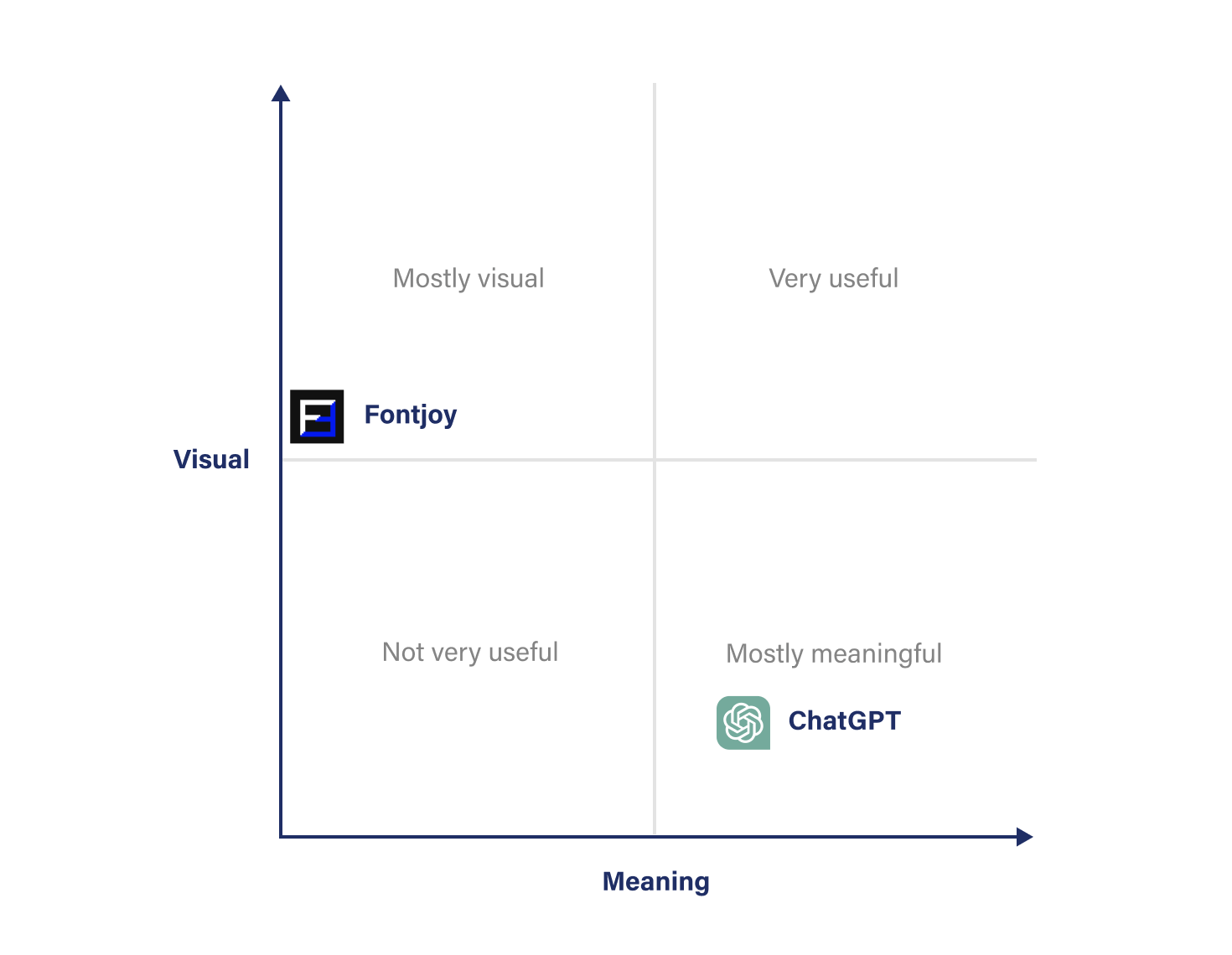
Fig 12: A visual presentation of current AI tools capabilities compared to the two aspects of picking fonts — visual and meaning.
Neither is in the top right corner of the chart where a perfect solution would be, but ChatGPT has the potential to improve. Right now it can come up with suggestions based on adjectives we include in our prompt — modern, feminine, candid. But to match, or even beat an experienced designer, it’ll need to get way better than that.
I discussed this with Mike Zetlow, an experienced designer who raised an important point — brands are not just a couple of adjectives. Here’s what he said:
Brands are more subtle than a couple of adjectives. I don’t start picking fonts until we’ve got 100% of the copy and image assets. Between the copy, brand guidelines, brand history, markets’ perception of the brand, and brand image assets, there is a lot of nuance and it’s a big job of taking all that information and making a creative decision as to which font best represents all that. Granted, a quick solution like Raleway above will work for someone starting their own blog, but for my use cases, the decision is much more involved.
The state of AI’s font picking and pairing capabilities is at the stage of a junior designer. So if you’re a designer and answered “yes” to most questions from the beginning of this article, or you’re a non-designer, yeah the AI can pick and pair fonts better than you. But that’s great because it makes better typography more accessible for non-designers. It also makes quicker learning possible for inexperienced designers. Both will significantly contribute to overall better web typography.
If you want to learn how to pick and pair fonts really well, my free email course is a good starting point. What do you think? Will AI ever be able to do this well? Let me know in the comments below 👇
Better Web Typography for a Better Web
Free Course
Join 30,000+ designers and developers, get 7 free lessons and unlock your better web typography skills.
Learn more →Just cool web typography stuff, no spam.