Cool new stuff in web typography in July ’19
How is it going? It seems like pretty much everyone around me is on holiday but I’m still here working 😅 I recently started thinking about an exciting new project and I can’t wait to share it with everyone.
News
- A lot of people still ask me about the printed version of the Better Web Type book. You can get a copy on Amazon or Book Depository but it’s the first edition.
Featured
Vertical rhythm in Sketch
I already wrote a lot on vertical rhythm in typography but this time I wanted to take a look at how vertical rhythm can be established and used in Sketch. In this post, I look at why working with a baseline grid makes sense, how to establish the vertical rhythm and how to align type and components to it.
Font of the month

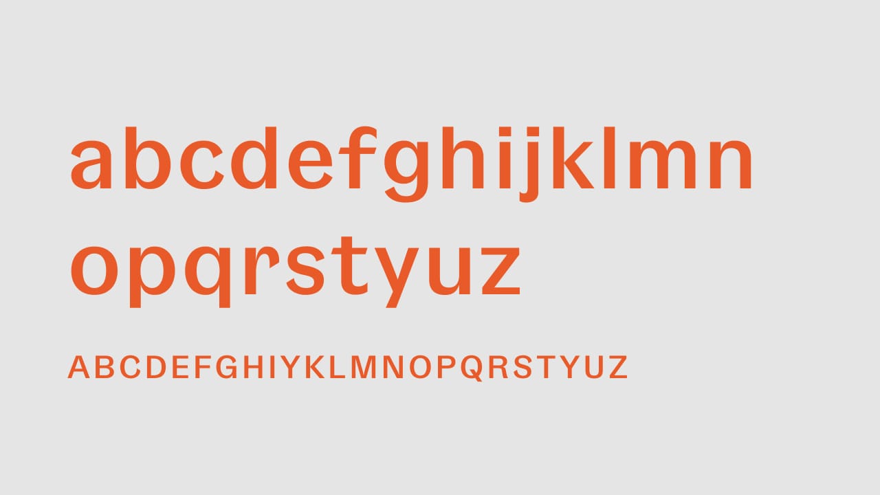
Gangster Grotesk
A typeface designed by Fresh Fonts, Gangster Grotesk is a contemporary typeface that combines a sharp contrast with angled terminal strokes that curve inward ever so slightly. These elements are simple but effective, lending the typeface character while being practically invisible at small sizes.
Cool Articles
Developing a robust font-loading strategy for CSS Tricks
I loved going through this case study by Zach Leatherman where he looks at optimizing the font loading at CSS Tricks. How awesome is that?
Optimizing Google Fonts performance
I remember there was a similar article a while ago. But with Google Fonts being so popular, there’s always something to learn how to optimize their performance. This is a cool article about that by Danny Cooper.
Truncating multi-line text with CSS
Truncating content has become so crucial on the web. And now it seems we’ll soon be able to truncate multiple lines of text. Bram Van Damme shows us how in his latest post.
Did you know?
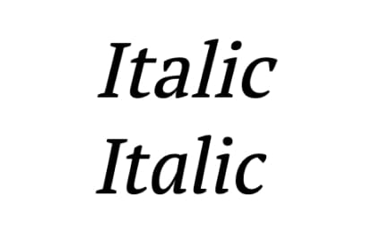
The proper italic style (bottom) has differently designed letters and is sloped at an angle that the type designer designed it. It’s ugly cousin “oblique” (top) is something that comes from forcing a regular font into italic by just sloping it. This also happens when we apply font-style: italic; to a font that doesn’t have an italic style. This practice should be avoided.

__
That’s it for this month, see you in August! 👋
Ciao,
Matej