Rhythm in Web Typography
This guide is based on chapter 6 from the book Better Web Typography for a Better Web by Matej Latin. The book consists of 13 chapters through which the reader designs and builds an example website.
Rhythm in typography is just like rhythm in music. A text can either flow like a masterpiece symphony performed by an in-tune orchestra, or it can be a disjointed flimsy song by a one-man band wannabe. Just like in music, where order is more pleasurable to our ears than chaos, so is a well-designed text with an established rhythm easier to read and more enjoyable to consume by our eyes. Ears and eyes are just the sensory tools; it’s our mind that processes the information. And our mind is a machine for pattern recognition. That’s why a well-tuned, rhythmic and proportional text will always triumph over a scrappy one. But, unlike in music, there are two types of rhythm in typography: horizontal and vertical.
The music analogy works very well with typography, because your text will either be easy to read and the reader will get into flow—not focusing on reading but simply consuming the content —or struggle through the information before finally giving up. Horizontal rhythm mostly impacts the legibility, while vertical rhythm impacts the readability of the text and establishes a sense of visual hierarchy.
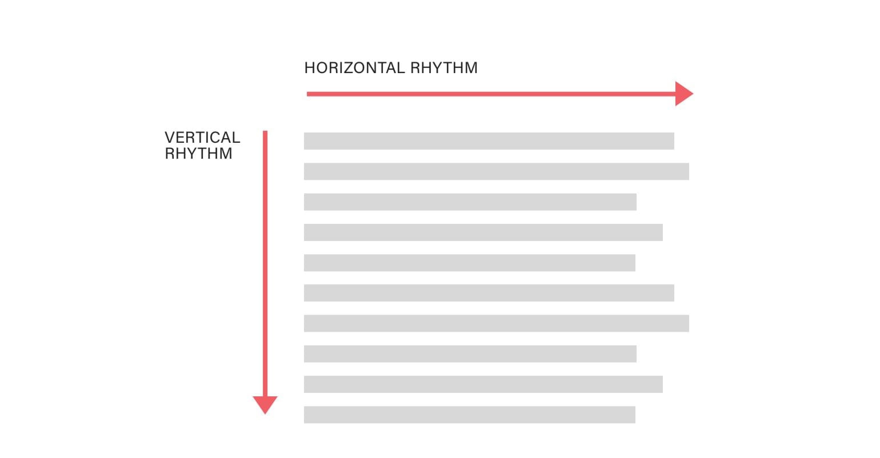
Vertical and horizontal rhythm in web typography.
Horizontal Rhythm
Letter spacing (tracking)
Letter spacing is more commonly known as tracking in print design. It can have a massive impact on the legibility of the words, so it should be used with caution. Letter spacing lower case text is not recommended. “A man who would letterspace lower case would steal sheep,” Frederic Goudy used to say. Letter spacing impacts legibility because it makes the words harder to be deciphered by our brain. Reading slows down, even for fast readers. Unless you have a very good reason for doing so, don’t letter space the main body text.
There are two occasions when letter spacing can have a positive impact. Headings tend to be larger and heavier than the body text. Because of their larger size, the spacing between the letters also looks optically larger than at smaller sizes. In this case, it’s a good idea to slightly reduce the letter spacing. We’re talking about 3–5%, not more. This will make your heading a bit more compact, and a bit closer in appearance to the body type.
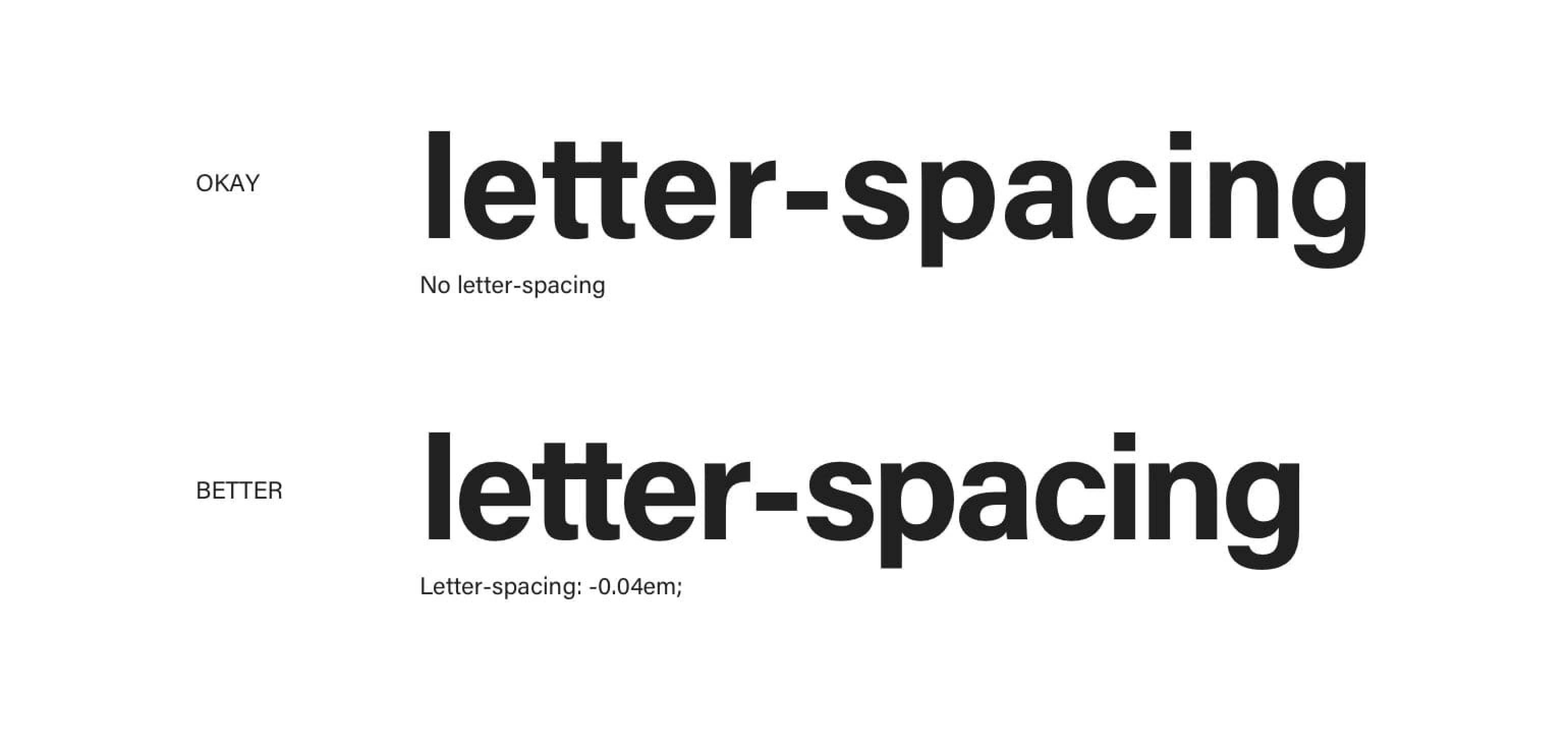
Applying negative letter spacing to headings makes them more compact and closer in appearance to the body type.
Another occasion where letter spacing can be useful is when applied to small caps or uppercase text only. Using uppercase for longer text is a really bad idea, so this might be best combined with headings again. Whenever we have a line of text set in all uppercase or small caps (we’ll cover small caps in the second part of the book), it’s a good idea to increase the spacing between the letters just a bit. Again, we’re talking about small increases, but just enough to make a difference. My recommendation is from 5 to 10%.
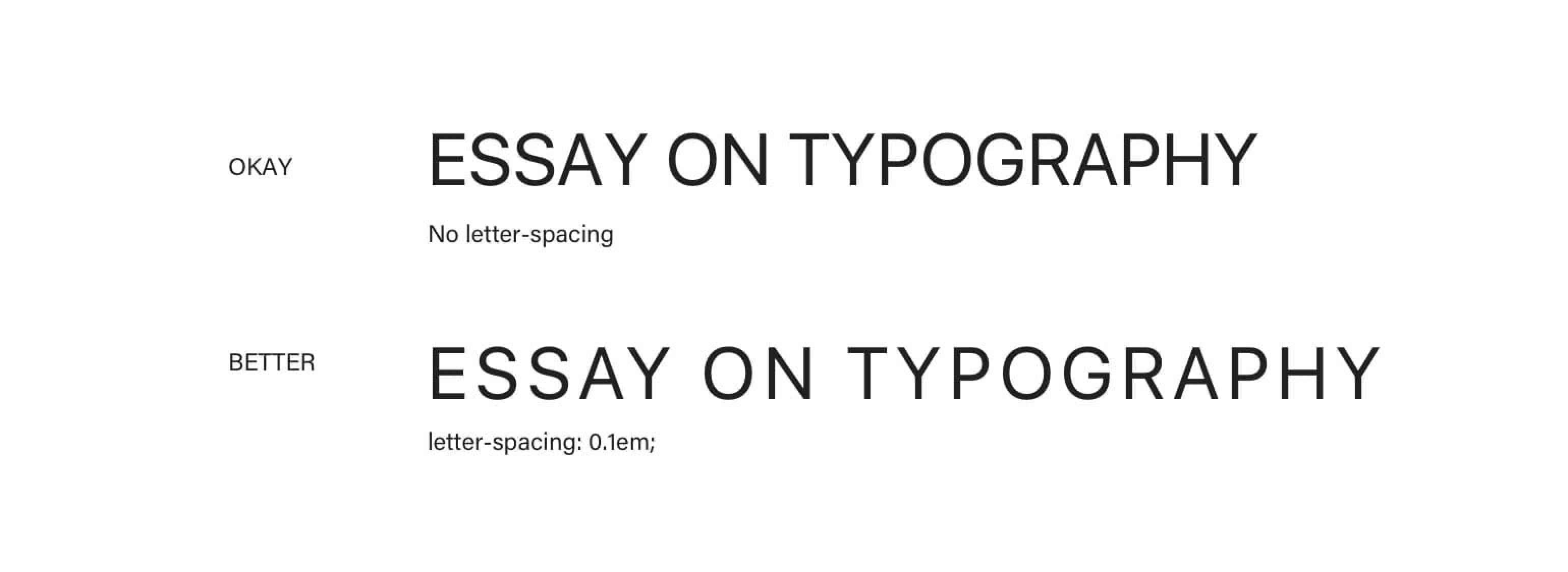
Applying letter spacing to uppercase or small caps helps with legibility.
By doing so, we make the uppercase letters and words easier to read and process because the letters are easier to recognise. Besides that, a bit more space between the letters will add a touch of sophistication to our design. Pay attention to well-designed products or brands that use all uppercase in their branding. You’ll notice that most of them are letter spaced.
Letter spacing acronyms and long series of digits is also recommended, even in the body text.
Kerning
Spacing between different letters is far from equal. Each letter comes with a default set of spacing around it, no matter the neighbouring letter. That’s why we get inconsistencies like this:

Bad kerning, also known as keming. In this particular case it’s so bad that the word “SAVE” seems to be two words “SA” and “VE”.
Kerning—altering the spaces between particular pairs of letters—can resolve these issues. The result is a much better proportioned word and optical perfection. Kerning, unlike letter spacing, changes the spacing around letters depending on their neighbouring letters.
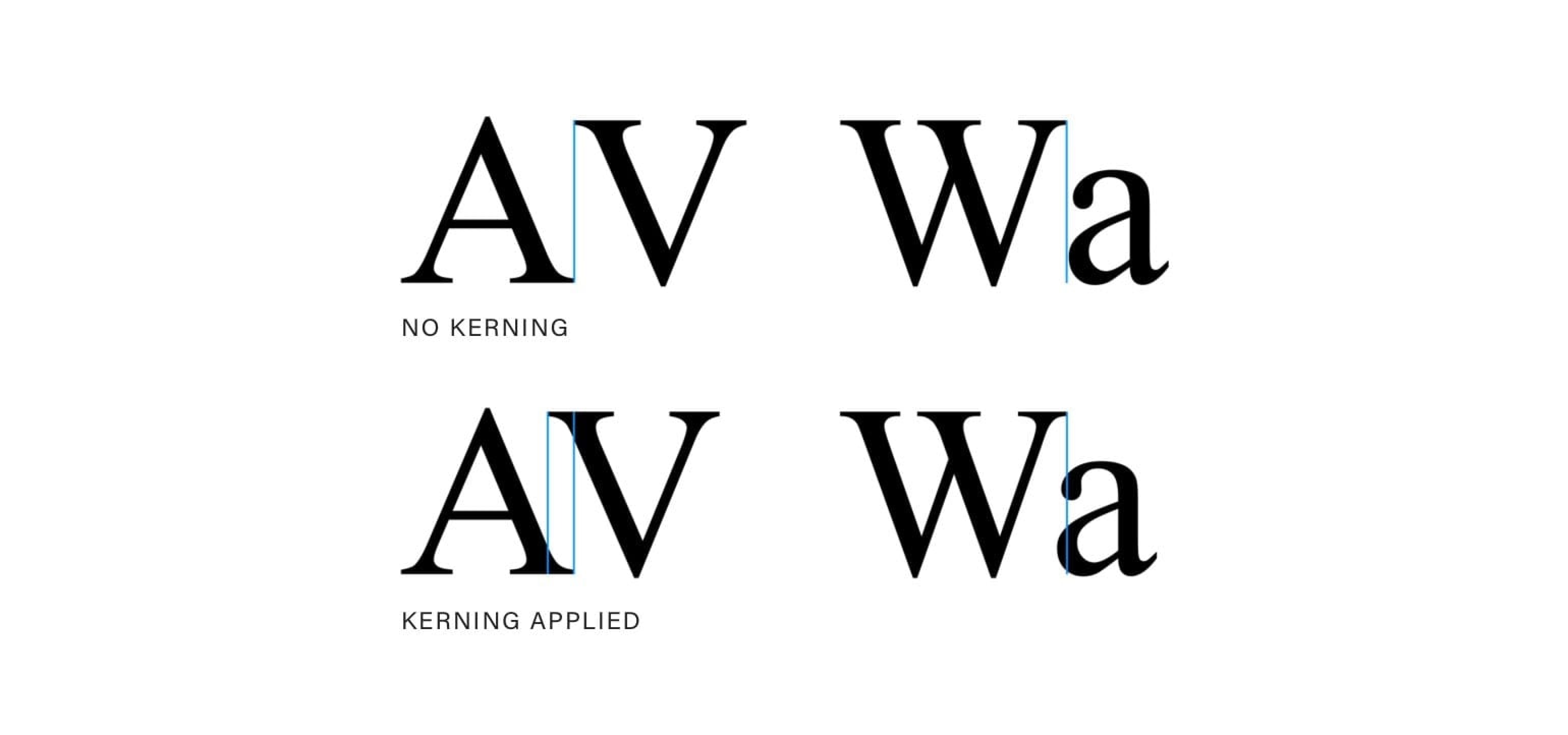
Fixing the bad kerning.
Most web browsers default kerning to auto. This means that the kerning will be enabled for larger type and disabled for smaller. Bad kerning is not as obvious on small type. If you wish, you can control it like this:
  font-kerning: auto; // default
  font-kerning: normal; // enables kerning
  font-kerning: none; // disables kerning
That’s about it when it comes to what we can do with the default browser support right now. This is probably not good enough for special occasions when we need to move a particular letter by x pixels to achieve that optical perfection. Thankfully, there are tools like Lettering.js. With it, we can control the positioning (and also style) of each letter.
Kerning in Sketch
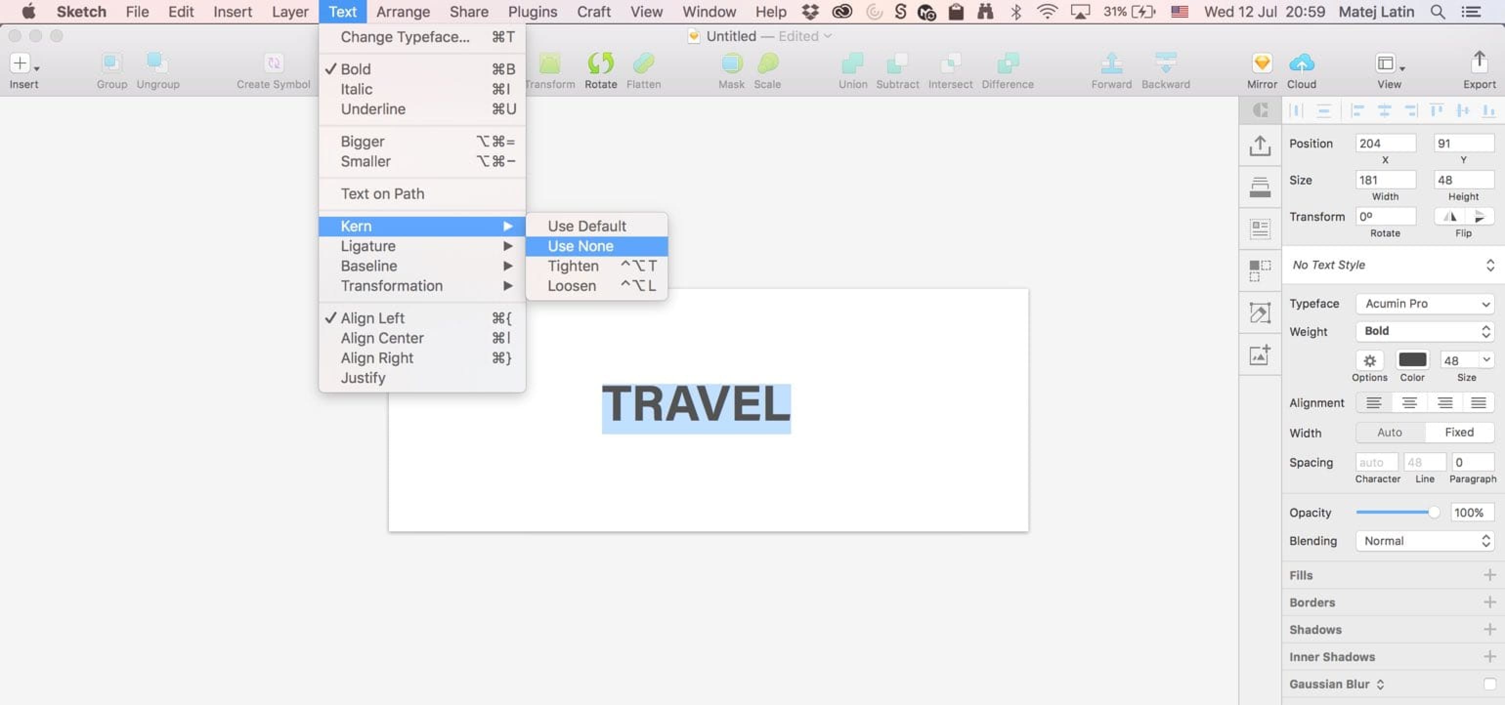
Sketch comes with default kerning enabled but you can change it or disable it completely if needed. To do that, you need to select the text (actual text, not the text box) and go to Type > Kern > Tighten if you want tighter kerning and Type > Kern > Loosen if you want looser kerning. Choose the default option to go back to normal or the disable option to completely disable it.
Don’t justify on the web
A break in music has a meaning. It separates the sound from silence. Nothingness from a rich sound of a chord. It seemingly breaks the rhythm (even though breaks in music always match the rhythm). We get the same effect in typography. A combination of letters, words and empty spaces define the rhythm. For reading to flow, that rhythm needs to be consistent. And because (as we learned earlier) we read word by word, too much spacing between words breaks this rhythm. It breaks the flow of reading. It turns the easiest text to read into something that is hard to consume, no matter the language or words used. I still encounter this far too often on the web:
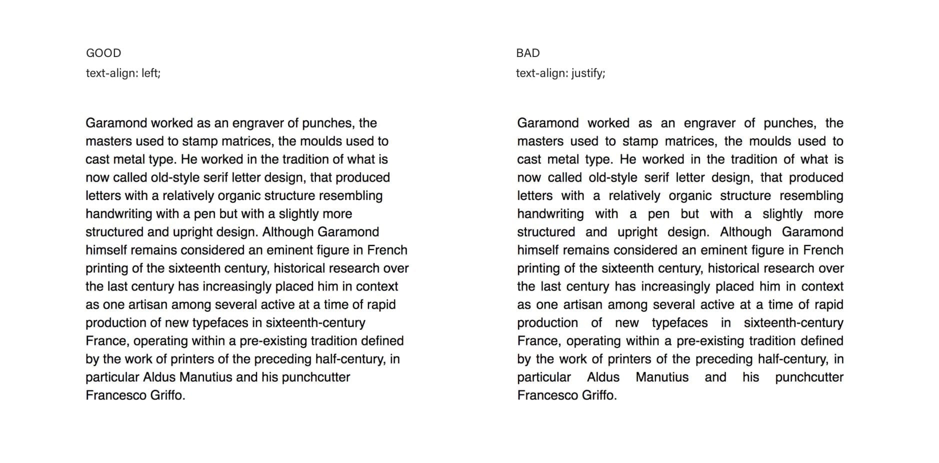
Comparing left-aligned and justified text on the web (no hyphenation).
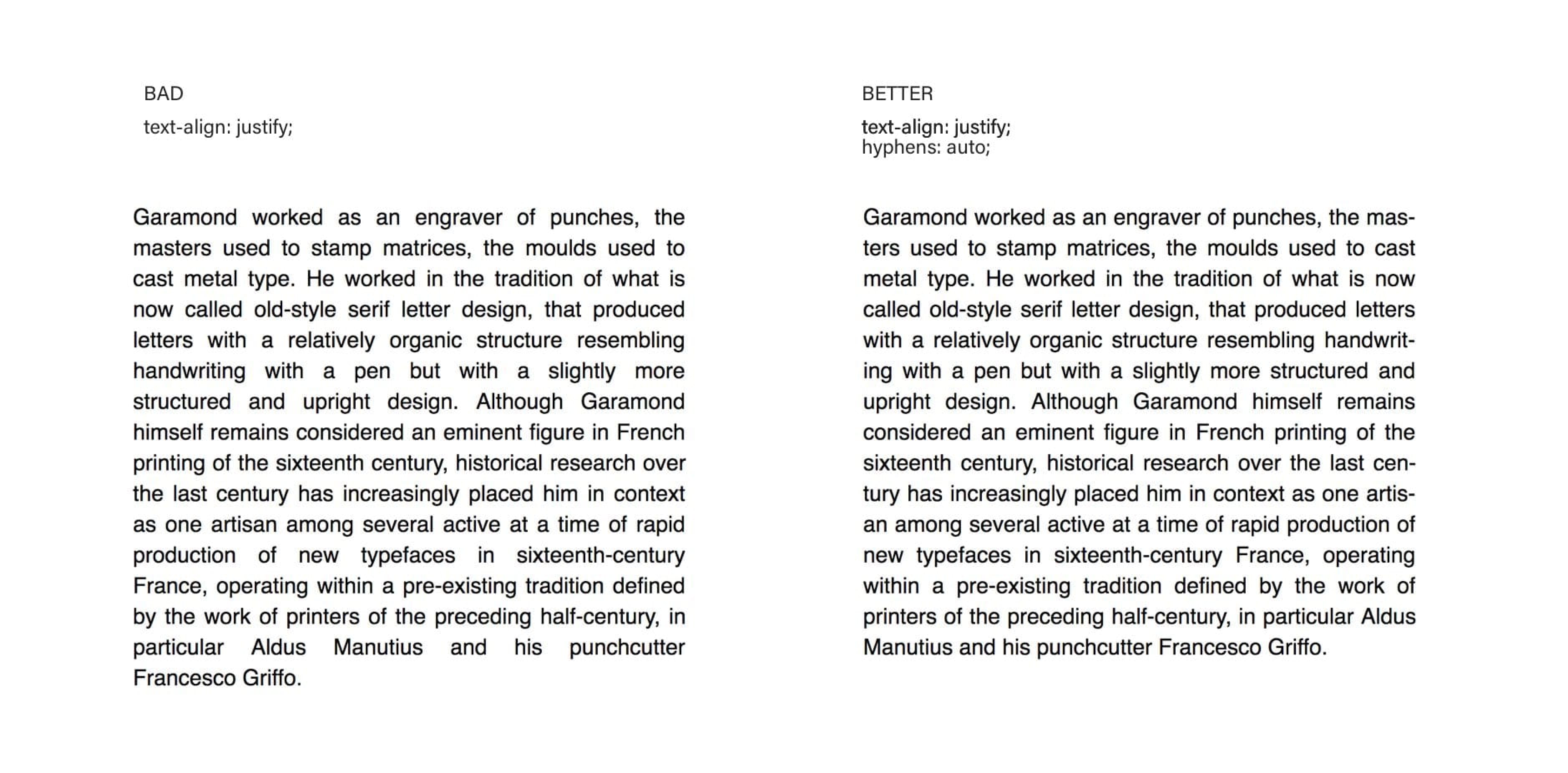
Comparing two justified paragraphs: one hyphenated, one not.
Web browsers render justified text very poorly. They don’t have the necessary algorithms to properly set the spacing between words and even individual letters (which is what proper text editors do). That’s why justified texts come with patches of space between the words: rivers of white between the black of text. This makes it very hard to read so justifying text on the web should be avoided at all costs. Web browsers are getting better in supporting hyphenation, though. If you do use justified text, complement it with hyphenation. For now, I recommend not using justified alignment at all.
Justified alignment and accessibility
Benedicte, a student from the Better Web Type course sent me an email recently. He told me that he works for an organisation in Norway that specialises in books for readers with different special needs. He pointed me to the fact that people with dyslexia have a particular problem with reading justified aligned texts. It’s not clear where a line of text ends which makes it very easy to switch to the wrong line. I did a bit of research and even Gov.uk (a UK public sector information website) recommends aligning text to the left.
Paragraph indenting
A common way to visually separate paragraphs in books is to indent the first line. It’s actually more common than putting an empty line between them. In terms of rhythm, we’re changing the horizontal rhythm to separate paragraphs instead of the vertical one. The contrary is true on the web—paragraphs are more commonly spaced apart but indenting the first line is quite a simple thing to do. There are two rules that must be followed:
- Don’t indent the first line of the first paragraph or of the paragraph that comes after a heading, an image or any other type of figure. I know it sounds quite complicated but it’s actually very simple when it comes to CSS.
  p + p {
    text-indent: 1em;
  }
This works because the text-indent property will only be applied to paragraphs that are preceded by another paragraph. If a paragraph is preceded by an h1, for example, the text indent won’t be applied. That’s exactly what we want.
- Don’t put a bottom margin on your paragraphs. They’re visually divided by the indented line and that’s enough. There’s no point in having space between them. Indented and spaced-apart paragraphs make skilled typographers cringe.
  p {
    margin: 0 auto;
  }
This will set the top and bottom margins of all paragraphs to 0, just to make sure that a top margin doesn’t put a blank space between the paragraphs.
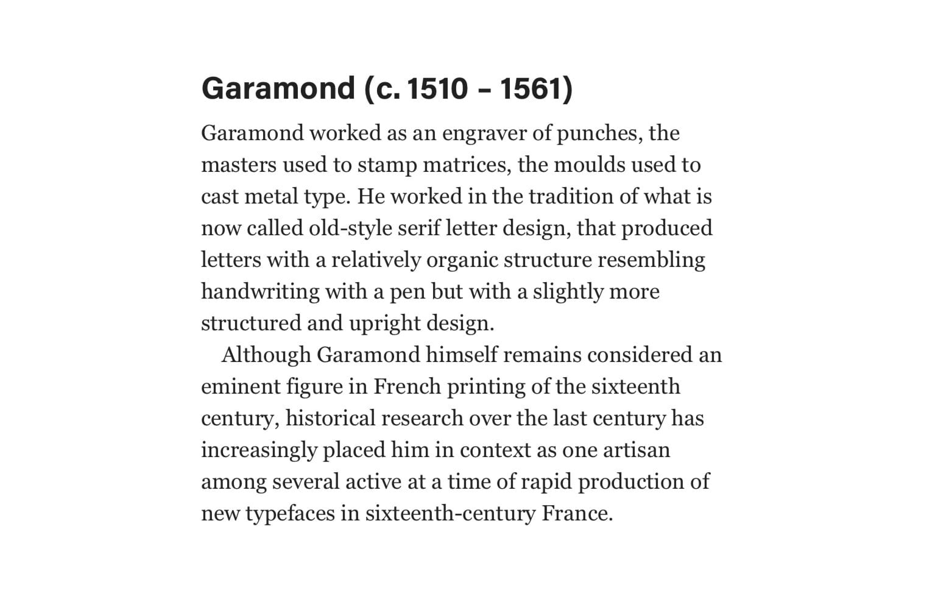
I recommend doing this for texts that aren’t broken down into different sections, divided by titles or a lot of images. It simply works best with longer texts divided into paragraphs. Long articles or web books are best-use cases for paragraph indentation.
How much indentation?
The recommended and most common paragraph text indent is 1em, just like we set in our example above. It’s also common to set it to one unit of line height (more on line height being a unit in the upcoming vertical rhythm section). So if we had a paragraph with a font size of 18 pixels and a line height of 27 pixels, we would set the paragraph indent to 27 pixels, or 1.5em (equalling the line height of 1.5). Half an em is considered the minimum for paragraph indentation and 3em the maximum. My recommendation is either 1em or equal to one unit of line height.
Hanging punctuation
Hanging punctuation is something 9 out of 10 websites get wrong. I’m sure that once I tell you about it, you’ll start noticing it everywhere. By its definition, hanging punctuation “is a way of typesetting punctuation marks and bullet points, most commonly quotation marks and hyphens, so that they do not disrupt the ‘flow’ of a body of text or ‘break’ the margin of alignment”. Let’s take a look at a few examples.
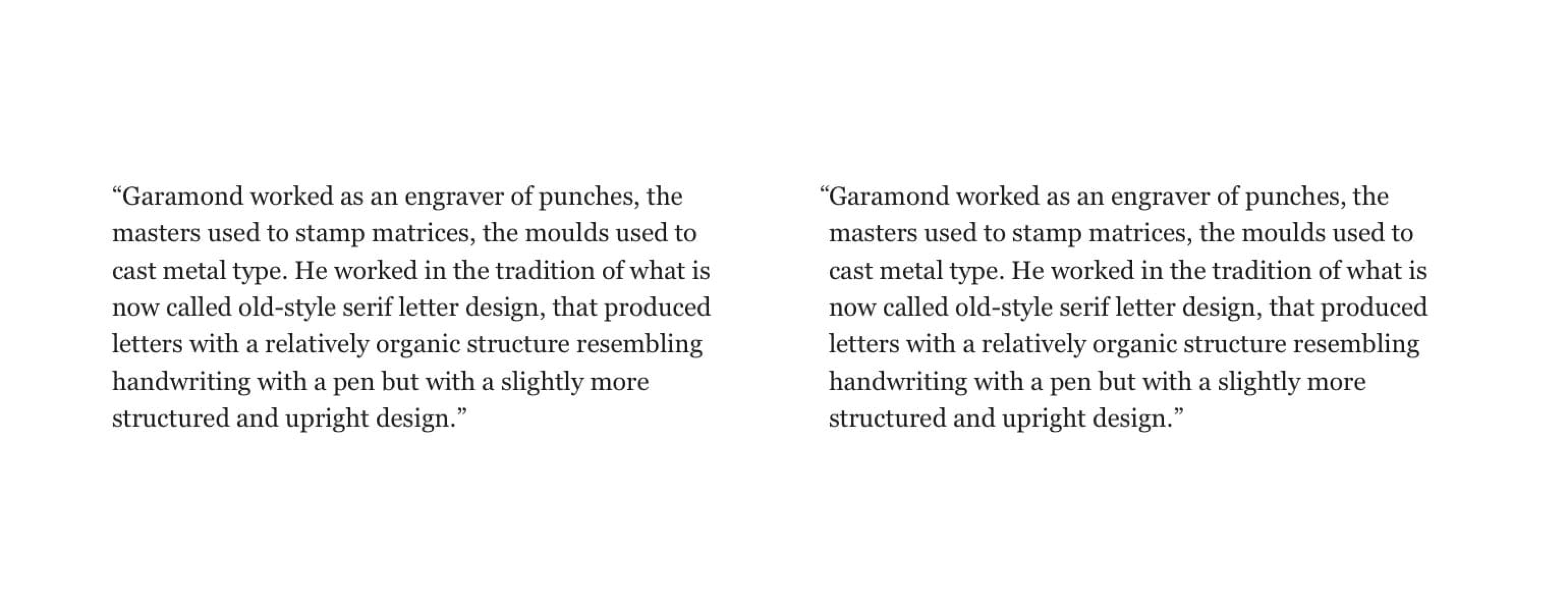
Can you notice the difference in the image above? It’s jarring to me and it really hurts to see the example on the left so often. The quotation marks at the very beginning of the paragraph must sit outside the main block of text so it doesn’t disrupt the flow, or the rhythm, of it. It’s a small detail, I know, but it can have a major impact on the overall look of your typography if done right. So how do we do it right? That’s where it gets a bit complicated. There is a CSS property for hanging punctuation but it’s only well supported by Safari at the time of writing this.
blockquote p {
  hanging-punctuation: first;
}
Setting the hanging-punctuation property to “first” means that “An available character at the start of the first formatted line of an element hangs”. In our case this means the quotation mark at the start of the first line of our paragraph hangs. The “available character” part simply means that the quotation mark is on the list of characters that CSS considers as the ones that can hang.
That’s great, but because of the poor browser support, we can’t use this at the time of writing this book. Too bad, that would make it so easy. Well, as it turns out, there’s a workaround that’s equally simple: negative text indent.
Here’s what we get:
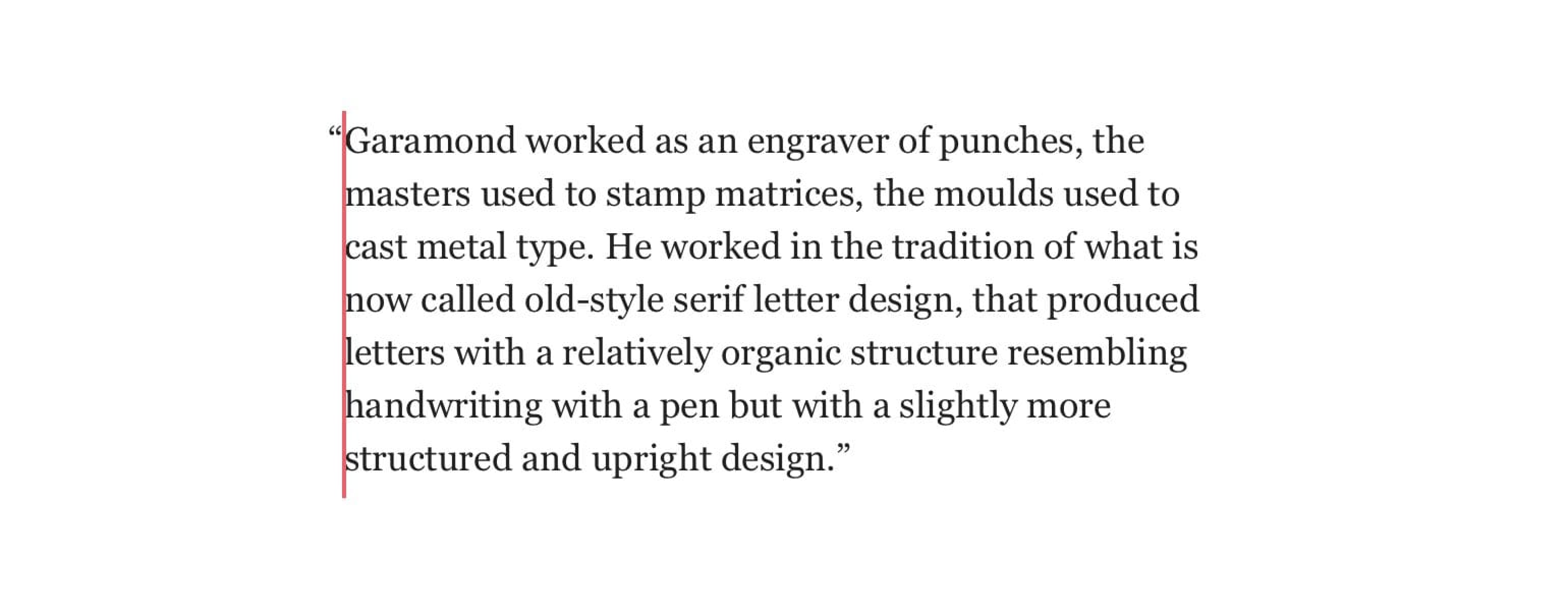
Just make sure you change its value so it works with the font you’re using. -0.5em should be pretty much there but make sure you change it if needed, so it’s spot on. Take a look at the live example at betterwebtype.com/book/c6e1.
There’s a problem with both of the two solutions I haven’t told you about yet. Well, actually, both solutions work considering the quotation marks only come in the first line. What if we were to quote someone in the middle of a sentence and that quotation happens to start on a new line?
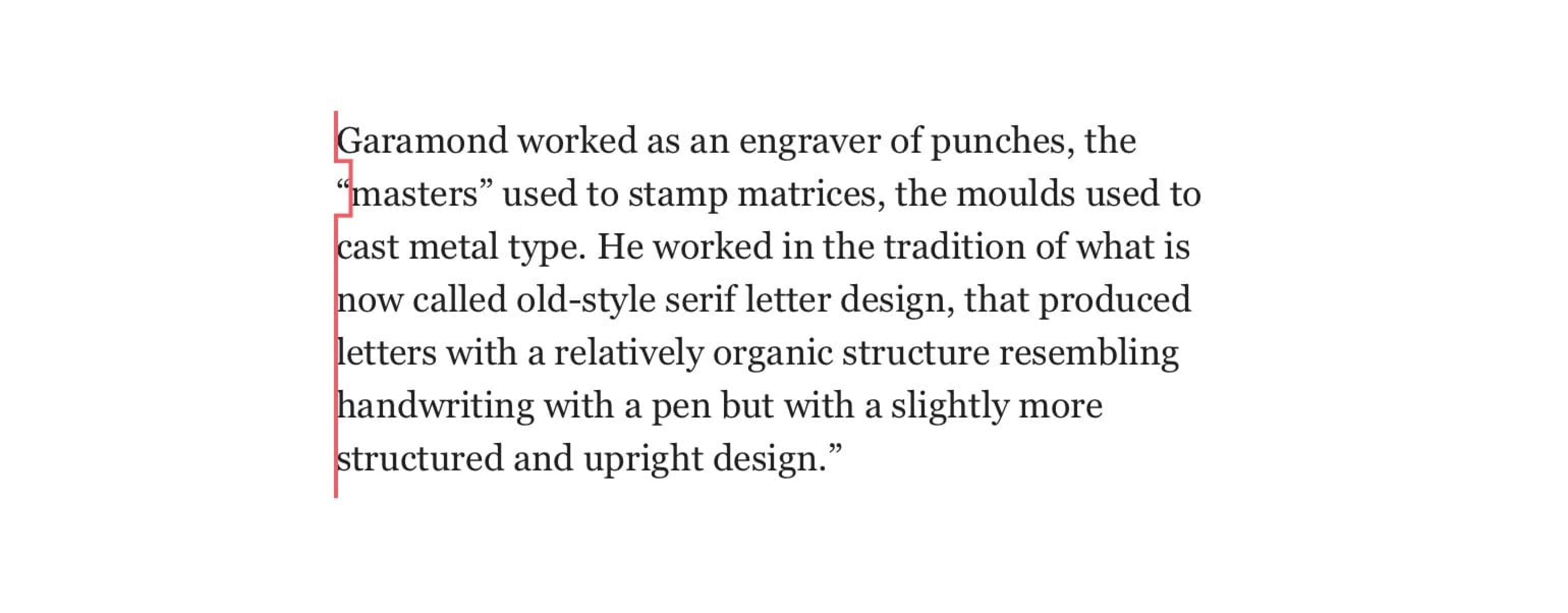
None of the two solutions work in this example. The quotation mark is pushed into the main body of the text. It’s aesthetically unappealing but there’s not much we can do about it. At least not yet.
Hanging punctuation with other characters
Hanging punctuation should be applied to other characters as well. After the quotation marks, the next most important are bullets. Again, most websites get this wrong but, actually, browsers get this wrong by default as well. This is how most browsers will render ordered and unordered lists by default.
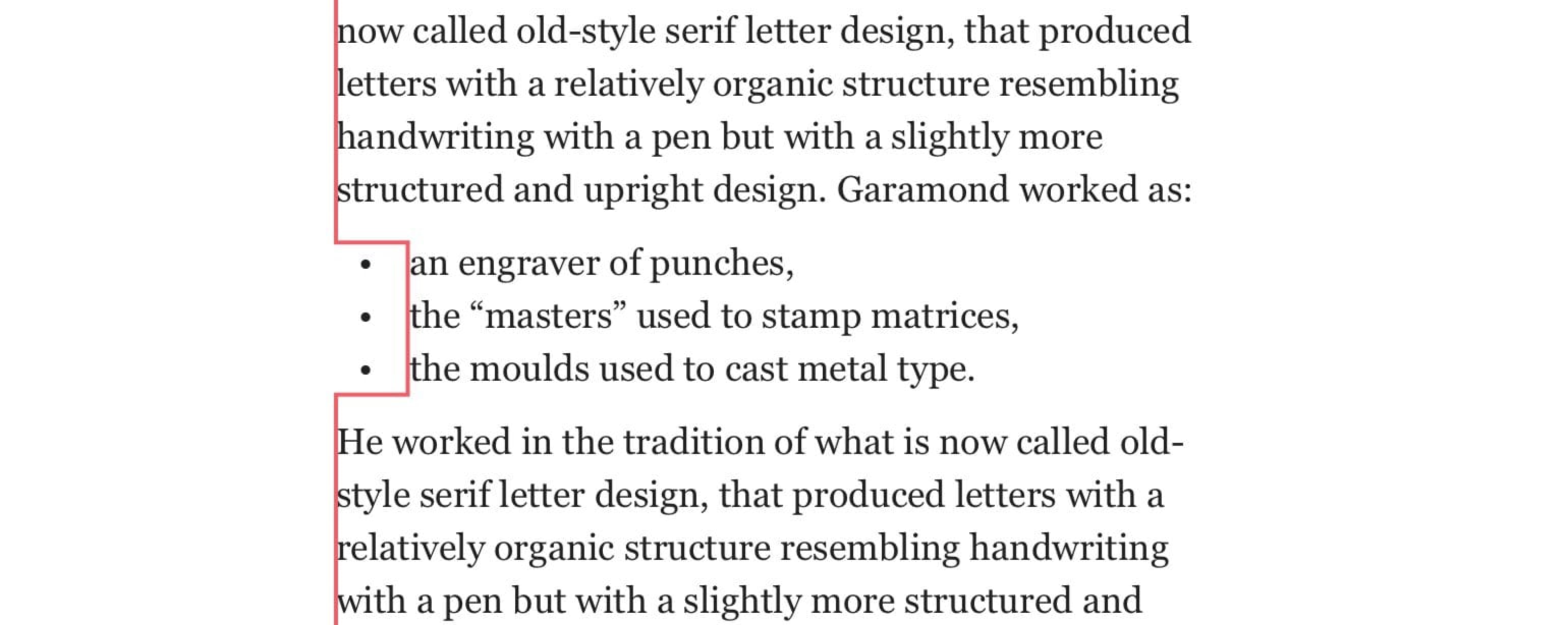
In fact, the bullets should be hanging so they don’t disrupt the flow of the text. To keep the horizontal rhythm undisrupted we need to change the padding of the unordered and ordered list elements.
ul, ol {
  padding-left: 0;
  list-style-position: outside;
}
Note: Also make sure that list-style-position is set to outside.
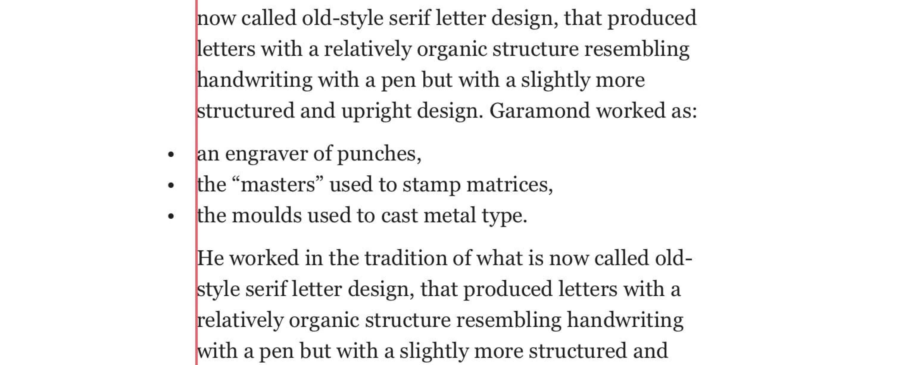
This will push the bullets outside and keep the horizontal rhythm unaffected. Having the bullet points inside the main block of text is not as big a crime as having the quotation marks inside. It is typographically correct but I know that it looks strange to some people, at least at first. They don’t mind it once they get used to it. We, as a web design community, have been making mistakes like this for so long that these things need to be re-hardwired. I, personally, see the hanging bullets as a recommendation, but hanging quotation marks as a rule. Take a look at a live example of the list at betterwebtype.com/book/c6e2.
Vertical Rhythm
Let’s say that a website has the main body text set at 20 pixels and a line height of 30 pixels. The line length should be appropriate for this size and line height: 600 pixels looks just about right. We now have all we need to set up the vertical rhythm throughout the page. To do that, we need a basic rhythmical unit. In typography, that’s line height. We can see it by adding a 30-pixels-tall baseline grid to our website.
Note: I’m using pixels in these examples because they’re easier to explain. Ideally, we would be using EM or REM.
p {
  font-size: 20px;
  line-height: 30px;
  max-width: 600px;
}
Baseline grid indicates equal line height and vertical rhythm.
Note: Unlike in print and graphic design, the baseline grid lies right in the middle of the lines. Lots of people ask me if it shouldn’t lie right at the bottom of the bodies of letters. Not on the web. Take a look at how web browsers interpret a line of text:

A baseline grid on the web falls right in the middle between the line, unlike in print where letter bodies lie directly on it.
We only have a paragraph of text for now, so everything looks right. To keep this rhythm going, we need to use the line height as a base unit for every size, margin and padding on the site. Let’s see. We want to add a title to our text. We assign a size of 55 pixels to it, to make it stand out. Its line height now needs to be an even multiple of the original (base) line height, our main rhythmic unit. This also applies to its margins—especially the top and bottom ones.
h3 {
  font-size: 55px;
  line-height: 60px; // = 2 × 30px (main body text line-height)
  margin-top: 90px; // = 3 × 30px
  margin-bottom: 30px; // = 1 × 30px
}
Note: I’m using pixels for these examples but you should be using units like em, rem or just a decimal 1.5 or a percentage (150%) value for line height.
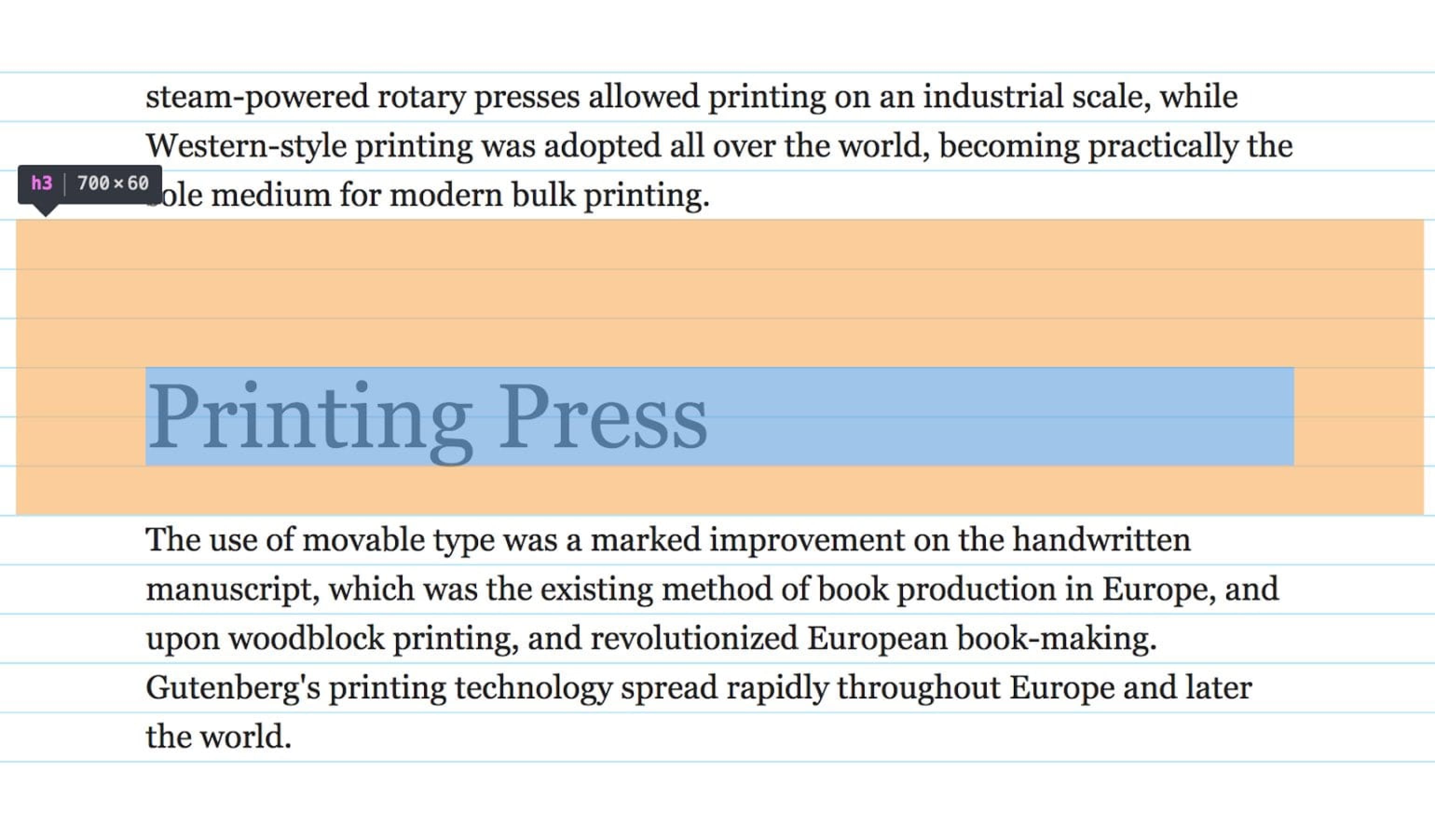
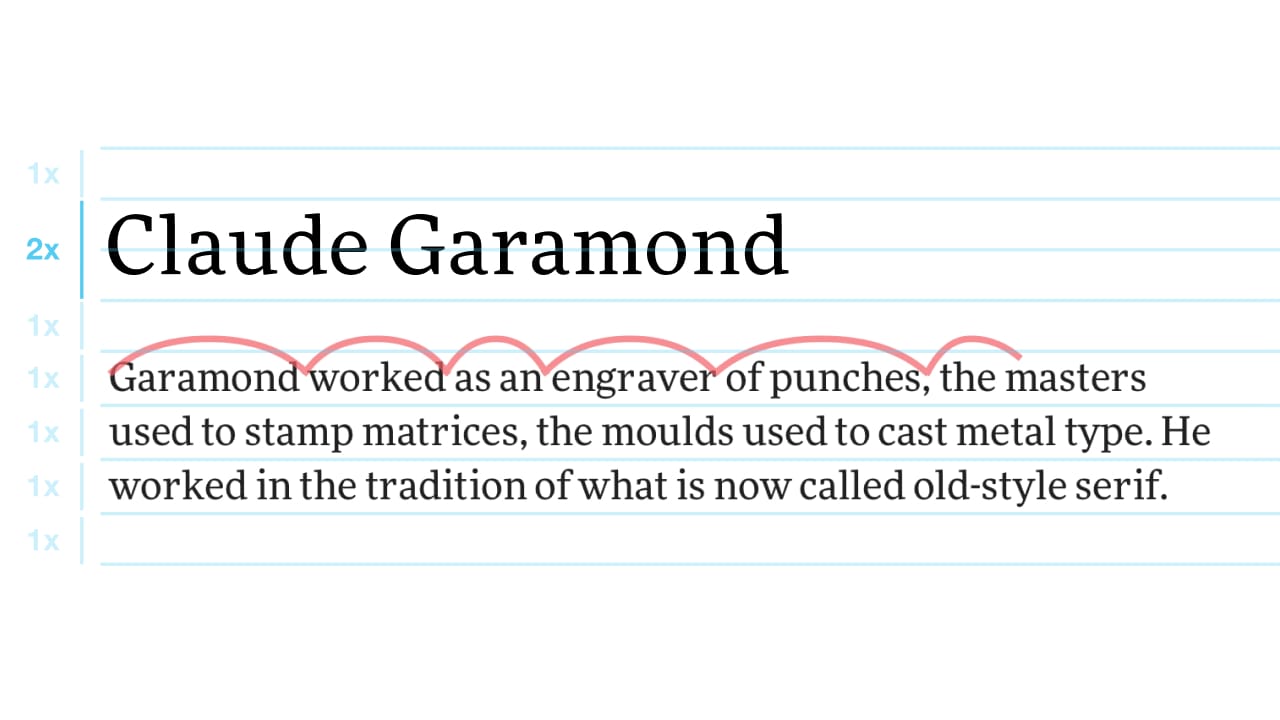
Heading 3’s line height equals two lines, its margins equal three lines on top and one line at the bottom. Everything falls into place.
We assigned a line height of 60 pixels because it’s the next multiple of our base line height (30 pixels) that comfortably accommodates the title set at 55 pixels. A guideline for heading margins that I like to stick with is that the bottom margin should be noticeably smaller than the top one. A lot of websites make the mistake of having equal top and bottom margins for headings, so they float right in the middle between the blocks of text. The title needs to visually connect with the text beneath it, the text it’s actually referring to. And that’s exactly what we want to achieve with vertical rhythm and visual hierarchy. A reader can now understand the structure of the text by simply scanning it.
Because we’ll need this in most cases it’s best practice to assign default line height, margins and paddings to all elements and deviate from it only when necessary.
* {
  line-height: 27px;
  margin-top: 0;
  margin-bottom: 27px; // = 1 × 27px
}
So if you want your lists to have a specific bottom margin, you’d go for something like this:
ul, ol {
  margin-bottom: 54px; // = 2 × 27px
}
You may be questioning what happens when an image breaks the vertical rhythm. It’s a good question. Images come in various sizes. It’s impossible to expect that we’ll be able to control their height on every occasion, especially for large-scale websites. What do we do then? My suggestion: let it be. Use the baseline grid as a guide, not as a restraint. Your text and your page proportions are still rhythmically correct. It still has an established visual hierarchy. Large solid blocks of content, which images certainly are, don’t visually break the rhythm apart. It may break your grid, yes, but at the end of the day it doesn’t matter. The grid is just a tool.
Vertical rhythm with Sass
Last year, I built a tool revolving around vertical rhythm and modular scales in typography. I called it Gutenberg—a meaningful web typography starter kit. Sass was the one thing that made it so much easier. In fact, I don’t think it could have been built without it. Its main goal is that a developer sets a few basic sizes (font size, line height and max width) and Gutenberg takes care of the proportions and vertical rhythm. I now use it for every website I build. Here’s the main thing that Sass made so much easier:
$base-font-size: 112.5; // Is used as %
$line-height: 1.5; // = 27px

$base: 16 * ($base-font-size / 100);
$leading: $base * $line-height;

@mixin margin-bottom($number){
  margin-bottom: #{$number * $leading + 'px'};
  margin-bottom: #{$number * $line-height + 'rem'};
}
This is the mixin I used a lot. Gutenberg has similar mixins for other margins and padding as well. Instead of manually setting any margins or paddings, I used mixins every time. That way, I’m sure the vertical rhythm is left intact. An example of using the mixin above is:
h3 {
  @include margin-bottom(2);
}
Which translates to:
h3 {
  margin-bottom: 54px; // 2 × line-height (27px)
  margin-bottom: 3rem; // 2 × line-height (1.5)
}
The Sass mixin sets the bottom margin in rems, and in pixels as a fallback.
Vertical rhythm in Sketch
You don’t need a plugin to set a baseline grid in Sketch. We can do that with the features Sketch offers out of the box with a simple workaround. Once in Sketch, add an artboard. Then, go to View > Canvas > Layout Settings. The layout settings window will open. Here’s what you need to do:
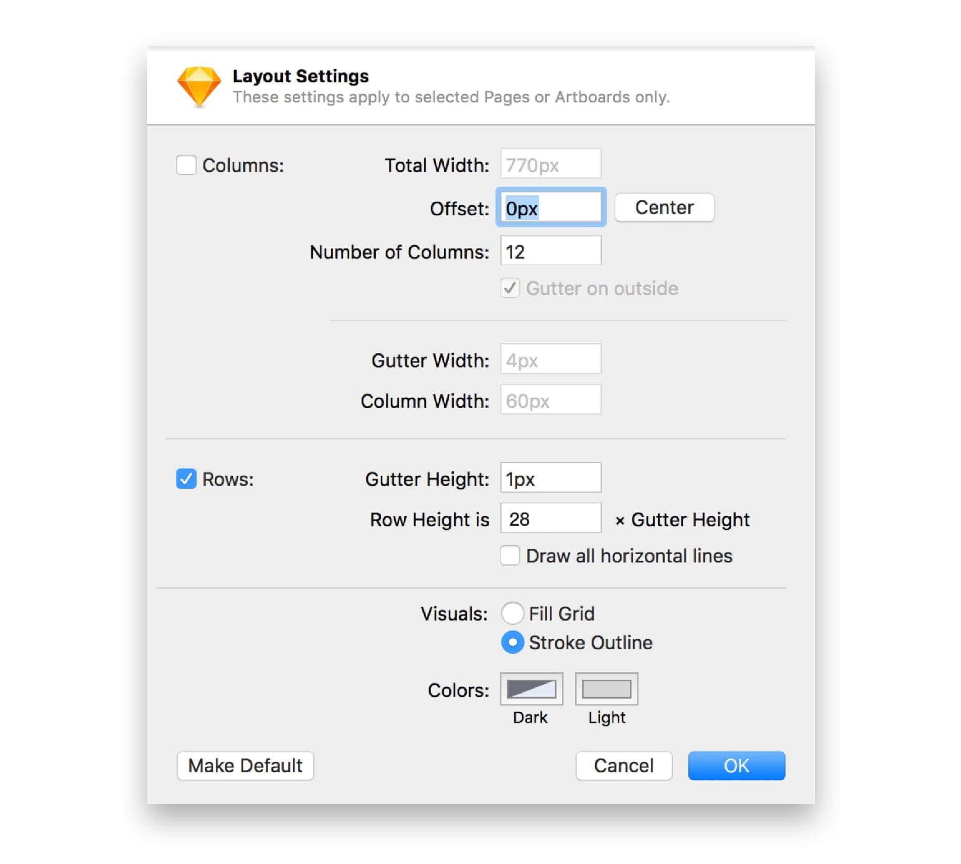
- Tick the “Columns” checkbox and change the value of “Total width” to match the width of your artboard. “Offset” must be set to 0. You can disable the “Columns” checkbox then, as we don’t really need them.
- Now tick the ‘Rows’ checkbox if it isn’t already. Change the ‘Gutter height’ to ‘1px’ and ‘Row height’ to what your line-height is in pixels + 1 pixel (to accommodate the ‘Gutter height’ we set in the previous step. In this case, that’s 27 + 1 which translates to 28 pixels.
- Then change the “Visuals” radio to “Stroke outline”.
- Change the colour of the lines to something subtle. You need to change the “Dark” colour. I usually set it to a light shade of blue. Click “OK”.
Bam! You now have a baseline grid in Sketch. Simple, right?
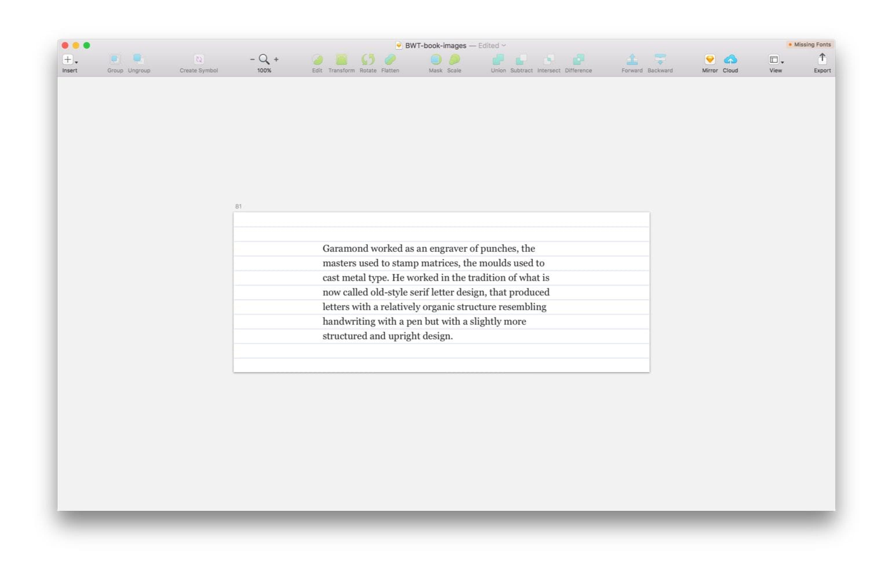
Note: your content will display behind the grid and there’s no way of changing that. What you can do is change the opacity of the lines. You can do that in the colour selection window while selecting the colour in Step 4 above.
An example of rhythm in web typography
This article is based on chapter 6 from the book Better Web Typography for a Better Web. To this point, the reader would already be familiar the anatomy of the typeface, choosing and combining fonts and how to shape perfect paragraphs. They already applied all this to the example that we’re now starting to work on.
Well done for making it so far. Rhythm is one of the most important things in typography and it doesn’t take too much effort to get it right. I know that some designers like to use what looks right to their eyes (they make the decision based on what looks right optically), and others prefer to back their decisions with maths. I believe both can and should work together. I like to start off with what’s mathematically correct and make optical corrections when they’re needed.
In the previous chapter, we decided which typeface to use for headings on our example website. The following is where we left off.

We have our body text set to 18 pixels and our line height is 1.45 (26 pixels). With that, we have everything we need to apply vertical rhythm to our website. I’ll be using Sass throughout this example and I’ll only be focusing on desktop, to make things easier to understand. In a real example, the process would need to be repeated for the mobile text size and line height (if it’s not the same as on desktop)—something we’ll cover in the chapter about responsive web typography.
Let’s start by setting the line height and the bottom margin for all elements.
// Variables
$base-font-size: 112.5; // Gets used as %
$line-height: 1.45;

// Vertical rhythm mixins
@mixin line-height($number) {
  line-height: #{ $number * $line-height + 'rem'};
}

@mixin margin-top($number) {
  margin-top: #{ $number * $line-height + 'rem'};
}

@mixin margin-bottom($number) {
  margin-bottom: #{ $number * $line-height + 'rem'};
}

html {
  font-size: #{$base-font-size + '%'}; // 112.5% = 18 pixels
}

* {
  @include line-height(1);
  @include margin-bottom(1);
  @include margin-top(0);
}
We’ve just reset the line height and the margins of every element. They all fit the baseline grid now. With that, we created a problem at the same time. Headings are usually larger than body text size and won’t fit into a single line height. We need to change the line height for all headings. Let’s change their margins while we’re at it as well.
The easiest way to do that is to create an object with a list of all headings and their values for their line height, top and bottom margins.
// Headings parameters [ h1: line-height: 2 × 26px, margin-top: 3 × 26px, margin-bottom: 1 × 26px ]
$headings: (
  h1: (2, 3, 1),
  h2: (1.5, 2, 1),
  h3: (1.5, 1, 0),
  h4: (1, 1, 0),
  h5: (1, 1, 0),
  h6: (1, 1, 0)
);

// Set line-heights and margins
@each $heading, $properties in $headings {
  #{$heading} {
    @include line-height(nth($properties, 1));
    @include margin-top(nth($properties, 2));
    @include margin-bottom(nth($properties, 3));
  }
}
All right, now we’re talking. Now even all the major text elements fit the baseline grid. And that’s pretty much it when it comes to vertical rhythm. We have a good foundation to work on. Let’s make sure we set all our line heights and margins with the Sass mixins from now on and everything will be all right. Check out our example website so far at betterwebtype.com/book/c6.

From here on, the book explores modular scales and what “meaningful typography” means, composing pages, responsive web typography and also dives into 4 additional chapters about micro typography. This is the finished live example website that gets built as your progress through the chapters.
Did you enjoy what you just read? Great, I have much more of this stuff in my book about web typography that I wrote. It’s very popular with web designers and developers, you should definitely check it out.
Resources & tools for vertical rhythm
Here’s a list of really cool and useful tools and resource when it comes to rhythm in web typography.
-
Syncope
Syncope is a WYSIWYG tool for establishing vertical rhythm on websites. -
Archetype
Create beautiful web typography designs, in the browser. -
Grid Lover
Establish a typographic system with modular scale & vertical rhythm. -
Gutenberg
A meaningful web typography starter kit.
