5 free monospaced fonts with coding ligatures
![]()
~ 7 min read
At some point, I found Fira Code and loved the fact that it had coding ligatures, so I made the switch. That wasn’t long ago, but I recently did even more research into monospaced fonts and found my new favourite, you can see it at the bottom of this article. Here are the five fonts I considered the best, all of them are free to download and use.
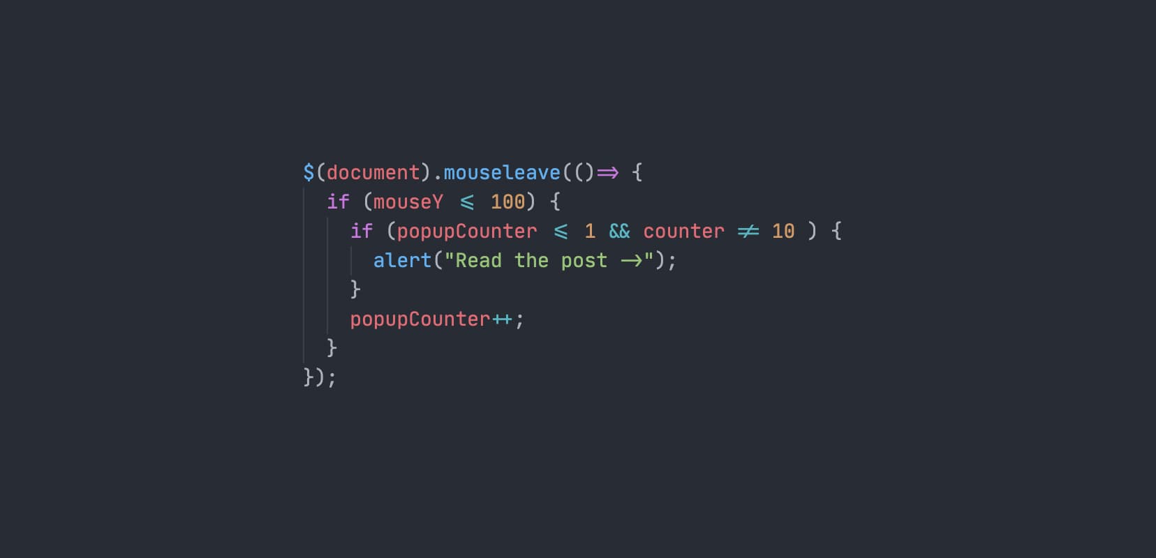
Fira Code
This is a really cool monospaced font based on Fira Mono from Mozilla. I wanted to have it first on the list as I used it for quite a while and I want to compare all others to it. It also seems that it’s become quite popular since its release so a lot of you may be using it. Perfect reason for using it as a baseline.
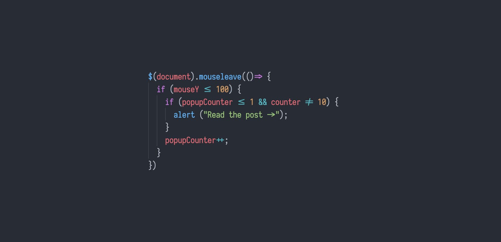
This is what Fira Code looks like in action.
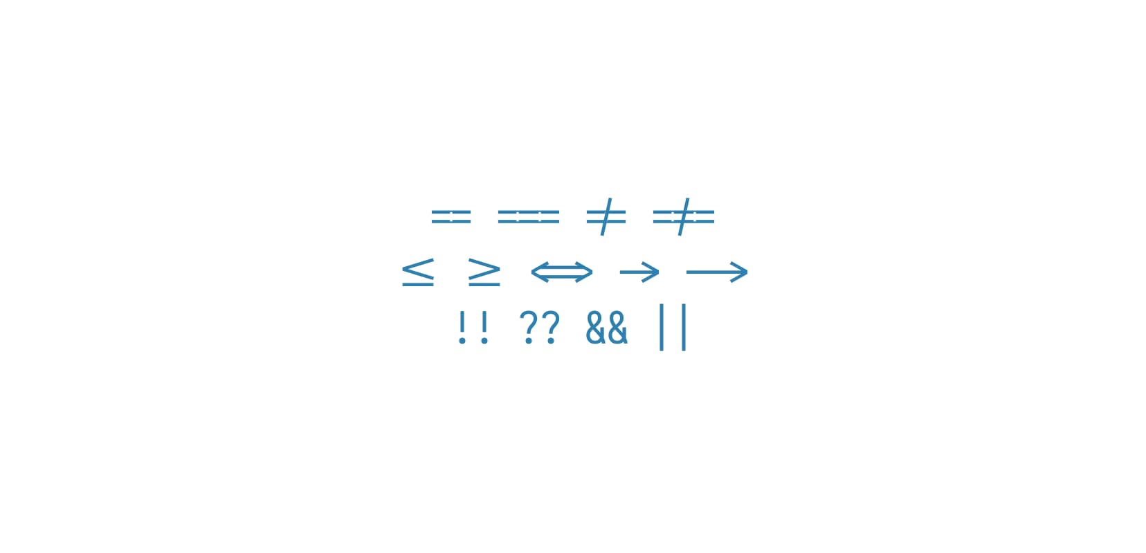
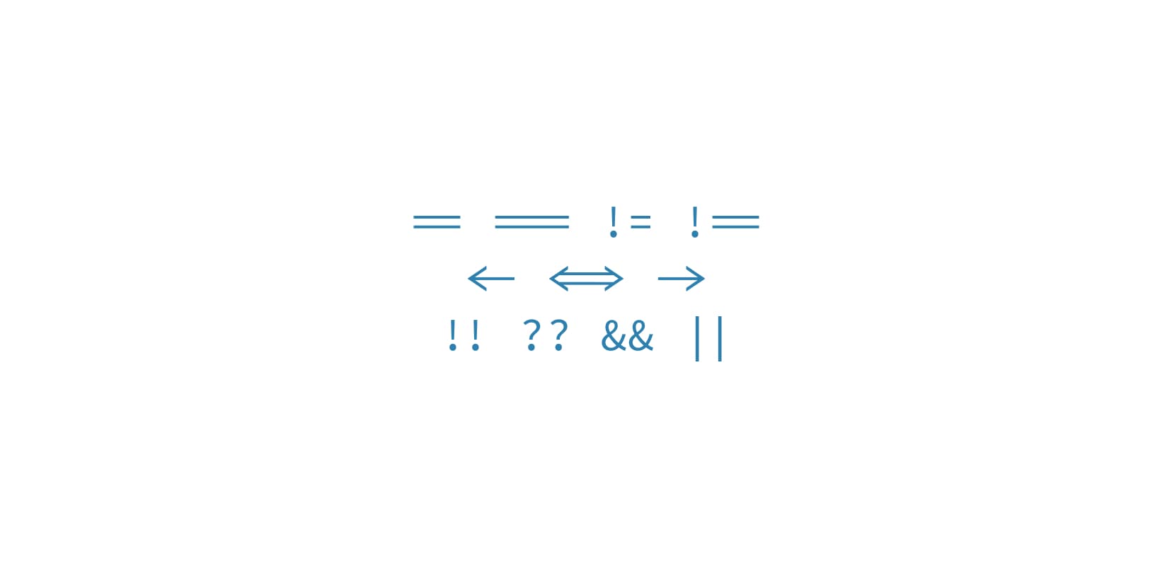
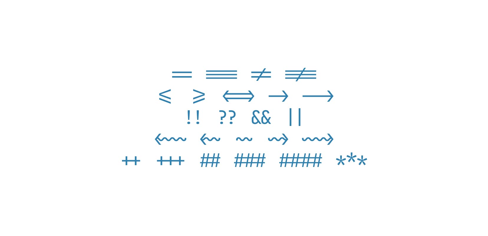
Ligatures
It seems that from all five fonts in this article Fira Code has the most ligatures. If not the most, definitely the widest range of all the different ligatures supported. For example, it even has a www ligature, as well as ones for all markdown heading levels and even traditional ligatures like “fi”, “fl”, “Fl” and similar.
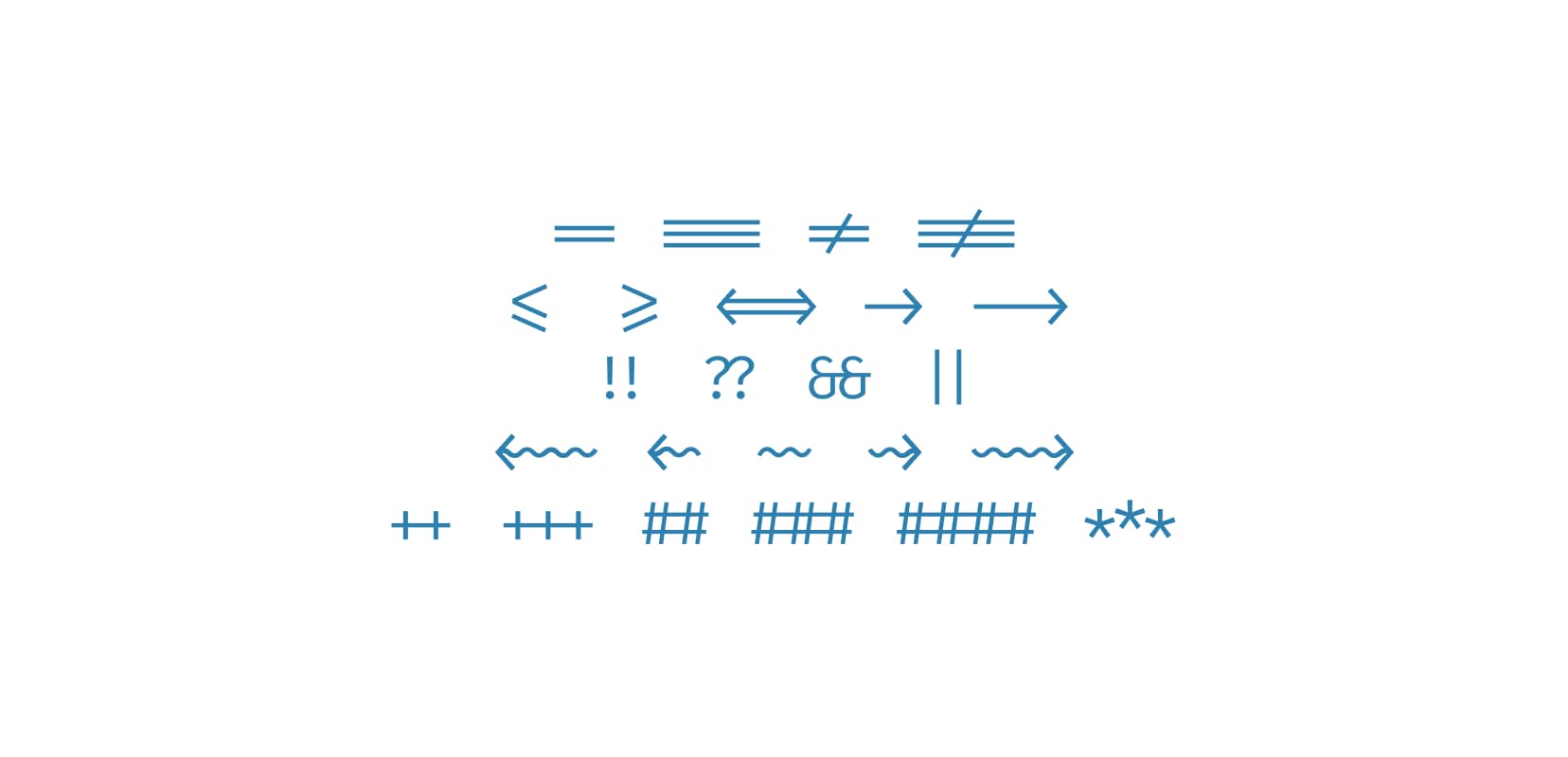
Fira Code has a lot of coding ligatures and they look really good.
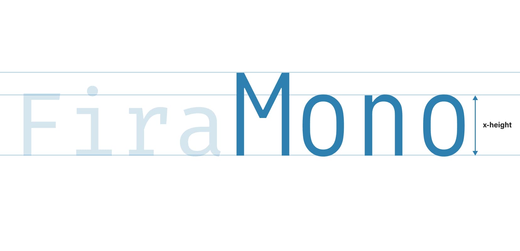
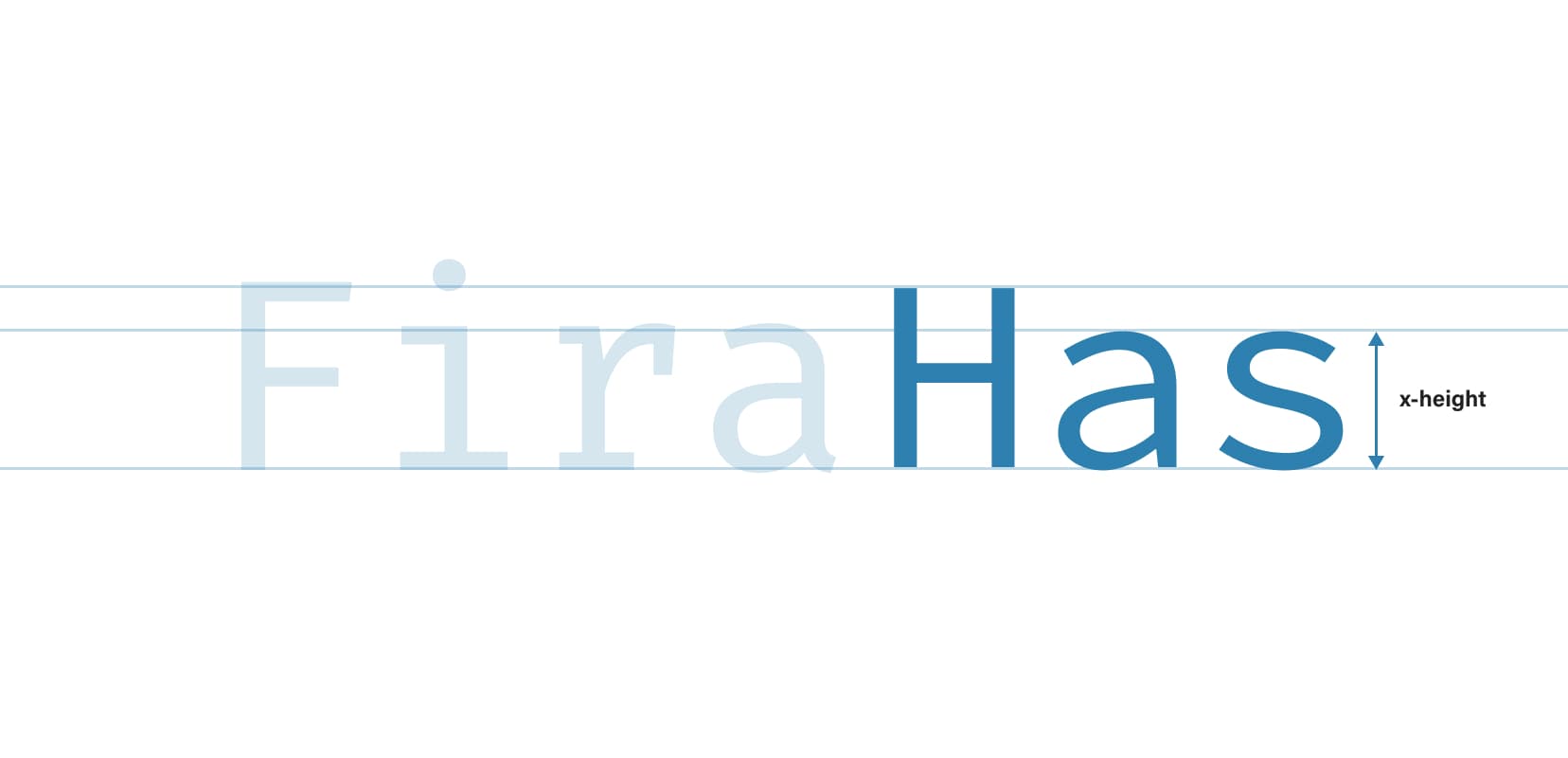
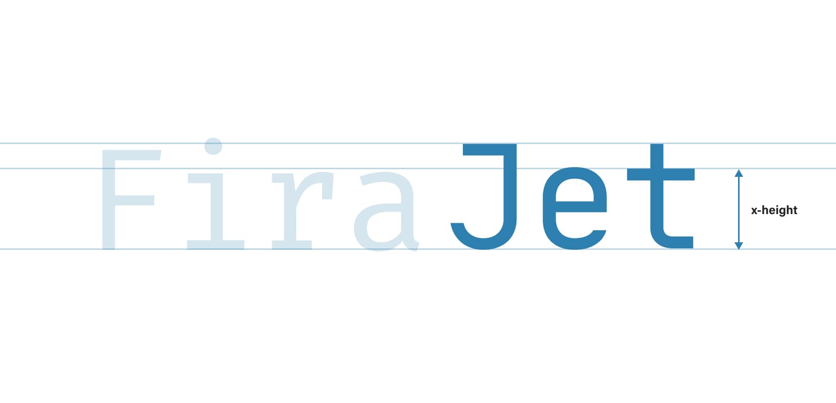
X-height
Fira Code’s x-height is what I would call “regular”. Not small, not large, somewhere in between. This is another property that makes it a good baseline to compare other fonts to.
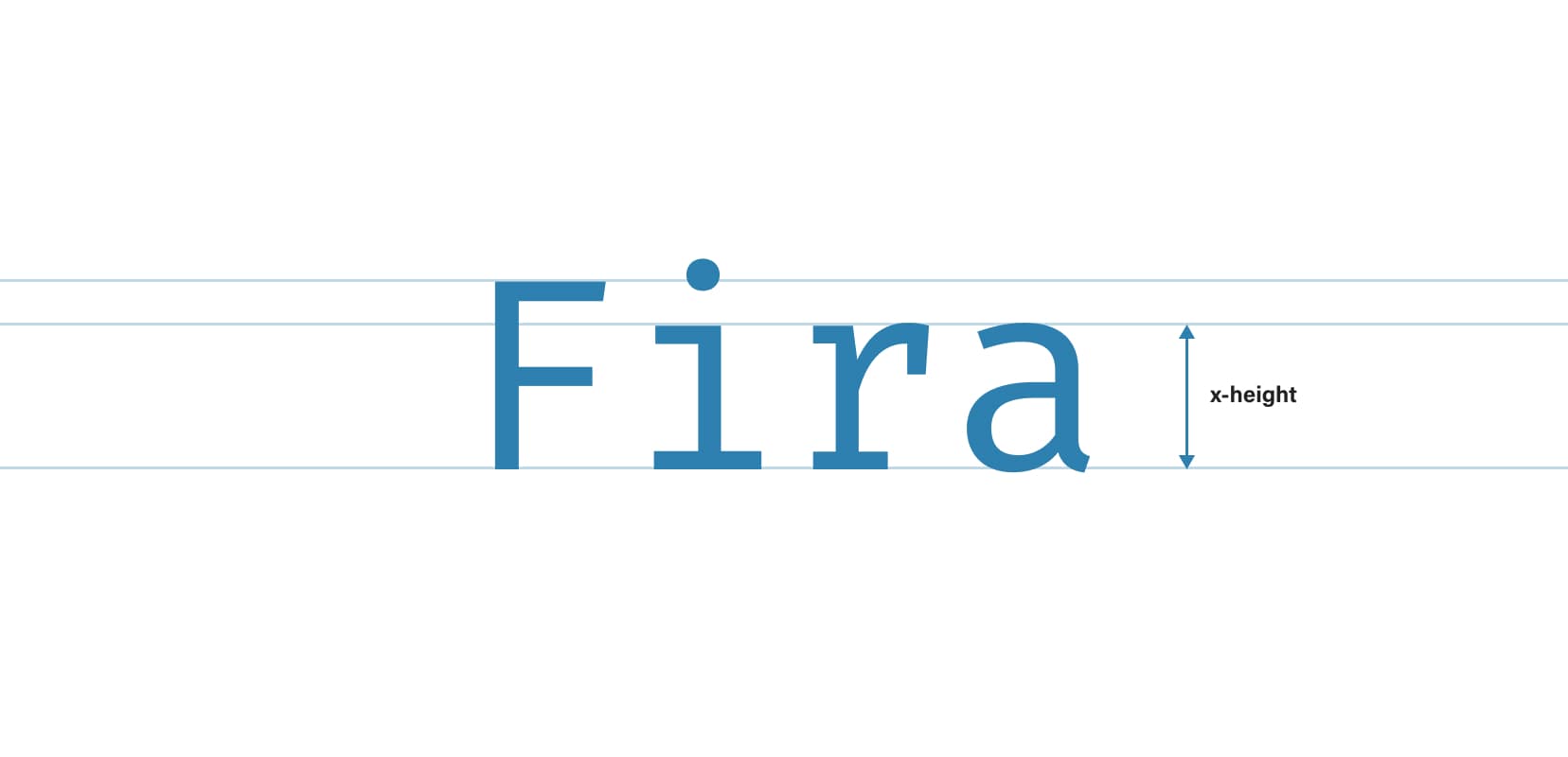
Fira Code’s x-height is quite standard, perfect for comparing with other fonts.
Legibility
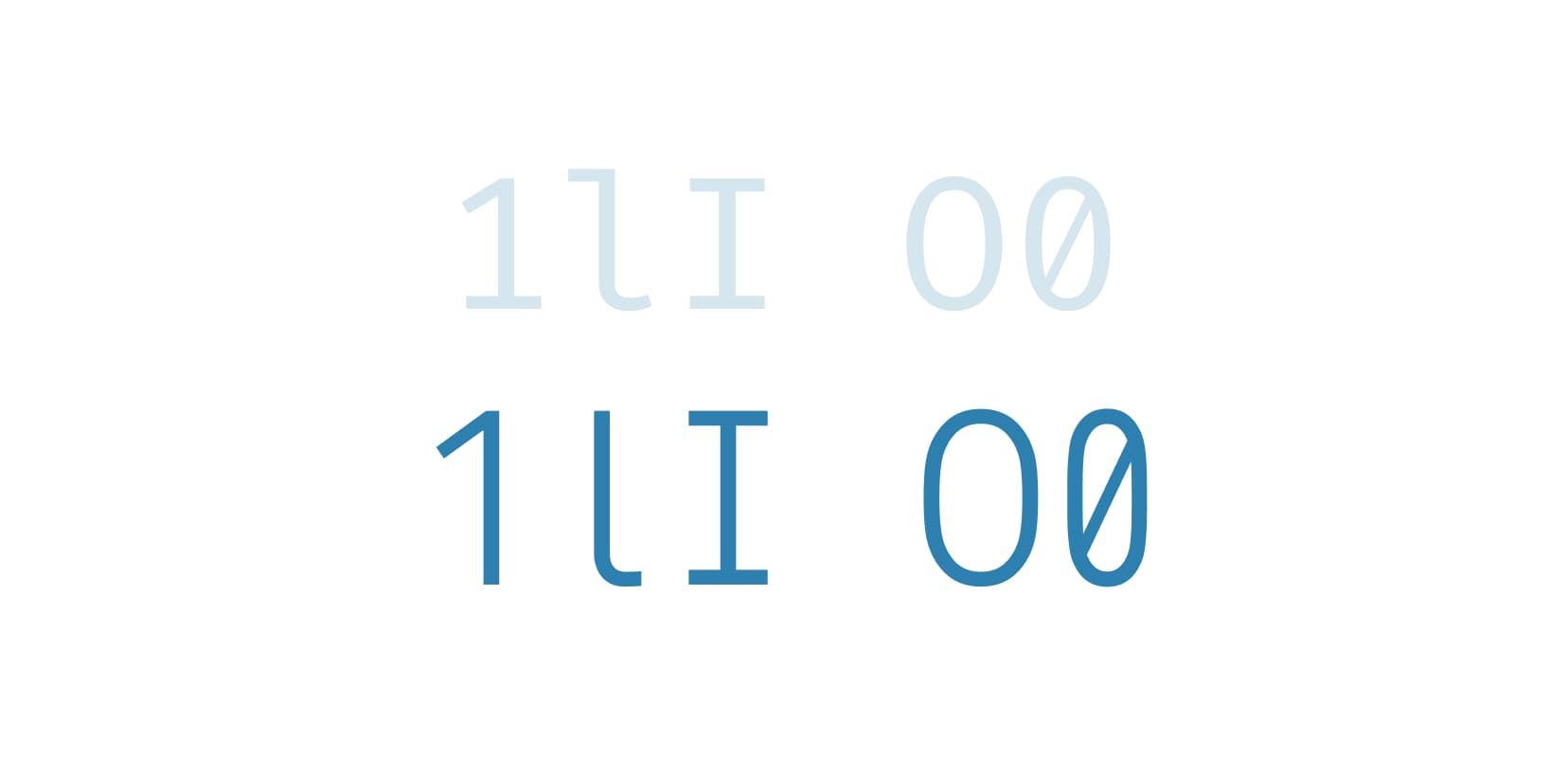
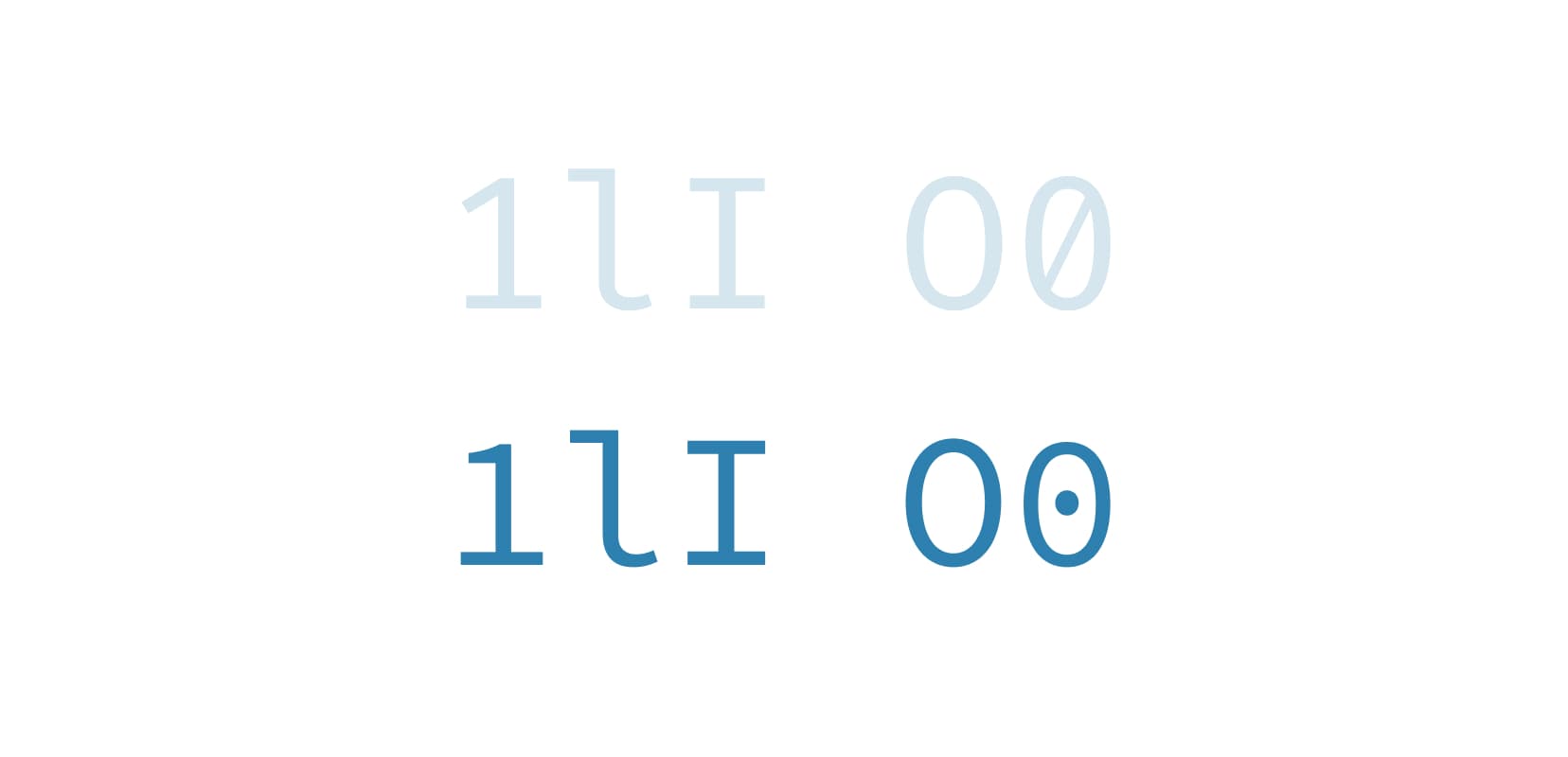
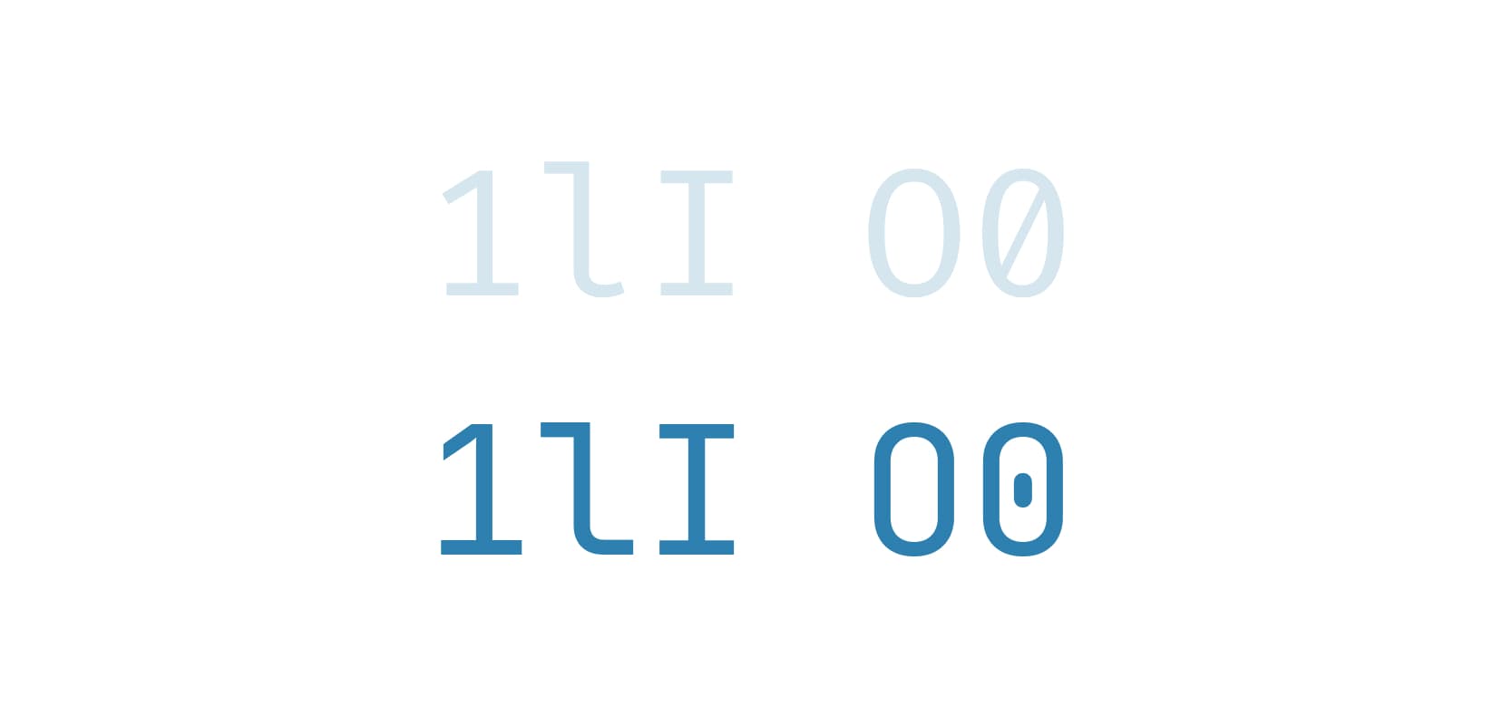
When it comes to legibility, Fira Code does a really good job. The “1”, “l” and “I” characters, for example, are clearly distinguishable. This is an extremely important thing when it comes to coding where a single misspelt character can break the code. The “O” and “0” characters are also different enough to tell them apart immediately. They’re differently shaped and the zero character comes with either a slashed or a dotted design.
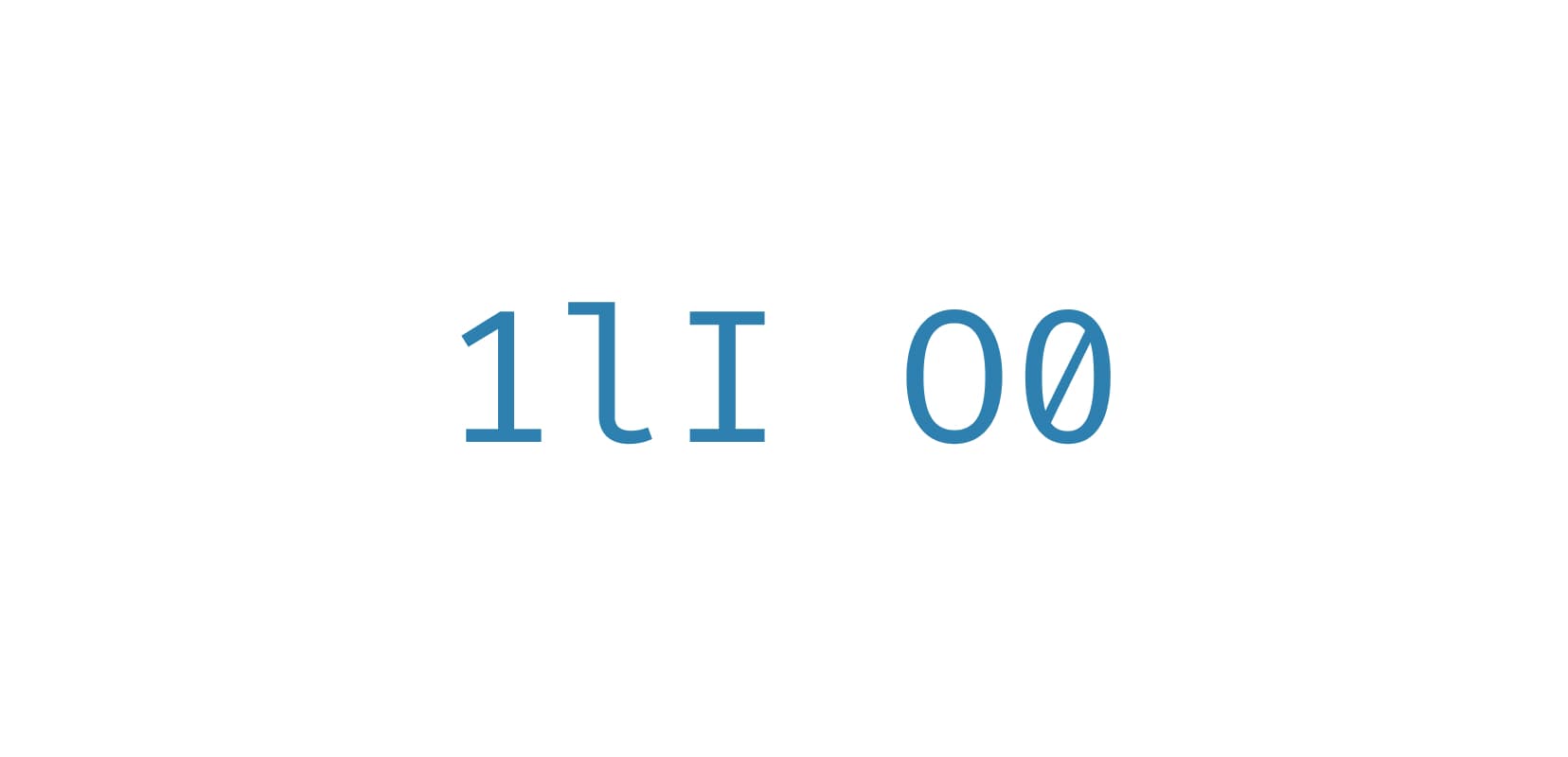
Fira Code scores well on legibility.
Other cool things about Fira Code
Lots of OpenType features supported and a Retina weight that looks really good on Retina screens.
Iosevka
Iosevka is described as a “slender monospaced sans-serif and slab-serif typeface designed to be the ideal font for programming.”
This is what Iosevka looks like in action.
Ligatures
There’s a ton of ligatures in Iosevka but I must say, some of them don’t look as good as in other fonts from this article. The angles used in arrows and some of the sizes used look a bit strange. For a coding font, I really like it to be explicit and the code set in it readable. Iosenka could improve its ligatures design a bit.
Iosenka supports a good range of ligatures but they could look better.
X-height
Let’s compare Iosenka to Fira Code. We can see straight away that their x-height is similar so I’ll conclude that Iosenka’s x-height is regular too. Now that we’re having a closer look, I noticed that Iosenka seems to be somewhat condensed.
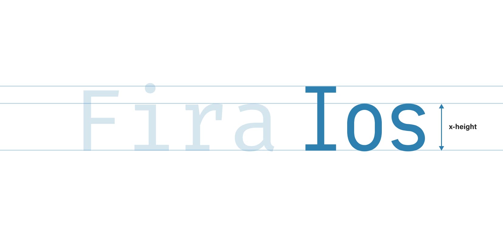
Iosenka’s x-height is very similar to Fira Code’s.
Legibility
I decided to score Iosevka’s legibility as “not that good”, partly because of this somewhat condensed style, but also because of particular characters designs. If we check the “1lI” and “O0” characters which often suffer the most from poor legibility, we can see that they’re very similar. They’re not that easy to tell apart, especially at smaller sizes. And coding fonts usually are used at smaller sizes.
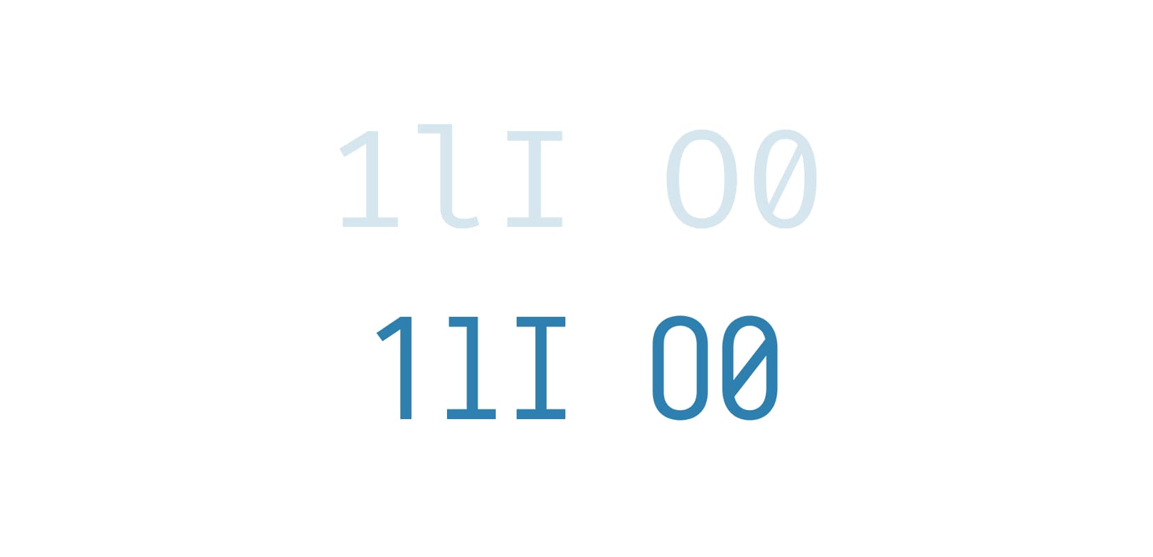
Iosenka’s legibility of the most problematic letters could be improved. Fira Code for comparison above.
Other cool things about Iosevka
So not good scores on the ligatures and legibility of Iosenka, but we do have to give credit to the authors for producing 9 weights and they all come with their italic and oblique counterparts.
Monoid
Monoid is the monospaced font that stands out the most from the ones I write about in this post. Its authors describe it as “Semi-condensed and distinguishable glyphs with short ascenders and descenders, big apertures and supersized operators and punctuation.” Sounds interesting, let’s take a closer look!

This is what Monoid looks like in action.
Ligatures
Monoid has the most basic ligatures for coding which should cover 80% of what a programmer needs. It’s not a big range of ligatures but it’s ok to work with. The smaller range of ligatures isn’t Monoid’s primary problem though, it’s the fact that they don’t work on some popular code editors. That includes Visual Studio, Sublime Text and Notepad++.
Monoid supports a decent range of ligatures and they look good. Too bad it doesn’t support some of the popular code editors.
X-height
Monoid is semi-condensed which results in a large x-height. By far the largest from all of the five fonts. This is good for legibility but I’m not sure about the semi-condensed part. In my opinion, it looks too tight. I like my code to be able to “breathe” in my code editor. That’s just a personal preference though.
Monoid’s x-height is very large.
Legibility
Larger x-height and short ascenders and descenders contribute to a better legibility, but what about character designs? Let’s take a look at the usuals. “1lI” characters are clear enough to tell apart and the shapes for “O” and “0” are different and the zero is slashed. It can also be dotted (enabled by an OpenType feature) but it’s not as clear as the slashed one. Overall, I’d say the legibility of Monoid is good.
Distinct enough character designs help improve Monoid’s legibility. Fira Code for comparison above.
Other cool things about Monoid
It also comes in a Retina weight and has tons of OpenType features.
Hasklig
This is basically Source Code Pro but with ligatures. Source Code Pro is a good monospaced font for coding and this “extension” makes it even better. Hasklig uses ligatures for rendering multi-character glyphs more “vividly” and to correct problematic spacing.
This is what Hasklig looks like in action.
Ligatures
Hasklig currently supports 33 ligatures so pretty much all the basic ones. Its support for ligatures across code editors is good which makes it a really good option.
Not a huge range of ligatures but it does cover the most basic ones. Good support across code editors.
X-height
As Hasklig is based on Source Code Pro, their x-heights pretty much match. It’s smaller than Fira Code’s for example, so I’d categorise it as a smaller x-height. This generally has a negative impact on legibility but let’s take a closer look before we decide about that.
Comparison with Fira Code makes it clear that Hasklig’s x-height is indeed a bit smaller.
Legibility
In general, Hasklig looks smaller compared to other fonts in this post. When we put it next to them, it’s immediately clear that it’s the smallest (note that I compared them at the same size of 14 pixels). Let’s take a look at the most problematic character designs. “1lI” characters look good and can easily be told apart. “O” and “0” use the same shape but the zero comes with either slashed or dotted design. Overall, I’d say that the legibility of Hasklig is ok. Other fonts in this post are better in this regard.
Hasklig’s legibility is ok. The smaller x-height does seem to have a negative impact on that. Fira Code for comparison above.
Other cool things about Hasklig
Something that’s unique to Hasklig (and Source Code Pro) is that it doesn’t really look like a monospaced font. It character designs look closer to a sans serif font. It also offers really precise control over which character designs we want to use, it does that through OpenType features. It also comes in seven weights, which is impressive.
JetBrains Mono
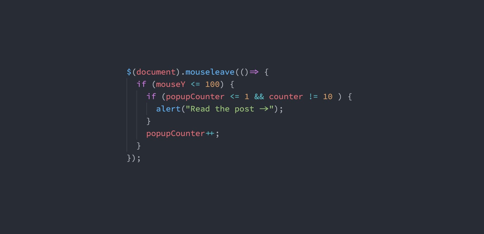
This is the one I’m most eager to present as it’s my new favourite. When I said I recently replaced Fira Code, this is the one I replaced it with. There are quite a few things that I love about it but mainly it’s the simplicity of design of characters and the incredible range of ligatures.
This is what JetBrains Mono looks like in action.
Ligatures
JetBrains Mono comes with an astounding range of 138 coding ligatures! That should pretty much cover everything a programmer needs. But what sets this font apart from others is how slick its ligatures are. They’re really well proportioned and generally well designed.
A really wide range of ligatures and they look really good.
X-height
The x-height of JetBrains Mono is larger which makes it more legible. We know that a larger x-height equals better legibility so I’m surprised that only a few of the coding fonts use it. Combined with a simplistic but slick character designs, JetBrains Mono looks really good in a code editor.
A larger x-height is one of JetBrains Mono’s strong points.
Legibility
A larger x-height already contributes to a better legibility but let’s also take a look at the characters design. The most problematic ones, “1lI”, are easily told apart. Their designs are distinct and there’s basically no way of confusing a capital “I” with a lowercase “l”. “O” and “0” use the same shape but zeros are made more distinct by a slashed design (a dotted design is also available through an OpenType feature). Overall, I’d say the legibility of JetBrains Mono is very good.
Distinct character designs, combined with a larger x-height help make JetBrains Mono’s legibility very good. Fira Code for comparison above.
Other cool things about JetBrains Mono
JetBrains Mono comes in four weights.
What font do you use for coding? Did I miss any cool font you know about? Let me know in the comments.
Better Web Typography for a Better Web
Free Course
Join 30,000+ designers and developers, get 7 free lessons and unlock your better web typography skills.
Learn more →Just cool web typography stuff, no spam.