AI vs Designer: Who’s better at pairing fonts?
![]()
~ 7 min read
You’ve heard about it. It’s in your inbox every day, it’s in the news, it’s in social media. People are so excited about AI that they just can’t stop talking about it. AI can generate beautiful art, it can code and ship production-ready code, write articles, come up with design ideas and generate mockups, UI and prototypes, and it can even be a personal assistant.
With all those AI capabilities you can’t help but wonder — is AI coming for my job? Will it replace programmers, writers, and designers? Or is it just hyped up beyond realistic expectations and capabilities?
If you look at the 2023 Gartner Hype Cycle for Emerging Technologies (Fig 1) you can spot the generative AI sitting at the top of the Peak of inflated expectations stage. That means a reality check is coming and the hype will settle down once it reaches the next stage — the Trough of disillusionment.
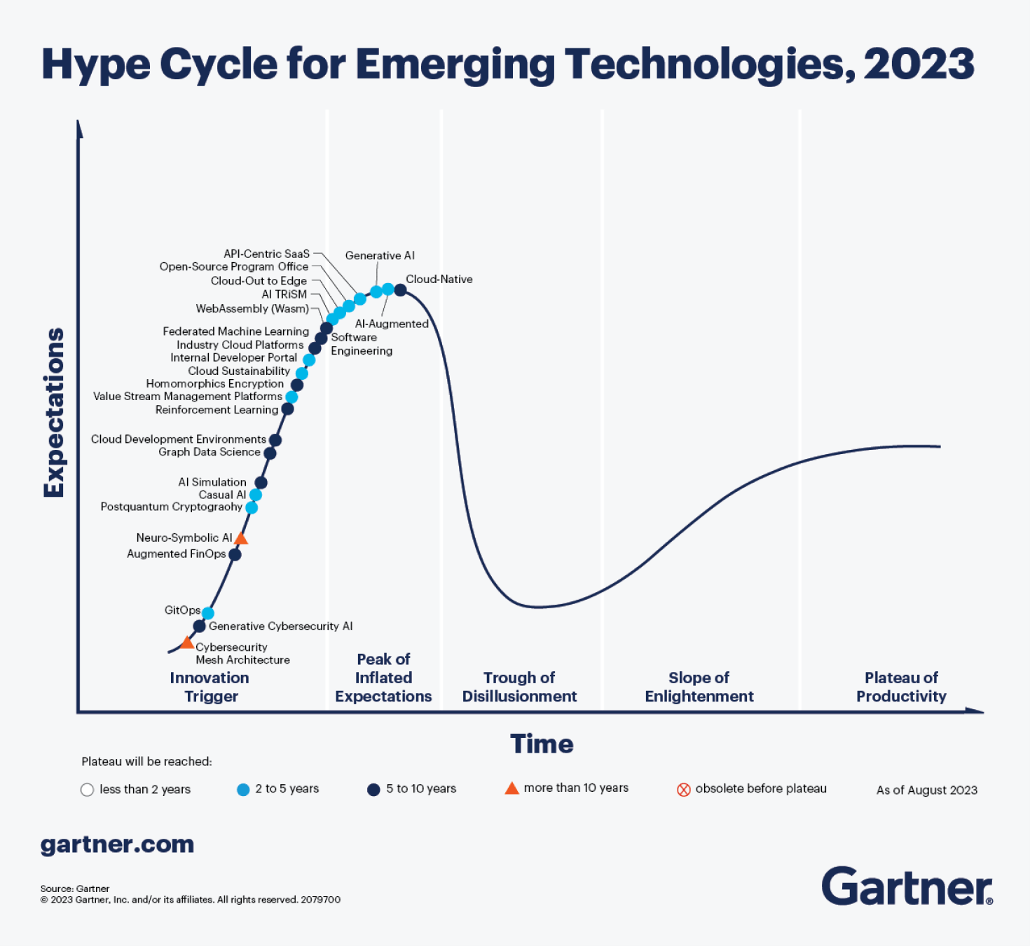
Fig 1: Generative AI sitting on top of “Peak of inflated expectations” stage.
Will AI ever be able to do the things that took you years to master? I already dipped my toes into the AI Designer hype with the blog post Is AI better at picking and pairing fonts than you? My conclusion there was that AI’s current typographic capabilities are at the level of a junior designer. Now, I want to put that to the test.
Test setup
The test is simple: two designers, each with their font pairing versus two pairings by AI. The font pairings are then presented in a UsabilityHub preference test where test participants pick their preference without knowing whether it’s by AI or a human designer.
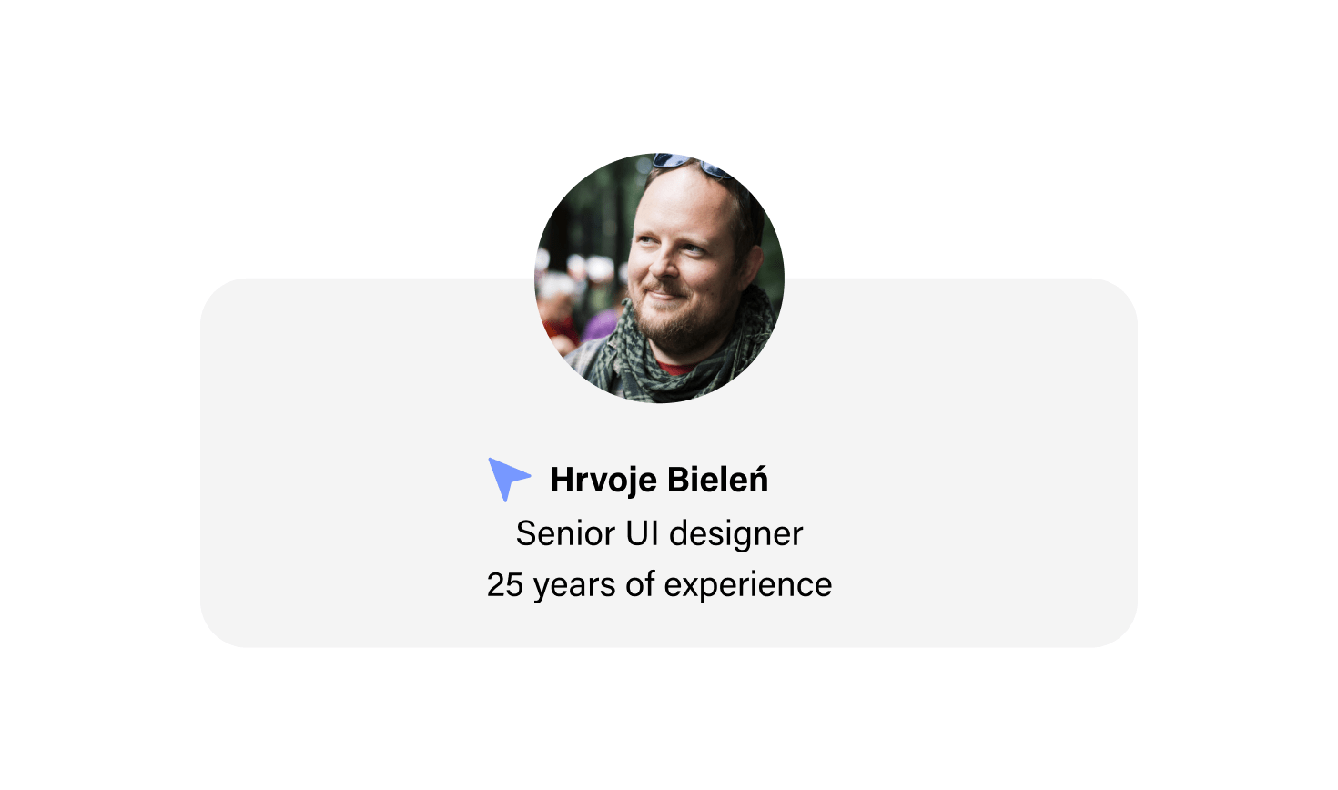
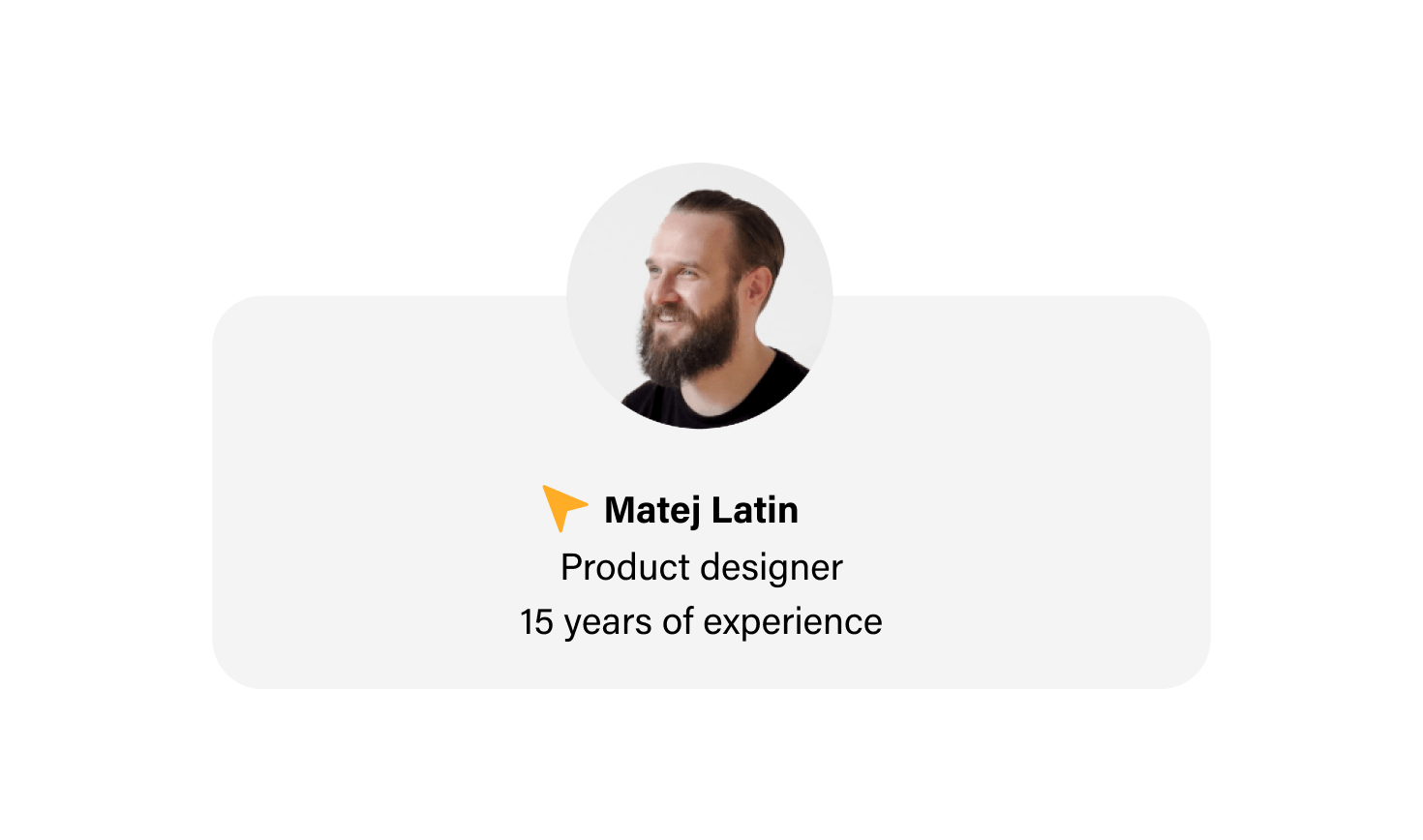
Designer 1: To make the test interesting and the result more convincing, I decided to invite another designer to compete against AI with me. I asked Hrvoje Bieleń, a senior UI designer at pointjupiter.com, with a professional career spanning over 25 years.
Designer 2: I’m a product designer, a type geek, and the author of the Better Web Type project (this website) and the Better Web Typography for a Better Web book.
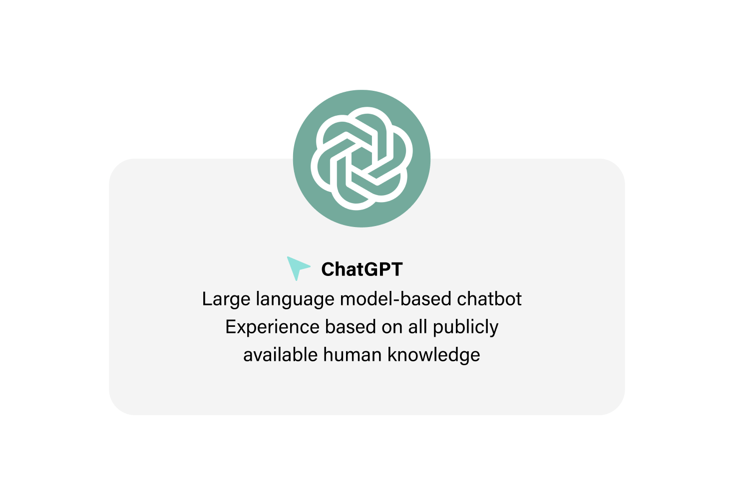
AI: In the AI corner of the ring, we have ChatGPT, a large language model–based chatbot developed by OpenAI. It scrapes the content from the internet and other publicly available resources to learn.
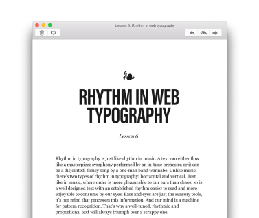
The task: The heading font was already selected — DM Serif Display (Fig 2). Designers and AI had to find a good match for body text. The prompt I used for ChatGPT was What is the best open-source font for body text pairing with DM Serif Display?
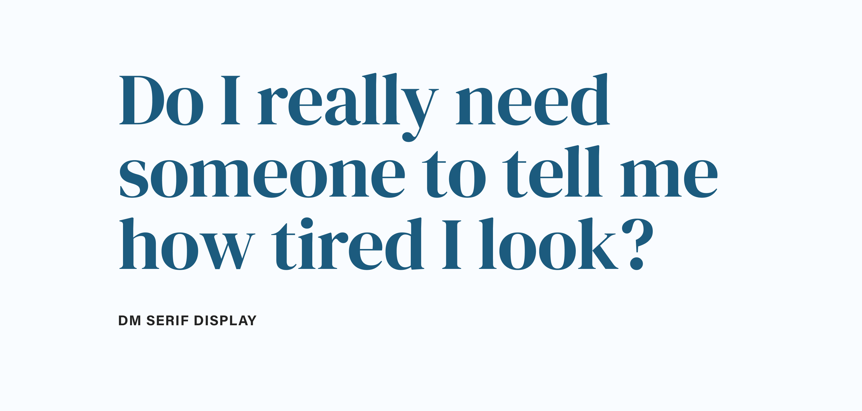
Fig 2: The DM Serif font was already selected for the headings.
UsabilityHub and the recruitment of test participants:
A preference test in the UsabilityHub shows two options, side-by-side to a test participant (Fig 3). The participants can zoom in and pick the one they prefer when they’re ready. The test can have multiple variants to pick preferences for. If you want to see how the test works or just add your vote, it’s still live here.
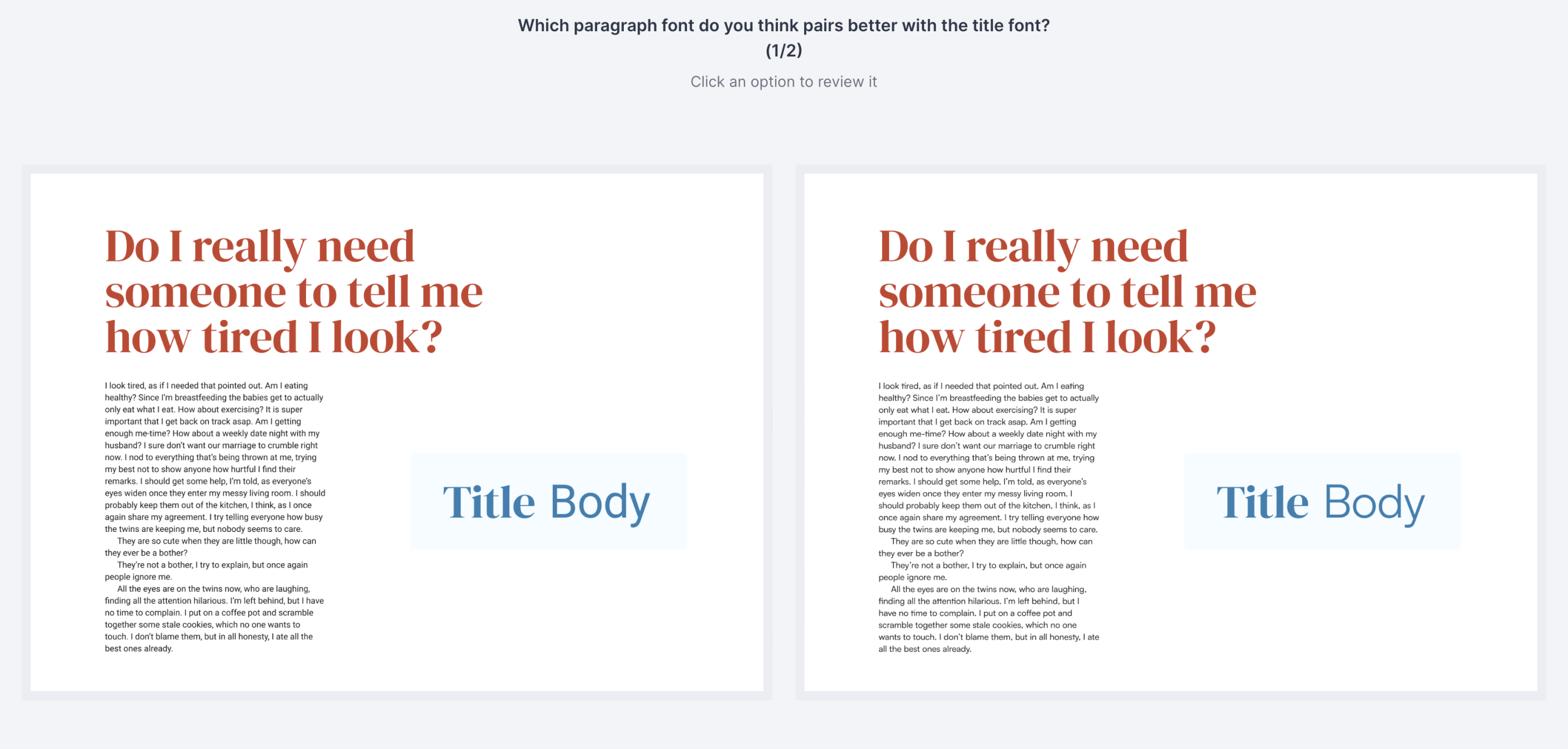
Fig 3: A screenshot of the preference test in UsabilityHub.
I recruited all the test participants in my audience (my email subscribers). I received 224 votes. Each participant would vote on both variants: Designer 1 vs. AI and Designer 2 vs. AI.
Let’s see what the designers and the AI came up with, and who won! Who are you rooting for?
Designer 1 vs. AI
In the first face-off, we have the Assistant font take on Lora (Fig 4). Before I tell you who picked them, which one would you choose?
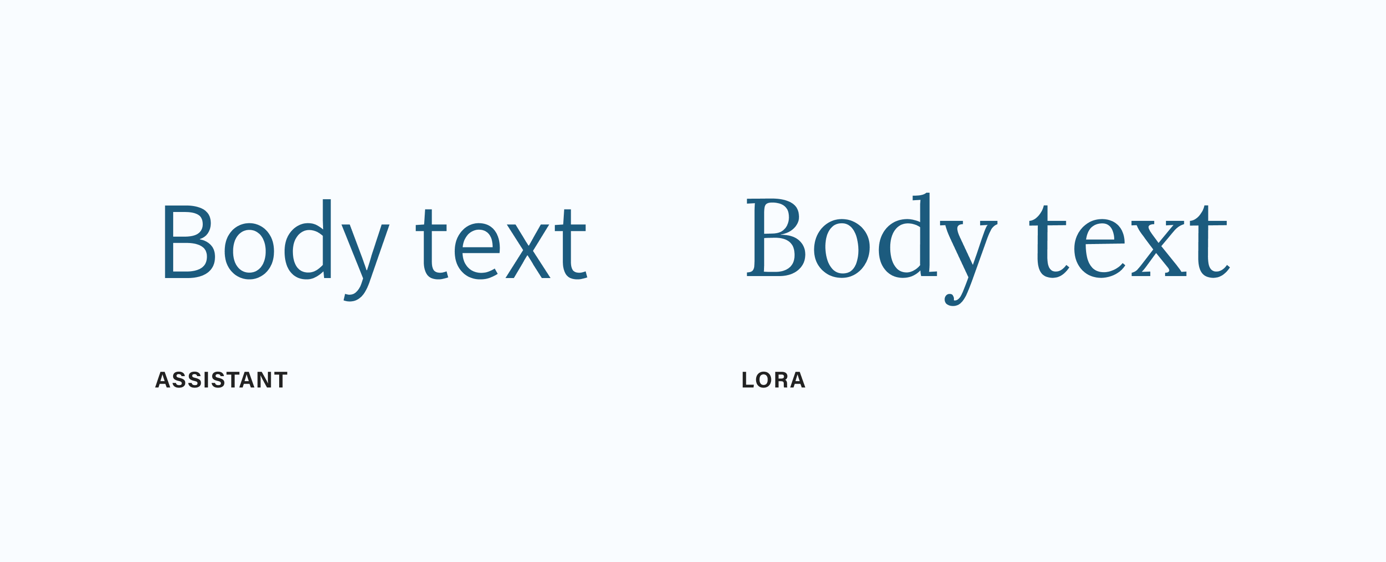
Fig 4: Assistant takes on Lora.
Done? Okay, now I can tell you who picked the fonts: Hrvoje picked the Assistant font and ChatGPT picked Lora.
Here’s how Hrvoje explained his decision to pick Assistant:
I was looking for sans-type families with similar features, like the lowercase letter g, somewhere between closed and open shapes of letters a and s. I also wanted to find a typography that would feel a little condensed but still was wide enough to be used as a body text. After a thorough search on Google fonts, I picked a variable font Assistant by type designer Ben Nathan. It lacks italics, but in all other aspects, I feel it accompanies DM Serif Display pretty fairly. It has pretty open shapes, but the terminals are slightly pointing inward, thus giving the feel of the intent of closing the shapes — like it was frozen in the attempt. Some angles follow a similar direction to that of DM Serif Display. Both families have similar x-heights, which gives this pairing even more credibility.
Here’s what his pairing looks like (Fig 5):
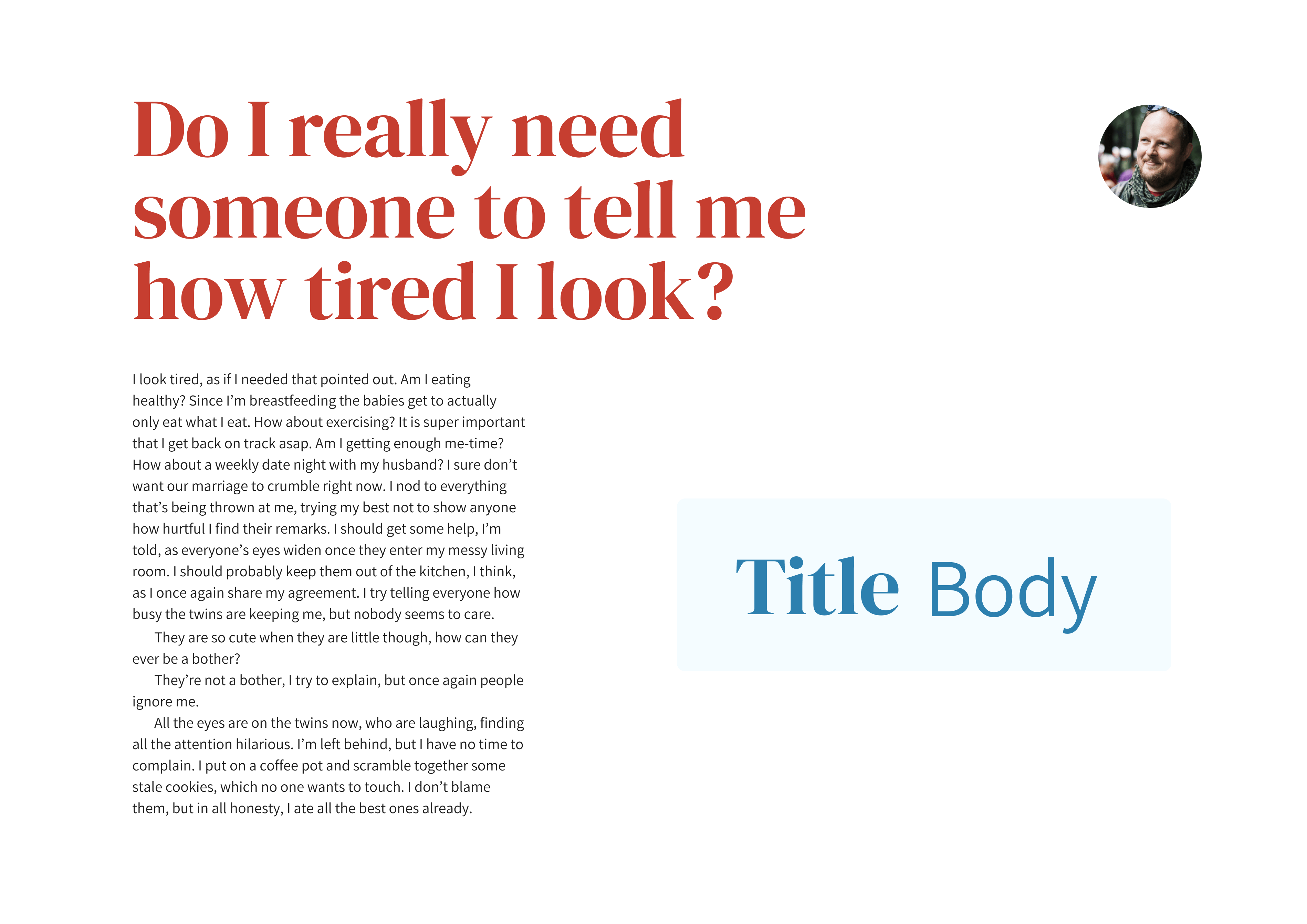
Fig 5: The pairing of Assistant and DM Serif by Hrvoje.
Here’s how ChatGPT explained its choice of Lora:
Lora is an open-source serif font designed by Olga Karpushina. It has a classic and elegant appearance that works well for body text. Lora’s moderate contrast and well-defined letterforms make it a suitable companion for DM Serif Display, maintaining a cohesive and refined aesthetic. Using DM Serif Display for headings and Lora for body text can create a balanced typographic pairing that offers contrast while maintaining readability. The combination exudes a sense of sophistication and elegance.
And here’s what the ChatGPT’s pairing looks like (Fig 6).
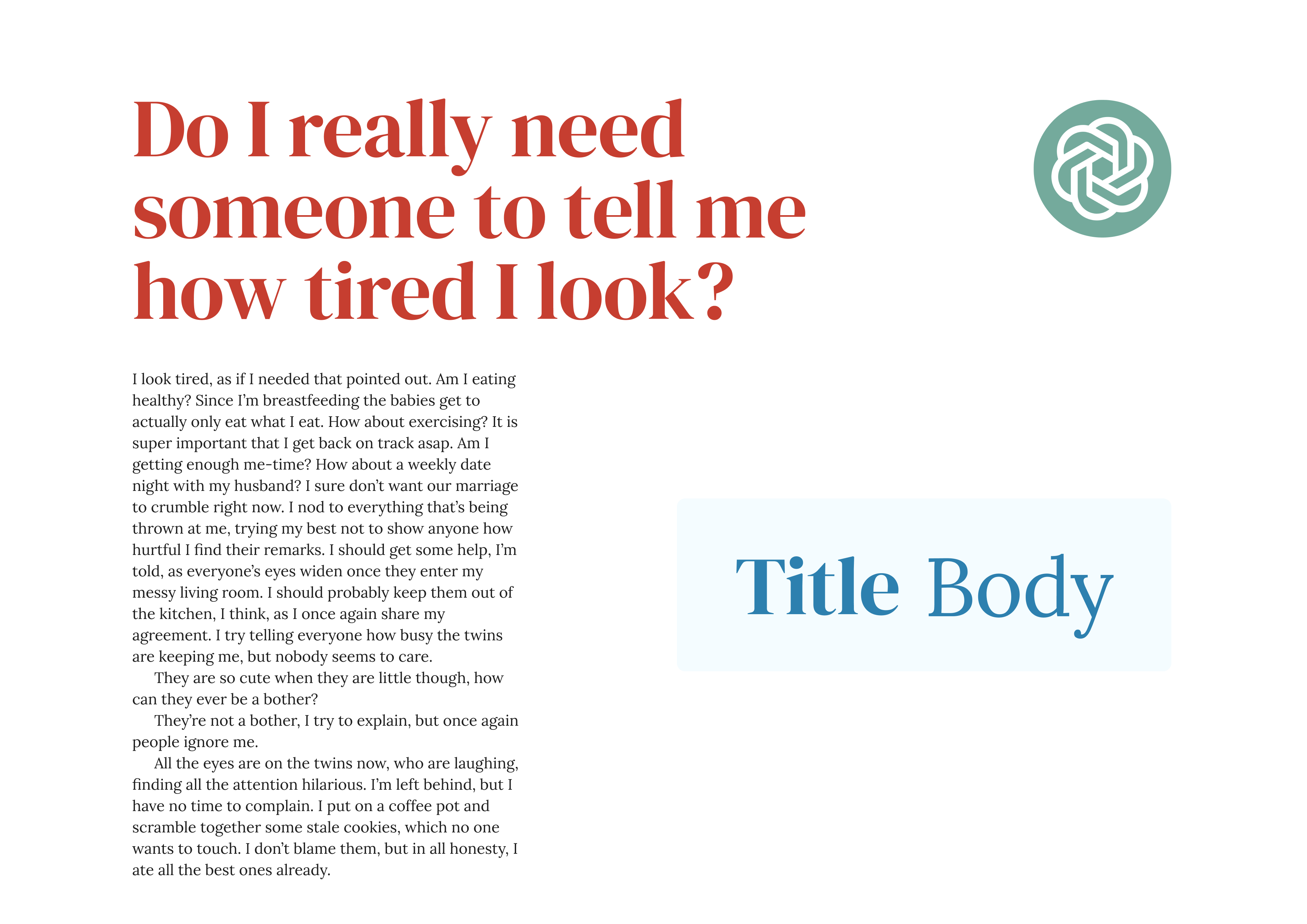
Fig 6: The pairing of Lora and DM Serif by ChatGPT.
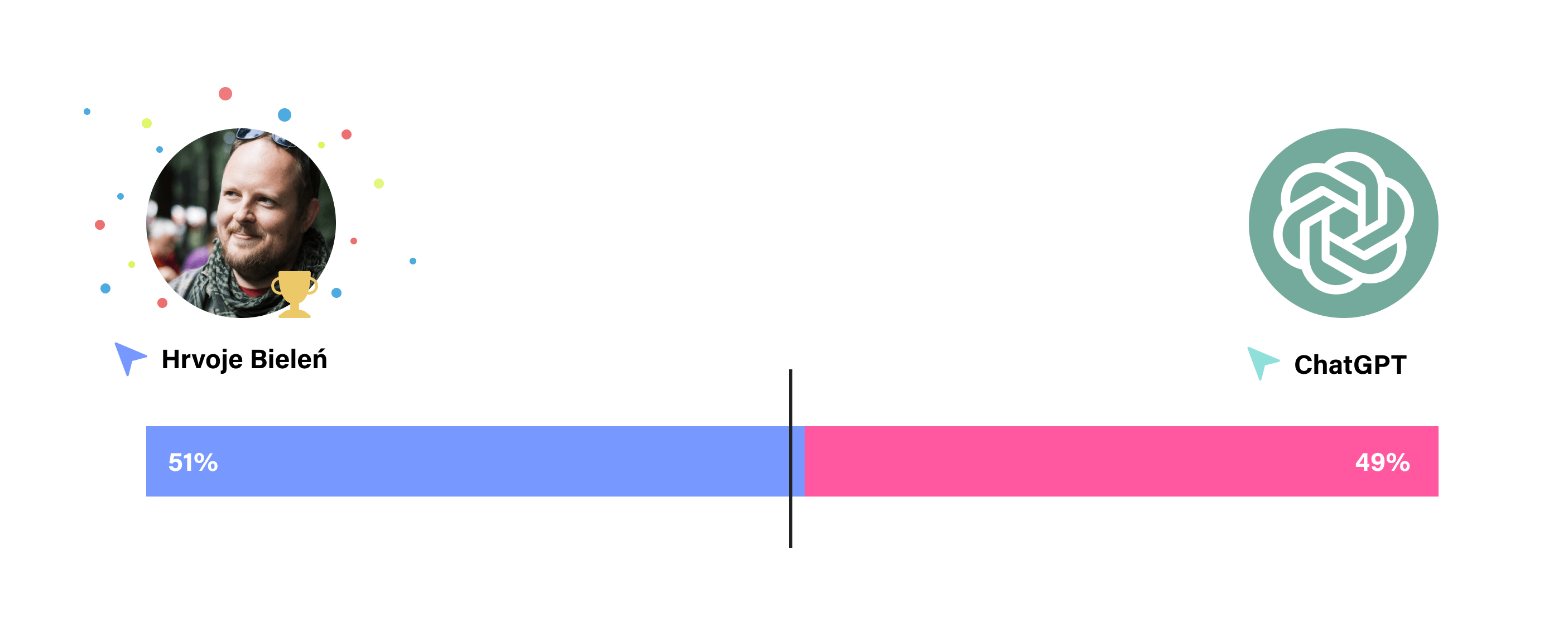
Okay, so who won? This was a close one, the result was 51% vs. 49%. UsabilityHub noted that it wasn’t statistically significant because of such a small difference. A result this close would need a lot more votes to become statistically significant. And the winner is… Hrvoje! 🏆 1-0 for designers.
Designer 2 vs. AI
In the second face-off, we have Satoshi taking on Roboto. Again, before I tell you who picked them, which font would you choose to pair with DM Serif?
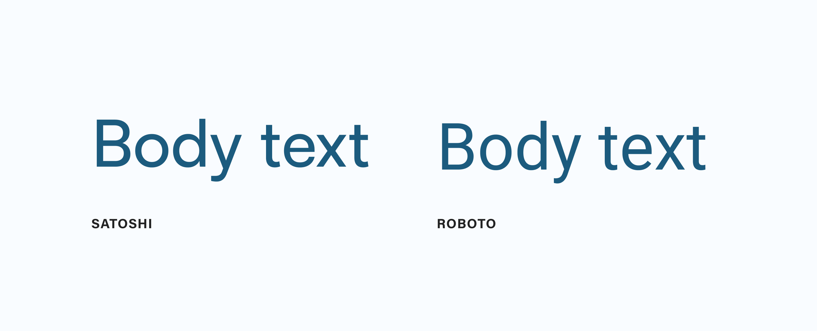
Fig 7: In the second round Satoshi takes on Roboto.
I picked Satoshi and ChatGPT chose Roboto. Here’s how I picked Satoshi:
I started by analysing DM Serif Display which was already picked as the font for the headings. I thought to myself: DM Serif looks elegant and sophisticated, but there’s something else to it — it looks kind of modern. It’s not a typical neo-classical or transitional font (Baskerville is a good example), but more a mix of the two styles. It has a high contrast that reminds me of neo-classical fonts like Bodoni but the letter shapes are pretty open and the serifs reminded me of those in Baskerville which is a typical transitional font. But the serifs are less pronounced and more nuanced.
Okay, so it’s a somewhat modern-looking serif font with high contrast. What font would also look modern but still be the exact opposite? I knew I was after a sans-serif right away. I wanted closed letter shapes, no contrast, and something unique that still looks good as a body text font. I wanted the x-height to be similar so that the two fonts look well-balanced when next to each other at similar sizes. I tried numerous geometric and grotesque sans-serif fonts, eventually landing on Satoshi. It has everything I was looking for, but most importantly it’s a grotesque sans-serif that feels modern and complements the modern side of DM Serif Display.
And here’s what the pairing of Satoshi and DM Serif look like (Fig 8):

Fig 8: The pairing of Satoshi and DM Serif by me.
This is how ChatGPT explained its choice of Roboto:
Roboto is an open-source sans-serif font designed by Christian Robertson. It has a clean and neutral design that contrasts well with the ornate and decorative style of DM Serif Display. Roboto is known for its readability on screens and in print, making it a suitable choice for body text.
Pairing DM Serif Display with Roboto for body text creates an eye-catching contrast between the two styles. The combination of a decorative display font with a simple and contemporary sans-serif can result in an engaging typographic composition.
This is what the pairing of Roboto and DM Serif looks like (Fig 9)
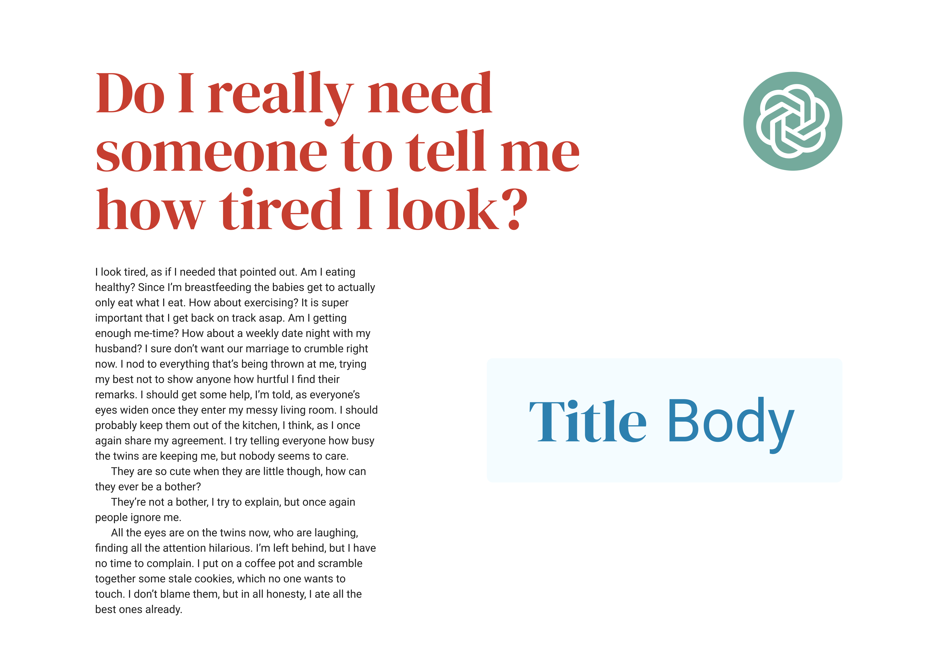
Fig 9: The pairing of Roboto and DM Serif by ChatGPT.
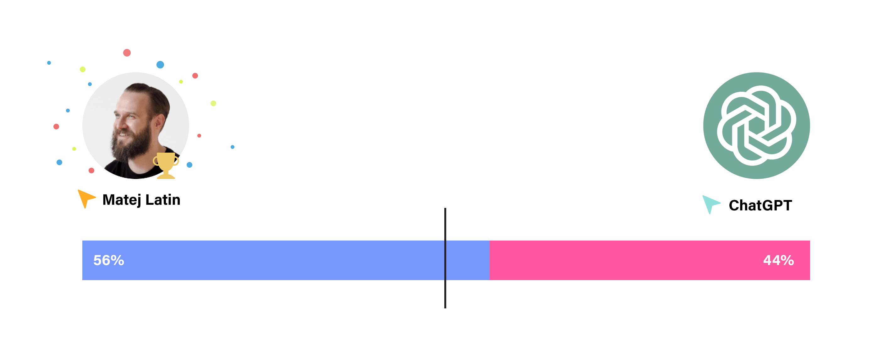
Okay, who won the second round? The result was 56% against 44% in favour of the winner. Usability Hub says that it is statistically significant in this round. And the winner of this round is… Me! 🏆 2-0 for designers!
Both results are very close, let’s take a closer look at what this means.
Designers won, what does that mean?
I have to admit, I’m surprised by how close the results were. I expected an easy win for designers, especially after reviewing the font pairing capabilities in a previous article where I found that AI’s font choices aren’t very original.
Okay, but what does this all mean? AI picking common fonts is why they’re not original picks but also why the result is so close. Many professionals believe that what you read most, you read best (source), meaning that the most common fonts are also the most popular. The word “popular” originates from Latin where popularis means general, common; devoted to or accepted by the people (source).
My conclusion here is that the designers in this face-off picked really good font selections to beat the common (popular) font choices by AI. We can attribute the close result to the mere-exposure effect which is a phenomenon by which people tend to develop a liking for things merely because they are familiar with them (source). Both fonts picked by AI, Roboto and Lora, are very common.
What does this mean for you? Should you trust AI with the font picking and pairing tasks for your projects? I wouldn’t recommend that right now as it comes up with pretty basic recommendations. It can be a good starting point for learning because ChatGPT can provide explanations on why it picked the fonts it did. Designers can read those and look for better, and more original, font options with similar characteristics that ChatGPT based its choice on.
Let’s move to the most pressing question — is AI coming for your job as some claim? Far from it. AI currently does what a lot of designers do. So its solutions aren’t very creative or original. As you can see, the two designers in this test both picked a somewhat uncommon font for the body text but still won the test. This means that the work of creative, experienced designers who strive for a balance between originality and creativity stands out in quality but doesn’t suffer in accessibility. AI can’t do that. Not yet. But it’ll be exciting to see what it’ll learn to do in the future. I guess it might learn from this article too 🤔
What do you think? Let me know in the comments below 👇
A special thanks goes to Hrvoje for participating in this fun experiment with me!
Better Web Typography for a Better Web
Free Course
Join 30,000+ designers and developers, get 7 free lessons and unlock your better web typography skills.
Learn more →Just cool web typography stuff, no spam.