8 more micro tips for remarkably better typography
![]()
~ 7 min read

In case you missed it, there’s a part 1 of this two-part blog post series. I already mentioned there that typography is way more than just picking a font and setting font sizes. It’s more than these micro tips too, but these are great to get you started. In that post, I already gave you 8 micro tips to make your typography remarkable. Now I’ll give you 8 more in another 8 minutes. Let’s go!
By the way, if you want to learn more about the craft of web typography, you should start with my free course Better Web Type.
1. Adjust font sizes when using different fonts inline to create a better reading experience
A lot of blogs use some sort of text snippets inline with their paragraph text. Code snippets are a great example of this. You want to make these snippets stand out a bit so that it’s easier for the reader to read and understand what you’re explaining. But these shouldn’t stand out too much. Literally and figuratively.
I’m using Meta Serif Pro and JetBrains Mono in the example below. JetBrains is obviously larger than Meta Serif (when they’re set at the same size). This results in a font standing out too much and in an unattractive way (left example in Fig 1). This is not what a professional, experienced designer would allow. To improve it, I reduced the size of JetBrains Mono from 14 pixels to 12 pixels. The font is heavier than Meta Serif so they pair really well even when the JetBrains’ size is reduced (right example if Fig 1).
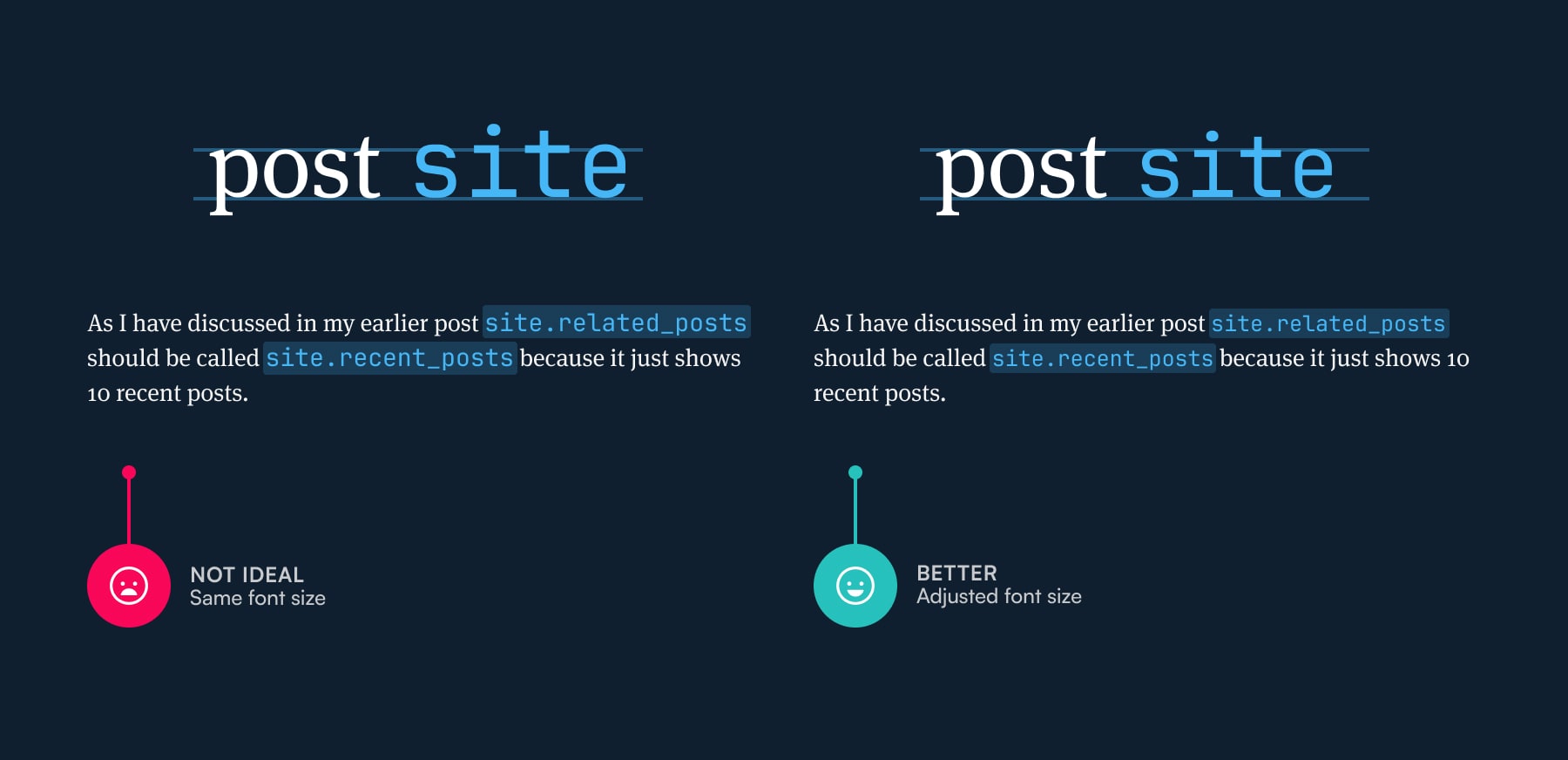
Fig 1: Meta Serif Pro and JetBrains are different in size so JetBrains needs to be reduced a bit for them to match.
2. Increase the line height if you use inline code snippets
The second tip is the perfect follow-up to the first one. To make the inline code snippets stand out a bit more (in a good way) they often come with a colour box around them. There’s a high chance that these boxes will clash between the lines of text (left example in Fig 2). It looks ugly even if they don’t clash but come close. To prevent that you should increase the line height of your text if you use inline code snippets (right example in Fig 2).
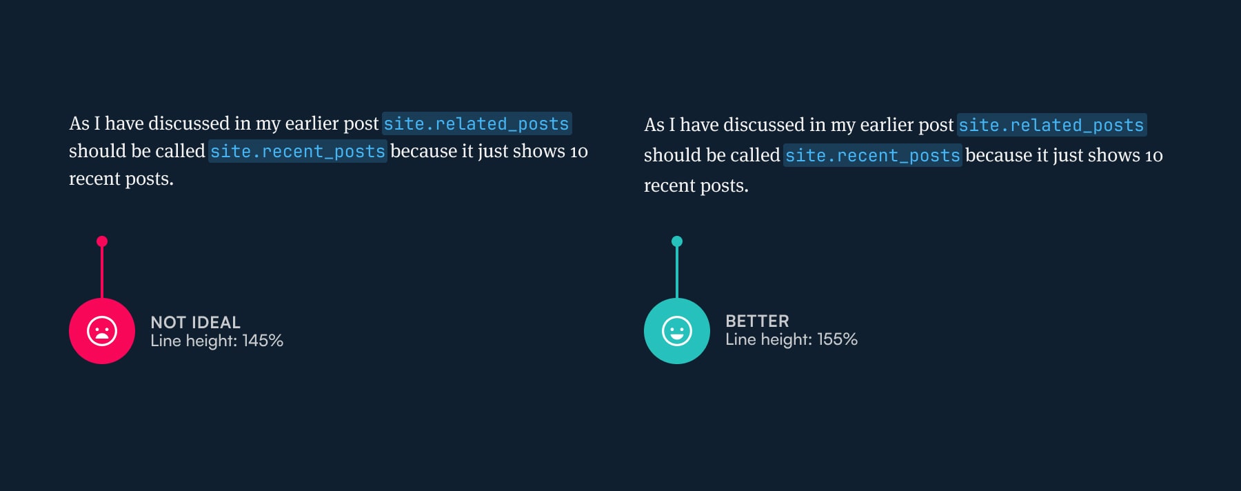
Fig 2: When the line height is increased the code snippets don’t clash and have “room to breathe.”
3. Using huge type is bold but you should reduce letter-spacing to make it beautiful
Huge type looks great when done right. I already wrote about huge type and how to use it on the web and how to do it well. The main thing for making huge type look beautiful is reducing the letter-spacing. The spacing between the letters in fonts is generally optimised for small sizes. It’s what fonts are most commonly used for.
So when you increase the font size considerably, it’ll suddenly look like there’s too much space between the letters. Take a look at the top example in the image below (Fig 3). It may look ok to an untrained eye, but look at the bottom example where letter-spacing has been reduced by 2%. It looks refined and polished. That’s because it looks more correct. This applies to titles that aren’t set in uppercase letters. The letter-spacing should be reduced by 1 to 2% maximum.
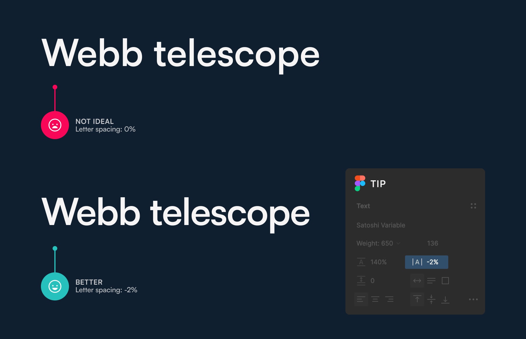
Fig 3: Spacing in fonts is optimised for smaller sizes. Reduced it when the font is used at large sizes.
4. Check the legibility of the font to ensure good readability of your text
Let’s establish the difference between legibility and readability first.
Legibility is an informal measure of how easy it is to distinguish one letter from another in a particular typeface.
Readability is about the reader – the ease with which a reader can successfully decipher, process, and make meaning of the text read.
— Source
Helvetica, one of the most popular fonts out there, scores poorly on legibility because a lot of its characters aren’t distinct enough. A good quick way to check the legibility of a font’s key letters is to check the letters “1lI O0.” If they’re too similar, they’re not very legible. Take a look at the examples of “Illustrator” below (Fig 4). On the left, a font with poor legibility is used, on the right a better font is used. Make sure you check this whenever choosing a font or the readability of your text might suffer.
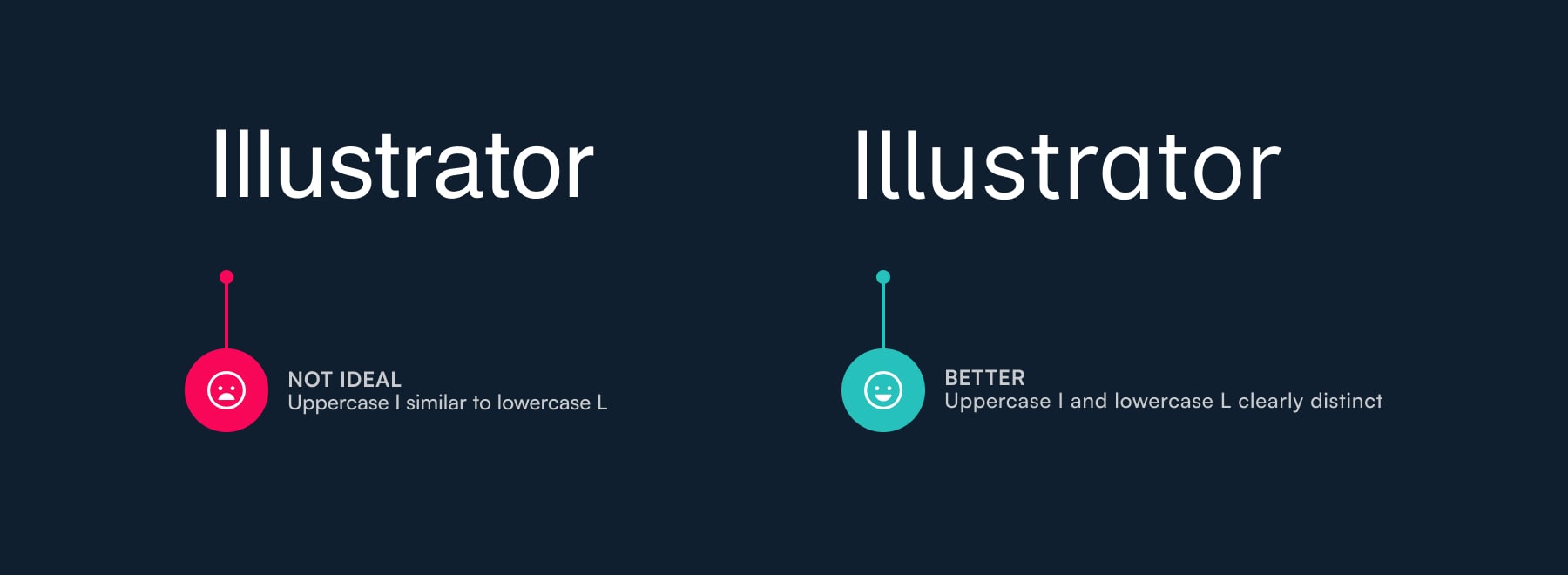
Fig 4: Test fonts for legibility when picking them. Use “1lI O0” for a quick check.
5. Check the kerning of the font when you’re deciding which one to use
Kerning is the spacing between letters in a font. Unlike letter spacing (from the tips before) you can’t control this one. It’s embedded in the design of the font. All you can do is enable or disable it. But some fonts come with poor kerning and you need to watch out for that.
Whenever you’re picking fonts, type “TyHMAVA” to check the kerning. Fonts with poor kerning will have weird-looking spaces between “T” and “y,” and “A” and “V.” Fonts with really poor kerning will have weird spacing between “H” and “M” too. Take a look at an example of poor kerning below (left example in Fig 5) and a font with normal kerning on the right.
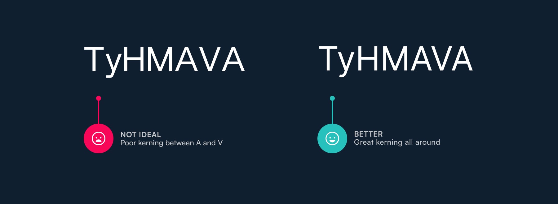
Fig 5: Poor kerning in a font is reason enough to reject it.
6. Use proportional figures to make tables of numbers easier to read
You learned about lining and old-style figures in tip number five in the first part of this blog post series. Lining figures are basically uppercase numbers and old-style ones are lowercase. But there’s another important variant that you need to learn about — proportional versus tabular.
The tabular ones are commonly called monospaced. They always take up the same amount of width. So if you compare number 1 to a 0, they’ll be equal in width. Not the number designs themselves but the spacing around them. This makes them great for tables where numbers are often compared between rows. The top example in the image below (Fig 8) uses normal, proportional figures, and the bottom one uses tabular. The numbers are so much easier to compare and the table is easier to read in the example below.
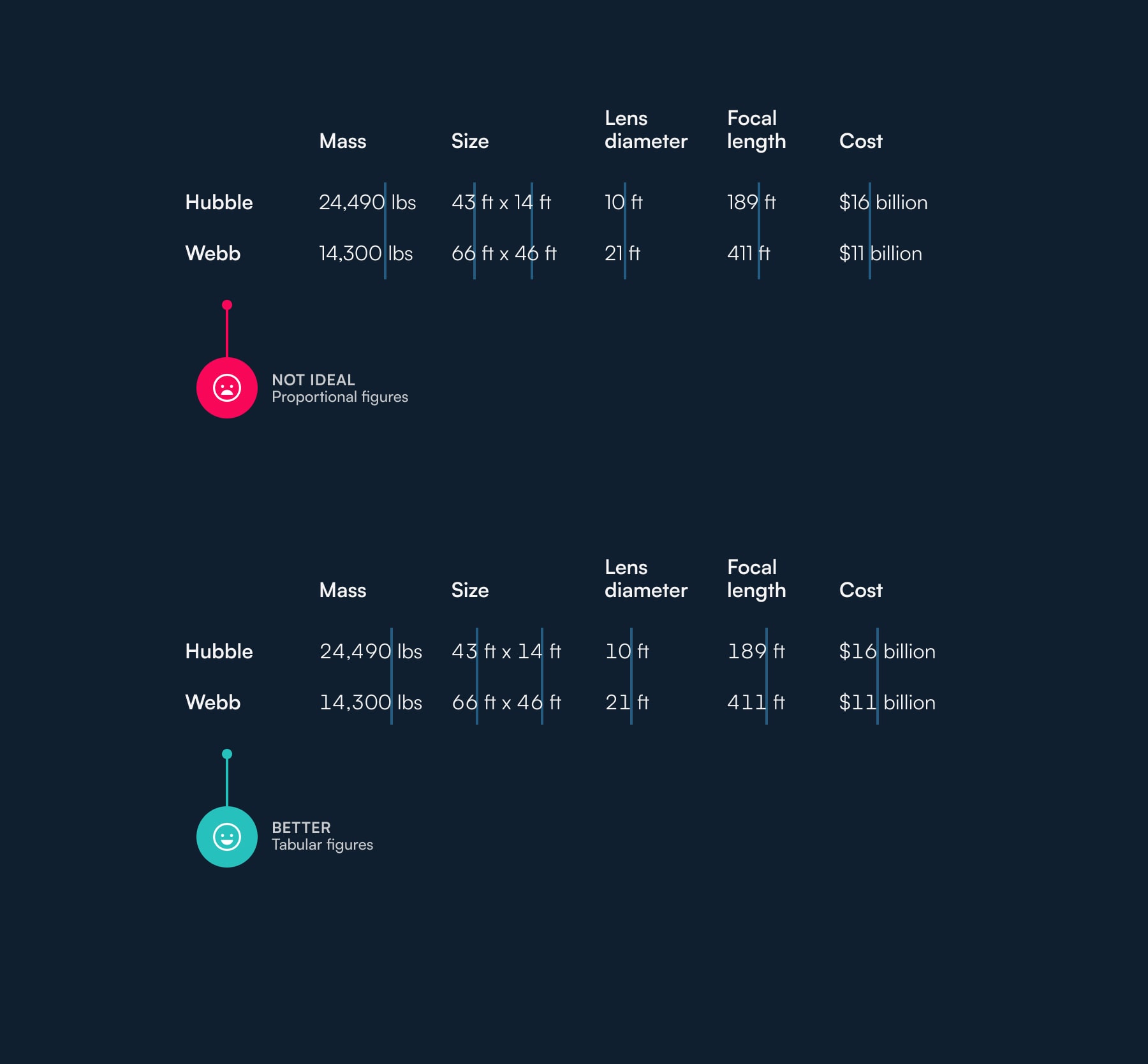
Fig 8: Tabular figures make rows of numbers easy to compare and tables easier to read.
7. Improve your visual hierarchy with better margins above and below headings
Another problem that is very common is incorrect margins above and below headings. Even some official WordPress themes come with this mistake — the margin above the heading is equal to the one below (left example in Fig 7). The heading hangs somewhere in the middle, not belonging to either of the text blocks. When in fact, it should be closer to the paragraph below because that’s the text it’s related to (right example in Fig 7). Scanning and reading articles is easier when this is corrected because it’s perfectly clear when a section ends and a new one starts. I recommend the margin above to be at least 2x of the one below. Sometimes I use even 3x.
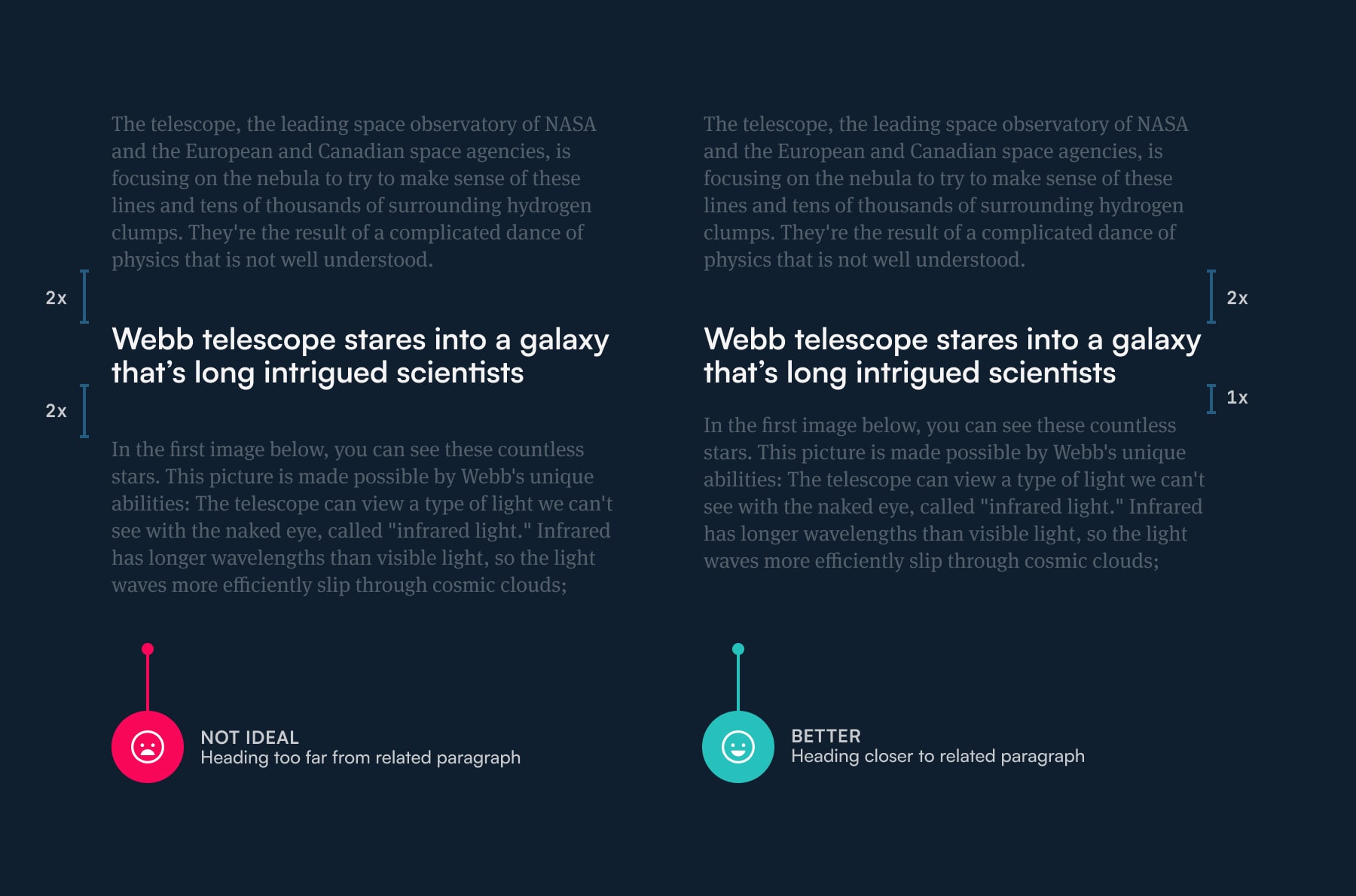
Fig 7: Increase the margin above the heading to at least 2x of the bottom one.
8. Adjust your line height to the language used in the text
I lived in Germany for two years and learned a few interesting things about the German language. One, they have a habit of merging words together. For example, this is a word meaning “motor vehicle indemnity insurance” — Kraftfahrzeughaftpflichtversicherung. According to this article it’s the longest word in the German lagnuage — it’s 36 characters long! The merging of words results in generally longer words. On average, German words are 11.66 characters long, compared to just 8 in English.
Two, all German nouns are capitalised. That means there’s a lot of capitalisation in a normal paragraph of text. Take a look at the examples below (Fig 8). You’ll notice that the paragraph is ragged on the right. Meaning that there’s a lot more space at the end of the lines. That’s because the long words don’t fit and they’re pushed into the new line. Another thing you’ll notice is a lot of capitalised words. To make the text easier to read, you should increase your line height in such cases (right example in Fig 8). This helps the eyes move to the correct line when there’s so much space at the end and give more breathing room to all the capitals in the text.
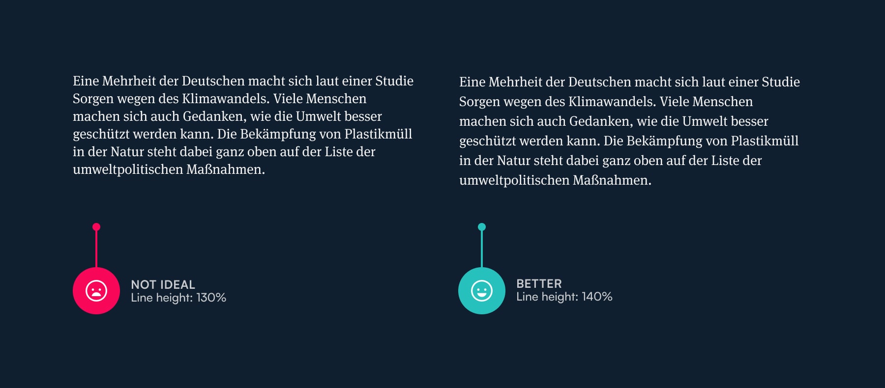
Fig 8: Give your text room to breathe, consider the language to be used.
Why should you learn how to do typography well?
First of all, you’re probably reading this because you’re either a designer or a web developer. Both roles are important in shaping texts online. That alone is reason enough. But why should you do it well? Why care? Here are 4 reasons from the top of my mind:
- Your work will stand out as original and of higher quality
- The texts that you’ll design (or code) will be easy and enjoyable to read
- You’ll become a part of the small group of top designers and developers who contribute to remarkably improving web typography — making the web better and more accessible for everyone
- You’ll start seeing poor typography EVERYWHERE. You’ll go to a restaurant and spend 30 minutes ranting about how their menu design sucks because of poor choice of fonts. This is the fun part of it.
In short, it’s your responsibility to design and code better web typography. It’s a responsibility that will turn into a craft. You’ll enjoy it, believe me. Learn how to do it well with my free course Better Web Type.
Better Web Typography for a Better Web
Free Course
Join 30,000+ designers and developers, get 7 free lessons and unlock your better web typography skills.
Learn more →Just cool web typography stuff, no spam.