8 micro tips for remarkably better typography
~ 6 min read

But I don’t want to get into that in this blog post. Yes, it takes a lot of time and effort to craft beautiful and original typography but what if you don’t have the time? What if you want to quickly improve the typography on your website in just a matter of minutes?
Today I want to show you how you can make your typography remarkable with 8 micro tips in less than 8 minutes. Let’s go!
1. How lightening your font weights on a dark background can improve aesthetics and readability
Two things became popular in the design industry lately — dark modes and variable fonts. But most websites make this mistake when they add a dark mode. They keep the font weights intact. If a heading is set in bold on light mode, it’ll have the same weight when the user switches to dark mode.
This is a problem because light text on a dark background looks heavier. It looks unpolished and can even impact the readability of the text (left example in Fig 1). My recommendation is to consider using a variable font and adjusting the font weight in dark mode. Reduce it by 50. So if the font is set to bold in light mode (bold equals 700), reduce it to 650 (right example in Fig 1). Now your text looks refined and it’s easier on the eye, which means it’s easier to read.

Fig 1: A comparison of weight 700 versus 650 on a dark background.
2. Why reducing the line height of headings drastically improves their appearance
Here’s the thing with headings — they’re generally short. Usually one line of text, sometimes two. In extreme cases, they break into three lines. But that’s it. A line height of around 140% is recommended for body text, so full paragraphs. When the same is applied to headings it looks like the lines are drifting apart. Like they don’t belong together (left example in Fig 2). Reduce the line height of headings to somewhere between 110 and 120%. The headings will look more compact, cohesive and polished (right example in Fig 2).

Fig 2: Large line height in a heading versus a smaller one
3. How using open-type features can make your fonts look more original
Open-type features are becoming increasingly popular. This is great because it also means that more and more fonts support them. One of my favourites is stylistic alternates. The type designer who designed the font is giving you the option to use alternative symbols. Most commonly these are alternative designs for letters “a” “g” and “t.”
Don’t use the font as it is out-of-the-box. Check if there are open-type settings that you can use to make it look more original. Below, I’m using Satoshi out-of-the-box on the left (Fig 3) and with stylistic alternates on the right.
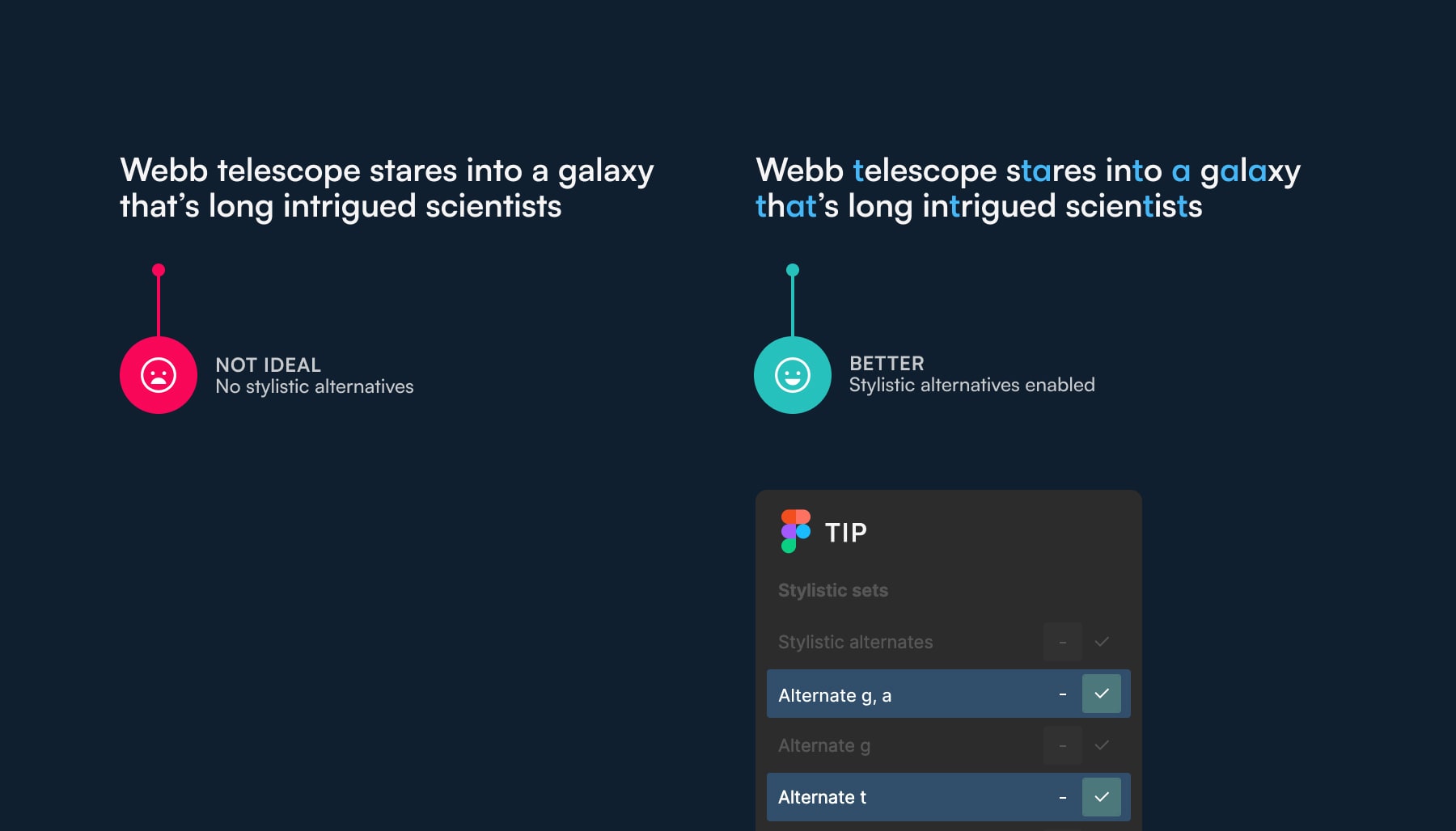
Fig 3: Stylistic alternates versus default character designs.
4. Don’t be afraid to use uppercase, but when you do letter-space it
Everyone already knows that words written in uppercase are hard to read. So it seems everyone just stopped using it completely. It’s ok to use uppercase in small amounts. It helps separate different parts of content or UI. It’s a cool way to emphasise something without using bold or italics.
I use uppercase for showing the category of the article below (Fig 4). Notice the difference between the left example which isn’t letter-spaced and the right one which is. Letter-spacing uppercase words helps improve readability and it also makes your designs look more refined. I recommend letter spacing up to 5%. Always, ALWAYS letter-space uppercase.
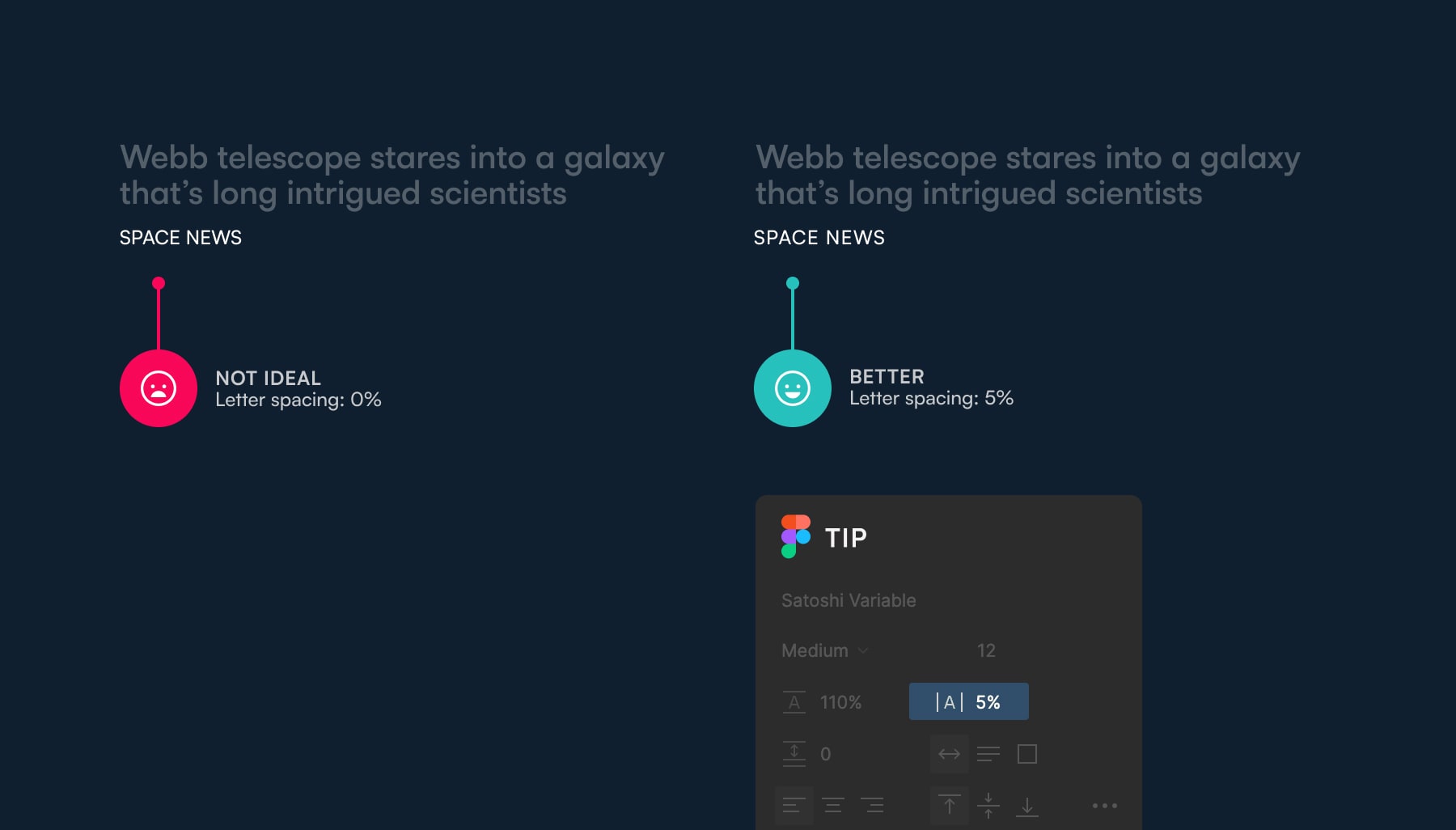
Fig 4: Letter-spacing uppercase words improves their readability.
5. Use the subtlety of old-style figures to make your text free of distractions and easier to read
The most experienced designers will refuse to use a font for body text if a character stands out too much. I’ll give you an example — I once decided not to use a font because the lowercase letter “g” had an unusual, weird descender (the bottom part of the letter). It stood out too much, you just couldn’t help but notice it — it was a distraction. You don’t want that. You want your readers to be completely consumed by the content.
The same applies to numbers in your text. When they’re set in lining figures (usually the default style in fonts) they stand out too much (left example in Fig 5). As the readers progress through the lines of text, they can’t help but notice these numbers before they get to them. They get distracted and it becomes harder to read.
Old-style figures are the lowercase alternative. They go along well with lowercase text and don’t stand out. Very few websites and apps go as far as to take care of this typographic detail. So if you do, you’re website will be typographically refined and stand out in its subtlety. The subtlety that only type geeks will notice but your readers will unknowingly appreciate.
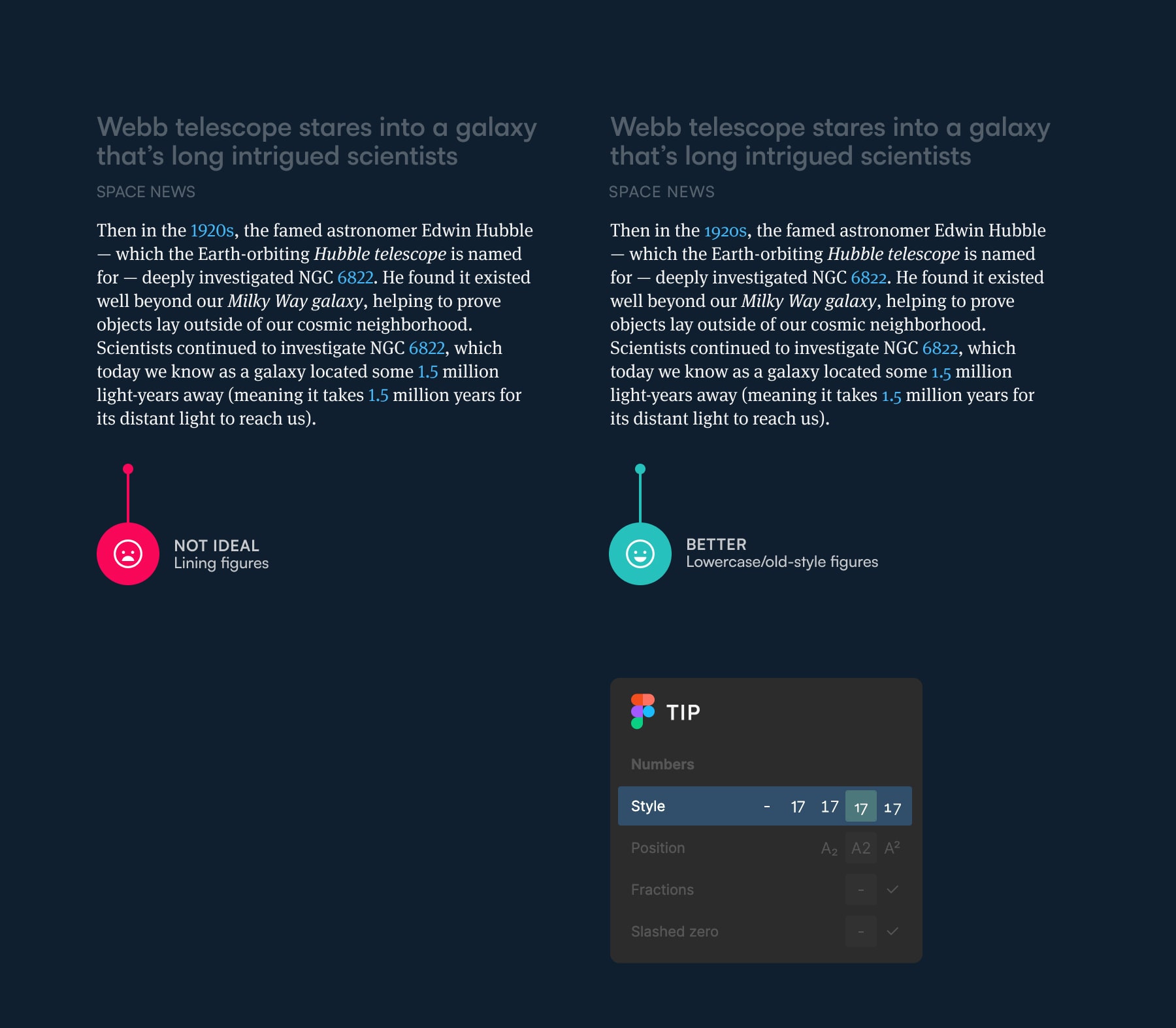
Fig 5: Old-style figures blend in with the text in a paragraph, lining figures stand out (too much).
6. Make your acronyms fit in with small caps
This is the same as tip number five above but for letters. Or more precisely, acronyms. Let’s try something out, I’ll write CIA here to prove my point. I’m 100% sure that you noticed the “CIA” sometime when you started reading this paragraph (maybe you didn’t notice it but your eyes surely drifted to it for a fraction of a second).
That’s way too early and if this paragraph was full of acronyms like that, it would be full of distractions. Your eyes just can’t help but notice them and be attracted to them. So the text you’re reading becomes harder to read. If your font supports them, use small caps to eliminate the distractions in your text and make it easier to read.
I’m using Meta Serif Pro below and no small caps in the example on the left (Fig 6) and with small caps enabled in the example on the right.
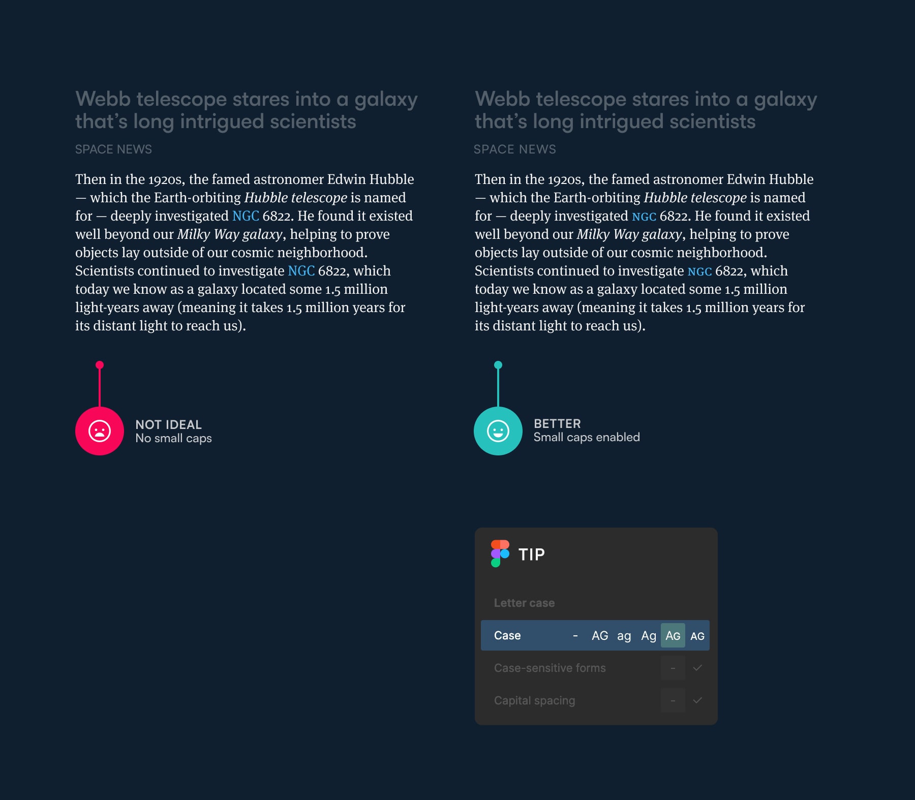
Fig 6: Small caps blend in with the texture of the paragraph perfectly.
Bonus tip: don’t use “fake small caps!” If a font doesn’t support small caps but you force-enable them, fake small caps will be used. Fake small caps are just resized capital letters and look way too light compared to the rest of the text. This is even worse than just using normal uppercase letters. See a live example here.
7. Use ligatures to improve the aesthetics and readability of your text
Ligatures in typography prevent unattractive clashes between certain letters. “fi” “fl” “ffi” are typical examples. This is more on the aesthetics side than readability but in some fonts, these clashes might be so obvious that even normal people (i.e. not type geeks) will notice them. And as you already saw, readers aren’t supposed to notice typographic details. If they do, the designer has failed. All they need to see is the content. In some cases, ligatures may even add a bit of character and originality to your typography (see the example in the title in Fig 7).
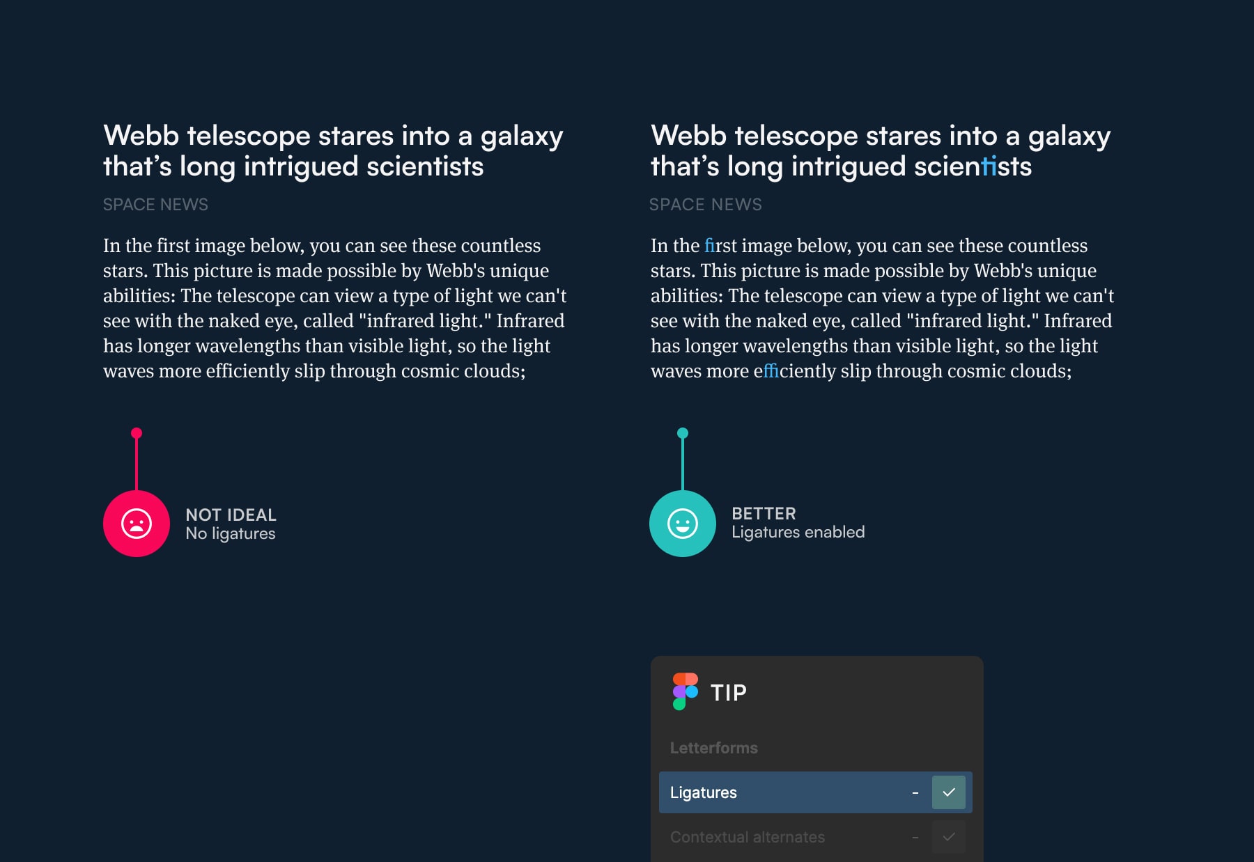
Fig 7: Ligatures look great but blend in subtly with the text, improving the readability in the process.
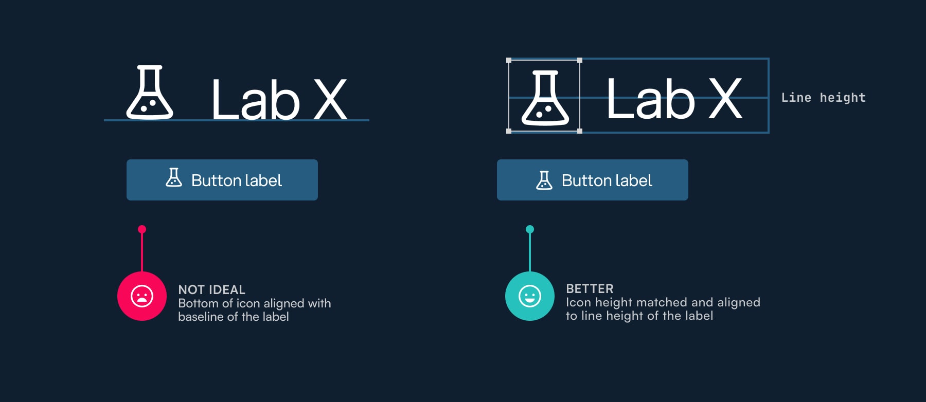
8. Align your icons to the line height of the label
I see this mistake all the time. Designers often try to align the bottom of the icon to the baseline of the label (left example in Fig 8). It’s how you align everything in typography right? The baseline is the grid that you work with. No, not really. When it comes to aligning icons to text, it’s better to match and align the height of the icon to the line height of the text (right example in Fig 8). If done right, the vertical centre of the icon should align perfectly with the middle of the uppercase “X.”
Fig 8: Icon alignment done right — match and align its size to the line height of the text label.
Typography is so much more than just tips
These eight tips are great to get you started. They’ll drastically improve your typography but they’re just the tip of the iceberg (pun intended). Great typography, meaning typography that blends perfectly with the content, consumes the reader completely, and makes a text easy to read, requires a holistic approach. You should always start with the content that you’re designing for. Not by choosing a font, and not using Lorem Ipsum as placeholder text. You should choose a font that matches the content of the website, not just a random font.
And this is just an example from the beginning. Then you need to know how to pair fonts, shape perfect paragraphs for easier reading, use scales to define a system of font sizes, use vertical and horizontal rhythm correctly, compose interesting and original page compositions, and make it responsive on top of all that. If you want to learn about this holistic approach to typography, check out my free course Better Web Type. If you sign up, you’ll also be notified about part 2 of this 2-part blog post series.
Better Web Typography for a Better Web
Free Course
Join 30,000+ designers and developers, get 7 free lessons and unlock your better web typography skills.
Learn more →Just cool web typography stuff, no spam.