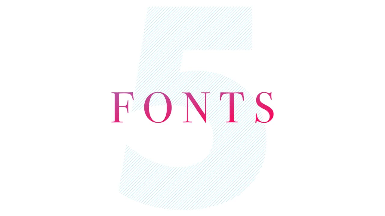
All you need is 5 fonts
![]()
~ 4 min read
It’s kinda funny to look back and realise that it was harder for me to choose fonts when there were fewer to choose from than now. I had moved away from being a freelance graphic designer in the years since then, but I still do branding, web design and graphic design work for my own projects. I acquired enough experience and learned so much about web typography in my career that I naturally came to the conclusion that many designers had reached before me—all you need is 5 fonts.
Massimo Vignelli’s 5 fonts
Massimo Vignelli was one of the best visual communicators of our times. His work had a huge impact on the graphic design of the 20th century. He’s one of the designers, if not the designer, who made Helvetica as popular and common as it is (or was).
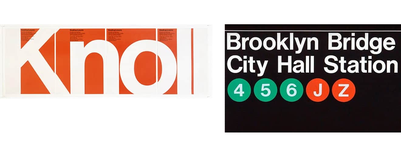
An example of how Massimo masterfully used Helvetica in different ways.
He produced vast amounts of graphic design in his incredibly rich career, but only used a few fonts for most of it. In fact, one of his famous quotes is:
In the new computer age, the proliferation of typefaces and type manipulations represents a new level of visual pollution threatening our culture. Out of thousands of typefaces, all we need are a few basic ones and trash the rest.
— Massimo Vignelli
So what were his 5 fonts? They’re fonts that we rarely use today (except Futura).
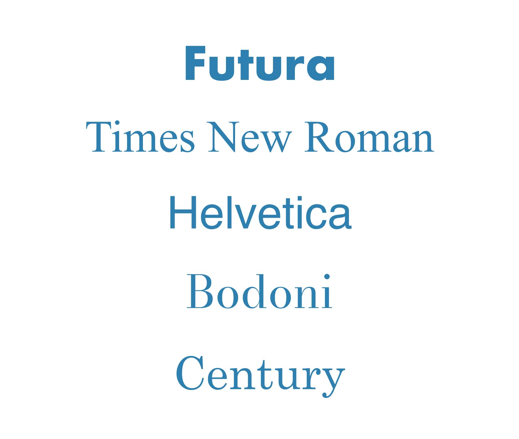
Massimo Vignelli’s 5 fonts which he built his rich career on: Futura, Times New Roman, Helvetica, Bodoni, Century.
Times New Roman and Helvetica fell out of favour with designers soon after the proliferation of web fonts in the early 2000s. They were the two obvious choices as web safe fonts, as well as Arial which is a copy of Helvetica. Designers wanted more options. And as soon as they could start to experiment with different fonts, they never looked back to the tried and tested heavyweights from the past. It’s now completely common for a designer to always pick a different font for each project. But the question here is—do we really need all these fonts? And should we really just forget about the web safe fonts which we often consider as “boring?”
My 5 fonts
An inexperienced designer thinks that they need a vast amount of fonts to choose from, an experienced one knows that they can use one font in many different ways. Massimo Vignelli’s example of using Helvetica from above illustrates this. It’s not just about which font we choose, but also how we use it. Size, contrast, placement, background and foreground colours, and how it’s combined with other fonts in a design. These are just the basics, but just using these, we can create lots of original designs and variety with a single font. I learned that by trial and error through my career. Being self-taught had a huge role in how long it took me to grasp that it’s not the quantity of fonts that matters, it’s the quality.
I came to the same conclusion as Massimo and many other designers—I don’t need a huge range of fonts of questionable quality to choose from, I only need a few high quality ones. So I created my own list of 5 fonts that I use most often.
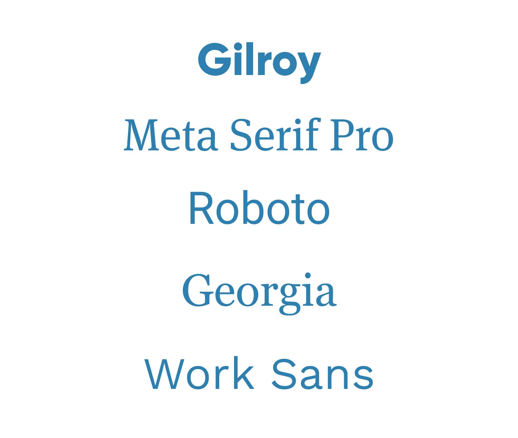
My 5 fonts that I keep coming back to: Gilroy, Meta Serif Pro, Roboto, Georgia, Work Sans.
These are the fonts that I’ll try using whenever I start working on something new. If I really can’t make it work, I’ll go and find a new one, like I did when I worked on the UX Buddy project.
How to create your own list of 5 fonts
Here’s a list of types of fonts I think a modern web designer needs to have on their “5 fonts” list:
- A geometric sans serif
- A high quality serif for long text
- A workhorse font
- A web safe font
- A variable font
If you take a closer look, you’ll notice that this list of types of fonts aligns perfectly with my own “5 fonts” list. Gilroy is a geometric sans serif font that I really like because it feels modern (unlike Futura which may look dated in some occasions). Meta is my high quality serif font because it’s really well designed, it works really well for paragraphs and has many OpenType features like ligatures, alternative digit styles and much more.
Roboto is a typical workhorse font family. It comes in many different styles and weights and is very well designed. It consists of a sans serif, a slab serif and a mono style and can be used for anything from long paragraphs to UI labels and code snippets.
Work Sans is a variable sans serif font that I really like. It’s highly legible, even at smaller sizes which makes it great for UI design. The fact that it’s variable means that I can match various weights to get a good balance between font sizes which helps my UI designs look slicker.
And the last is Georgia, an underrated web safe font. It looks quite modern which is fascinating, because it was designed a while ago. It comes with old style figures, often called “lowercase digits.” That makes it great for paragraphs, especially when I need to save a few kilobytes. I have been saying this for a while, web safe fonts don’t suck. They’re completely free as we don’t need to pay to use them and they also don’t add any weight to our websites so they load faster. More on web safe fonts another time.
What are your 5 fonts?
Ok, now it’s time for you to think about your own 5 fonts. Start with writing down a couple of fonts that you used more than once. Then go through my recommended list of font types above and try to complete your own “5 fonts” list. It may seem like you’ll have less choice if you narrow down your scope to only 5 fonts. But you’ll learn how to use them better which will make you a better designer in the long term. Besides, you can always take a font you don’t seem to be using often out and replace it with another one. Just make sure you try to stick to around 5 fonts in total. Soon you’ll come to the same conclusion as I and many other designers did—5 fonts is all you need, as long as none of them is Comic Sans.
Choosing fonts
How to make original font choices
Join 20,000+ designers and developers, get my free typography course straight to your inbox.
Get the free courseJust cool web typography lessons, no spam.
Already have a shortlist of fonts? Which ones? How did you choose them? Need help with choosing your fonts? Let me know in the comments!