Cool new stuff in web typography in September ’19
![]()
~ 2 min read
How is it going? I started working on a new project in August which I’ll share with everyone really soon. I can’t wait 🤩
News
- Today is one year since I started this newsletter 🥳 Thanks to everyone for supporting my work and sending me really nice notes about how much they enjoy it.
- The printed version of the second edition of the book is now available on Amazon and Book Depository. Unfortunately, adding a new edition meant all the awesome reviews I received on Amazon are only on the first edition.
Featured
The birth of Inter
I’m a fan of Figma and pretty much all of the design work that comes from their team. Inter UI, their main typeface, was featured in a recent newsletter and now we get to see how it was made in this really cool article.
Font of the month
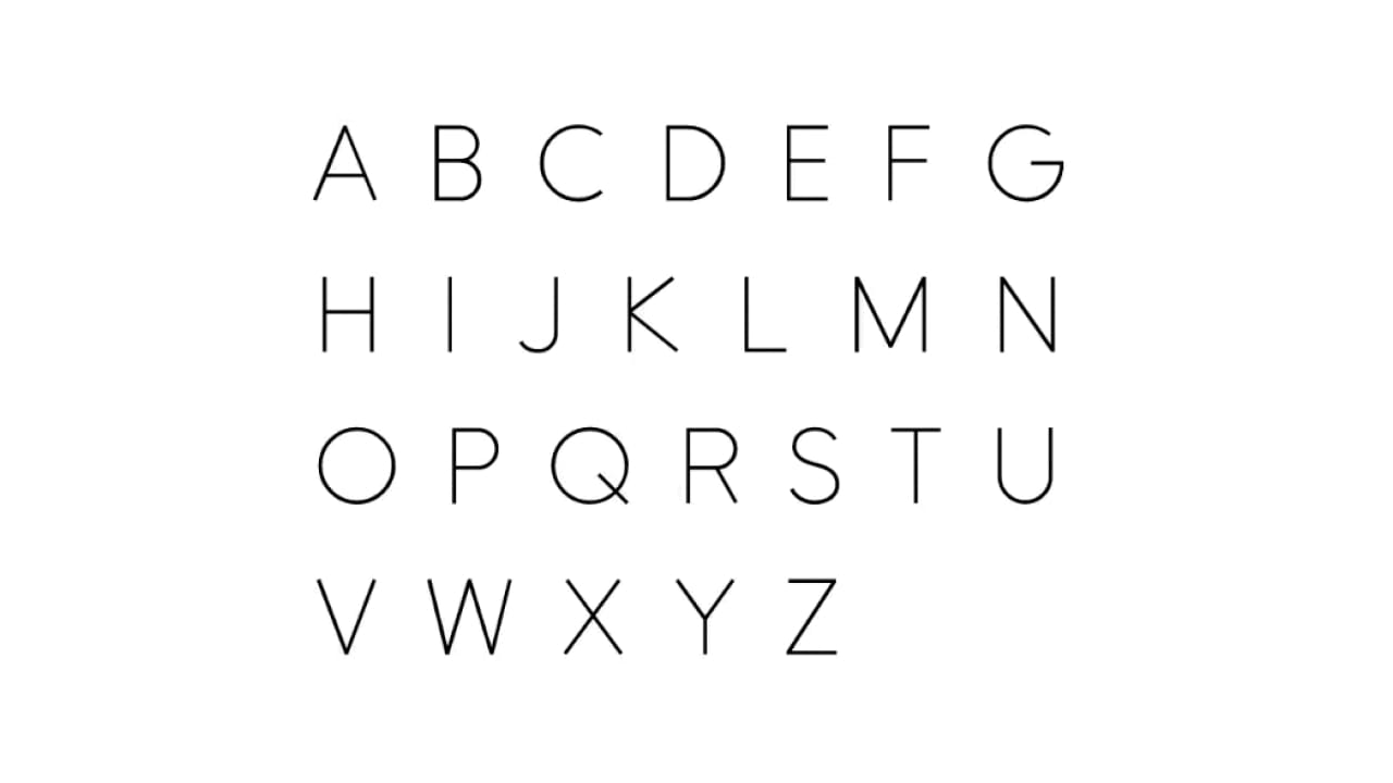
Leon Sans
Leon Sans is a geometric sans-serif typeface made with code in 2019 by Jongmin Kim. It allows to change font-weight dynamically and to create custom animations, effects or shapes in the Canvas element of HTML5.
Cool Articles
Styling links with real underlines
Underlining text on the web has been a discussion for a while. Should the underline cross the descenders or not? Ollie Williams explores the new CSS properties that should help with this. Read more →
Kerning & ligatures in letterspaced type
If you‘re into small typographic details like I am, you’ll love this short post. Read more →
Ikea is changing its brand (again)
Yup, they are. I didn’t notice the change in their branding before this one though. That’s probably because it’s very subtle. They’ll start using a new typeface. Read more →
Variable font animation with CSS and splitting JS
Variable fonts + animation = awesomeness 😍Read more →
This cat font rules
It’s too decorative to be featured as the free font of the month but it is a cool thing to check out 😹 Read more →
Did you know?
The first slab serif typeface was initially called Egyptian but the style of the typeface had nothing to do with Egypt. It was just that Napoleon and his campaign in Egypt made everyone completely fascinated with everything Egyptian, so the naming of the typeface style was purely a marketing stunt. The style was popular in advertising but its popularity declined with the rise of the sans serif typefaces.
Photo of the month
I stumbled upon this gem while strolling around in downtown Ljubljana. @matejlatin.
__
That’s it for this month, see you in October! 👋
Cheers,
Matej