Cool new stuff in web typography in February ’21
![]()
~ 2 min read
how’s it going? I’m slowly getting back into my routine and I’m finally getting stuff done again. Better Web type is not my top priority project right now, but I decided to put an extra effort in and keep the monthly newsletters going. I’m really excited about this edition, there’s really cool stuff included.
News
📖 As an existing customer and supporter of my work you can get the printed version of the Better Web Type book on Lulu.com at a heavily discounted price.
🚀 I’m making good progress towards launching my new UX portfolio course UX Buddy in March. Right now, you still have time to join the 300 people already on the waitlist.
Featured
A dictionary of typography
This is such a cool piece of work by Nicholas Rougeux who recreated the dictionary of typography originally written by John Southward in the 1870s. It covers both editions written by Southward and the differences between them. You can read_the making of_blog postor check out thefinished product. You can even get some cool typography posters. Really nicely done Nicholas! 👏
Font of the month
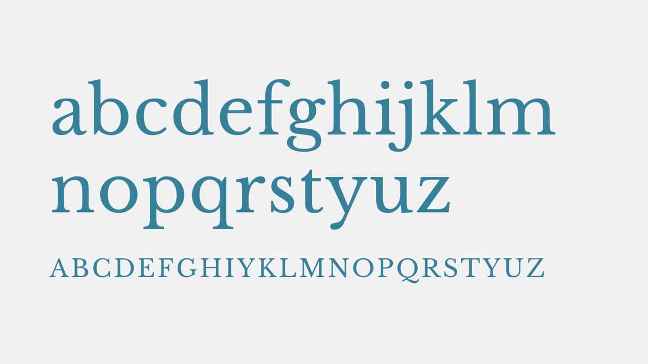
Libre Baskerville
Another classic this month. After featuring an Open Source edition of Garamond last month, I found a similar edition of Baskerville which is one of my all-time top 5 typefaces. This is an awesome edition that comes in two weights, regular and bold, and an italic style. They look 👌 I recommend using this one for paragraphs on websites that need a bit of a classical feel and possibly feature somewhat longer articles.
Cool Articles
Imperfect, by design
Twitter’s got a new look and a new typeface. I’m not a fan of Twitter (or of what it has become) but the custom typeface looks good. Here’s the story behind it.
Uniwidth typefaces for interface design
This is really cool! Lisa Staudinger made a list of typefaces where all characters are of the same width, even when they’re bold or uppercase.
My favourite typefaces of 2020
I Love Typography’s list of cool typefaces from 2020. I bookmarked some of these for myself, I’ll probably use them in the future.
Letters close enough to touch
Sarah, a subscriber of my mailing list, sent me this article. It’s an interesting story about how The New York Times introduced an “EA” ligature to make the word IMPEACHED look better on the front cover.
That’s it, see you next month! 👋