Cool new stuff in web typography in February ’20
News
❤️ Today is exactly 3 years since I launched the free Better Web Type course. More than 30k people signed up for it and its rating is still an unbelievably high one—4.7 after more than 1,000 reviews! Thanks, everyone for supporting my work!
🤔 I’m trying out something new in this issue to make it more fun. I’m including a puzzle/question to test your knowledge about typography. It’s at the beginning of this email but the answer is at the bottom. This should give you enough time to think about your answer.
Featured
5 monospaced fonts with cool coding ligatures
I’d always used the Monaco font and Sublime Text for coding but I recently decided to switch to VS Code. That change also led me to explore monospaced fonts suitable for coding as I worked on customising my VS Code theme.
Font of the month

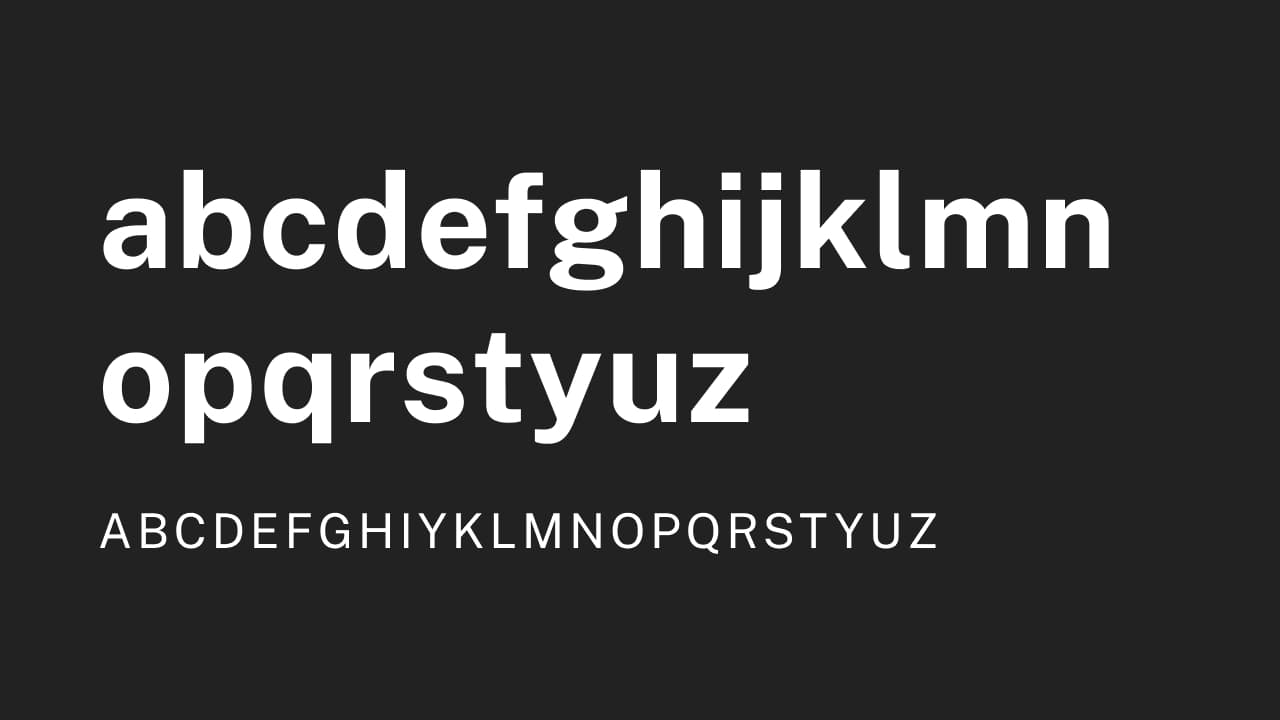
Public Sans
Public Sans is the official font of the digital.gov—United States’ website for technology and information services. It seems they designed this awesome font which is free for personal and commercial use. It comes in 9 weights, all with italic equivalents 😲 This makes it a very versatile font. It looks really good too!
Cool Articles
The real politics of type
I don’t like politics but I love to see any research about typography. This one is about people making assumptions about candidates based on the typefaces they use for their branding.
Set type on a circle… with offset-path
Another cool tutorial by Chris Coyier. This time he shows us how to set type on a circle with CSS alone.
Here’s the typography of the next decade
What will typography be like in the next decade? Are geometric sans-serif typefaces going to continue to dominate? Rachel Hawley shares her thoughts.
Did you know?
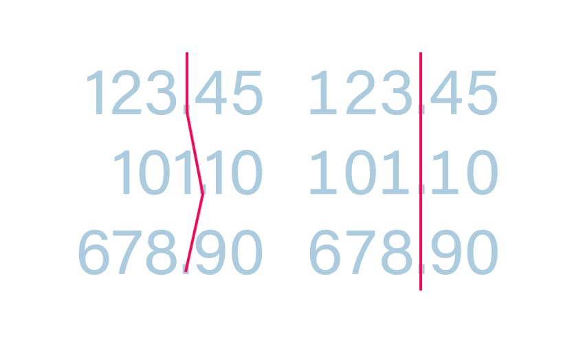
The special thing about tabular figures is that they all have the same width. The width of the number “1” equals the width of the “0” for example. Not the actual glyph, but including the spacing around it. The uniform spacing makes them great for aligning them vertically in tables or generally in columns of numbers.
