Cool new stuff in web typography in June ’21
![]()
~ 1 min read
how are you? I just moved again, and it’s only a temporary solution until we finalise our new house and move in. So at least one more move and we’ll finally be home. It’s stressful, but also exciting times!
News
🚀 My new online UX portfolio course UX Buddy sold out very quickly again in May. I’ll do another early access launch this year, so make sure you join the waitlist to find out when!
📖 The Better Web Type book is on sale! Get 40% off for a limited time!
Featured
All you need is 5 fonts
I blogged after a long time. I realised through my work that I tend to use a couple of fonts most often. So I remembered of Massimo Vignelli who built his whole career as a graphic designer with only 5 fonts. I decided to explore that further and see if there’s a general stack of 5 fonts a modern web designer should have. As it turns out, there is.
Font of the month
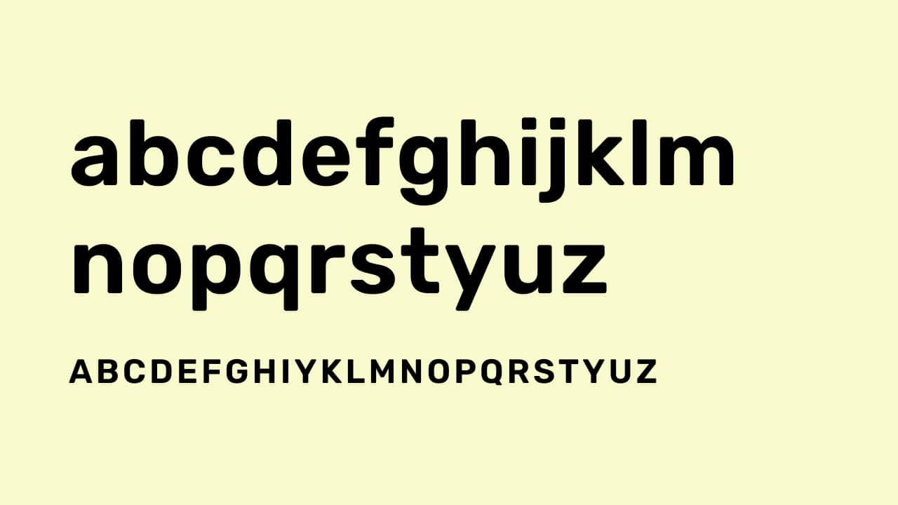
Rubik
This month, I went looking for a cool variable font to feature and found Rubik. It looks a bit anonymous at first, but take a closer look. The softer edges make it feel special and could be well used for branding or headings on a website. The fact that it’s variable makes it very flexible. What’s best is it’s on Google Fonts.
Cool Articles
Best practices for fonts
Katie Hempenius wrote this awesome refresher about the best practices for using fonts on the web.
Our favourite uses of typography in watches
As the title of the post suggests, it’s about typography in watch design. Not actually about web typography but still very interesting.
The origin story of the Wingdings font
I have to admit, I used the symbols from the Wingdings fonts quite often, especially early in my career when I focused on graphic design. It’s really interesting to read about its origins and some controversies around it.
Microsoft’s 2021 default font — my thoughts and suggestion on it
Oliver is back with his views on Microsoft’s new default font!
That’s it, see you next month! 👋