Cool new stuff in web typography in March ’20
![]()
~ 2 min read
How is the recent virus outbreak affecting your life? 🦠 A lot of people are switching to work from home and it’s the first time for the majority of them. Cities here in Slovenia seem to be in lockdown, the streets are empty and quiet. Other than that, my life isn’t that much different. I guess it’s another advantage of being used to working from home—my productivity doesn’t suffer because of it. I hope you’re well and healthy and that this nightmare ends soon. Anyway, let’s get to typography stuff, this month’s edition is very much variable fonts flavoured.
News
📈 I recently wrote a blog post for GitLab about how a holistic approach to UX design resulted in a 141% uplift in free trial signups. At the same time, this proves the value of doing UX design well. Curious about how we did it? Read about it on the GitLab’s blog.
Featured
The performance benefits of variable fonts
When we look at web font performance we look at three things: the number of font requests, font file size, time to first render. But how do variable fonts compare to standard fonts? At first, it looks like a variable font is generally much bigger than a standard font file. But Mandy Michael looked into it and found the opposite.
Font of the month
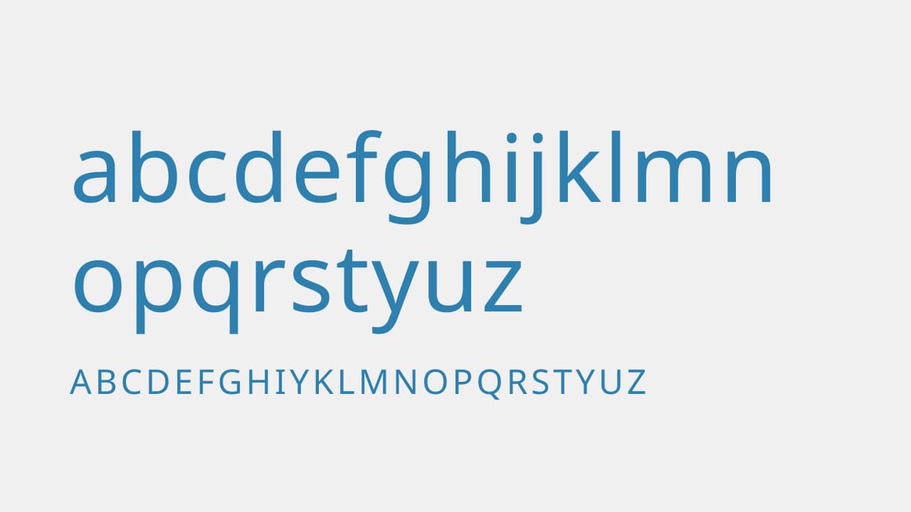
Noto Sans
Noto Sans is not a new font. It’s been around for a while but I remember the impact it made when it was first released. Why? Well, it’s a typeface designed by Google and it supports more than 100 writing systems and 800 languages. It’s intended to be visually harmonious across multiple languages, with compatible heights and stroke thicknesses. I think this makes it a perfect option for multi-language websites so I decided to feature it here.
Cool Articles
Tips when choosing a typeface
This is quite a cool article on how to choose a typeface for your projects. In case you missed it, I wrote about this last year when I described my process of choosing a typeface for my new project UX Buddy.
Variable fonts’ past, present and future, according to Dalton Maag
Dalton Maag is one of my favourite type designers. Here’s his view on variable fonts.
Web typography tips
Here’s a list of cool web typography tips, some of them are a bit basic and I’m sure you already know about. But there’s always more to learn!
Durex’s new typeface
I just love these custom typeface articles. The latest one is for Durex—One Night Sans by Colophon.
New resources
A Variable Fonts Primer
This is pretty much everything you need for variable fonts. It has guides for designing with variable fonts, as well as for implementing them. Neat!
Photo of the month
I spent a week in London at the beginning of the Month. I attended a conference at a venue that’s just 2 minutes from where I used to live. I still love how lively and diverse this city is. @matejlatin