Cool new stuff in web typography in May ’21
![]()
~ 2 min read
how is it going? I finally have some good news. My wife and I are finalising the purchase of our very first home. It’s been 10 years of hard work, sacrifices, moving from city to city, from one country to another but always having that one goal in our minds—having our own home. Sometimes I still can’t believe it’s actually coming true.
News
🚀 My new online UX portfolio course UX Buddy is coming back in May. It’s another early access release but this time it will have 20 seats up for purchase. Last time there were only 10 seats available and they sold out in 5 minutes! 😲 Join the waitlist to get notified of the exact day and time of the release.
📖 The premium version of my web typography book is on sale! Get 30% off, the offer ends today!
Featured
I studied the fonts of the top 1000 websites. Here’s what I learned.
Michael Li wrote this informative article and came to interesting conclusions: most websites use sans serif fonts for titles and paragraphs, they generally have 4 fonts in the stack and most of the paragraph sizes are still quite small.
Font of the month
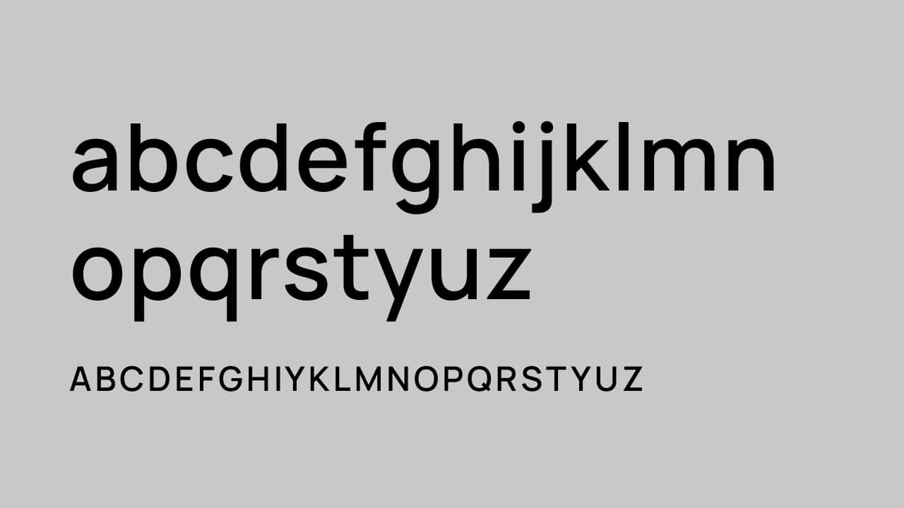
Hauora Sans
Hauora is a neo-grotesque sans-serif font that comes in 8 weights, a ton of features, and is Open-source. What’s best is, it comes in desktop, Webfont and variable formats! 🔥 I love the geometric style which is even more apparent in the design of the digits. This font can look really cool on a clean, modern, and typography-centric website. Possibly combined with a modern serif for longer texts 👌 This one goes to my personal shortlist.
Cool Articles
Beyond Calibri: Finding Microsoft’s Next Default Font
Microsoft’s design team writes about finding the next default font that will replace Calibri. They didn’t design a new font themselves, they commissioned 5 new fonts and chose one as a new default.
Microsoft debuts five new fonts in a death match to rule Office
Fast Company’s article on the same topic. It’s interesting to combine the insider view with an outsider’s one.
How tracking and kerning improves all caps text
Oliver is back with another article & video combo. This time he takes on the all caps and how to make them look better.
Designing a Custom Typeface That Works for Indeed
Eric Smillie from Indeed reached out and shared the article about designing a custom typeface for Indeed. As you probably already know, I love these custom typeface design case studies!
That’s it, see you next month! 👋