Cool new stuff in web typography in November ’19
![]()
~ 1 min read
How is it going? I just wrapped up a part of the work for my new project but I’m not taking any rest just yet. There’s more work I want to still do by the end of this year.
News
- Last month I launched the website for my new project—UX Buddy. If you’re a designer, looking to take the next steps in your career, you should definitely check it out.
Featured
How to choose a font for a project
I recently received an email from a designer called Jared. He went through the typography lessons that I offer as part of the free course and he was very grateful for them. He said he learned a lot but also had one important question: how do I go about choosing a font for my project?
Font of the month
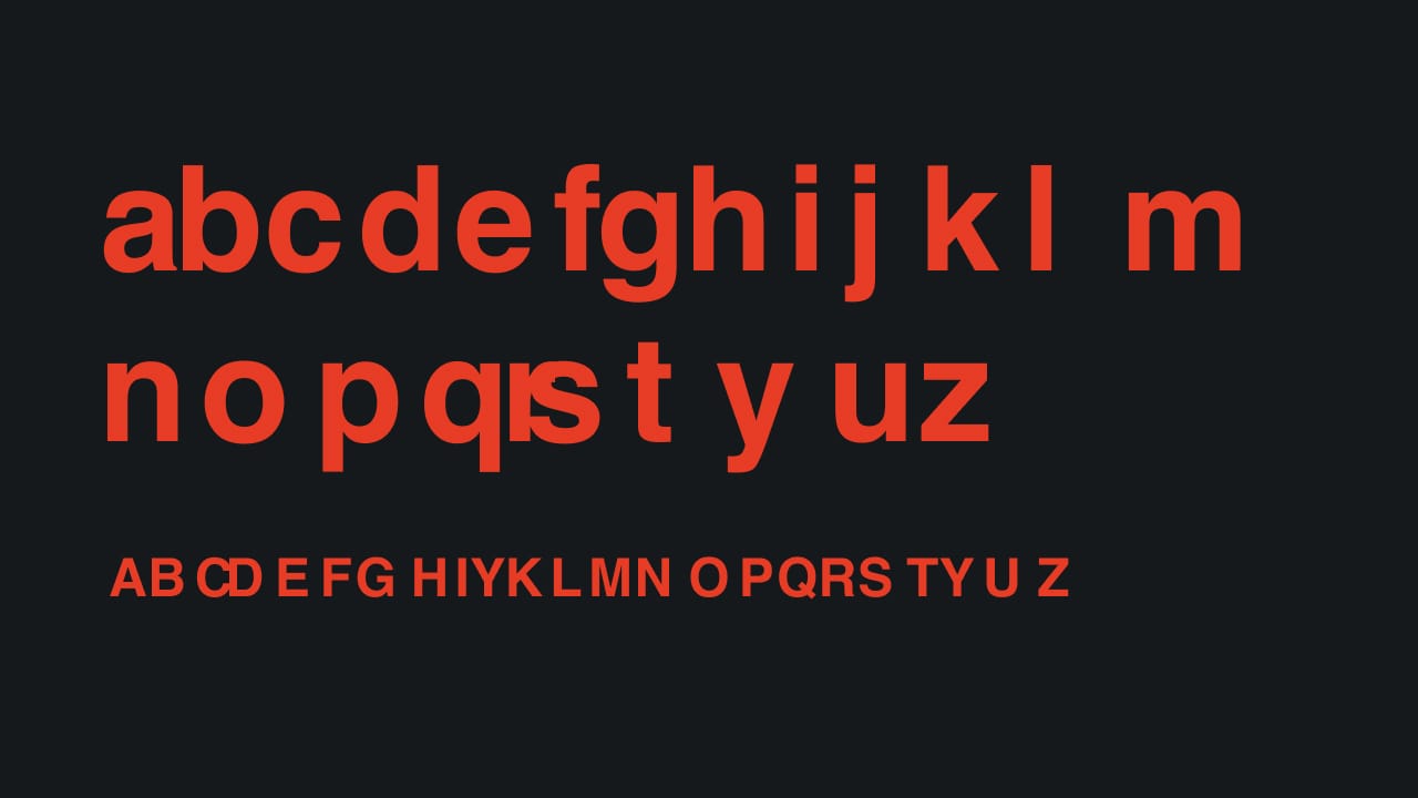
Hellvetica
Well yes, this is clearly a joke. But I love how well it’s made and presented. It reminds me so much of this. I wonder if there can be some other use for this font, other than this mockery of course 😂
Cool Articles
Words and phrases in common use which originated in the field of typography
Five phrases that originated in typography. The last one from this list is the coolest and most surprising one. Read more →
Typographic illusions
This is a really interesting link about optical details in typefaces. Read more →
Accessible drop caps
This is how you do drop caps right. Adrian Roselli goes into details and even tests different implementations with the screen reader. Read more →
New resources
Transfonter
Modern and simple css @font-face generator.
Wakamai Fondue
Interesting name, cool tool. Wakamai Fondue shows which features a font supports. Just drag and drop your font.
fonttools
A library to manipulate font files from Python.
Did you know?
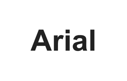
Arial is a copy of Helvetica and is often referred to as “Helvetica’s ugly twin”. It was created to be metrically identical, with all character widths identical, so that a document designed in Helvetica could be displayed and printed correctly without having to pay for a Helvetica license.
__
That’s it for this month, see you in December! 👋
Cheers,
Matej