Cool new stuff in web typography in October ’19
![]()
~ 2 min read
How is it going? It’s been a really busy period for me and it will remain like that until the end of the year when I’ll finally take some time off again.
News
- My book was featured in the post Two books to start handling digital typography right. I’m really glad to see my book bringing so much value to people 🎉
Featured
An ode to OpenType: fall in love with the secret world of fonts
Figma was at the centre of last month’s featured post and it’s here again. This time, it’s a post introducing the new support for OpenType features in Figma. This will allow you to turn on additional ligatures, customize the style of digits, switch to alternative letterforms, and make use of adjustments available in many of today’s fonts — through a user interface that will make discovering them as much fun as using them.
Font of the month
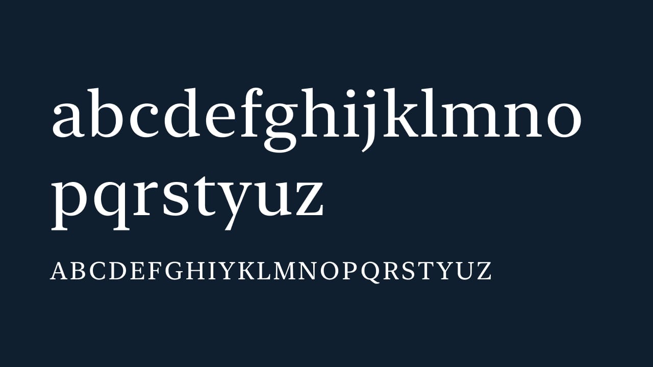
New York
This is actually a font that Apple introduced on the Macintosh back in 1983. It’s been tucked away for many years since then but it’s coming into the spotlight again. It’s supposed to work well on its own or combined with Apple’s main system font—San Francisco. You can get it for free right now, I don’t think you can use it for commercial purposes though.
Cool Articles
Variable fonts & the new Google fonts API
Google Fonts is introducing variable fonts support and changing the API for loading the fonts. Read more →
This typeface hides a secret in plain sight. And that’s the point
An interesting case study of how Atkinson Hyperlegible typeface was created. The designers broke a lot of rules while creating it but it resulted in a typeface that’s easy to read even to people with visual impairment. Read more →
Reviving a blackletter font from a museum’s archive
Another interesting case study on typeface design, but this time, it’s a revival of a 1916 blackletter typeface. Read more →
These font football kits are perfect for type nerds
This is so much fun. If famous typefaces were football kits, what would they look like? Take a look! If these were real football clubs, which one would you want to play for? Read more →
Did you know?
Futura was the typeface used on the commemorative plaque on the Apollo 11 landing module so it’s literally the first typeface that made it to the moon (and remained there).
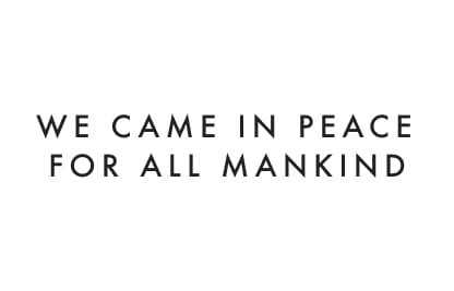
Photo of the month
Can you spot the bad kerning on this photo? @matejlatin.
__
That’s it for this month, see you in November! 👋
Cheers,
Matej