Cool new stuff in web typography in October ’20
![]()
~ 2 min read
How are you? I gotta say, I’ve been better. I think I have been working too much for too long and sometimes the body just says “stop.” In this case, a hand injury prevented me to work for a full week, and that’s also why this newsletter is a bit late. I’m feeling better already but I need to keep in mind that I should find a way to work less.
News
📣 Many have been telling me lately that my newsletter often goes into their Promo, or maybe even the Spam folder. If that’s the case, you can manually move it to the main inbox folder and the future editions should go there straight away 🤞
Featured
Leading trim: the future of digital typesetting
Have you ever struggled to get the margins right when you worked on a website? Was it the line-height of the text that was the obstacle? You need the heading to be 16 pixels from the paragraph but because of how line-height works on the web it was more than that? I sure had this problem many times. Well, Microsoft is working on a new CSS feature which will allow us to “trim” the line-height (leading) of a text so that we can get that alignment spot on.
Font of the month
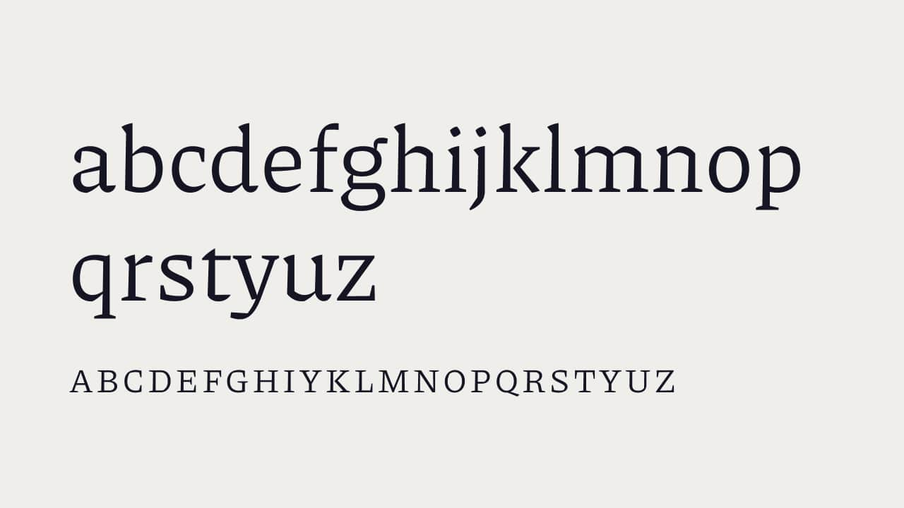
Piazzolla
One of my subscribers to this newsletter, Lucía, recently got in touch and asked me for an opinion on some of her work. Among it, there was a website presenting the Piazzolla typeface. Designed by Juan Pablo del Peral, this is an awesome full type system that comes with many OpenType features and variable fonts! I love the presentation website too. It’s simply awesome! 😍
Cool Articles
Madefor — a new custom typeface for Wix
Have I ever said how much I love custom typefaces? I probably did. Here’s another great example, this time it’s a typeface created for Wix. Again, I love the presentation website. Very neatly done 👌
Futura Now
Futura is the most popular typeface out there. I’m comfortable to say that it’s even more popular than Helvetica ever was. But this timeless, geometric beauty just got a new version from Monotype. It comes in many styles, it’s variable and just looks awesome. You can get a couple of weights for free.
When fonts fall
Marcin Wichary is back with an awesome article about font fallback.
Wikipedia is getting a new look
This will be the first major visual update in 10 years. It’s about time. I really hope they’ll work on typography as it needs a lot of attention. 🧐
Resources
ztext.js
Easy to implement, 3D typography for the web. Works with every font.
That’s it, see you next month! 👋