Vertical Rhythm in Sketch
~ 13 min read
The first major article that talks about aligning type on the web to a baseline grid was the one by Wilson Miner for A List Apart back in 20071. Revisiting the article now, it feels a bit clumsy to define the grid, the margins and the padding in fixed pixels sizes to make all the alignment work. But that was a while ago and we—mostly web development practices and tools—have come a long way since then. We can now use Sass mixins to easily define the grid, the margins, and the padding consistently. But what about digital design tools? We were still using Photoshop and Illustrator back in 2007 and those weren’t really tools for digital/UI design. They were adopted for it, but not designed for it. InDesign allowed aligning type to a baseline grid but using InDesign for web design work is like using a hammer to drill a hole (but believe me, I’ve seen people use InDesign for web design projects).
Sketch was the first proper digital/web design tool and is still the most popular among designers these days (with Figma quickly catching up). A lot has been written about the baseline grid and vertical rhythm on the web. Even I wrote a full chapter on this in my book which you can read as a blog post on this website. But now I want to take a look at how designers can use the baseline grid and establish a vertical rhythm in Sketch. I also want to take a quick look at why using the baseline grid makes sense and what the benefits are. Then we’ll jump straight into setting up the grid, what defines it and how we decide on the numbers that our grid will be based on. And finally, in the second part, we’ll at examples of aligning type and UI components to the grid we created.
Just a quick note on line-height in CSS as it’s different from line-height (or leading) in print. Increasing line-height on the web increases spacing on the top and bottom of the text, unlike in print, where space is only added at the bottom. This way, type on the web falls straight in the middle of the lines in a baseline grid. And Sketch, Figma and other digital design tools replicate that well.
Why vertical rhythm?
At this point, it might seem that setting up a baseline grid and then aligning elements to it is a lot of trouble and work. Why should designers even bother? That’s a legitimate question. I’m a self-taught designer and at the beginning of my career, I used to do things more “by my feeling”. Optically aligning things as they felt right. But through the years I learned about different techniques of improving the quality of my work, and using grids was one of them.
The benefits of using a baseline grid in a digital design tool like Sketch are nicely summed up in our GitLab’s design system2:
Adhering to a baseline grid allows us to be more efficient by removing decision making while maintaining a consistent rhythm between components and typography.
Let’s take a look at the “removing decision making” first. If you’re working on a web design project where none of the colours, sizing or spacing has been defined, every time you need to use a colour or define the sizing or the spacing of an element you need to make decisions. The advent of the design systems allows teams to do the exact opposite. Removing these micro decisions so that work can be done faster and with greater consistency. Instead of randomly choosing a number for spacing elements apart, we’re presented with a limited number of options to choose from.
We already touched on consistency but let’s take a closer look at that too. If you’re deciding on the spacing between two headings on a website and don’t use a grid to align to it, you’re presented with a huge number of options. The spacing can be anything from 1 pixel to whatever the maximum value that is acceptable in each specific case. For this particular one, let’s say that’s 50 pixels. You’re now choosing between 50 options, that’s crazy! And one more thing, for spacing other elements apart we might be choosing between a different set of numbers, maybe 1 and 30 pixels. That decision will be completely unrelated to the one we made before, leading to even greater inconsistency in sizing and spacing of elements on a website or in a UI. But if we introduce an 8-pixels baseline grid, our options for spacing the two headings apart narrow down to six: 8, 16, 24, 32, 40 and 48 pixels (sticking to our 50 pixels maximum value that we defined as acceptable). We can now go one step further and say that a heading 1’s bottom margin should always be 16 pixels. Removing even more decisions and making our layouts even more consistent.
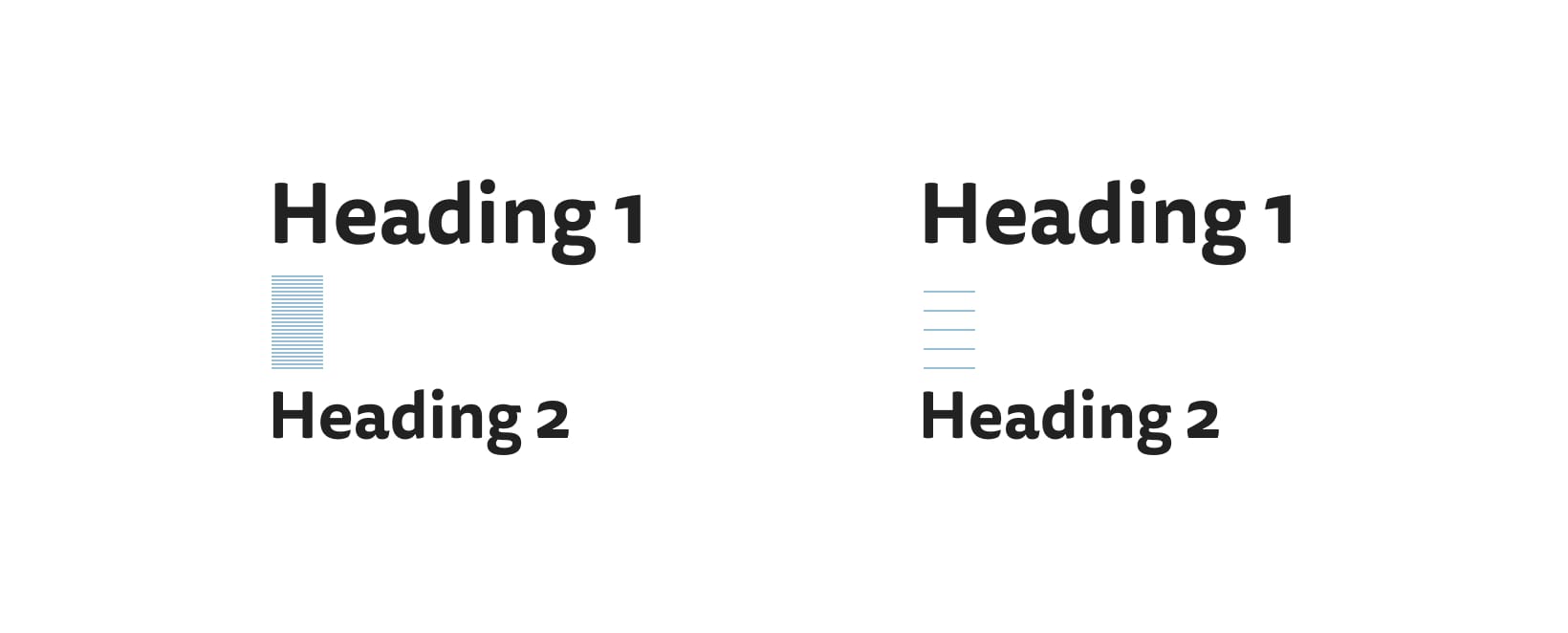
FIG 2: 50 possible options on the left (only half of them are represented by the blue lines), only 6 possible options on the right. Less options, more consistency.
Consistent spacing also establishes a correct vertical rhythm and a visual hierarchy that’s easy to distinguish. This means that we (designers) are not only doing this to make our jobs easier, it’s also good for the users.
Better Web Typography for a Better Web
Free Course
Join 30,000+ designers and developers, get 7 free lessons and unlock your better web typography skills.
Learn more →Just cool web typography stuff, no spam.
Setting up a baseline grid
A lot of guides that show how to set up the baseline grid start out with setting the grid first and then making the type work with it. I think this approach is wrong. We should always start with the content, set our paragraph text in a font we think it’s appropriate for the content and then design the grid around it. We won’t go into details here, but adopting the content-first approach, the process should then be the following:
- Get some content of the website/design you’re working on.
- Find a font that works well with the content.
- Set your body text to that font and find a good font size, line-height and line length (read more about this in my Equilateral Triangle article).
- Base your baseline grid based on the line-height you decided on, align all type and elements to this grid.
We’re only focusing on the last step in this article. You can read more about the content-first approach and how to craft awesome web typography with it, in my book.
Setting up the baseline grid is very simple once we know what numbers we’re going to use and where they come from. We’ll set up our baseline grid at the end of this section, but first, let’s take a look at how we establish what numbers we’ll use in our grid.
line-height as the base unit for the baseline grid
As mentioned above, the baseline grid should always be based on the line-height of the base font. This way, we start out with what’s at the core of our website—the content—and design around it. Our starting point for this article is a defined paragraph of text with an already set font, font size, line-height and line length. Let’s assume we already completed the first 3 steps from the list above and we have the following.

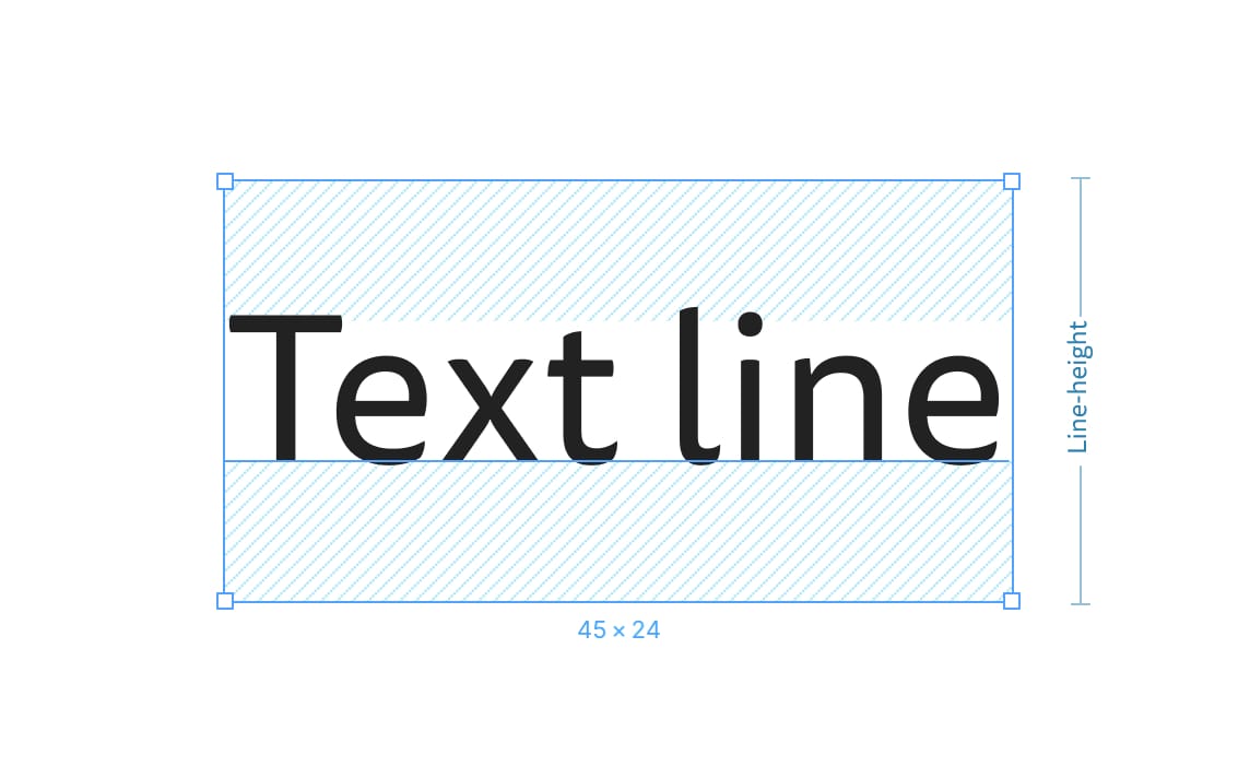
FIG 3: At this point, our paragraph for body text looks like this. We’re happy with how it looks so we’ll set up a baseline grid around it.
The font we chose for the project is Tisa Sans and the base font size is 18 pixels. The line-height of our paragraph is 24 pixels and its line length was defined by setting a maximum width of 560 pixels.
How to decide on the numbers
So if we’re designing a blog and we use a font size of 18 pixels and line-height of 24 pixels for our body text, the 24 will be our starting number. For the sake of simplicity of examples, I’m only focusing on one screen size here (desktop). In practice, we can change the baseline grid for many different screen sizes with media queries. Anyway, with 24 pixels as our line-height, we could just say that 24 pixels will be our base unit for the baseline grid.
FIG 4: A very simple and basic baseline grid. The problem here is: is it flexible enough?
But not so fast. 24 pixels is too large and doesn’t account for flexibility that is often needed in UI and web design. We need something smaller that is derived from that 24. We could just divide it by 2 and we’d get 12. This could be a good base unit for the baseline grid as it allows us to be twice as flexible.
FIG 5: A 12 pixels grid gives us twice the flexibility.
This is much better. But it can still be improved. 24 is a nice number that we can divide by 2 and get a full number as a result, but it can also be nicely divided by 3. 24 / 3 = 8. That’s interesting, let’s see how a baseline grid would look like with an 8 pixels base unit.
FIG 6: An 8 pixels baseline grid gives us even more flexibility. It’s also one of the most popular baseline grids out there.
Yes, 24 can also be divided nicely by 6 or 8. If we divide it by 6, we’d get a baseline grid of 4 pixels, and if we divided it with 8, we’d get one with 3 pixels as a base unit. At some point, we need to decide how fine we need our grid to be.
Finding the right base unit
We kinda complicated things right now. How do we know what a good base unit is? Should we use 12, 8, 6, 4 or 3 pixels? Which one is the right one? Well, they’re all right. As long as the number is derived from the line-height of our body text, all numbers are correct. But how do we decide which one is the right one for us—or the website we’re working on? My answer to that is not perfect but I think it’s a good guiding point. Decide on what base unit you’ll use for the baseline grid based on the complexity of the website you’re working on.
If it’s a simple blog, with mostly text and a few images, half of your line-height could be a good starting point (in our case, that’s 12 pixels). If it’s a bit more complex, it has lots of different styles of text, various components, complex layouts with more than one column, go for something finer. 8 or even 4 pixels would probably be a good idea. This also applies to web apps and complex UIs. For example, at GitLab, we know that our UI is quite complex, so we use 4 pixels as a base unit for our baseline grid (I’ll show a few examples of using the baseline grid at GitLab later on in the post).
Setting up the baseline grid
Awesome, now that we covered the what and the why we can finally look at the how. We can finally set up our baseline grid in Sketch. I’m not so sure that a 12-pixels baseline grid will offer enough flexibility so I decided to proceed with an 8-pixels grid for this example. Let’s set one up in Sketch!
We don’t need a plugin to set a baseline grid in Sketch. We can do that with the features Sketch offers out of the box with a simple workaround. Once in Sketch, add an artboard. Then, go to View > Canvas > Layout Settings. The layout settings window will open (FIG 7). Here’s what you need to do:
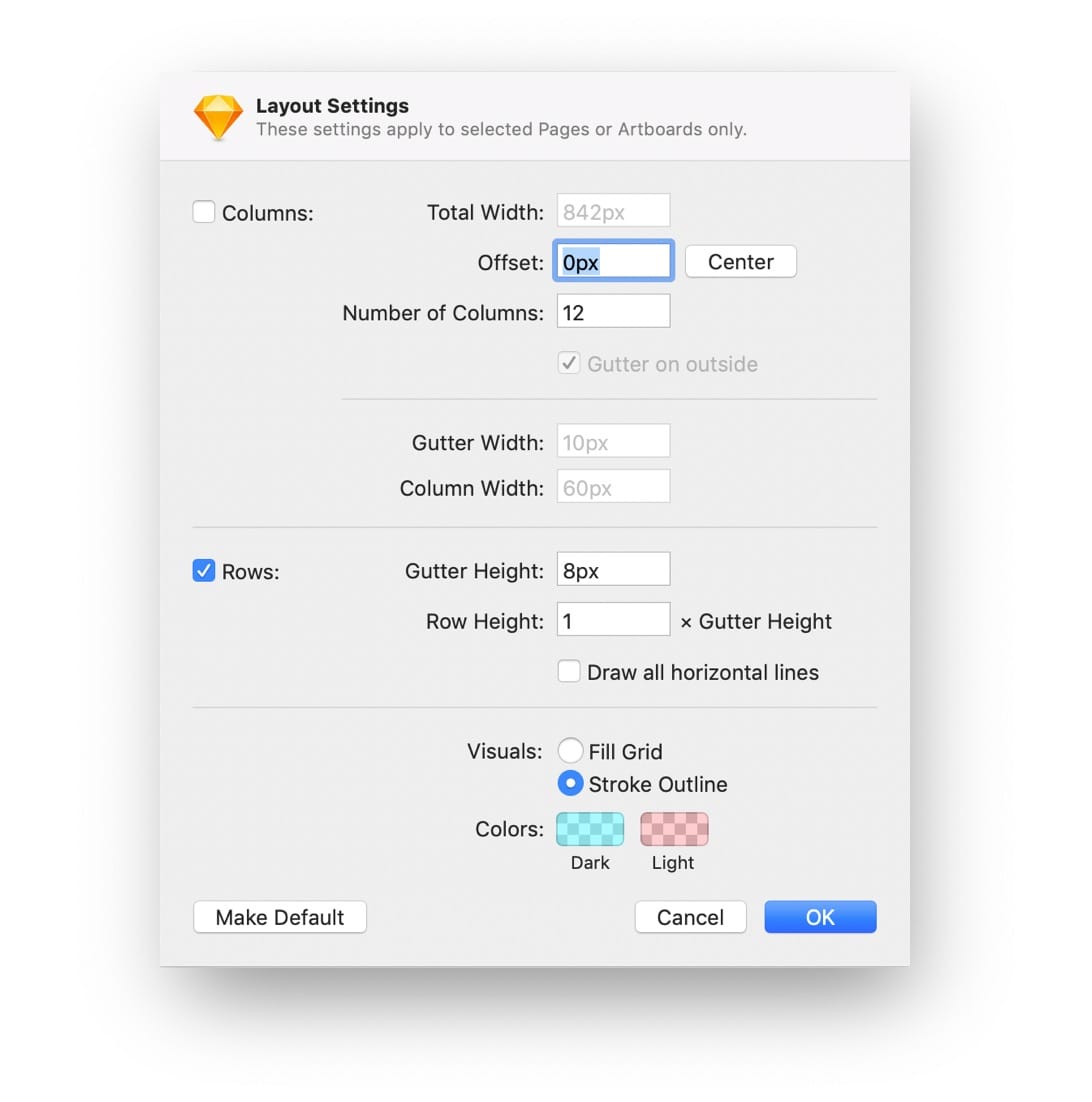
FIG 7: Canvas layout settings in Sketch.
- Tick the “Columns” checkbox and change the value of “Total width” to match the width of your artboard. “Offset” must be set to 0. You can disable the “Columns” checkbox then, as we don’t really need them.
- Now tick the ‘Rows’ checkbox if it isn’t already. Change the ‘Gutter height’ to ‘8px’ (our baseline grid base unit) and set the ‘Row height’ to ‘1’.
- Then change the “Visuals” radio to “Stroke outline”.
- Change the colour of the lines to something subtle. You need to change the “Dark” colour. I usually set it to a light shade of blue. Click “OK”.
Bam! You now have a baseline grid in Sketch (FIG 8). Simple, right?
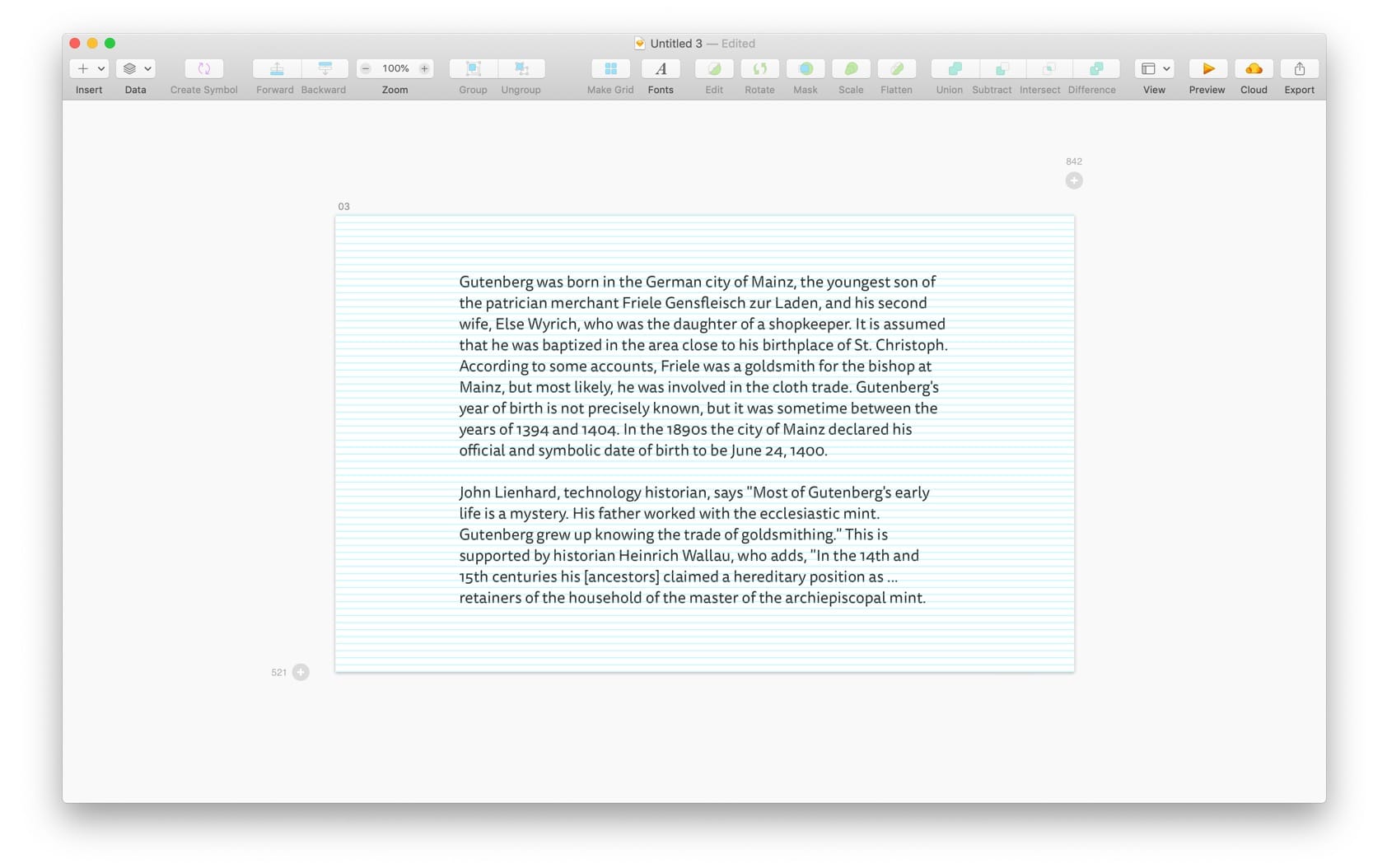
FIG 8: We now have a nifty 8-pixels baseline grid in Sketch!
Here are a few tips to make designing with a baseline grid easier and quicker:
Nudge, Push, Shove
Use the plugin called Nudge, Push, Shove to reset your nudging settings in Sketch so that when you press Shift + ↓ the selected element will move for x pixels downward. In our case, that would be 8 pixels (instead of the default 10). Resetting the number to 16 pixels for shoving also makes sense in our case. These are my settings right now:
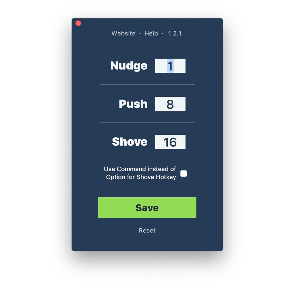
FIG 9: Settings that work great with the 8-pixels baseline grid.
Set a default for your baseline grid
Right now, whenever you start a new document your baseline grid settings will reset. To prevent that, go back to the Layout settings and click on “Make default”. You can see this button on the bottom left in the settings window in FIG 7.
Toggling the baseline grid
To quickly hide or show the baseline grid, press Control + l. I found myself using this keyboard shortcut all the time as I want to see if my elements are aligned to the grid and I also want to see the design itself.

“Incredibly informative, wonderfully written.”
A web typography book for designers and web developers.
Learn moreAligning type to the grid
At this point, we have our content and our base font size, its line-height and the baseline grid. Let’s add more content and align it to the grid.
Let’s say we have the following font sizes that we need to work with: the main body text size, two headings sizes and the side note size (FIG 11). Similarly to how we’re eliminating choice and establishing consistency with our baseline grid for vertical rhythm and visual hierarchy, we can use a modular scale to do the same for font sizes. Let’s put our base font size in the calculator at modularscale.com and create a scale. I’m using 18 pixels as the base and a ratio of 1.5.
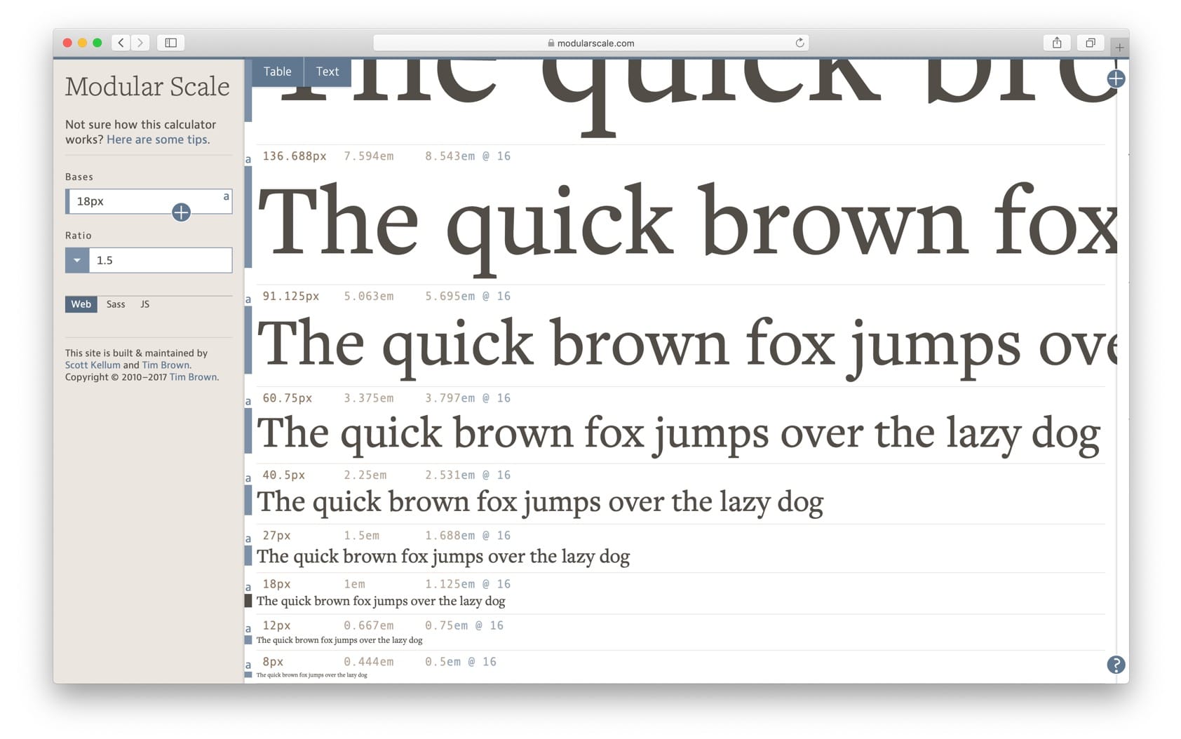
FIG 10: Modular scale with 18 pixels as base size and 1.5 as the ratio.
Great, we have some sizes to work with now. Let’s start assigning these and see what line-heights that are based on our baseline grid will work well with them. I take the sizes from the modular scale and assign the font sizes like this: 40 pixels for the large heading, 27 pixels for the smaller one, and 12 pixels for the side note.
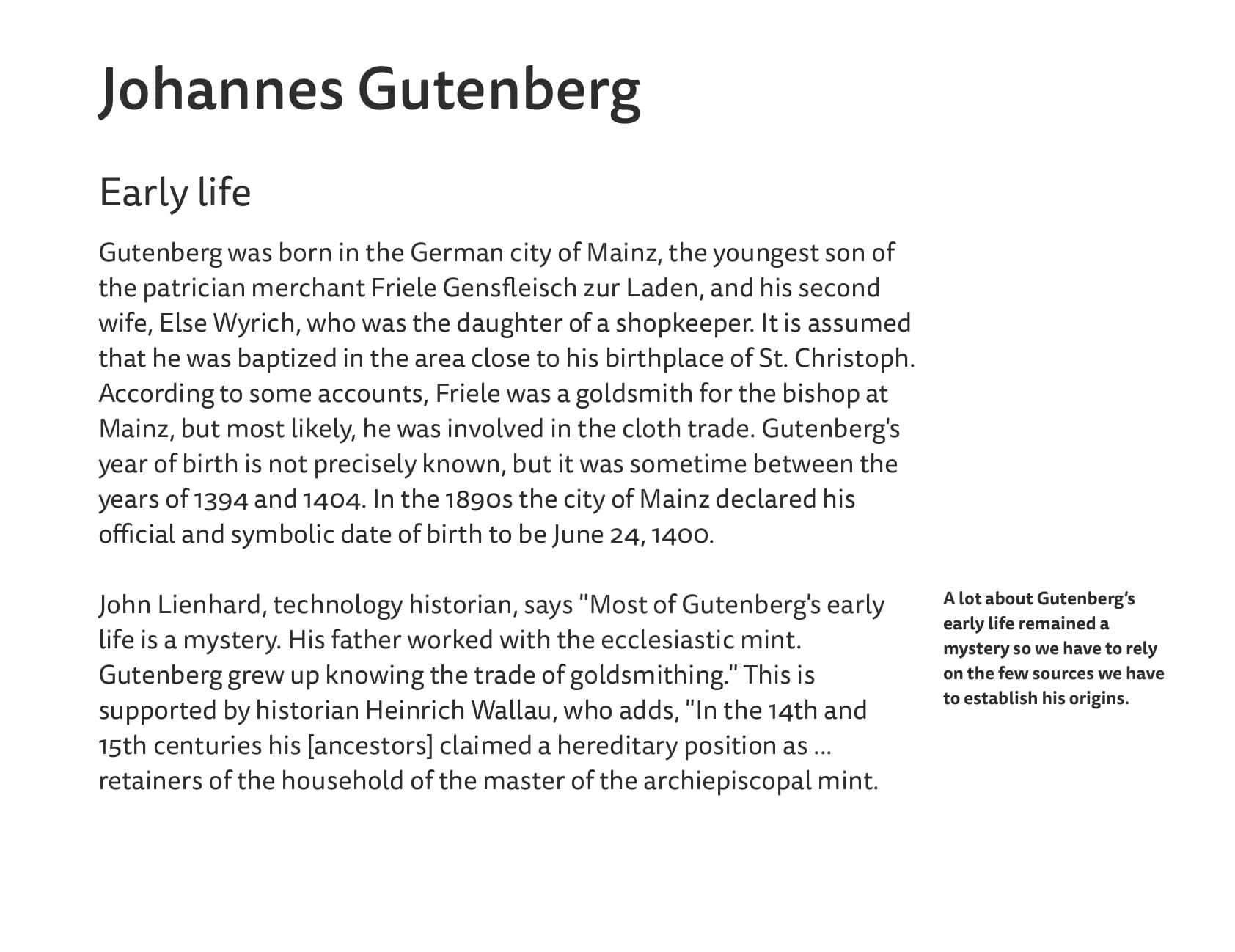
FIG 11: Without the baseline grid visible, this looks quite neat.
The sizes work quite well. But the line-height defaults that Sketch used are all wrong and don’t fit our baseline grid (FIG 12). The line-height of our large heading is 58 pixels which doesn’t align with our grid at all. The line-height of the smaller heading is 39 pixels which is close to fitting well but not quite. And finally, the line-height of the side note is 17 pixels which is also close but still not right.
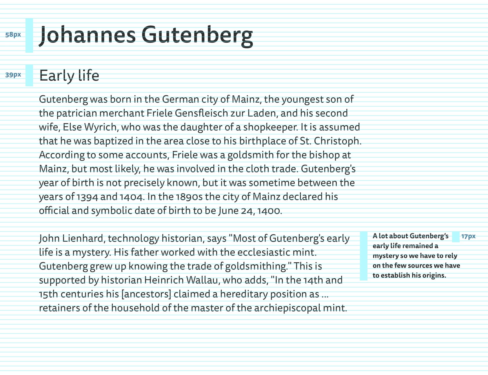
FIG 12: None of the type (besides the paragraphs) aligns with the baseline grid.
So to fix it, we need to change the line-height of the large heading to 48 pixels, smaller heading to 40 pixels and the side note’s to 16 pixels. Now, all the text aligns nicely with the baseline grid. Our 8 pixels grid works well, as anticipated. The 12 pixels grid wouldn’t offer as much flexibility and some line-heights would end up being too large and others too small.
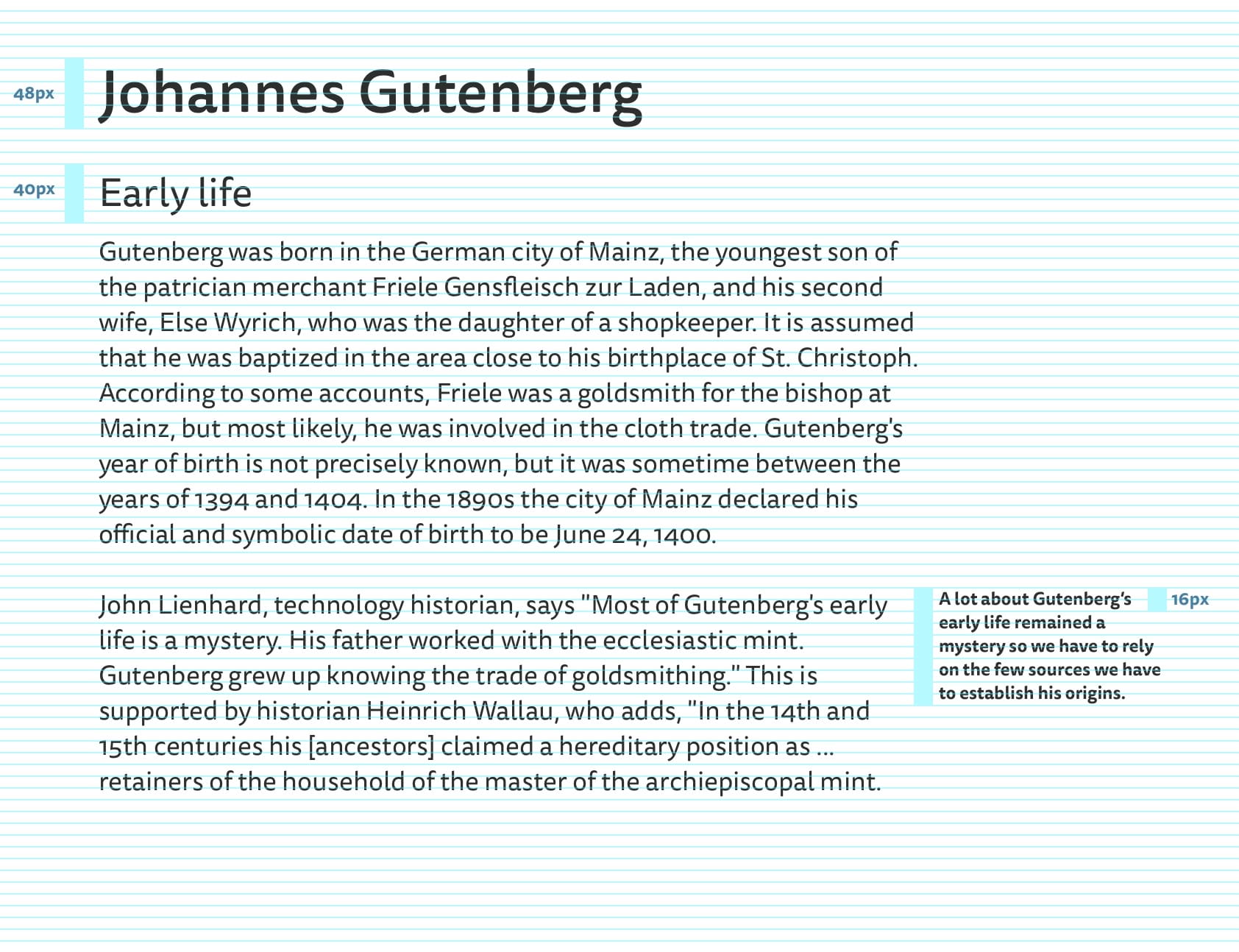
FIG 13: With our changes to the line-heights, all type now aligns to the baseline grid.
That’s pretty much it! It doesn’t look vastly different but the consistency is assured. The trickiest part about aligning type to the baseline grid is making the line-heights work. They need to fit the grid so the grid needs to be flexible enough for it to work.
Aligning components to the grid
Ok, so far we saw why and how to establish a baseline grid and how to align type to it. This should work well for websites with mostly text content like articles or blog posts. But what about websites with more complex layouts?
At GitLab, we use a baseline grid of 8 pixels but 4 pixels for type. What does this mean? Well, the two are compatible because 4 × 2 = 8. So there’s no problem there. In practice, this means we use the 8-pixel baseline grid for aligning components and type, but we can resort to aligning type to the 4 pixels grid if we need to. For example, our base font size is set at 16 pixels and uses 20 pixels as its line-height. This means that the ratio between the font size and its line-height is 1.25 which is good for paragraph text (multiple lines, long text) as well as for labels (mostly single line, short text). If we didn’t use the 4 pixels baseline grid for type, we’d be forced to use 24 pixels for the line-height. The ratio between font size and line-height would then be 1.5 which we tried at some point and realised it was too large. We need more flexibility when we work with type in our UI, and the 4 pixels baseline grid that fits perfectly our main 8 pixels baseline grid gives us exactly that.
A baseline grid can be very helpful even for complex layouts and UIs. We usually just need more flexibility to make things work. Here are a few examples from GitLab of how certain components and full UI layouts work with the baseline grid.
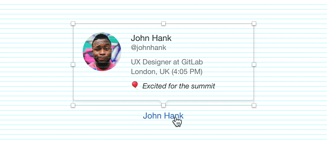
FIG 14: Consistent spacing and neat layout are now easier to achieve. The usefulness of the nudging and shoving keyboard shortcuts is clear here.
And it also works nicely with really complex layouts like the following one:
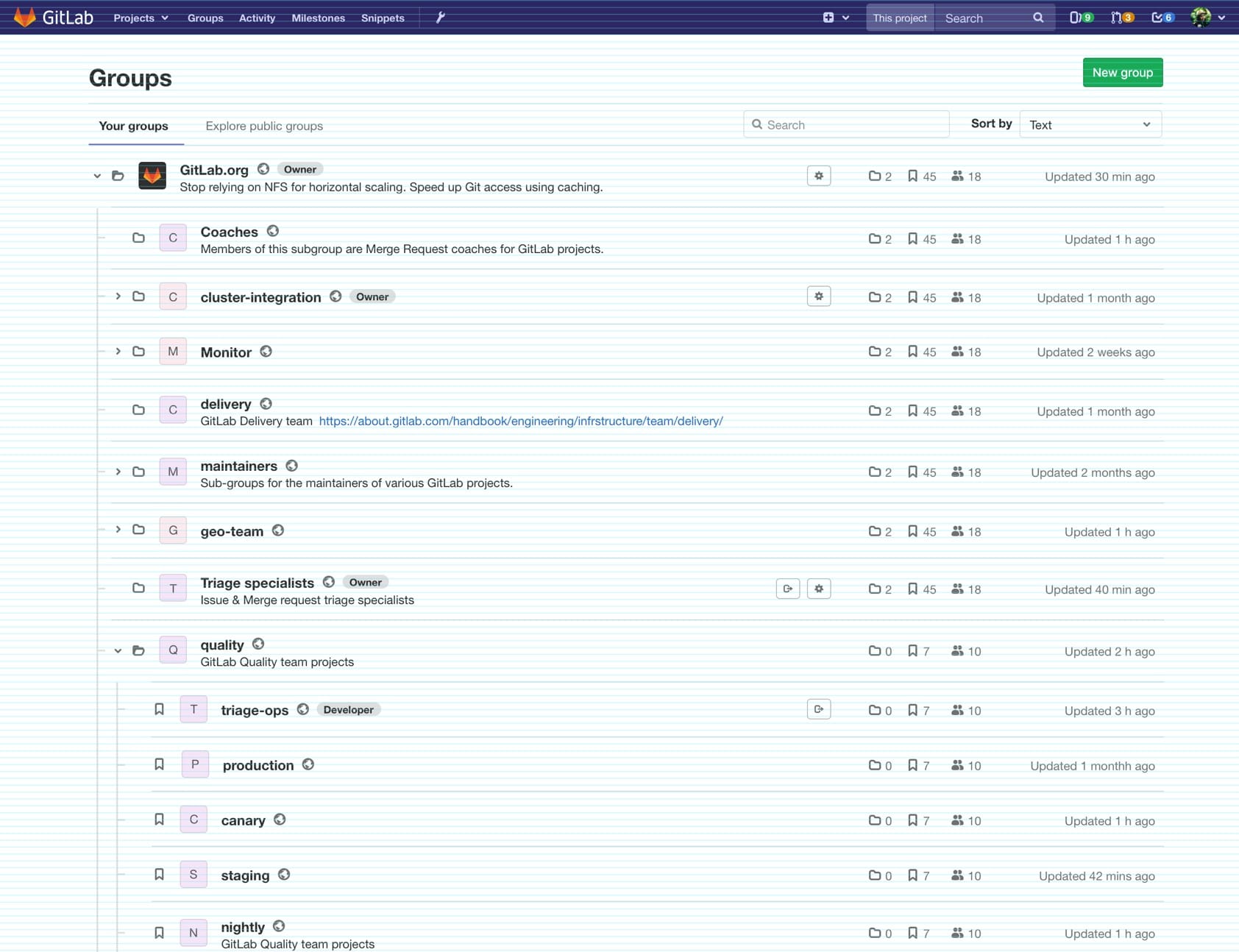
FIG 15: There’s a lot of information on this screen and we can clearly see consistent vertical rhythm doing its job. Everything is neatly spaced apart.
I hope you found this post useful and that it inspired you to start designing with a baseline grid. I’m sure that you, your team and your users will benefit from it.