A Guide to Combining Fonts
![]()
~ 11 min read
This guide is based on chapter 5 from the book Better Web Typography for a Better Web by Matej Latin. The book consists of 13 chapters through which the reader designs and builds an example website.
Do you really need more than one font?
Bad typography on the web in the early years of the internet was often blamed on the poor range of fonts available. But we already learned that typography is not merely about choosing fonts. One of its goals (probably the main one) is presenting information in a way that is readable and easy to consume. Before we start looking for a font to add to our design and combine it with our body text font, we need to ask ourselves: do we really need more than one font? Don’t just add one for the sake of it. There’s no rule in typography that says the more fonts used the better (the contrary is probably more true). There’s no guarantee that adding another font to your website will improve its typography. I like to keep my typography simple and solid. Like a machine—the fewer movable parts, the less likely it is to break down.
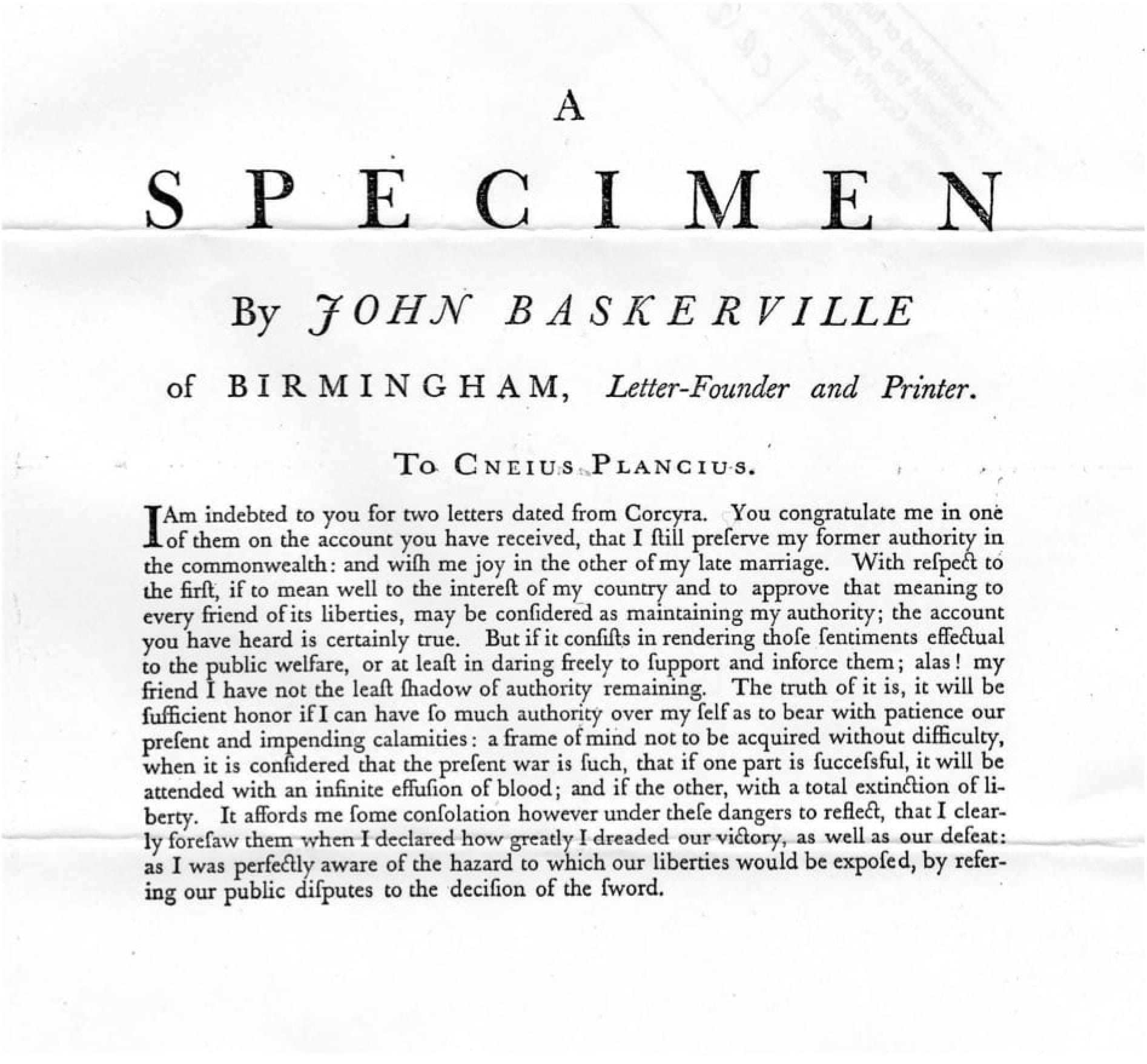
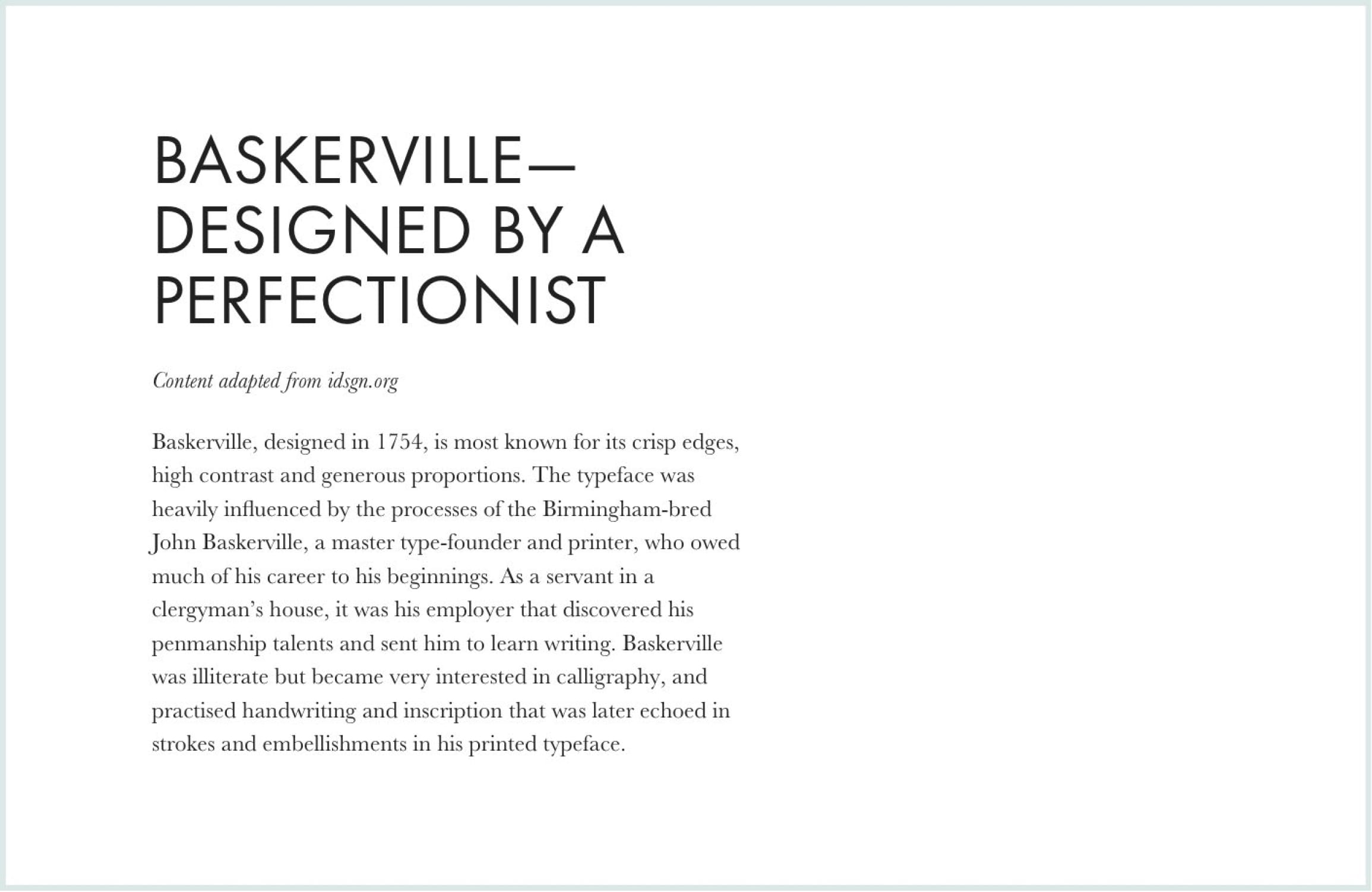
18th century typographic work in a single font—Baskerville—by John Baskerville himself.
It is a safe rule not to mix different styles of letters on the same page, or different faces of type in the same book.
—Eric Gill
Eric Gill, quite a controversial man but a great typographer (among many other things he did), had a similar opinion. There’s not much you can do better with more fonts than you can with a single one. Try to challenge yourself and create a website using one font only. If only for experiment and fun, I think everyone should try that as there’s lots to learn from it.
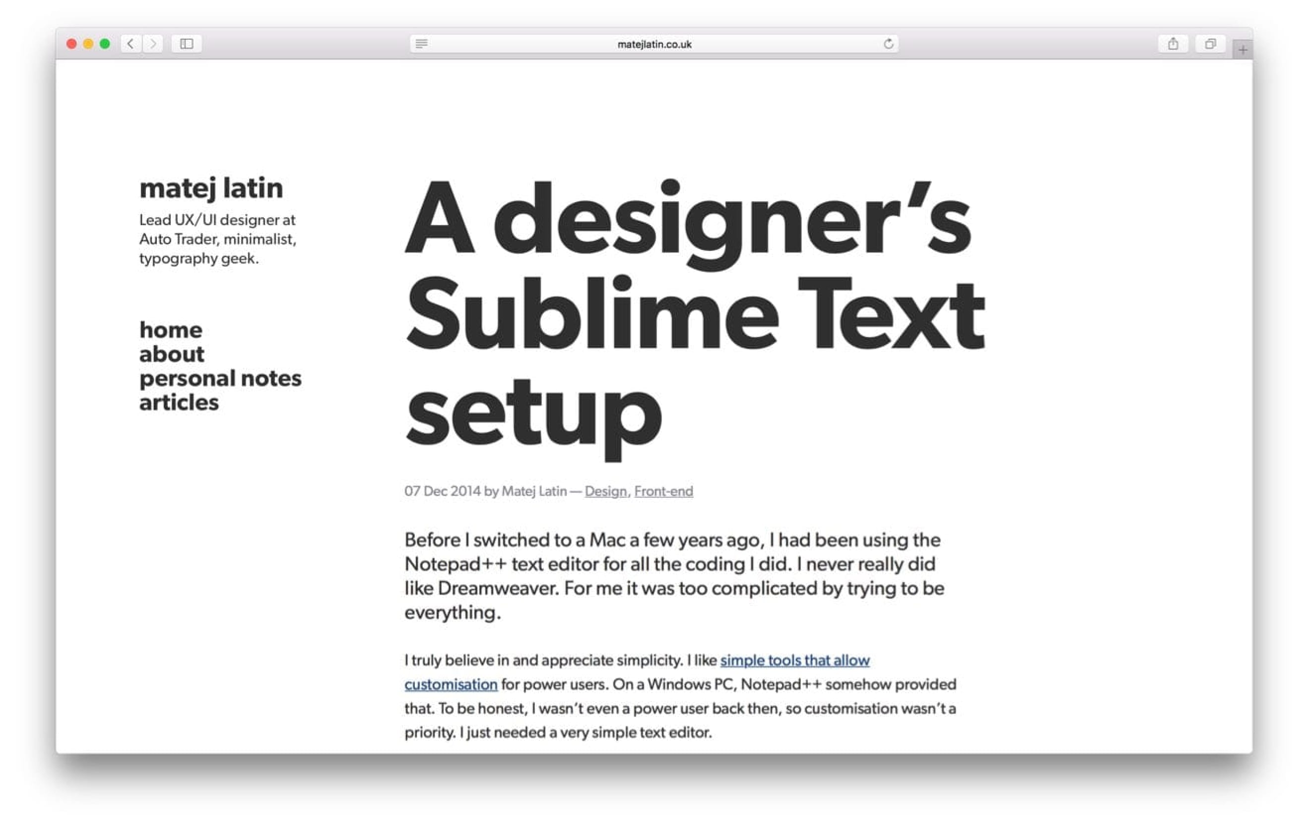
I recently redesigned my personal website. One of the things I wanted to stand out was the minimalism that is such a big part of my life. To best do that, I decided to use a single font. I also wanted the website to be typography-focused (literally 95% of it is typography) on top of that, which made the challenge even harder. I was looking for a clean, crisp and simple sans-serif font that would emphasise that even more. In the end I chose Gibson from Canada Type. It has a modern, but slightly friendly feel to it. And it works great when set to huge sizes. It was a bit of a challenge to get the typography right for that website, but I managed to do that just using different sizes, weights and only two colours—dark and medium grey.
I included that example in the book, because it’s great at showing how much can be done with a single font. Not only by typography masters like John Baskerville, but also by self-taught designers like me. Do you think you still need another font for your project? No worries, read on.
A four-step process for combining fonts
If you still think you need more than one font for your website, you’ll need a systematic process to guide you. The one I describe here is an adapted version of the one described in Tim Brown’s book Combining Typefaces. Here are the four steps:
- Find an anchor font for your main body text
- Find a few secondary fonts for possible combinations
- Evaluate the combination
- Eliminate/choose fonts combination.
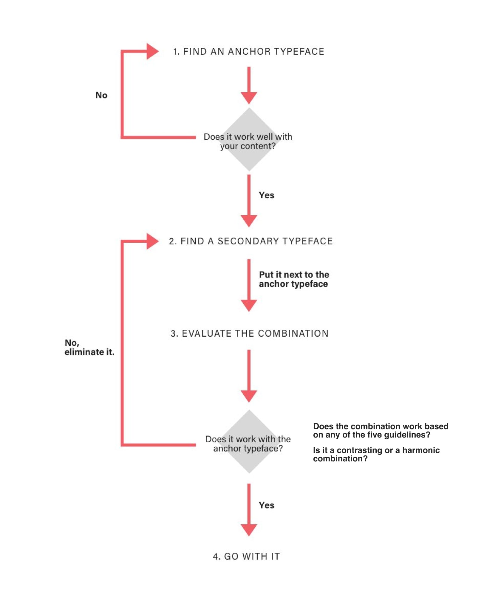
The process above assumes you’re starting out with the font for body text already selected. The process can easily be reversed if you want to start with a title font first.
There are two approaches to combining fonts and five guidelines that can help you with step 3 from the chart above. Let’s take a look.
Two approaches to evaluating font combinations
Contrast and harmony are the two most basic principles when it comes to design, architecture and art. Both are crucial when it comes to typography as well. Some evaluations described in this process will only work as a contrasting combination, some only as a harmonic one and some as both. Let’s take a look at a real-life example.
Contrasting combinations

Take a look at the photo of the office above. How would you describe it? It feels modern, right? But there’s something else. It feels warm, too. Unusual for offices with modern, almost futuristic furniture. Yet, this one does. The brick wall brings this feeling of warmth and cosiness to a room that would look cold without it. The same can be applied to combining fonts.
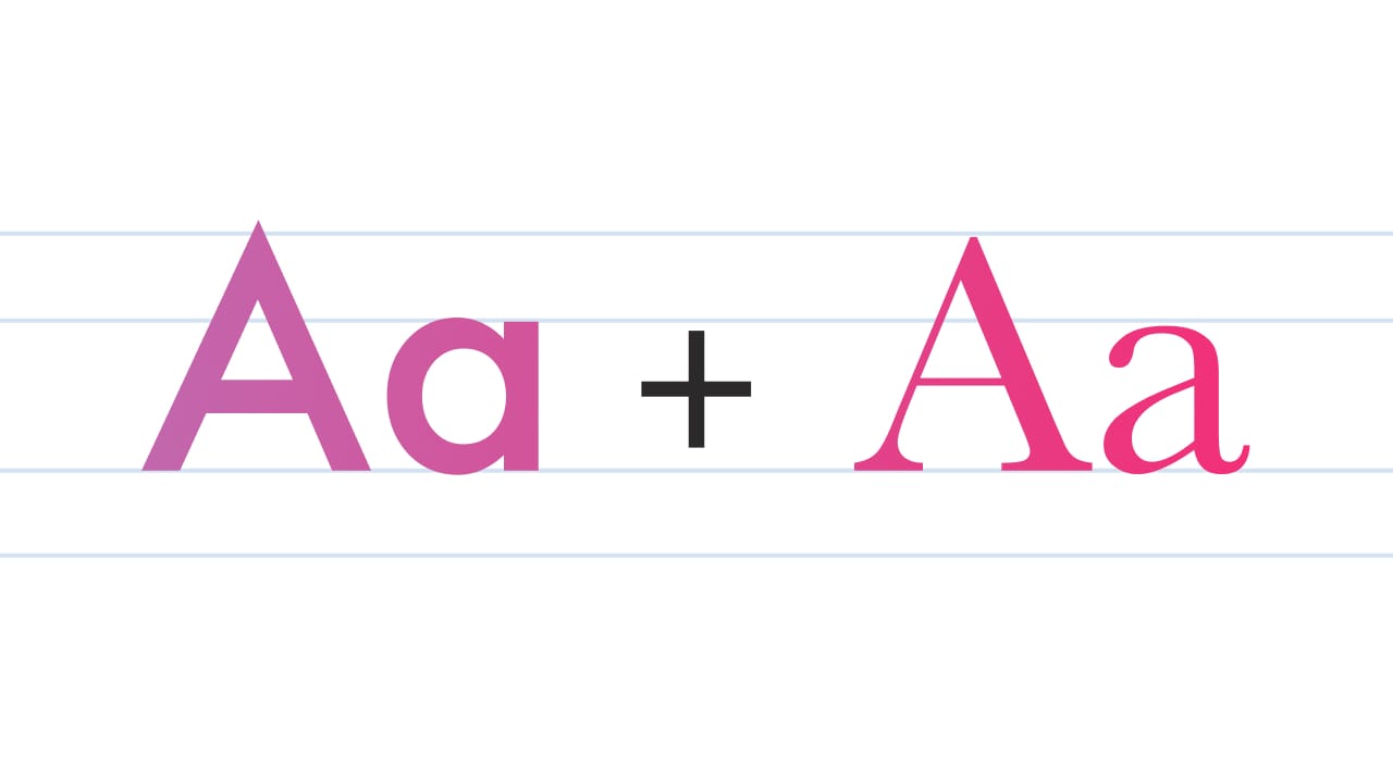
How can we apply this to typography? Let’s take the Baskerville font for our main body text. Baskerville was designed by John Baskerville in 1754. It was a modern font at the time as it was pushing the boundaries of what was possible in typography. It’s perceived as a classic these days though. It evokes feelings of trust and warmth. Based on an experiment, conducted by Errol Morris, it’s the most trusted font around. Now let’s complement it with an uppercase-only Futura for headings. Futura was designed by Paul Renner in 1927. It’s a geometric sans-serif font. It was a modern geometric sans-serif font when it was first designed and it still feels modern to this day.
Our design looks rich. Luxurious. It has a story to tell. But most importantly—it works. It uses two font classics from different time periods. Each comes from the opposite of the scale between modern/cold and classic/warm. Together, they’re like fire and ice that turn into flowing water.
Harmonic combinations

Harmony is exactly the opposite of contrast. So if you look at the photo of the office above you’ll notice how modern it looks throughout. Minimalistic space with no decorations, combined with modern-looking furniture. How could we replicate something like this in typography?
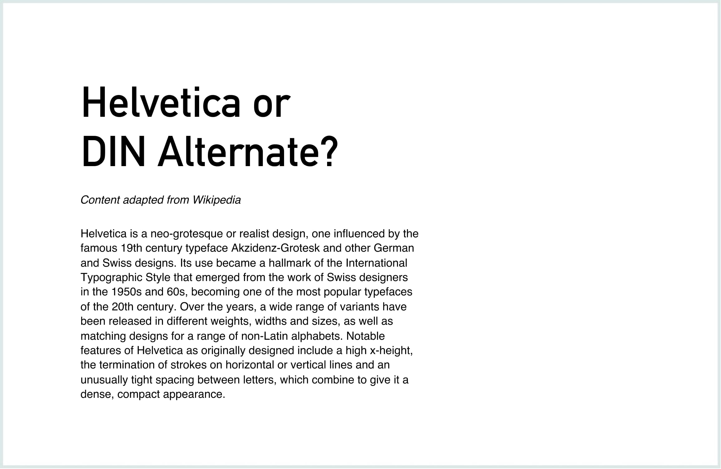
We used Din Alternate for the title and Helvetica for body font in the combination above. Both have a slight industrial and modern feel to them. There are many features that makes the two fonts similar but yet, they’re different enough to work well as a combination.
Five guidelines for combining fonts
Combining fonts with similar x-height
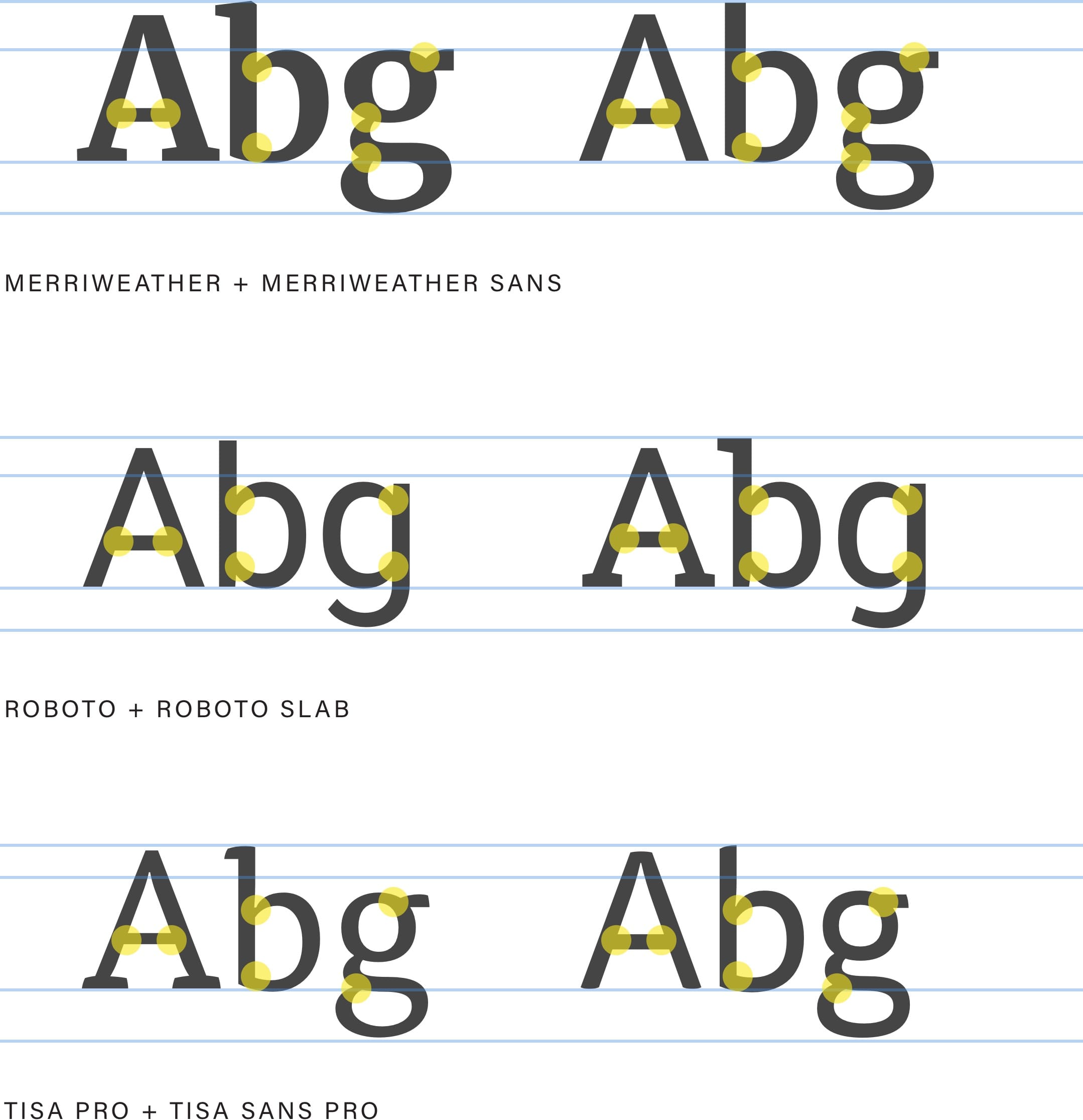
Remember when I told you to remember x-height in the chapter about the anatomy of typefaces? This is where it comes handy. Another way to evaluate a font combination is to take a close look at their x-heights, to see if they match. They should be very close at worst. Fonts with similar x-height work better together as they have a similar visual weight. Especially when it comes to vertical rhythm (something we’ll cover in the next chapter).
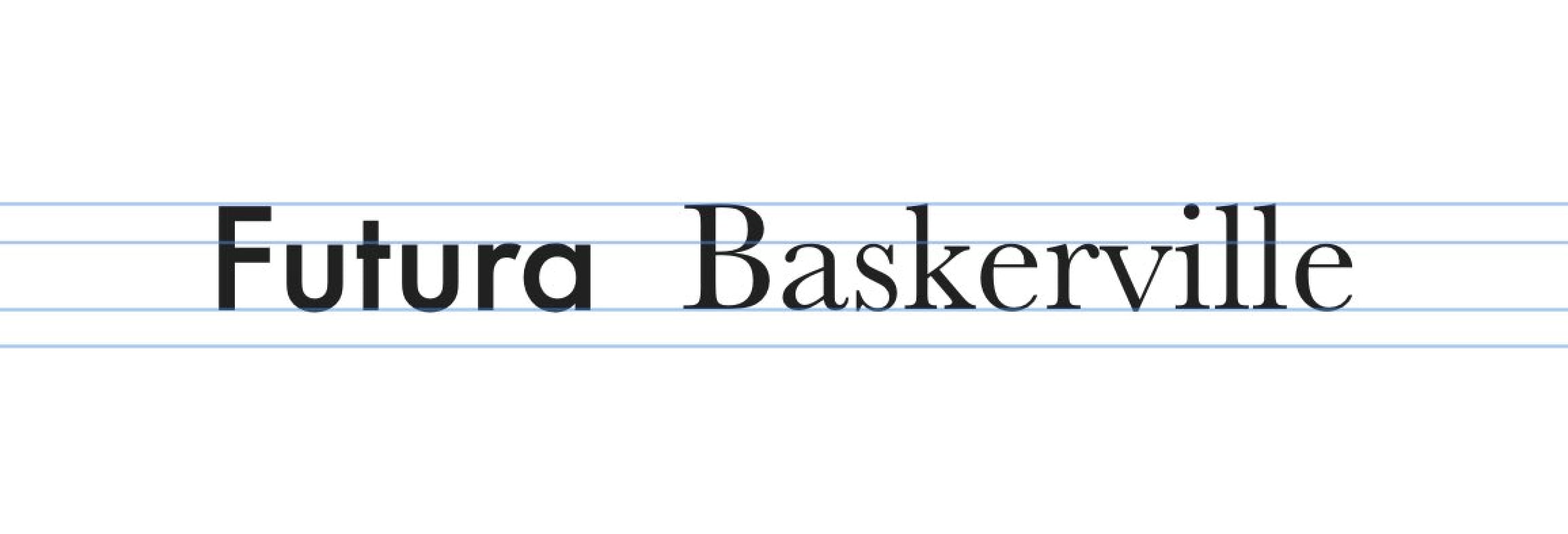
Above: Futura and Baskerville have a similar x-height which reinforces them as a good font combination.
This combination works with either contrast or harmony. Either choose fonts that have matching x-height or fonts that have very different x-heights. Don’t go with something in between.
Combining fonts from the same foundry
I noticed something through all the typography work I did so far. By choosing fonts, I tend to keep coming back to a certain few type foundries that produced them. Germany-based FontFont is one of them—I’m a fan of Erik Spiekermann’s work. London-based Dalton Maag is another one. There were occasions when I took time to simply explore all the fonts coming from these two foundries and there were hardly any that I didn’t like. It seems like their styles match what I most commonly look for. And that’s not a coincidence.
You see, when a type designer starts to work on a new font, they rarely start from scratch. It’s more common that they start designing a new font on top of an existing one. They use the same structure but still come up with a design that is original. But because of that shared underlying structure, the fonts can usually work well together. Combining fonts that came from the same foundry is therefore a good bet.
Combining fonts from the same author
Similar to combining fonts based on the foundry that designed them is combining them based on their author. As mentioned, type foundries commonly use a base underlying structure to produce different fonts. It’s probably even more common for font authors to do that. Combining, for example, fonts that Adrian Frutiger designed is almost a sure bet.
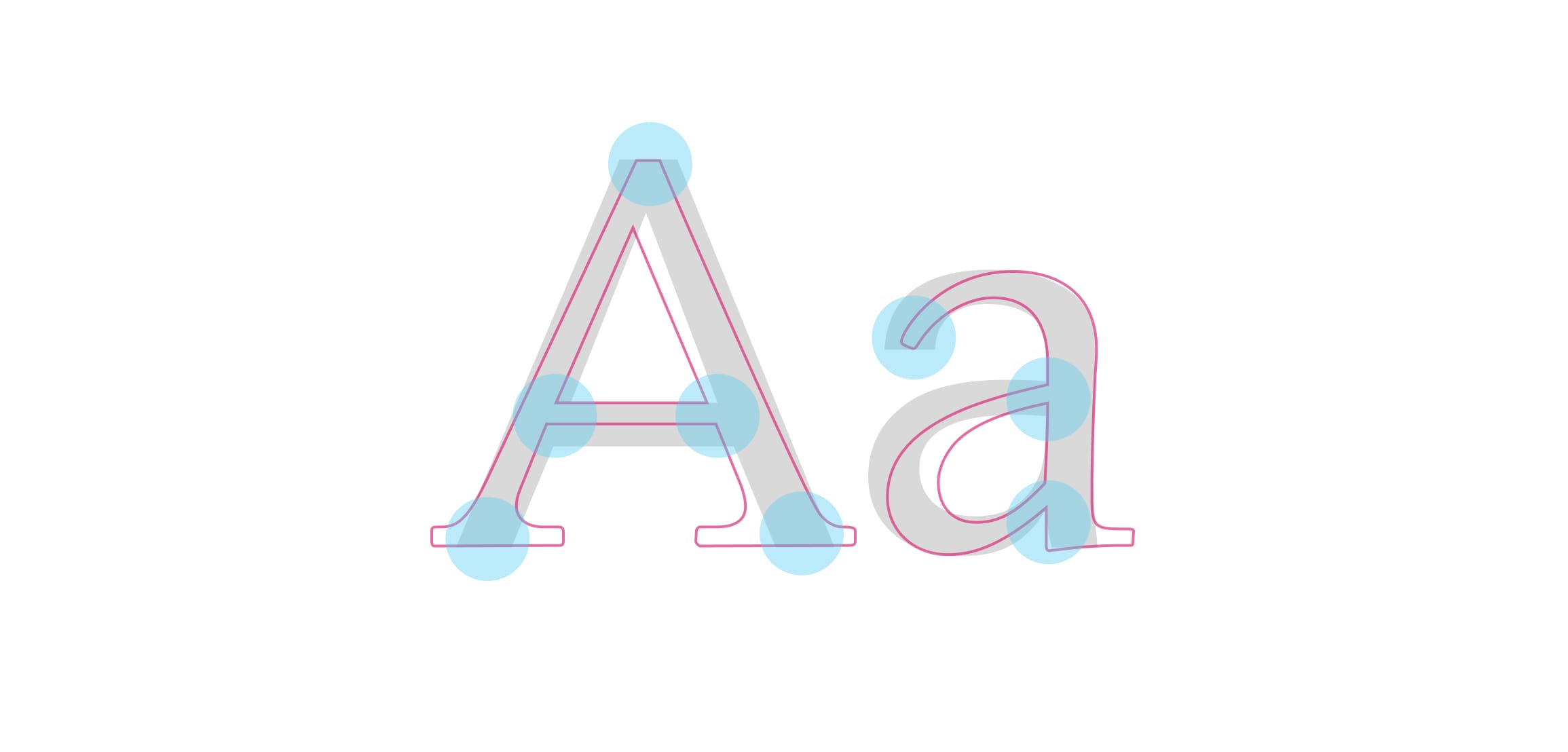
Above: Univers in the background and Apollo outlined in the foreground (Both designed by Adrian Frutiger). Notice how different they are in style but many key points intersect almost perfectly.
I still recommend putting the two fonts next to each other and comparing them, just like we did with Apollo and Univers above. Try to establish whether a combination works or not, in a similar way to how we compared fonts based on x-height, but focus more on the overall proportions. At this point, you need to really study the two fonts. I told you this takes time, remember? This combination should be used as a harmonic, not a contrasting one.
Combining fonts based on historic era
Evaluating fonts based on the time period works well with contrast or harmony. You could choose two fonts that are very far apart or from the same time period. Both should work.
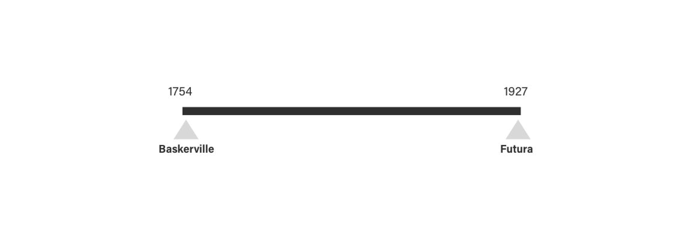
There’s almost 200 years separating the creation of Baskerville and Futura.
I find that this approach works best with fonts that were designed before the digital revolution. There are just too many fonts being designed at the moment. Pairing them solely on the fact that they’re from the same time period might not be enough.
Using super typefaces
There are the so-called super typefaces. Typefaces that come in both sans-serif and serif styles. Merriweather and Merriweather Sans are great examples. So are Roboto and Roboto Slab. You simply can’t go wrong by using the styles of one super family. This can be a great way to start developing your font-combining skills.
Some typefaces come in both serif and sans serif (or even more styles). You can’t go wrong if you combine these.
Better Web Typography for a Better Web
Free Course
Join 30,000+ designers and developers, get 7 free lessons and unlock your better web typography skills.
Learn more →Just cool web typography stuff, no spam.
An example of combining fonts
This guide is an adaptation of chapter 5 from the Better Web Typography for a Better Web book, so at this stage, the readers are 4 chapters in and already went through the process of choosing the main (anchor) font.
Anchor font
OK, we learned a lot in the last chapter. Let’s put that newly acquired knowledge to use. Following the process described above we must start with the anchor font. We have that, as we already decided what we wanted to use in Chapter 3 when we chose FF Meta. Let’s go straight to step 2.

The example of content for the website set in FF Meta—the font we chose earlier in the book.
Finding candidates for possible combinations
We’re looking for a font we can use for headings. Let’s review the key points we wrote down from the brief when we were looking for the body text font:
- the website needs to feel modern and up to date; its content needs to be easy to read to cater for the busy but curious technology enthusiast
- the website must be content-focused, with very few but high-quality and well-targeted ads as any website with that kind of traffic and audience, it must work across different devices.
- Let’s write down a few key points that will help us find the heading font, just like we did for body text:
- definitely sans-serif (we need something that will be of high contrast compared to our body text font)
- needs to feel modern which translates to larger x-height
- needs to work well with larger font sizes the more weights and styles the better
- OpenType features not required (besides ligatures, I rarely use other OpenType features with headings)
- needs the English subset of characters only
- needs to render well on the common screens (both mobile and desktop).
With that written down, we’re ready to start searching. Let’s fire up TypeKit and find a few candidates. Let’s set the filters so we can see sans-serif only, recommended for headings, heavy weight and large x-height. The large x-height will match what we’re looking for but also the x-height of FF Meta we chose for body text.
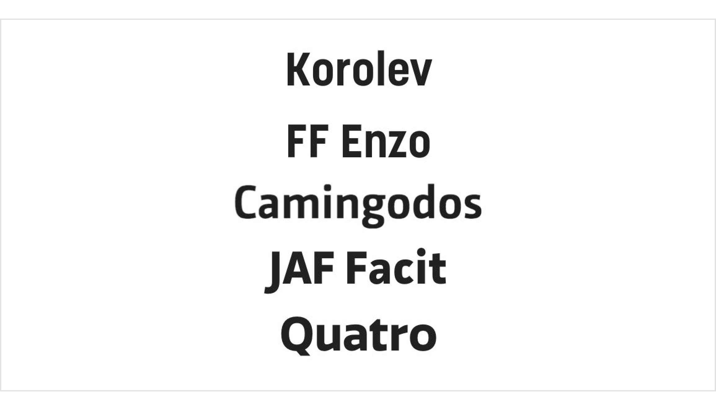
I go through the 40 results that came through and shortlist the following: Korolev, FF Enzo, Quatro, Camingodos and JAF Facit. Only five; I guess I have a good idea of what I’m looking for.
Evaluating font combinations
Because there are only five we can dive straight in and start experimenting with them. Let’s add them to our project in TypeKit and load them up in our example website. Then we copy some of the titles from our example content article and add them in.
Code example from this chapter can be viewed at CodePen.
At first, let’s evaluate the candidates at their default size and colour. Maybe we can eliminate some of them without digging too deep. Indeed, there’s something that doesn’t feel right about JAF Facit so we can eliminate it. Some characters, like “w” and “y”, in Quatro are quite uniquely designed and they stand out. In a bad way. Let’s cross it off the list. Sometimes it really is that simple. Taking a closer look at FF Enzo reveals it’s clearly humanist style (noticeable contrast and slightly sloped) which is not something we’re looking for. That’s the third one off our list.
Eliminating font combinations
We were able to eliminate three combinations in the evaluating stage, so that leaves us with two possible candidates: Korolev and Camingodos. Let’s take a closer look at these two and experiment further.

Camingodos also has a slight humanist feel to it but it’s not as clear as it was with FF Enzo. The characters are slightly narrower and x-height is large. There’s a certain square feel to it which I’m not sure about. It feels like it’s trying to be tech-y but not going all the way (because of that humanist side). Let’s take a closer look at Korolev.

Korolev feels unique. Very narrow characters, large x-height and it seems like it’s slightly condensed. It also has a square feel but not as obvious as Camingodos. Let’s try the two in the colour that they’ll most likely be used—red.

Let’s try a slightly lighter weight as well—medium instead of bold.

Now that’s interesting. Korolev literally comes to life when slightly lighter. It is now in complete contrast with the body text font. Camingodos, on the other hand, looks strange. It lacks identity and with that doesn’t stand up well against the body text font. The main problem with it is that it’s on the fence—it’s too similar to the body text font to be truly contrasting and yet contrasting to some degree. The thing with contrast in typography is that it needs to be either clear or non-existent. This makes the Korolev a clear winner. Our final result looks like this:

Take a look at the live example at betterwebtype.com/book/c5.
More about better web typography in the book
From here on, the book explores rhythm in web typography, modular scales and what “meaningful typography” means, composing pages, responsive web typography and also dives into 4 additional chapters about micro typography. This is the live example website that gets built as your progress through the chapters.
Did you enjoy what you just read? Great, I have much more of this stuff in my book about web typography that I wrote. It’s very popular with web designers and developers, you should definitely check it out.
Resources & tools for combining fonts
Here’s a list of really cool and useful tools and resource when it comes to combining fonts.
-
Combining Typefaces
Tim Brown’s free book on combining -
Font combinations
Canva’s tool for finding awesome font combinations. -
Typespiration
Free font combinations with color paletters and ready-to-use code. -
Archetype
Create beautiful web typography designs and font combinations in the browser. -
FontPair
A blog showcasing font combinations from really cool-looking websites. -
Typ.io
Find inspiration for combining fonts.