Cool new stuff in web typography in May ’19
![]()
~ 2 min read
What’s up? I’ve been working on something for the past few months that I’ll share with you in a couple of days. It’s just not completely ready yet but I’m really excited about it! 😄 Anyway, here’s what’s new in the world of web typography.
News
- I did an interview with the awesome folks at Design Decode where I talk about life, design, minimalism, and how it all works together. I feel I learned a lot about myself by answering these questions.
- Just a gentle reminder, if you like this newsletter please consider buying my book. It helps me spend more time on the Better Web Type project.
Featured
Getting to the bottom of line height in Figma
I’ve been using Figma for my personal projects and I must say I’m becoming a fan. In this post, Marcin Wichary takes a look at line height and the recent changes to how it’s handled in Figma.
Font of the month
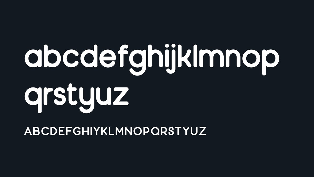
Moon
I found this font and loved it straight away! It comes in 3 weights (regular, light and bold) and the recently updated version with a lowercase font as well. You can get it for free with a personal license.
Cool Articles
Down the font legibility rabbit hole
I loved this post about what makes a font legible and what are the features that make them legible and how we can use these features.
Switching to variable fonts
Mathew Strom writes about switching to variable fonts and what he learned from it. This was a very interesting read!
The history behind 5 classic typefaces
Who was Garamond? Most of us know the typeface he’s famous for but what is the story behind the typeface? Read about it, and 4 other classic typefaces here.
Did you know?
Line height on the web is different from line height (or often called leading) in print. Letters fall right in the middle of the line on the web, unlike in print where they sit directly on the baseline.
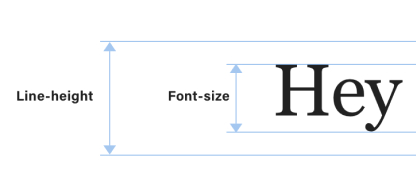
Photo of the month
What font do you want to use? 🤔 I went to the old printing works on the Bled Castle where they have a reconstructed wooden printing press from the times of Gutenberg. Do you notice the small scribbled letters in every compartment? @matejlatin.
__
That’s it for this month, see you in June! 👋
Cheers,
Matej