Preloading fonts: when does it make sense?
![]()
~ 6 min read
Yeah, that jarring transition was unavoidable. Flash of invisible text (FOIT) is supposed to improve that but because it hides the website’s text until the font is loaded, it introduces accessibility issues.
I just launched a website for UX Buddy—a new side project I recently started working on. I went through a long process of choosing the right font for it which I documented in my How to choose a font for a project article. Now I wanted to make sure that the visitors of the website don’t experience the jarring transition between the fallback and custom font while it’s loading. Could preloading the custom font help with that?
Default web font loading
Gilroy is a unique-looking geometric sans serif font and it’s hard to find a similar fallback font. My font stack for using it in CSS is the following:
font-family: "Gilroy", Futura, -apple-system, BlinkMacSystemFont, "Segoe UI", Roboto, Helvetica, Arial, sans-serif, "Apple Color Emoji", "Segoe UI Emoji", "Segoe UI Symbol";This means that, by default, the browser will first show all my headings set in the first font that is available on the user’s computer. My first fallback font is Futura but because it’s not a common font on Mac OS or Windows, the browser will most probably default to Roboto, Helvetica or Arial. Neither of those is a good option because they’re all very different from Gilroy. I optimistically set the first fallback font to be Futura because at least it’s a geometric sans serif font—kinda similar. Still, the website loading resulted in a jarring transition.

The browser shows the text set in Futura first (the first fallback font from the stack available) and only switches to Gilroy once it’s loaded. (Source)
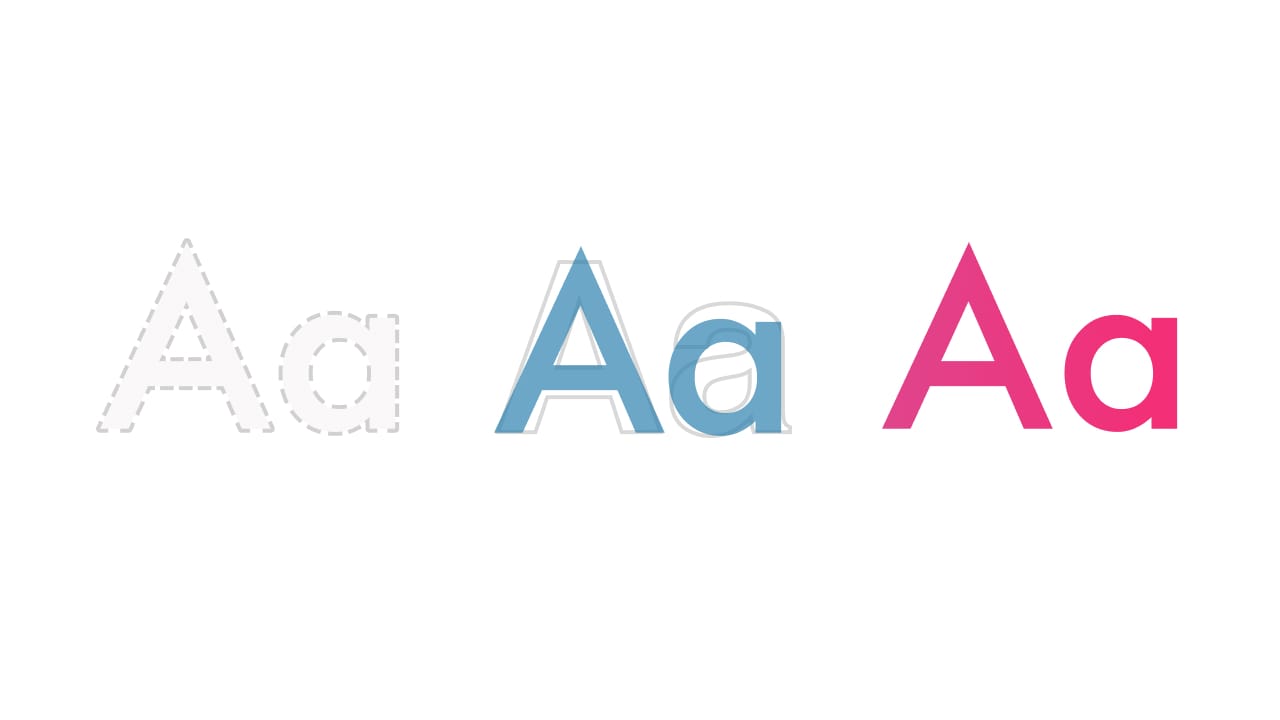
For a type geek like me, that’s unacceptable. In the past, I often relied on hiding the text until the custom font was loaded so the user experienced the flash of invisible text (FOIT) during the website loading. I later learned that this can result in accessibility issues or, in some extreme cases, custom font not loading at all and all text on the website remaining invisible! 😱 So now I wanted to find out if preloading fonts or using font-display can help me with that.
Font preloading
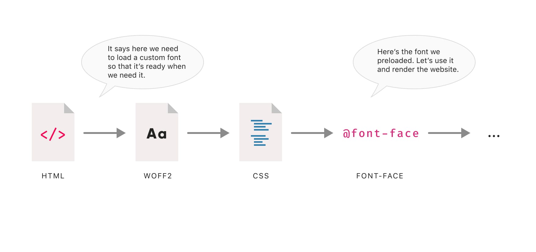
So the first thing I wanted to test was font preloading. When do the fonts get loaded by default? Does preloading fonts change that? Based on MDN’s documentation, preloading content means:
The preload value of the
<link>element’srelattribute lets you declare fetch requests in the HTML’s<head>, specifying resources that your page will need very soon, which you want to start loading early in the page lifecycle, before browsers’ main rendering machinery kicks in. This ensures they are available earlier and are less likely to block the page’s render, improving performance.
So here’s how the website is loaded by default:
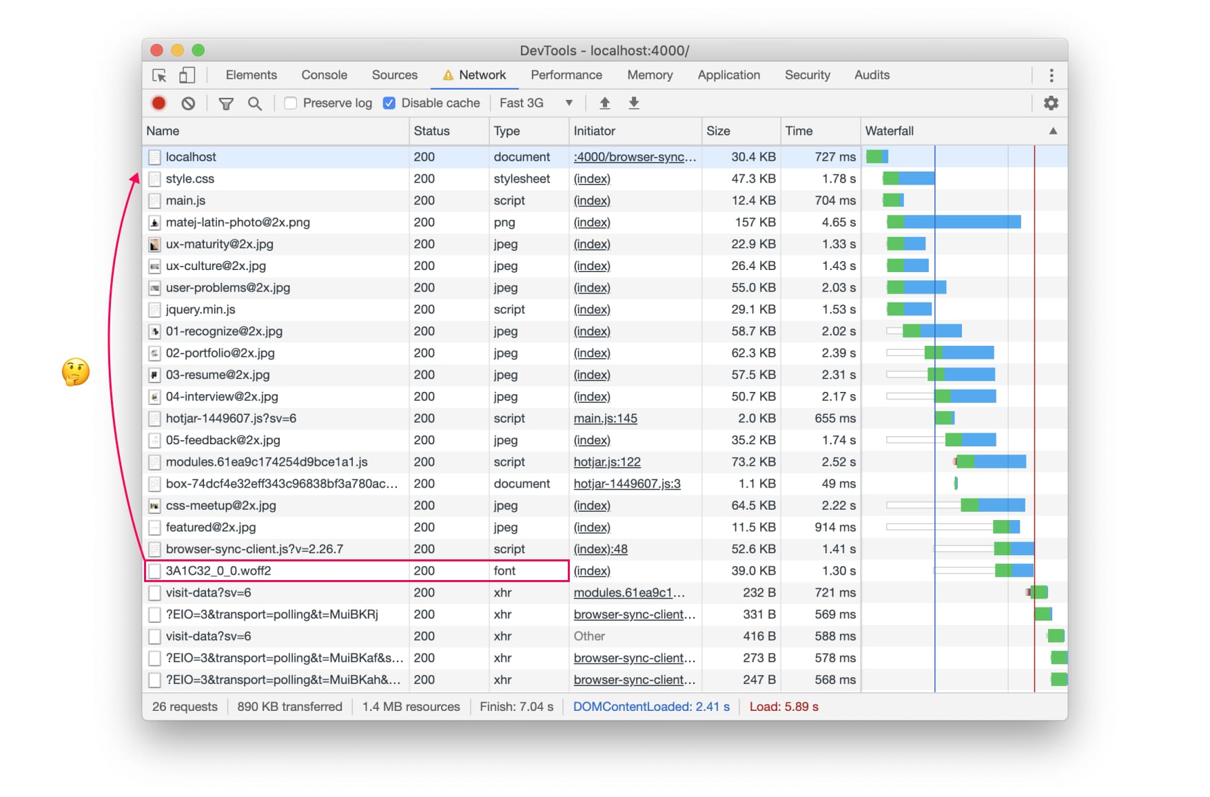
The font is among the last things that get loaded by the browser. 3G simulated loading took 7.04 seconds to load.
The fonts are pretty much the last things that are loaded. No wonder we have that jarring transition from the fallback to the custom font. So if I preload my custom font, will the website loading waterfall chart reflect that? And more importantly, will it have a positive effect on the website loading? Will it get rid of the jarring transition between fonts?
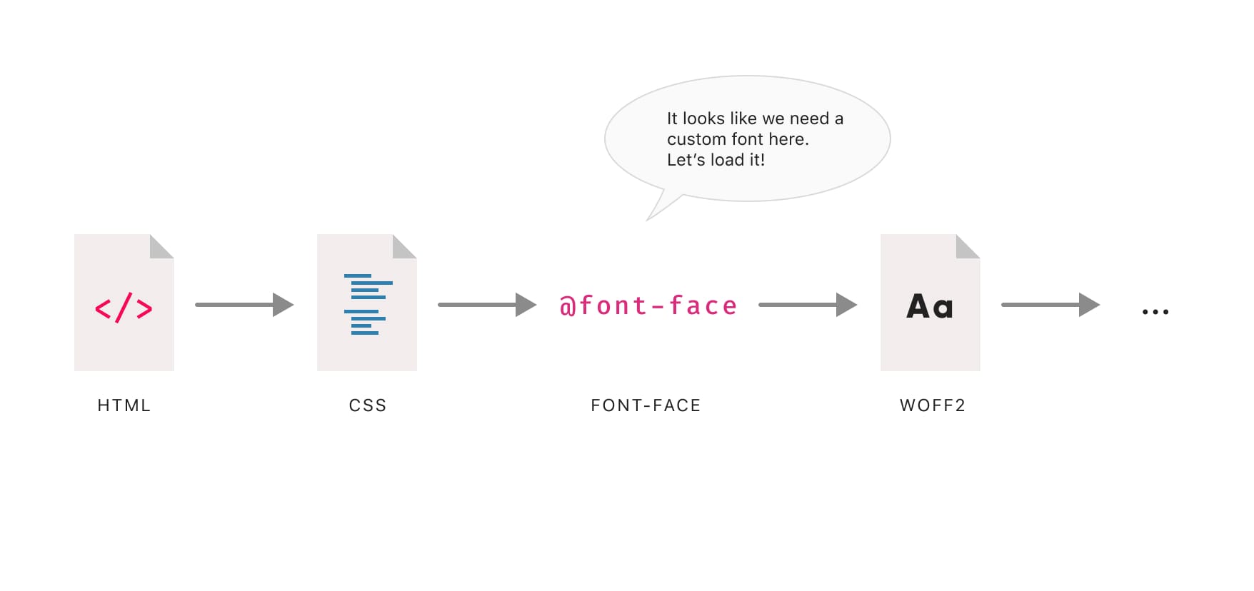
So I went ahead and added the following to the <head> in my HTML:
<link rel="preload" as="font" href="/assets/fonts/3A1C32_0_0.woff2" type="font/woff2" crossorigin="crossorigin">I added this line of code even before the one that loads the CSS for the website. Let’s take a look at the effect it has on website and font loading.
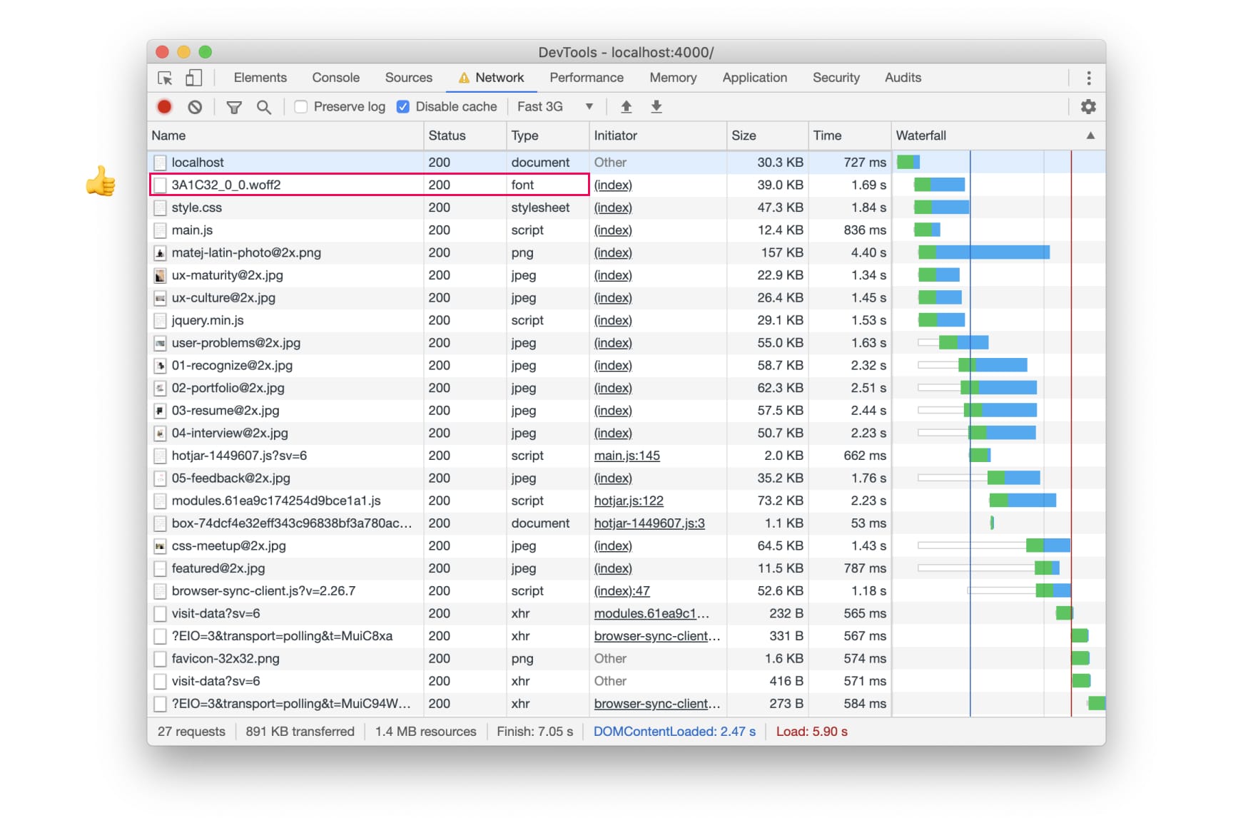
The font is now among the first things that the browser starts loading. 3G simulated loading took 7.05 seconds to load, so no major impact on performance.
Ok, this is really interesting. It’s pretty much how I expected font preloading would work. We basically tell the browser to start loading the content before it stumbles upon it. Unlike the browser, we know it’ll need the fonts to fully load the website so it’s completely fine to tell it to start loading the fonts sooner. So instead of the default loading process:
we tell the browser to load the font immediately because we know that it’ll need it later on:
That’s all cool, but does it actually help removing the jarring transition between the fallback and custom font? Here’s how the website loads now:

The browser starts to load the font right away and only starts rendering the website once the font is loaded. (Source)
Do you notice the difference? The text shows up a bit later than in the default loading process but it’s immediately set in Gilroy. No nasty FOUT, that’s exactly what I wanted! 🥳 But how does this compare to controlling when and how a custom font shows with font-display? Let’s take a look.
What about font-display?
Geoff Graham wrote a great CSS-tricks article explaining how font-display works so I won’t go into details here. The two main options I want to take a look at are font-display: swap and font-display: block. What effect do they have on font loading and when/how a custom font appears on the website. They should be added to the @font-face, so something like this:
@font-face {
  font-family: 'Gilroy';
  src: url('/assets/fonts/3A1C32_0_0.woff2') format('woff2');
  font-weight: normal;
  font-style: normal;
  font-display: swap;
}
Font-display: block instructs the browser to hide all text until the custom font is loaded, pretty much resulting in FOIT.
Font-display: swap on the other hand instructs the browser to swap the custom font with the fallback font while it’s loading, resulting in FOUT.
Let’s take a look at a side-by-side comparison of the three. This should help us decide which one to use and in what case they should be the preferred option.
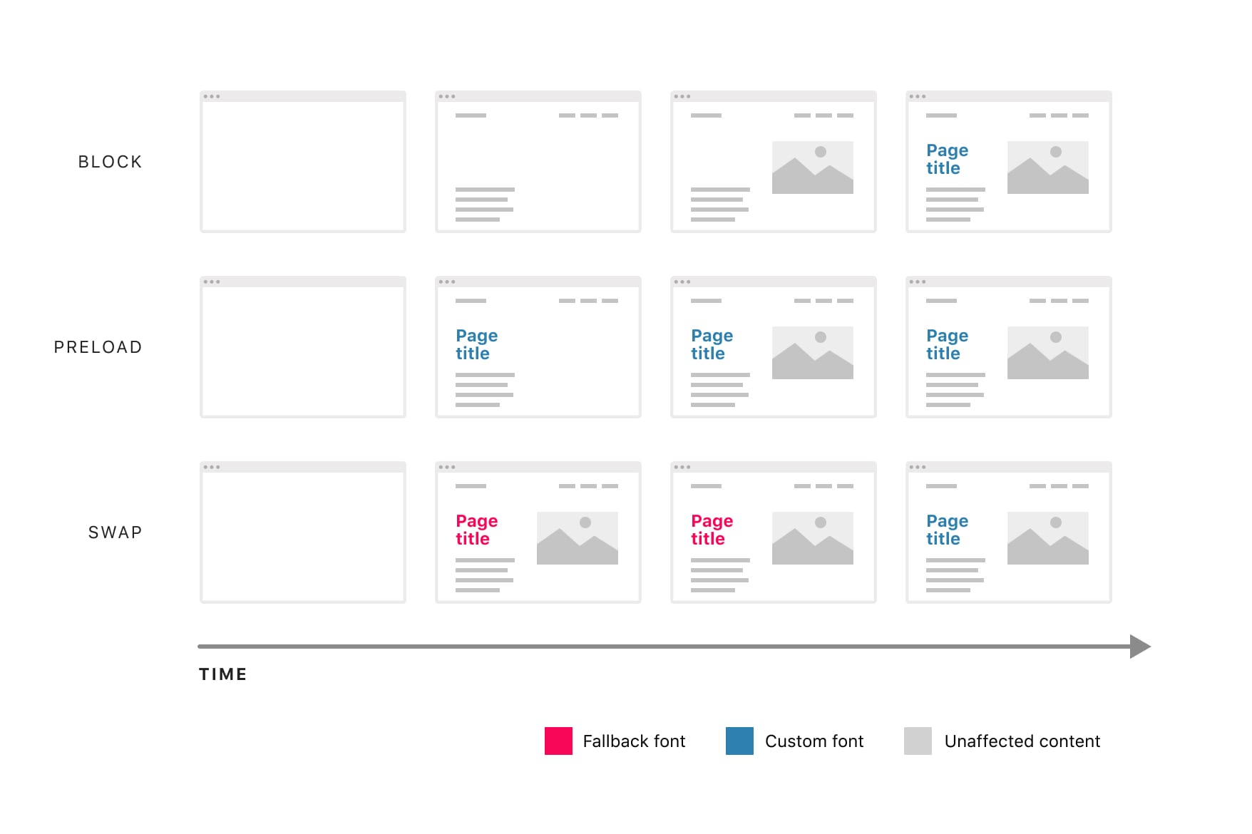
The swap option shows the text the soonest but it shows it in the fallback font first and switches to the custom font later. The block option is the last one to show any text but when it does, it’s set in the custom font. The font preloading option is somewhere in between. It doesn’t take as long as the block option to show the text and when it does, it’s set in the custom font. It seems like a good compromise.
Conclusion
So which of the three options should we use? There’s no simple answer. The best answer I can give is: it depends on your preference and the fonts you’re using. If perceived performance is what you’re after, go with the swap option. I’d especially encourage you to use this option if your custom font is quite similar to a fallback font or if you don’t use typography on your website as prominently as I do in this case (large titles set in a custom font). If you do and don’t want that jarring transition that the FOUT results in, go with font preloading.
You could even use a combination of the two: headings are generally larger and the FOUT is more obvious there. Body text is smaller and if you use a different font for it, you could preload the custom font for the headings and use the swap option for the body text. I can’t really see when the block option would make sense. Maybe if font preloading isn’t possible for some reason? Let’s take a quick look at pros and cons for each of the options.
Font-display: swap
Pros
- The website becomes readable pretty much immediately
- Improved perceived performance
Cons
- The jarring transition from the fallback to the custom font (nasty FOUT)
- Can take a while to load the custom font
Font-display:block
Pros
- No jarring transition from the fallback to the custom font (nasty FOUT), the text is hidden, the browser starts rendering the website regardless of the custom font being loaded or not
Cons
- The website isn’t readable for a longer time (especially on mobile devices)
- It’s pretty much a different way of achieving FOIT (flash of invisible text)
- Can take a while to load the custom font
- Possible negative impact on perceived performance
Font preloading
Pros
- No jarring transition from the fallback to the custom font (nasty FOUT), the browser starts rendering the website once the custom font is loaded
- Shorter time to load the custom font
- The website becomes readable sooner (than the block option)
Cons
- Can have an impact on perceived performance
So there you have it, I hope this helps you with choosing a good custom font loading approach for your next project. Cheers! 👋

Choosing fonts
How to make original font choices
Join 20,000+ designers and developers, get my free typography course straight to your inbox.
Get the free courseJust cool web typography lessons, no spam.