The State of Fluid Web Typography
~ 11 min read
Please note that this article uses animated gifs to illustrate the different approaches to responsive/fluid web typography and can be quite heavy for mobile devices.
Browser support for the viewport units has been good for a while. Looking into it now, most browsers fully supported them since 2013-2014. Microsoft’s Edge was an exception (no surprise there) as it only supports them since the Edge 16 version which was released in October 2017. Still, it’s two years since then. With all other major browsers supporting the viewport units for 5-6 years, how come we don’t encounter fluid typography on websites more often? I have to admit, I am one of those who resize the browser window to see how a website adjusts to the viewport change. I do that a lot, but I don’t remember the last time I encountered a website using fluid web typography. I know that CSS Tricks uses it, but I can’t think of other examples. So it makes me wonder—how come the adoption of this nifty web typography feature isn’t more wide-spread?
It’s hard to answer that question as I don’t think there’s one single thing that would be the cause. I think it boils down to:
- good responsive web design/development still being hard and complex
- web typography (still) isn’t perceived as important by many designers/developers
- potential accessibility problems
- fluid web typography can be very tricky.
Let’s take a closer look at each of these.
Good responsive web design is still hard and complex
A lot of energy and effort goes into the first of the problems listed above. The tools that we have at our disposal for building responsive websites are the best as they have been. It’s so much easier to build a good responsive website these days but it still takes quite an effort. Picking the tools, testing them and then adopting them if it seems they offer what we need takes a large portion of the time in a web design process. We haven’t truly come to the point yet where we simply design a website and the tools, somewhat automatically, make sure that the website works well on most devices. For example, we still design (draw static images of) our websites in digital design tools that are so far apart from what the actual end product is made of—code. These tools barely support the basic responsive web design techniques, we can’t even speak about fluid typography in them.
Web typography isn’t perceived as important
The second one is something that I want to challenge with Better Web Type. There’s quite a bit of type geeks out there already but I think it’s kinda sad that it’s mostly these people that really care about the quality of typography used on the web. Sadly, a lot of web designers and developers still think of web typography as choosing a font and setting text sizes for their websites.
Fluid web typography comes with accessibility problems
Too few people think about accessibility when it comes to designing and building websites. I want to look at this specifically as I do this exploration. I noticed a few accessibility problems with fluid web typography before but nobody really speaks about this. It only gets mentioned here and there.
Fluid web typography is tricky
Using viewport units for setting font sizes is tricky. I receive a lot of emails from people telling me that they experimented with fluid typography but never actually used it on a live website. But fluid web typography doesn’t need to be tricky. We just need ways to make it easy-attainable and better. And there’s a lot of smart people out there that have ways of making it work. Let’s take a look at a few approaches and see what works best and which approach makes fluid web typography less tricky, controllable and better. As we do so, let’s also take a look if there are any accessibility concerns when it comes to using this approach as well.
Responsive typography
Ok, so let’s start with what’s most common today. Our starting point into this journey of exploring fluid web typography is actually responsive web typography. Adopted with the most common approach to web design today (responsive web design), it’s popular to start with a mobile layout and font sizes, set a base font size and define other sizes based on that. This can be as simple as the following:
html {
  font-size: 100%; // Usually 16 pixels
}

h1 {
  font-size: 3rem; // 3 × base font size (3 × 16px)
}
Please note, all the code snippets use SCSS.
Here we set our base font size to match the browser’s default font size (usually 16px). This is an important step when it comes to creating websites with accessibility in mind, we’ll come back to this later. But then, we need to think about other devices and screen sizes and re-arrange the layout of our website and redefine the font sizes accordingly. So we use media queries to define the breakpoints at which these shifts in layout and font sizes happen.
html {
  font-size: 100%;

  @media (min-width: 768px) {
    font-size: 112.5%;
  }
}

h1 {
  font-size: 3rem;

  @media (min-width: 768px) {
    font-size: 3.5rem;
  }
}
In the example above, we redefined our base font size, we increased it for what we believe will be seen on a typical tablet screen. With a larger screen, we have more room to work with so our changes in font sizes can be more obvious. So we also increase the size of our heading 1 to 3.5rem instead of the default 3rem.
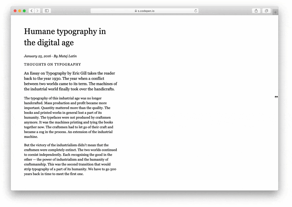
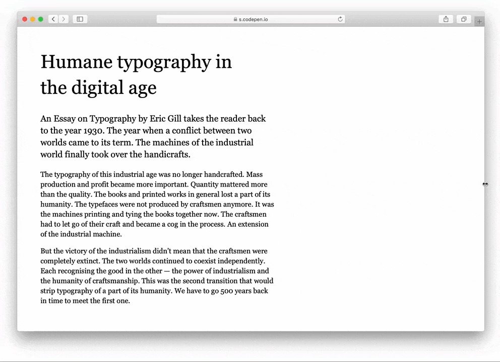
Take a look at this basic responsive typography example on CodePen. This works well, it’s supported by all browsers and has no accessibility issues. So why do we need to improve it? A lot of people worry about the fact that font resizing only happens at the breakpoints we define. In our example above, the reader of our website would see paragraphs of text set at 16 pixels all the way up to a screen width of 768 pixels. If they were reading our website on a tablet, they’d get the base font size of 18 pixels (112.5%). I think the main problem with this mentality is that they’re focusing too much on their own point of view, instead of focusing on the user. They resize their browser window and see something like the following:
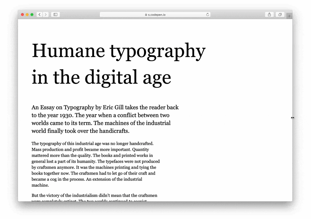
Responsive typography: fonts only resize at predefined breakpoints which results in drastic shifts like these.
Yes, the font sizes only change at the breakpoints we defined but we’re forgetting that the users have complete control over the text size through the settings on their device. If they’re accessing the website from a desktop computer and 18 pixels base font size isn’t large enough for them, they can easily resize it (if we don’t take this control away from them by overriding the default font size with non-relative units, like pixels, in CSS).
Pros
- Users remain in control of font size, no accessibility issues.
- With a good approach, a few media queries can cover a large part of different screen widths.
Cons
- Font sizes are mostly static and changes are tied to pre-defined breakpoints (screen widths).
- Lots of whitespace on large screens, font sizes aren’t adaptive, we end up with websites that use a centred, one-column layout.
Fully fluid typography
Ok, so we can conclude that the responsive typography approach isn’t ideal. It kinda works but we want something better. Something we can have better control over. We want our font size to be ideal on every screen size, not just on a specific mobile screen, a tablet screen, a desktop… Fluid typography to the rescue! Well, we’ll see about that.
Viewport units have been introduced a while ago. The idea is simple, we can use the viewport height and viewport width units to define the size of anything in CSS. Including font sizes. In my opinion, the viewport units were introduced more as a way to scale specific and mostly fixed types of website layouts, similarly to how Sebastian Eberlein describes it in his Hacker Noon article.
But nevertheles, viewport units have been used as a way to fluidly scale font sizes for a long time. Chris Coyier wrote about it back in 2012 and got excited about it because we know that ideal width of a line of text is around 80 characters and because “these units allow you to get it feeling perfect and then have that experience scale to any size screen” 1.
That’s all cool but it isn’t so simple in practice. Let’s say we do something like the following:
html {
  font-size: 1.3vw;
}

h1 {
  font-size: 3vw;
}
We define the base font size with a viewport width unit. This means the font size will get resized for every change in screen width, not just the predefined breakpoints as was the case with responsive typography. But because the shifts in screen widths are so drastic (mobile sizes compared to laptops and desktop computers) the font size changes very rapidly. Take a look at this fluid typography example on CodePen and try to resize the browser window. You’ll see something like the following:
Fully fluid typography: font sizes change rapidly depending on the screen width.
Can you see how tiny the font sizes get on smaller (supposedly mobile) screen sizes? That‘s way too small, how can we fix it?
Pros
- In practice, I don’t see any pros of using this approach without combining it with responsive typography.
Cons
- One downside to using Viewport units for defining font sizes is that they aren’t accessible (users don’t have control over font sizes in certain browsers).
- Using viewport units for font sizes also overrides user’s default font size (set in browser), another accessibility issue.
- Uncontrollable, font sizes scale rapidly from one extreme to the other.
Adding lots of media queries to make it work
So the fully fluid web typography approach clearly doesn’t work. Ironically enough, the only way to kinda make it work is to use the responsive typography techniques to try to control the rapidly-changing font sizes. But, unlike in our responsive web typography approach, in this case we need a lot of media queries to limit the resizing of fonts. So we can do something like this:
$breakpoint-1: 25em;
$breakpoint-2: 35em;
...

html {
  font-size: 1.3vw;
}

h1 {
  font-size: 3vw;
}

@media (min-width: $breakpoint-1) {
  html {
    font-size: 2vw;
  }

  h1 {
    font-size: 6vw;
  }
}

@media (min-width: $breakpoint-2) {
  ...
}
Take a look at this fluid and responsive web typography example on CodePen and try resizing the browser window. You’ll see that it’s better than the fully fluid approach above, we could say that it kinda works (I used seven breakpoints to make it work).
Fluid + responsive typography: we limit the scaling of font sizes for small and large screens.
I don’t know about you, but to me, this looks like too much work and trouble for the few benefits we get in return. Yes, our font sizes scale in a nicer manner than just the responsive web typography approach, but it also brings other problems. Including the accessibility problems which for me is a no-no.
Pros
- Fonts sizes scale nicely and adapt to each screen width.
Cons
- One downside to using Viewport units for defining font sizes is that they aren’t accessible (users don’t have control over font sizes in certain browsers).
- Because we use the media queries to control the scaling of font sizes, we still get these jumps in sizes on resizing the browser window.
- Using viewport units for font sizes also overrides user’s default font size (set in browser), another accessibility issue.
Better Web Typography for a Better Web
Free Course
Join 30,000+ designers and developers, get 7 free lessons and unlock your better web typography skills.
Learn more →Just cool web typography stuff, no spam.
Fluid typography with CSS locks
Others have noticed the problem of lack of control over font sizes in the fluid web typography approach. They knew that adding lots of media queries isn’t desirable or ideal so they tried to find an alternative. Mike Riethmuller 2, Tim Brown 3 and Geoff Graham 4 all eventually came to the conclusion that the Fluid typography with CSS locks is probably the best approach.
This is an interesting technique. It sets the minimum font size and at what screen width it should be used, the maximum font size and at what screen width it should be used and all the fluid font sizes between the two. It elegantly addresses the problem of font sizes scaling too rapidly and it uses basic math to do so. The approach is best described with the image below. Font sizes don’t change in the left and right compartments, they only scale in the middle one. Lower gate is the minimum screen size and we apply a fixed font size to it, the same for the upper gate which is the maximum screen size.
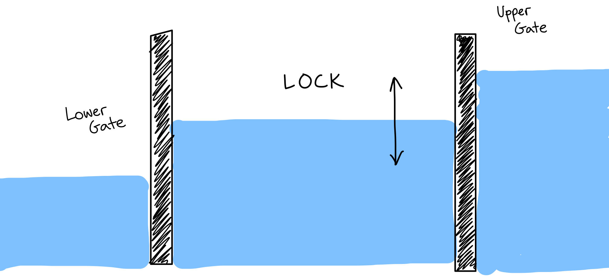
CSS locks for fluid typography, font sizes only scale in the middle compartment. (Source)
The formula to make this work is relatively simple, it takes 4 variables: minimum size, maximum size, minimum viewport width and maximum viewport width.
body {
  font-size: calc([minimum size] + ([maximum size] - [minimum size]) * ((100vw - [minimum viewport width]) / ([maximum viewport width] - [minimum viewport width])));
}
And if you take a look at the live example of fluid typography with CSS locks on CodePen and try to resize the browser window you’ll get the following.
CSS locks in action. Font sizes change only in the specified range.
This works satisfyingly nice. Font sizes scale nicely if the screen width is between the minimum and maximum. If the screen width is either smaller than the minimum or larger than the maximum, we switch to the fixed font size. In theory this works very well. But when I tried changing my browser’s default font size on Chrome, it had no effect on the CodePen example above. That’s a problem because it means that this approach still ignores user’s default font size and therefore causes accessibility problems. Certain browsers also don’t resize the font size on a website when the user tries to resize it (⌘+ on a Mac).
Pros
- No jumps in scaling font sizes on resizing the browser window.
- Font sizes don’t scale below the minimum and above the maximum screen width.
Cons
- One downside to using Viewport units for defining font sizes is that they aren’t accessible (users don’t have control over font sizes in certain browsers).
- Using viewport units for font sizes also overrides user’s default font size (set in browser), another accessibility issue.
Conclusion—should we use fluid web typography?
At first look, the CSS locks approach looks like the best one. It definitely solves the problem of font sizes scaling uncontrollably. It only uses a small number of media queries and it doesn’t get major shifts in scaling font sizes. My problem with all of the fluid web typography techniques is that they all override user’s default font size set in the browser (from my tests, this was only the case with Chrome). And in some cases and in some browsers, the font size can’t be resized by the user because the viewport units are used. This means that none of these solutions is completely compliant from the accessibility point of view.
Fluid typography doesn’t play nicely with the default browser font size and therefore shouldn’t be used until that changes.
When writing about the fully fluid typography approach, I wrote that “We want our font size to be ideal on every screen size, not just on a small mobile screen, a tablet screen, a desktop…”. I think that this approach is completely wrong. We shouldn’t be focusing on making our font sizes scale nicely for every screen width. We should make our texts easy and enjoyable to read to each and every one of our users. This means leaving some of the control over web typography in their hands. At this moment, fluid web typography interferes too much with that. If it played nicely with the default browser font size I’d say go for it, but because it doesn’t, I must say it’s not an approach we should be using. Not at this time at least. Just like I said when I explored fluid typography in my book, I’m still sticking with responsive web typography.
Did you enjoy what you just read? Great, I have much more of this stuff in my book about web typography that I wrote. It’s very popular with web designers and developers, you should definitely check it out.