An analysis of 5 monospaced fonts with coding ligatures
![]()
~ 9 min read

I only switched from the default font when I switched from Sublime Text to Visual Studio a few years ago. That’s when I wrote the original blog post about 5 monospaced fonts with coding ligatures. I was customising Visual Studio’s theme and wanted something different. I wanted to make the setup more “mine.”
We’re in the golden age of fonts, especially open-source ones. Many more monospaced fonts with coding ligatures have sprung up since that blog post so it’s time to revisit and examine five more.
I’ll compare them to Fira Code, a popular choice among programmers which makes it a perfect baseline for such comparison. This way we’ll see how the fonts I picked compare in legibility, x-height, ligatures, and what they look like in action.
What are ligatures? They’re specially designed characters in a font that usually combine two characters into one, to prevent collisions (Fig 1).
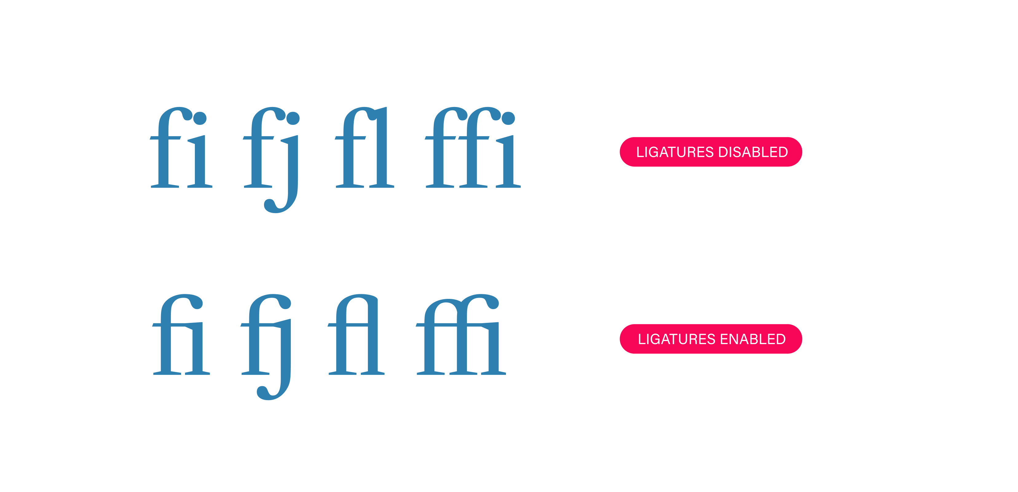
Fig 1: An example of “fi” “fj” “fl” “ffi” ligatures. The bottom example with ligatures is the desirable one.
Fira Code
Fira Code is based on Fira Mono from Mozilla. It has a regular x-height, many coding ligatures, and scores well on legibility. That’s what makes it an even better baseline for comparison. This is what it looks like in action (Fig 2).
Fig 2: Fira Code in action.
X-height
Larger x-height is generally considered to have a positive impact on legibility for small font sizes. This certainly applies to fonts for coding so x-height will be one of the major factors in my analysis.
Fira Code’s x-height is what I would call “regular” (Fig 3). Not small, not large, somewhere in between. This is another property that makes it a good baseline to compare other fonts to.
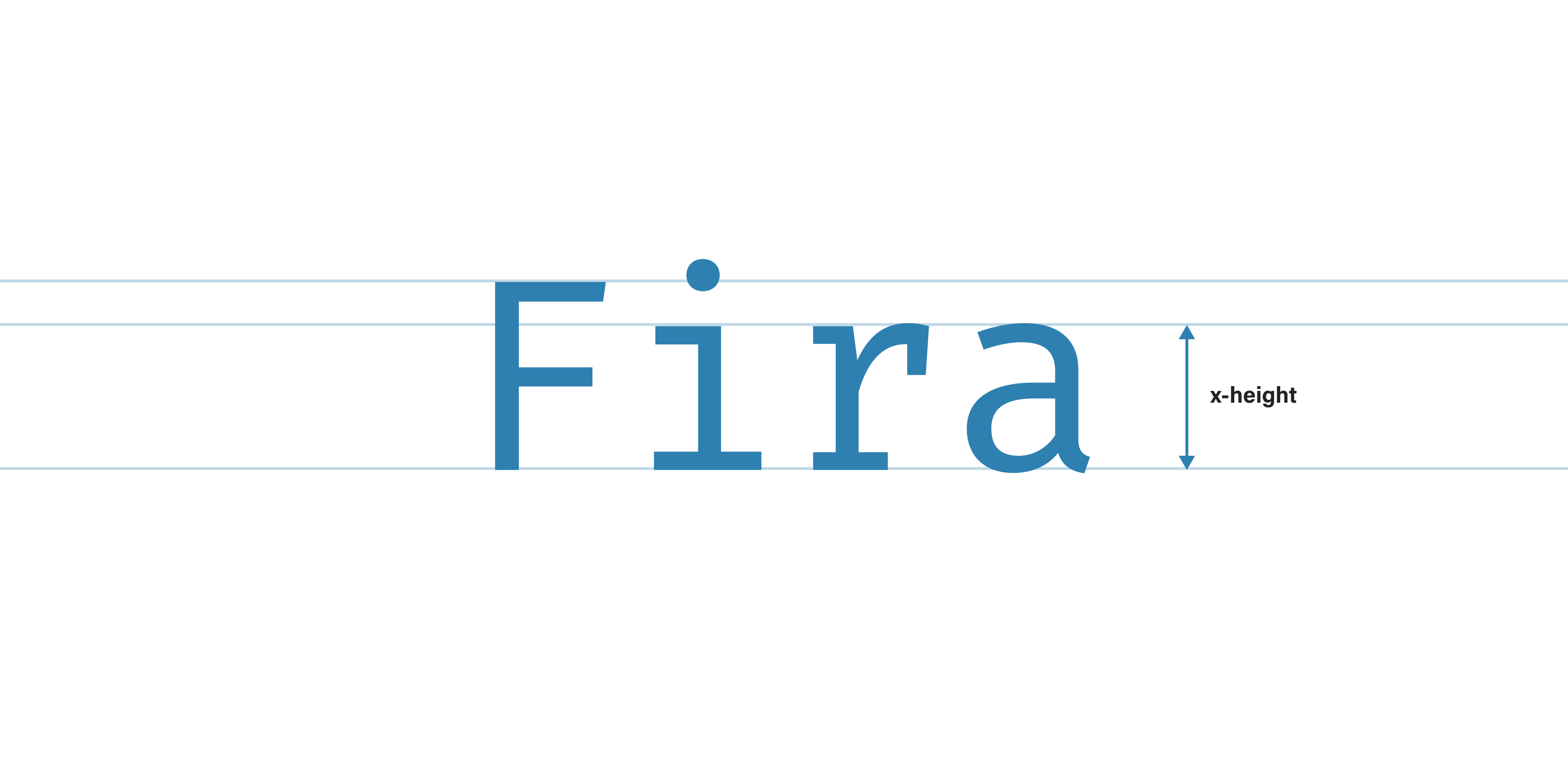
Fig 3: Fira Code’s x-height is regular.
Legibility
The legibility of a font can be quickly evaluated by taking a close look at characters 1lI O0. The designs of these characters need to be distinct, which in the case of Fira Code, they are (Fig 4).
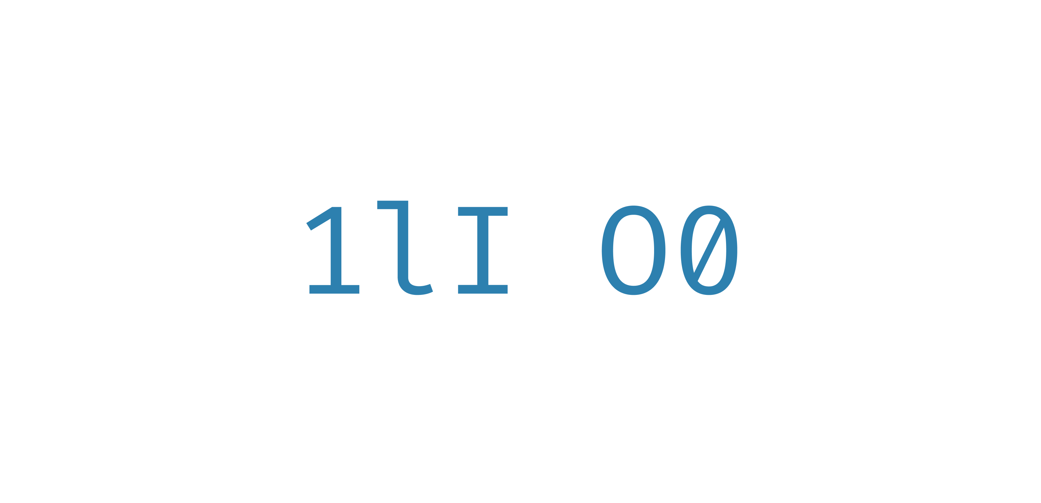
Fig 4: Fira Code scores well on legibility.
Coding ligatures
When it comes to coding ligatures, Fira Code probably has the widest range. Here are some of the most prominent ones (Fig 5).
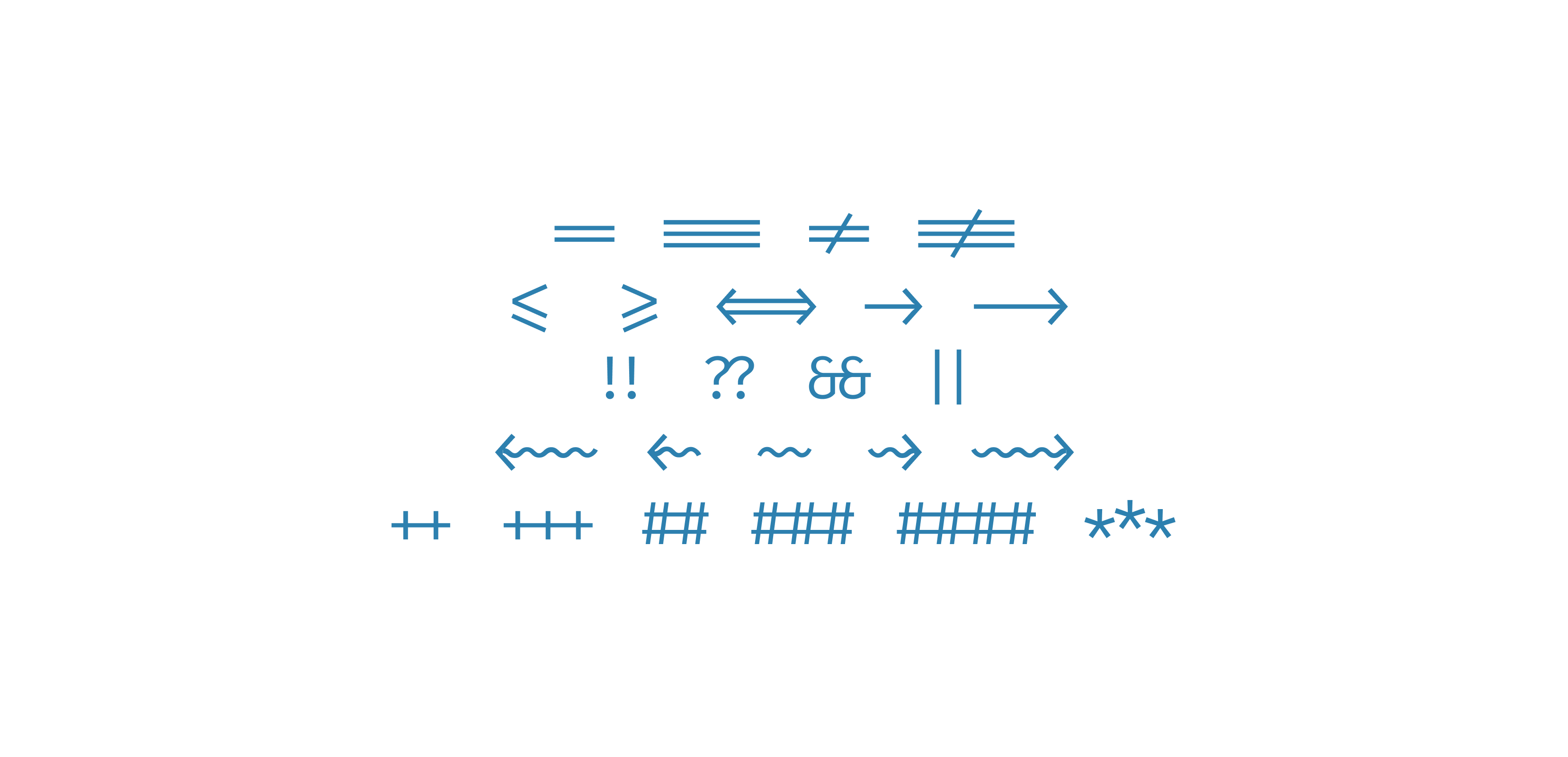
Fig 5: Fira Code has the widest reange of coding ligatures and they look great.
Ok, we have the baseline established, now let’s take a look at new monospaced fonts with coding ligatures.
Commit Mono
Commit Mono is described by its authors as _an anonymous and neutral coding font focused on creating a better reading experience. _It’s a variable font, highly customisable through its many Open Type features.
It even comes with “Smart kerning.” Kerning is crucial for readability but it has been impossible to combine with monospaced fonts so far. “Smart kerning” slides letters into a better position while preserving the monospacing. This makes the Commit Mono a highly readable monospaced font (Fig 6).
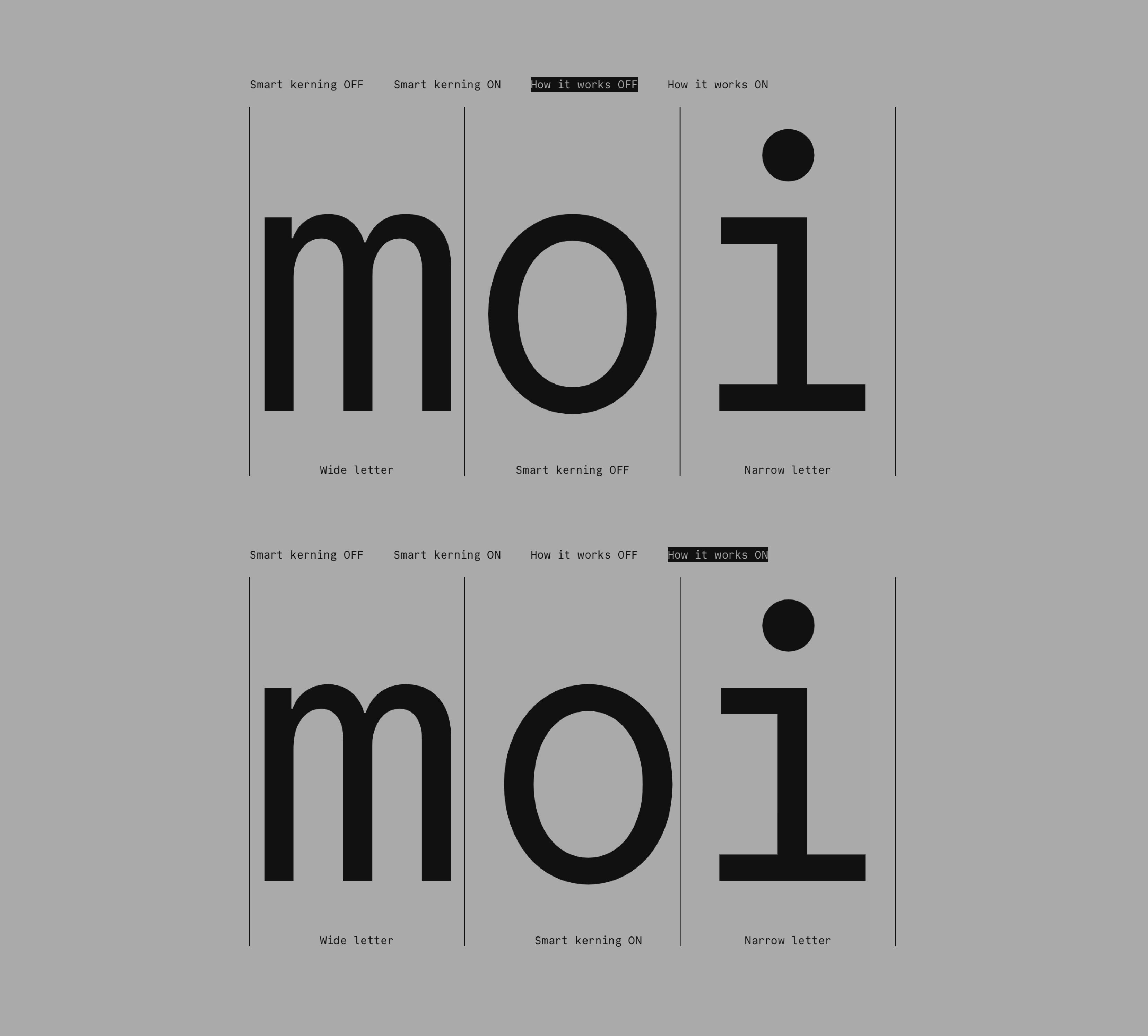
Fig 6: Commit Mono’s smart kerning feature helps improve the readability of the font. Notice the position of “o” in the bottom example.
Here’s what Commit Mono looks like in action (Fig 7).
Fig 7: Commit Mono in action.
Ligatures
Commit Mono doesn’t have a huge range of coding ligatures but it has the basic ones. They look nice, but those in Fira Code look nicer. Have a look for yourself (Fig 8).
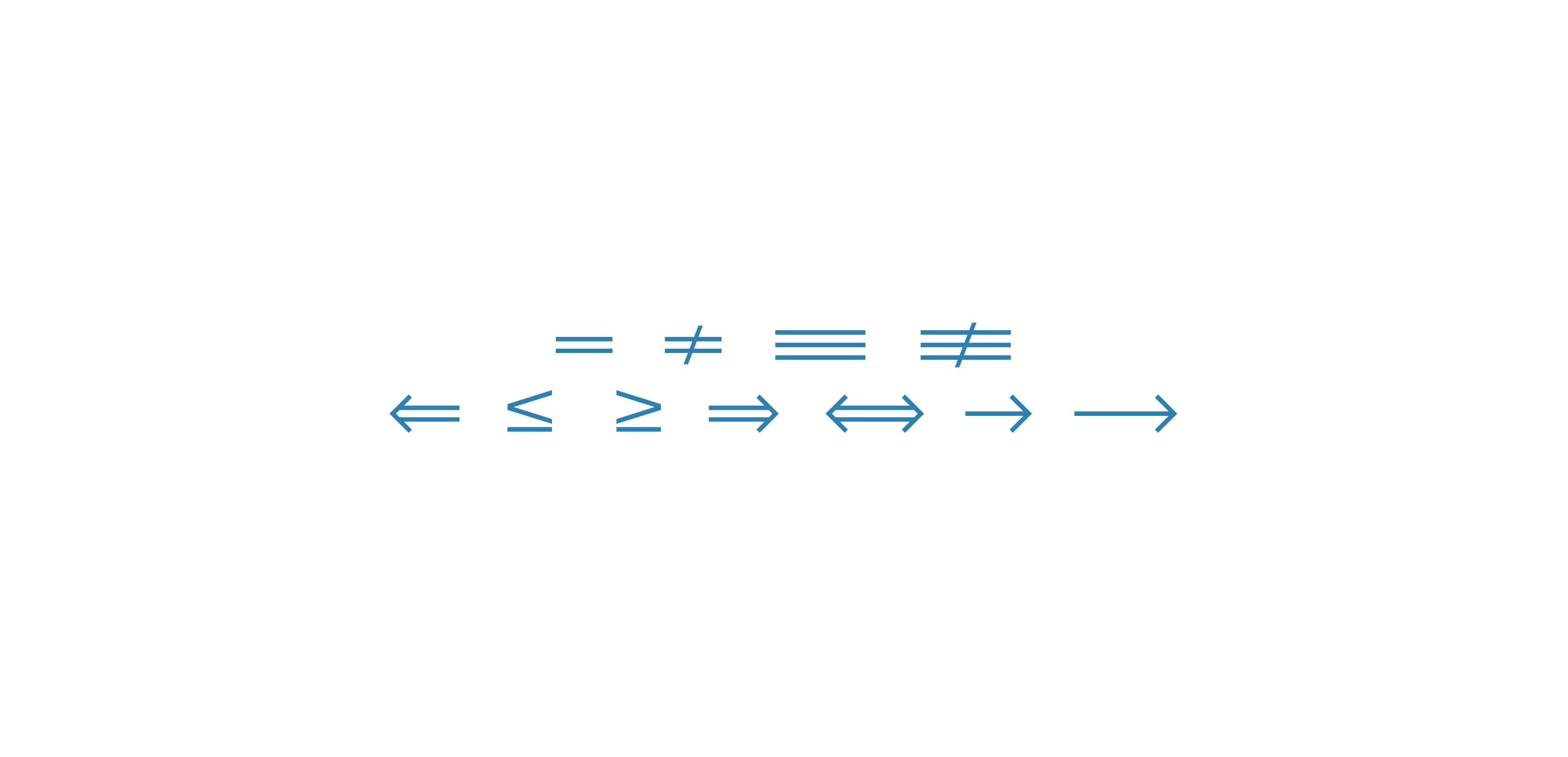
Fig 8: Coding ligatures in Commit Mono.
X-height
Commit Mono’s x-height is just slightly larger than that of Fira Code (Fig 9). As I take a closer look, I notice how well-spaced the Commit Mono’s characters are. Is that the “Smart kerning” in action?
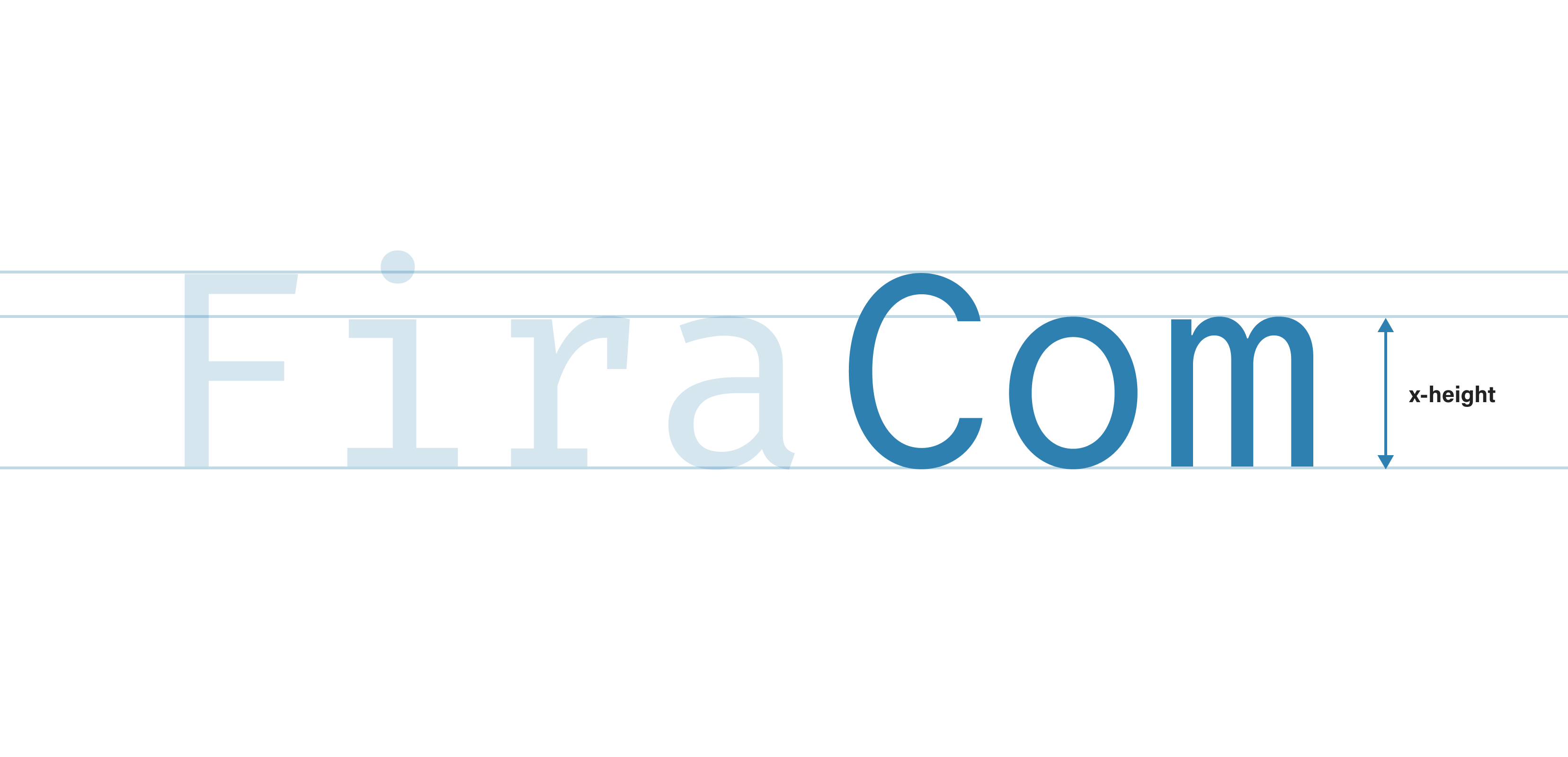
Fig 9: Commit Mono’s x-height is comparable to that of Fira Code.
Legibility
Even as I closely inspect the characters 1lI O0 I noticed a lot of similarities between Commit Mono and Fira Code. Take a look at the lowercase “l” and uppercase “I.” They look almost identical (Fig 10).
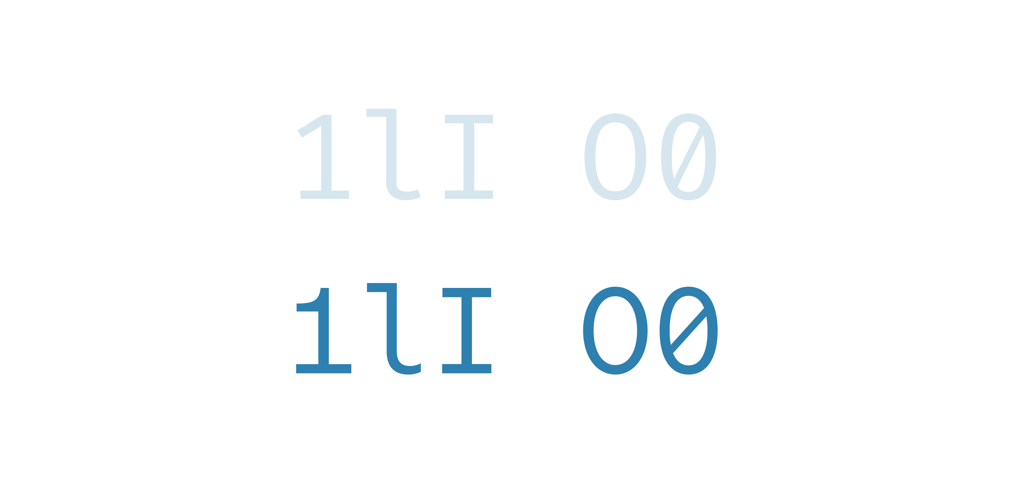
Fig 10: Commit Mono scores well in legibility, notice the similarity to some of Fira Code’s characters.
Anyway, Commit Mono’s legibility is ok, it’s easy to tell the key characters apart.
Cascadia
Cascadia is Microsoft’s new default monospaced font. It comes bundled with Windows Terminal and is the new default option in Visual Studio. So if you use the latest version of VS and haven’t changed your default font, perhaps you’re using this one but aren’t aware of it?
The italic version also has an alternative, cursive style available which looks great for comments in code. This is what it looks like in action (Fig 11).
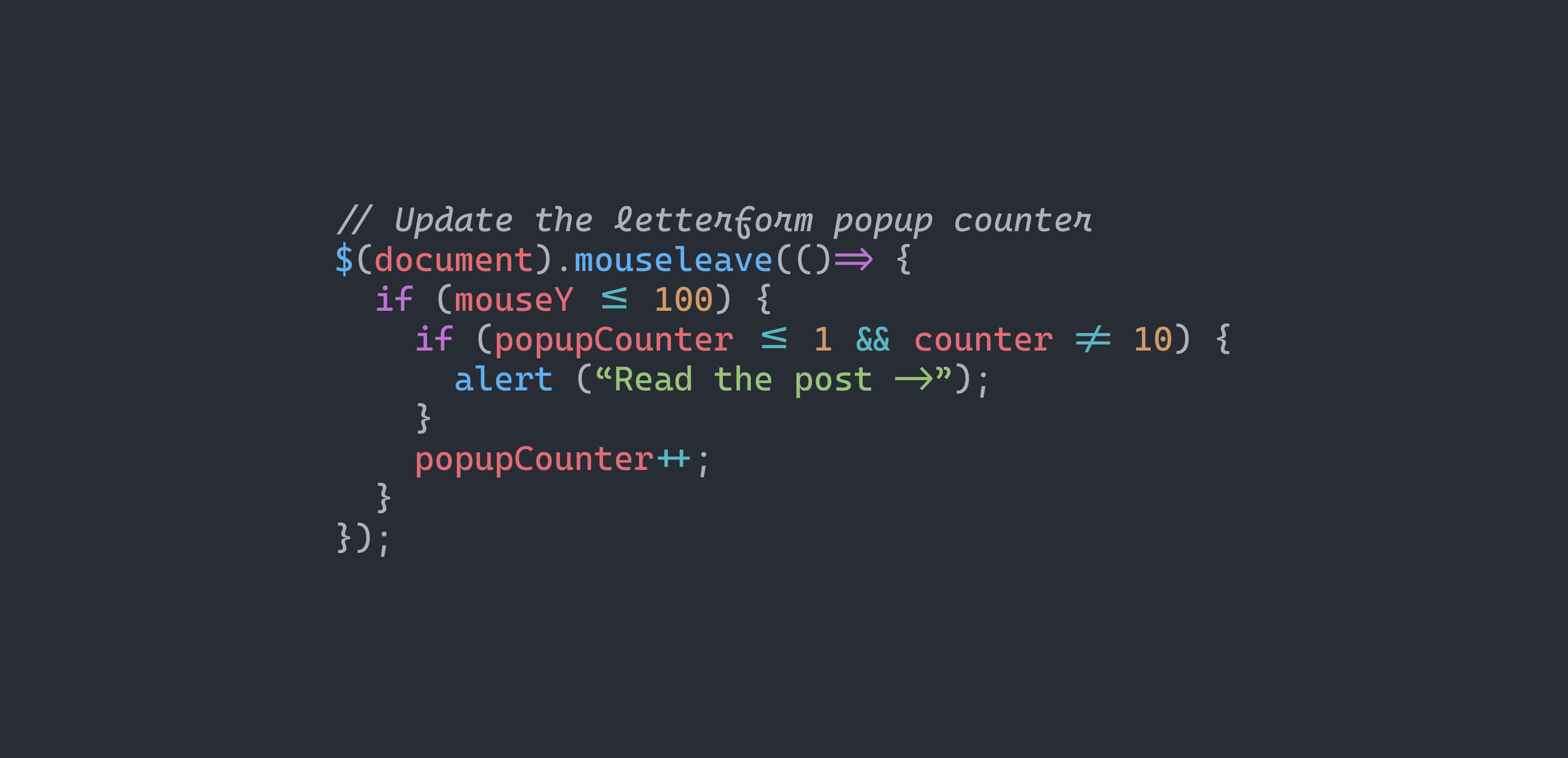
Fig 11: Cascadia in action. Looks a bit heavier but still nice and well balanced.
Coding ligatures
Cascadia Code supports many coding ligatures and even arrows. They’re somewhat similar to those in Fira Code, although I think those still look a bit better (Fig 12).
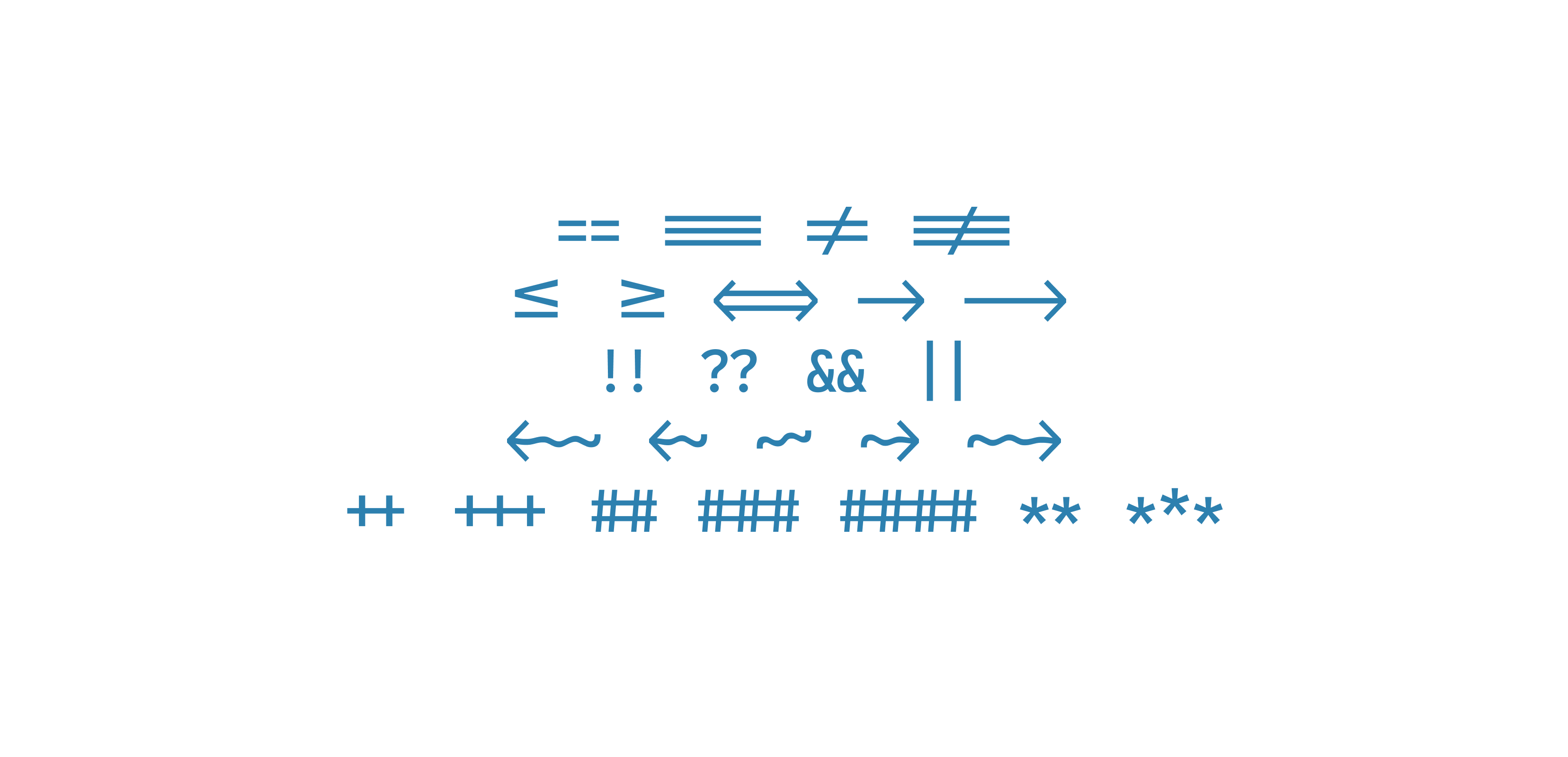
Fig 12: Cascadia supports a wide range of coding ligatures, some of them are similar to those in Fira Code.
X-height
Cascadia’s x-height is almost exactly the same as that of Fira Code, just slightly smaller. I wonder if the author took Fira Code as the basis when they started working on Cascadia. But if you take a closer look at the characters you’ll see they’re quite different. Cascadia has a lot more character but still looks great (Fig 13).
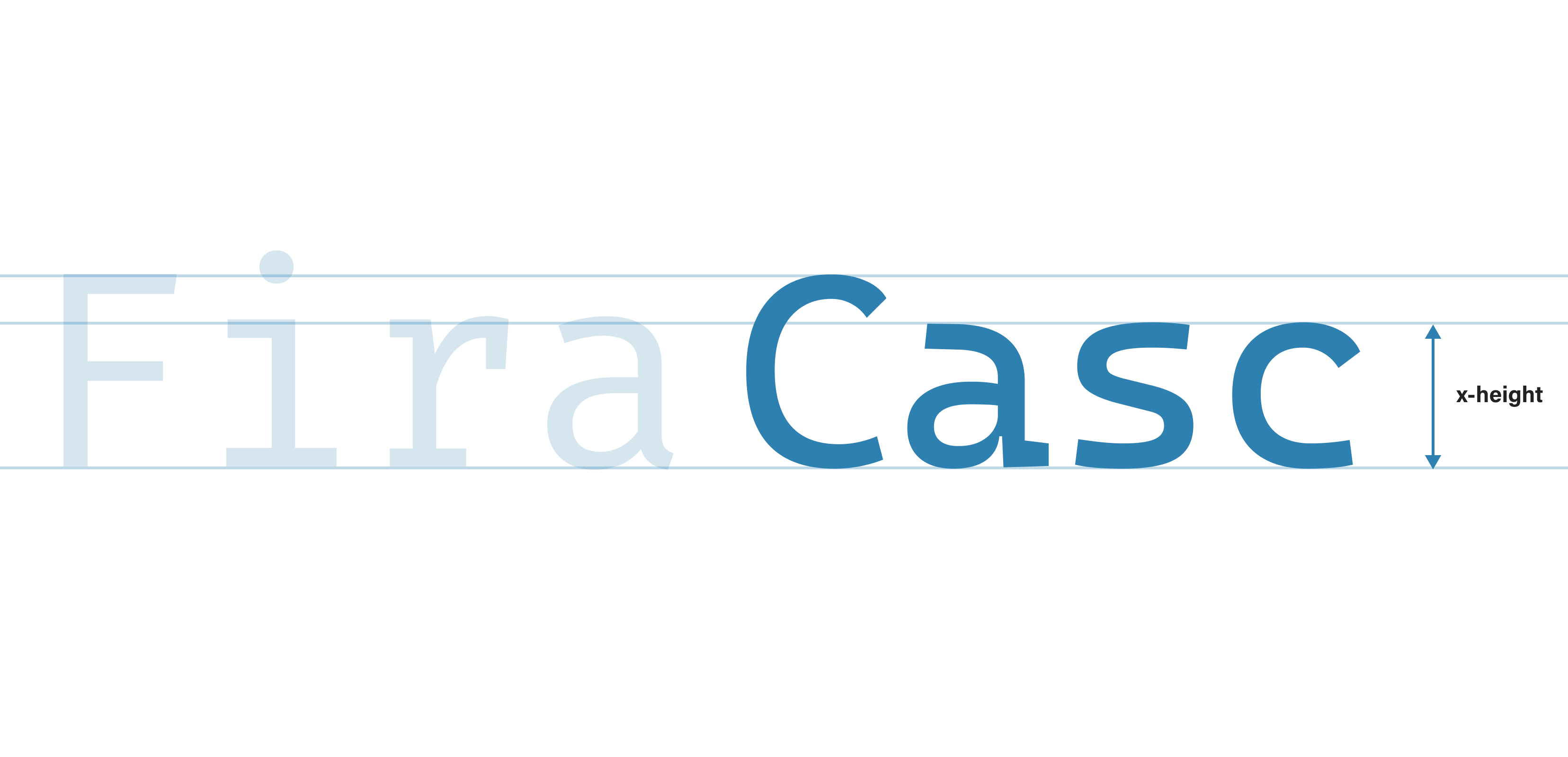
Fig 13: A side-by-side comparison of x-height, it's clear that Cascadia’s x-height is just a bit smaller.
Legibility
When it comes to legibility Cascadia scores similarly to Fira Code. The character designs are distinct enough to separate them easily in text-heavy situations like code generally is. The “O” and “0” characters are quite similar but the latter has a dot inside it to make it clear that it’s a number and not a letter (Fig 14).
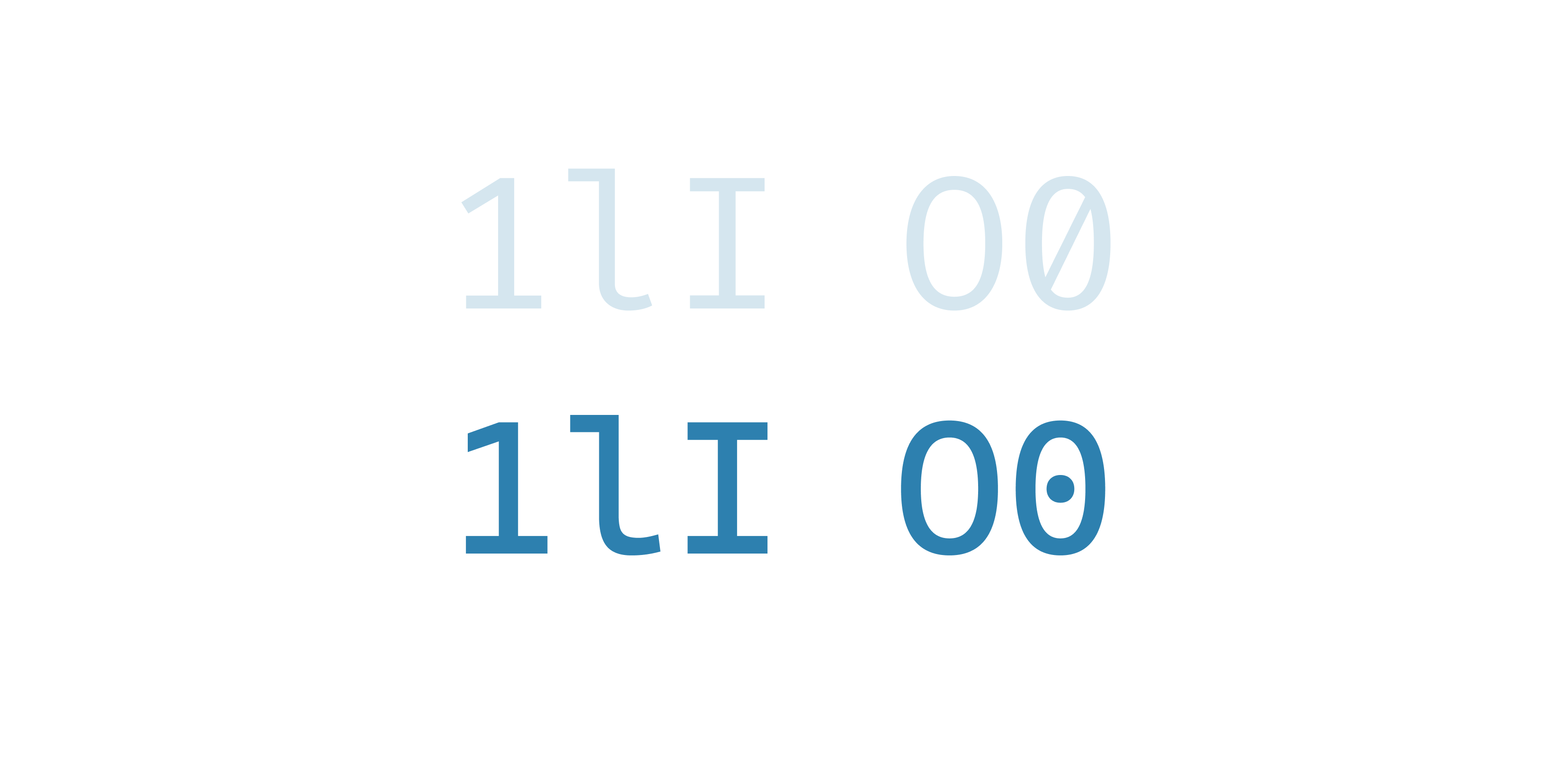
Fig 14: Cascadia scores well on legibility. Again, notice the similarity to some of Fira Code’s characters.
Cascadia generally looks heavier and has less contrast than Fira Code. This is a design feature that I really liked in JetBrains Mono in the original article.
Cursive style
As mentioned earlier, Cascadia supports a cursive variant of the italic style (Fig 15). This is often used for comments in code to help visually separate them from the actual code.
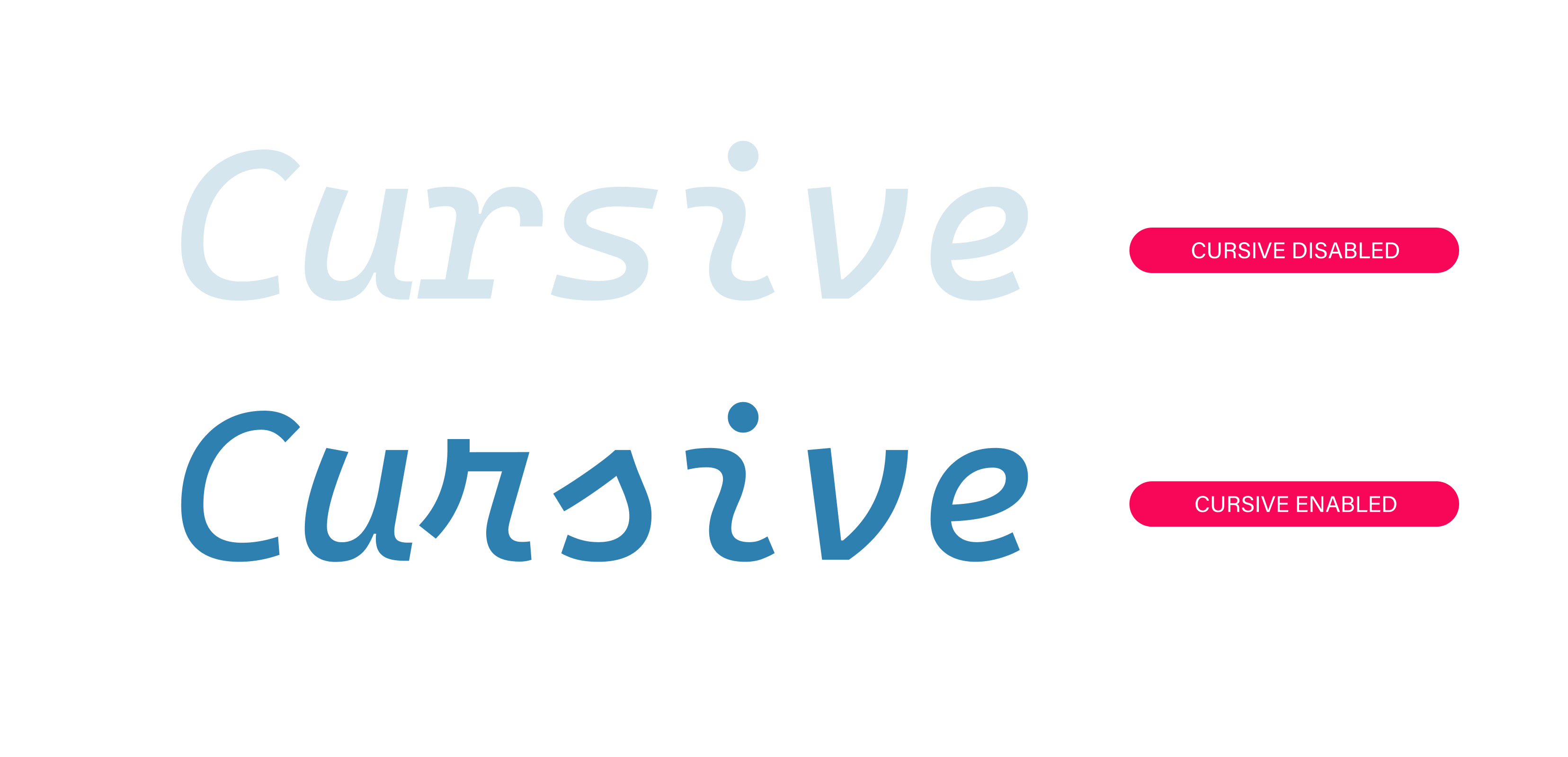
Fig 15: The cursive variant adds a bit more character to code, it’s great for visually separating comments from code.
Victor Mono
Its authors describe it as an open-source monospaced font with optional semi-connected cursive italics and programming symbol ligatures. It’s slender, crisp and narrow, with a large x-height and clear punctuation, making it legible and ideal for code. It comes in seven weights and Roman, Italic and Oblique styles.
Unlike Cascadia, the cursive style isn’t optional with Victor Mono. It’s how the Italic style is designed. Here’s what it looks like in action (Fig 16).
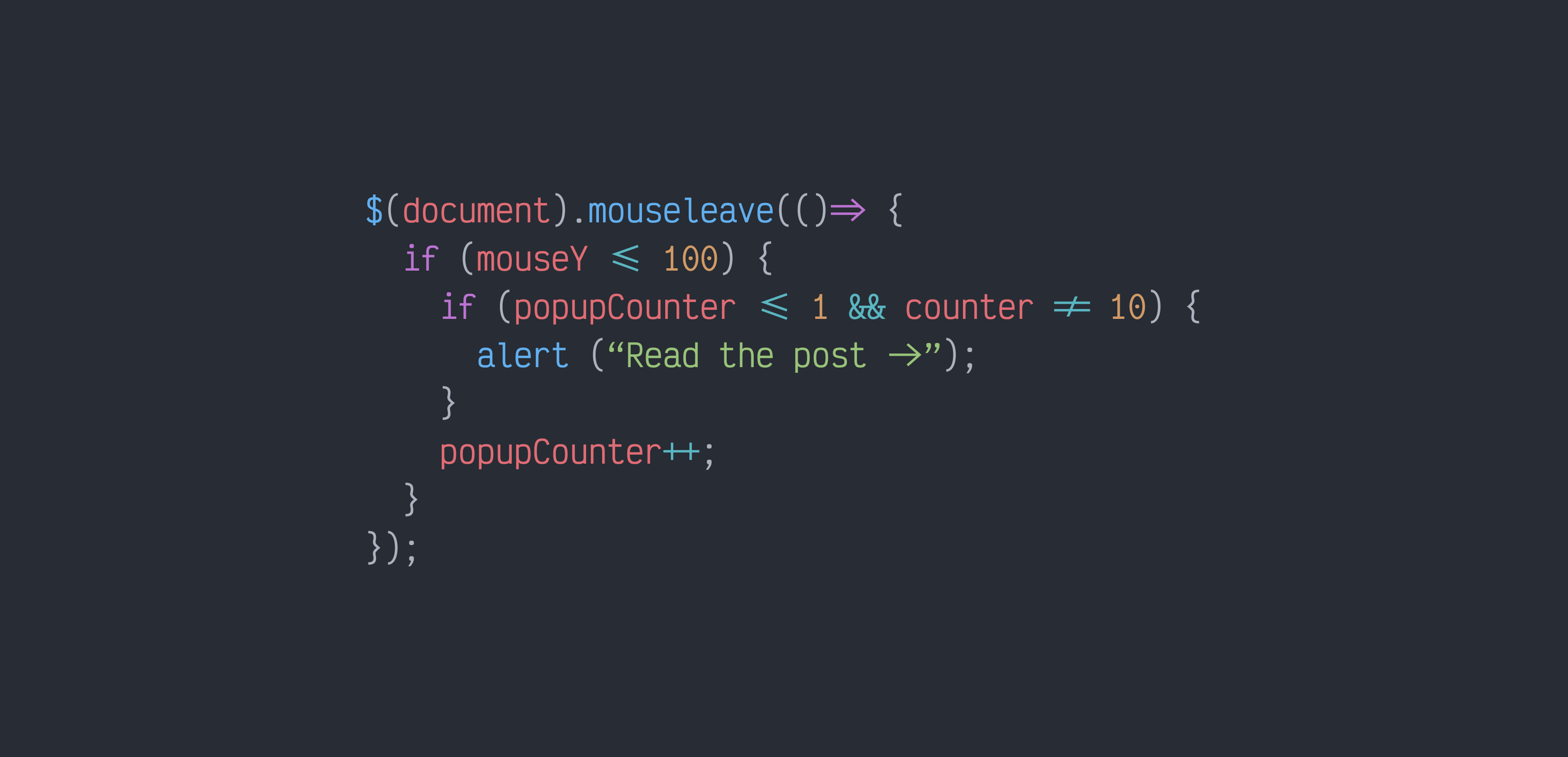
Fig 16: Victor Mono looks taller and slimmer.
Coding ligatures
Victor Mono also has a good range of coding ligatures, their designs remind me of those in Fira Code. But Victor Mono has a larger x-height and is generally thinner so the ligatures reflect that (Fig 17).
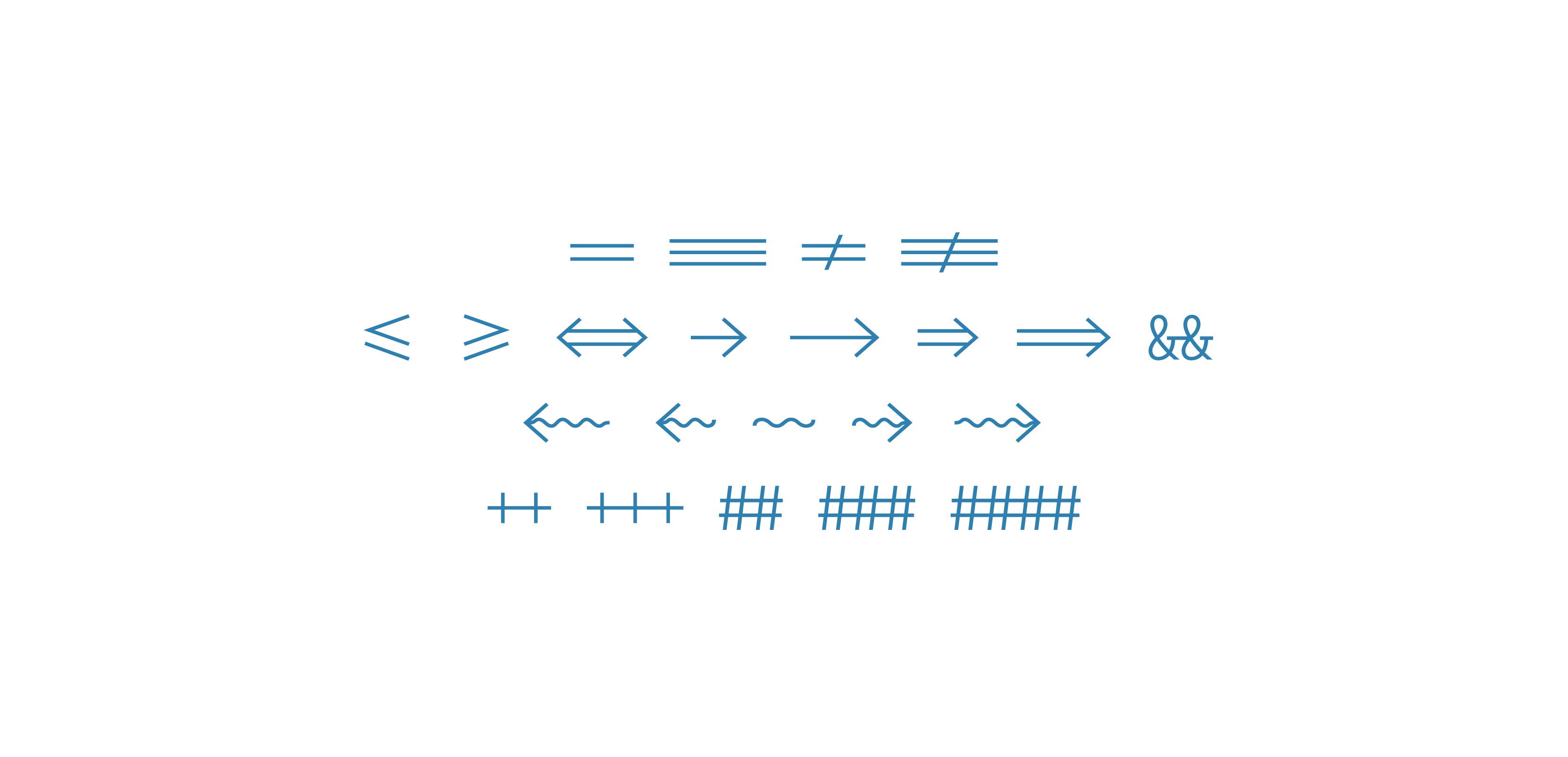
Fig 17: Victor Mono has a nice range of common coding ligatures and they look great.
X-height
Based on the author’s description, I expected Victor Mono to have a really large x-height, compared to Fira Code (Fig 18). It is larger, but there are monospaced fonts out there that have even larger ones. Monoid from the original article comes to mind.
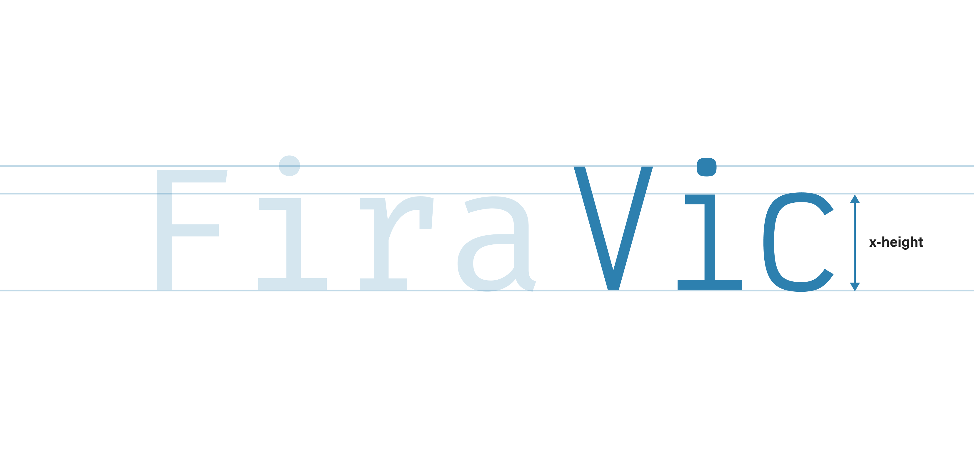
Fig 18: Examining Victor Mono closely reveals it’s larger x-height and how much slimmer it looks compared to Fira Code.
Legibility
The characters 1lI O0 look nice and distinct. Having a closer look now it’s clear how much lighter Victor Mono is (Fig 19). This is something that looks nice on high-resolution displays but I wouldn’t use it on my external monitor. I have to say that the font is very easy on the eye as I test it in my code editor (on my MacBook’s Retina screen).
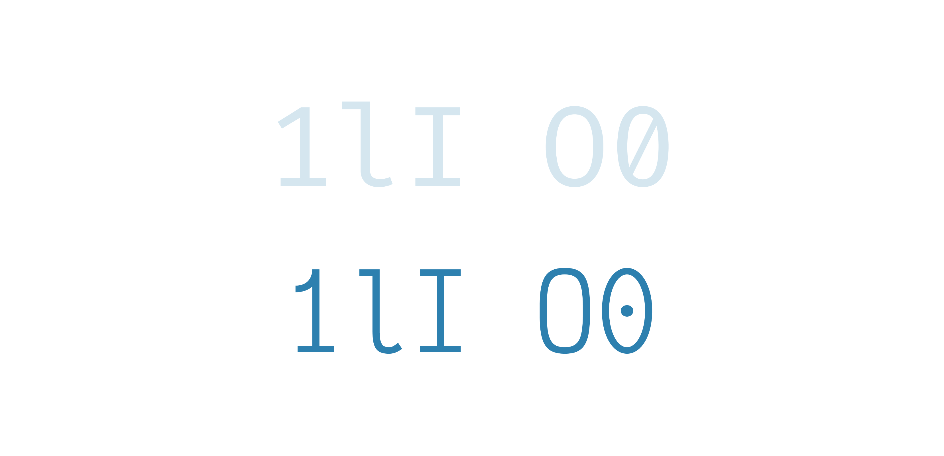
Fig 19: Victor Mono scores well on legibility. Again, notice the similarity to Fira Code in designs of key characters.
SF Mono
This is macOS’ default monospaced font but “ligaturised.” This means that Apple’s SF Mono was taken and the ligatures from Fira Code were added with the Ligaturizer. It’s a tool to do exactly that. So if you already picked your favourite font and it doesn’t have ligatures you can still add them with this tool. This is what SF Mono looks like in action (Fig 20).
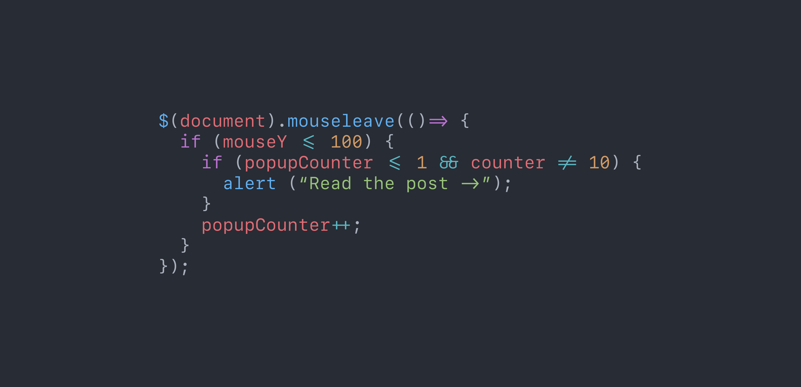
Fig 20: SF Mono in action.
Coding ligatures
The ligatures are the same as those in Fira Code but scale-corrected (fig 21). This means that they fit nicely with the font they were added into. I take a closer look and notice that the designs are exactly the same but the size isn’t. Those in Fira Code seem slightly larger.
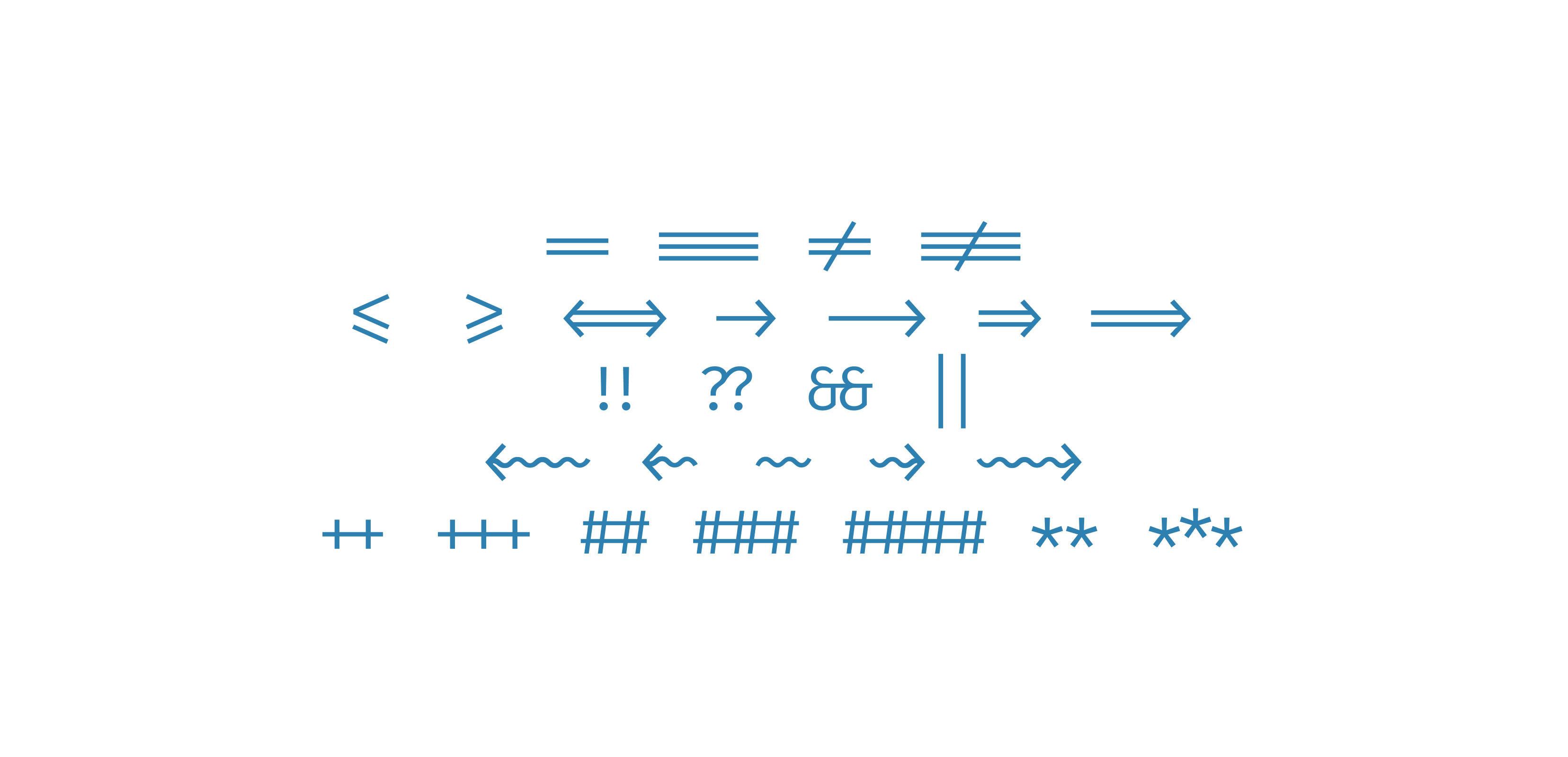
Fig 21: Because SF Mono is “Ligaturised” it has the same coding ligatures as Fira Code.
X-height
The x-height of SF Mono is almost the same as that of Fira Code (Fig 22). I can barely see a difference — SF Mono’s is maybe just a tiny bit smaller. That explains why the ligatures are just slightly smaller too.
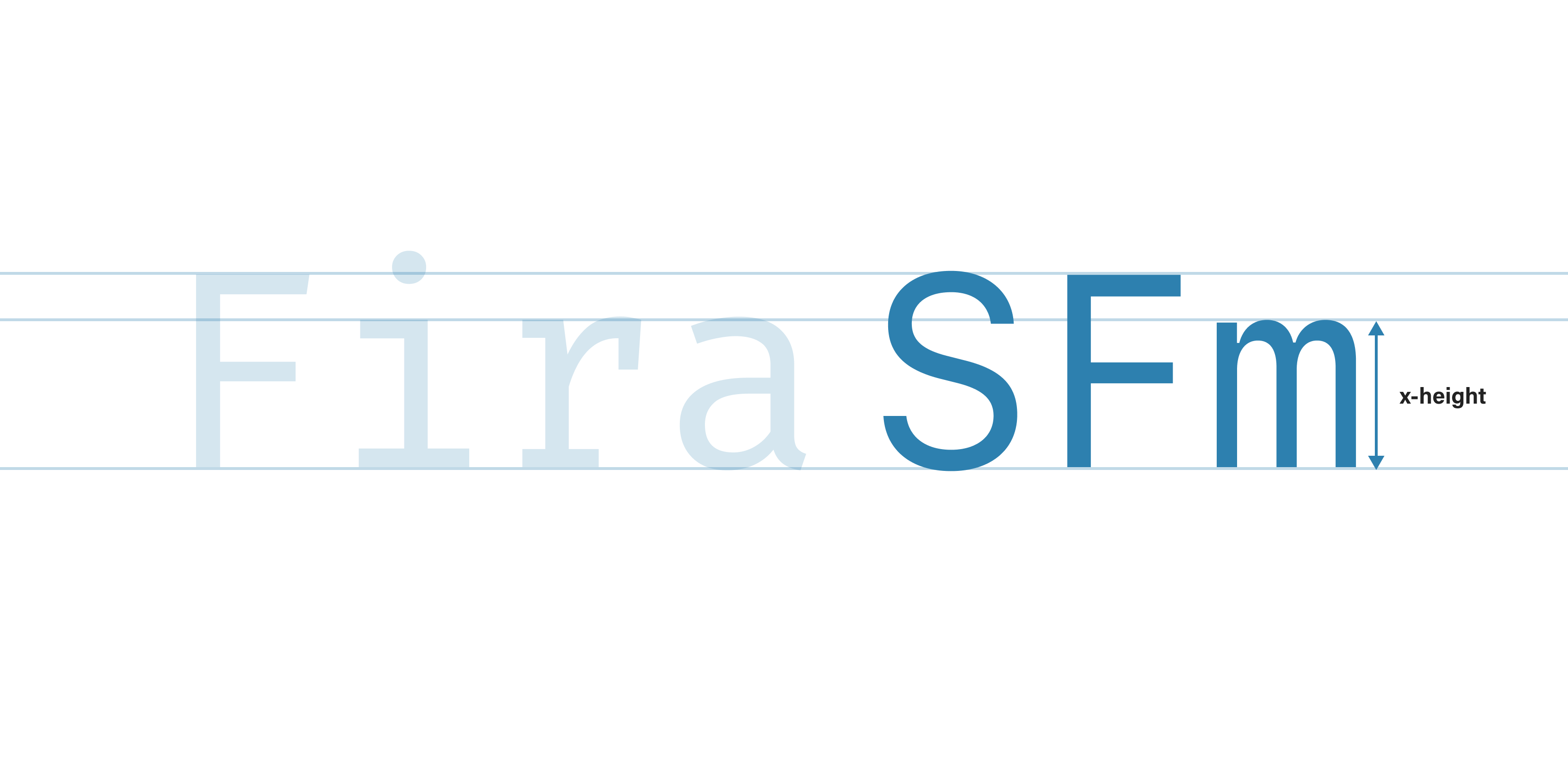
Fig 22: SF Mono’s x-height is just slightly smaller than that of Fira Code.
Legibility
SF Mono’s legibility is ok (Fig 23). Something that stands out to me is the number 1 being quite similar to the lowercase “l.” I think these two could be confused. Other than that, everything looks fine.
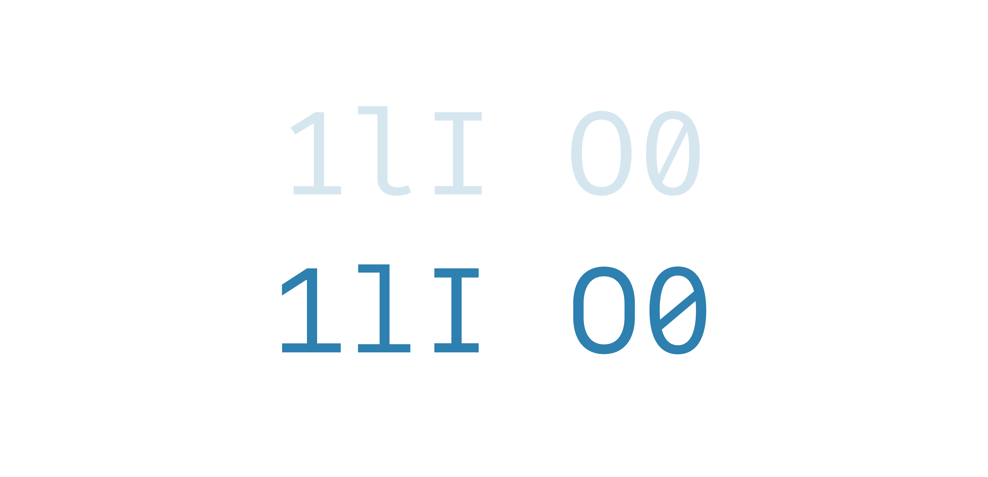
Fig 23: The “1” and lowercase “l” are quite similar and could be confused with each other. Other than that the legibility of SF Mono looks ok.
Recursive
Recursive is the last font on my list to examine but it may be the most impressive one. It’s a font with five variable properties: weight, slant, mono, casual, and cursive. This means it’s highly customisable.
The mono, causal, and cursive variable properties are the more interesting ones. Mono changes the font from a completely monospaced to a proportional (normal) font (bottom example in Fig 24). The Casual one makes the font look almost like the script style (third example in Fig 24). It’s the opposite of the Linear setting. The last one is cursive which changes some of the characters to the cursive variant (second example in Fig 24).
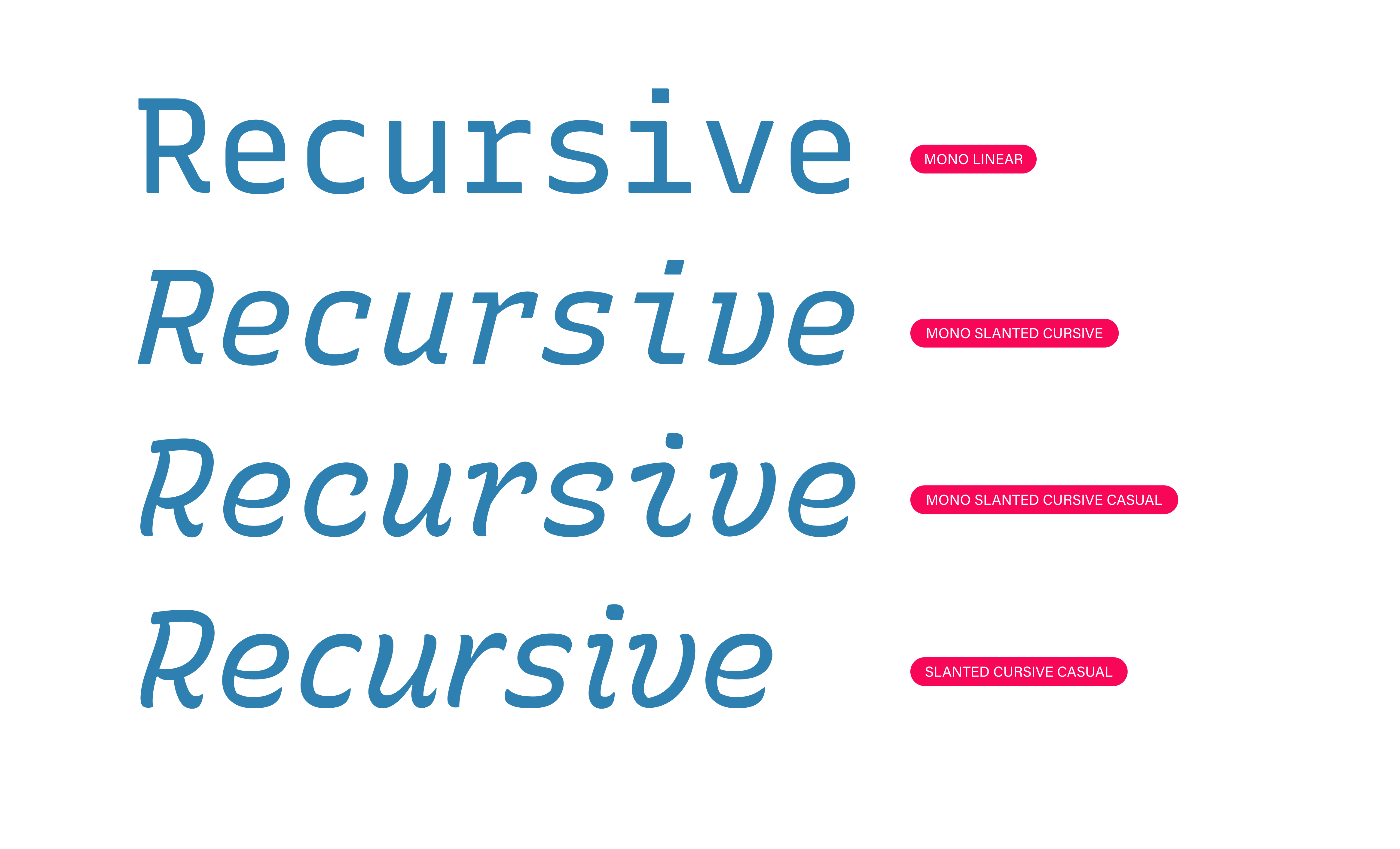
Fig 24: Recursive is highly customisable, the cursive variant of the italic style looks great for comments.
Here’s what Recursive looks like in action (Fig 25).
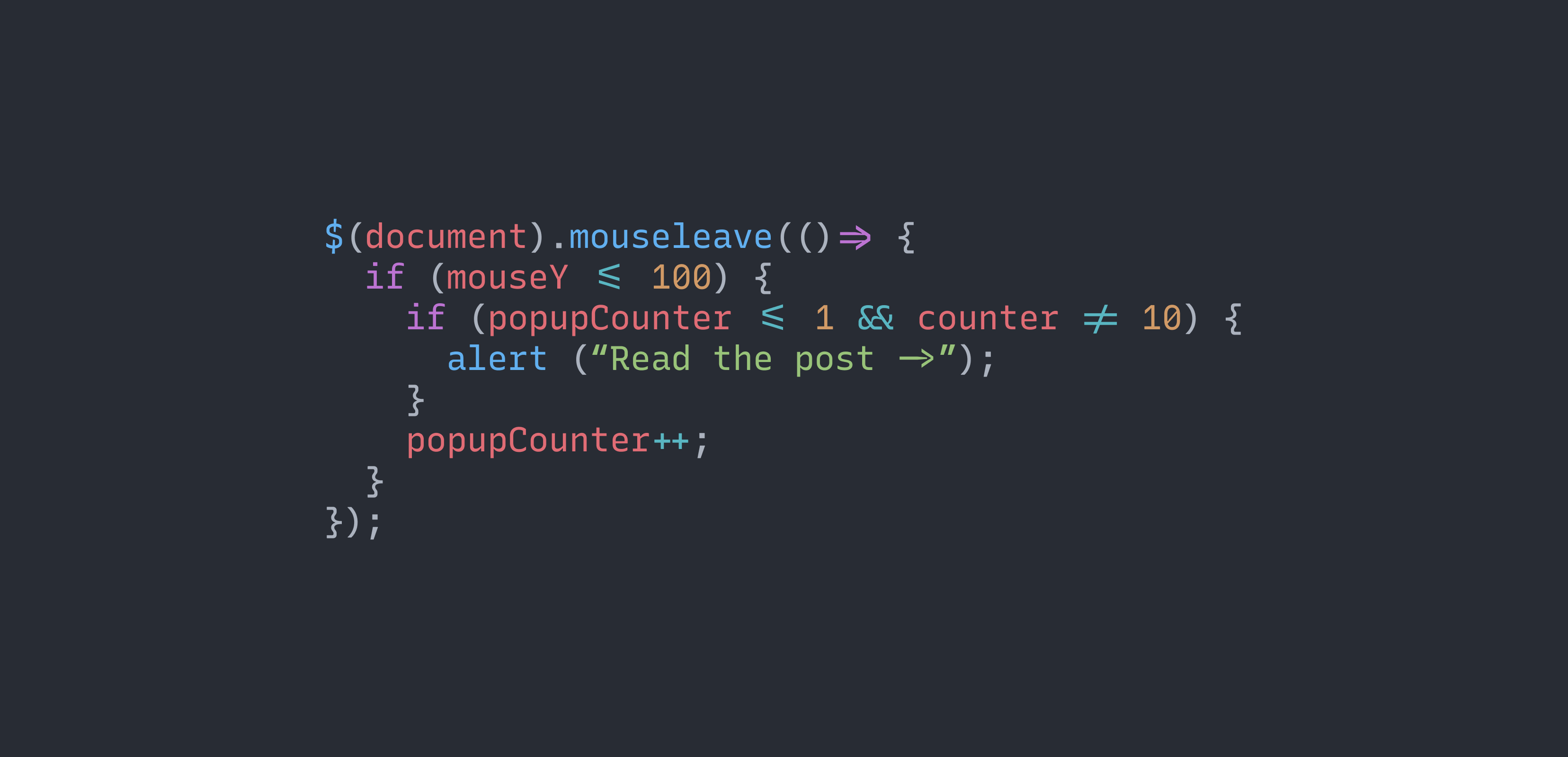
Fig 25: Recursive is highly customisable, the cursive variant of the italic style looks great for comments.
Coding ligatures
Recursive has a good range of coding ligatures but some look a bit off (Fig 26). The arrows, for example, don’t look that good.
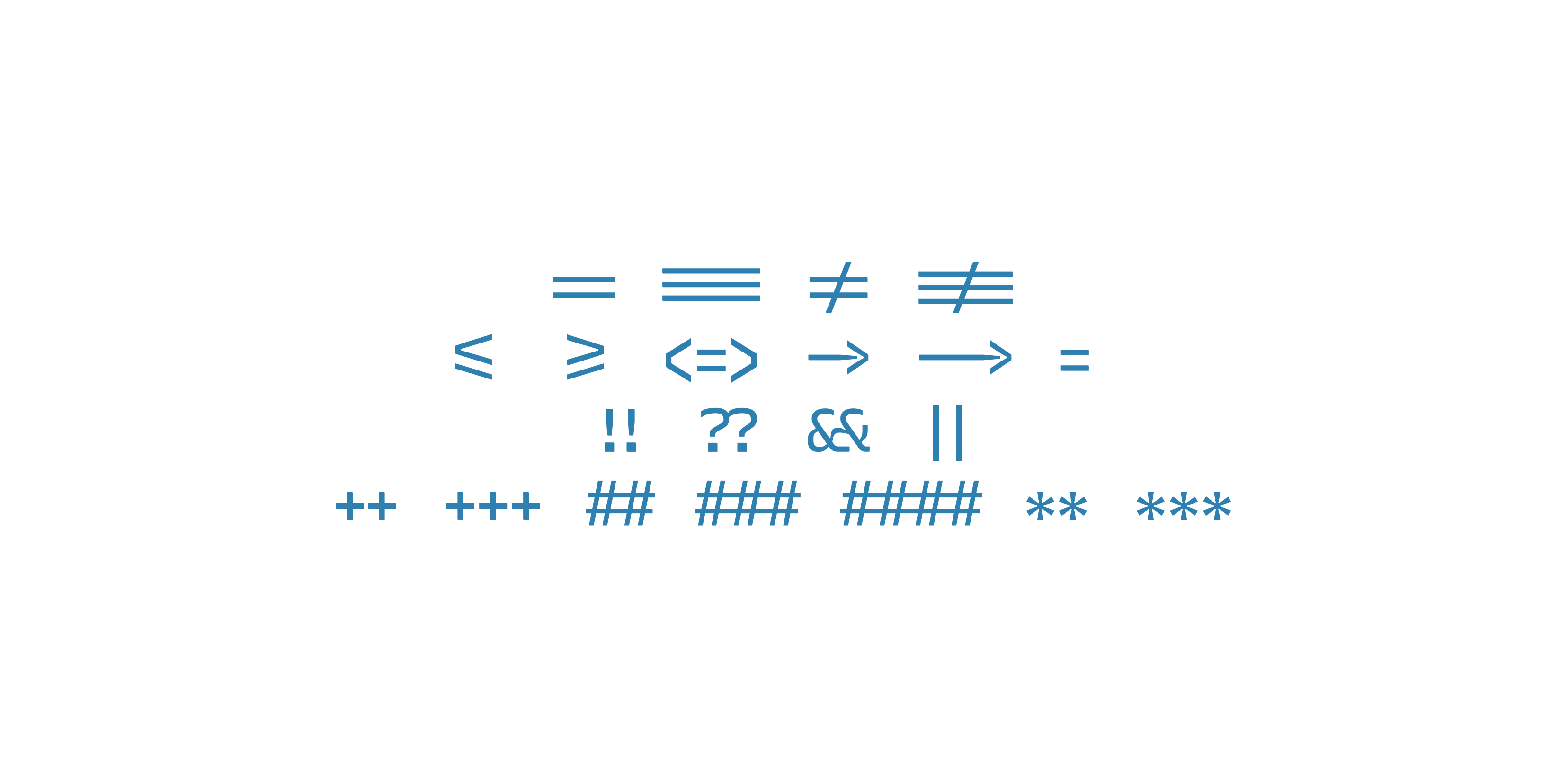
Fig 26: Some of the arrows in Recursive could look better but other than that the coding ligatures look great.
X-height
Recursive’s x-height also looks just a tiny bit smaller than that of Fira Code (Fig 27). That’s ok because Fira Code’s x-height is well-balanced for long-form reading.
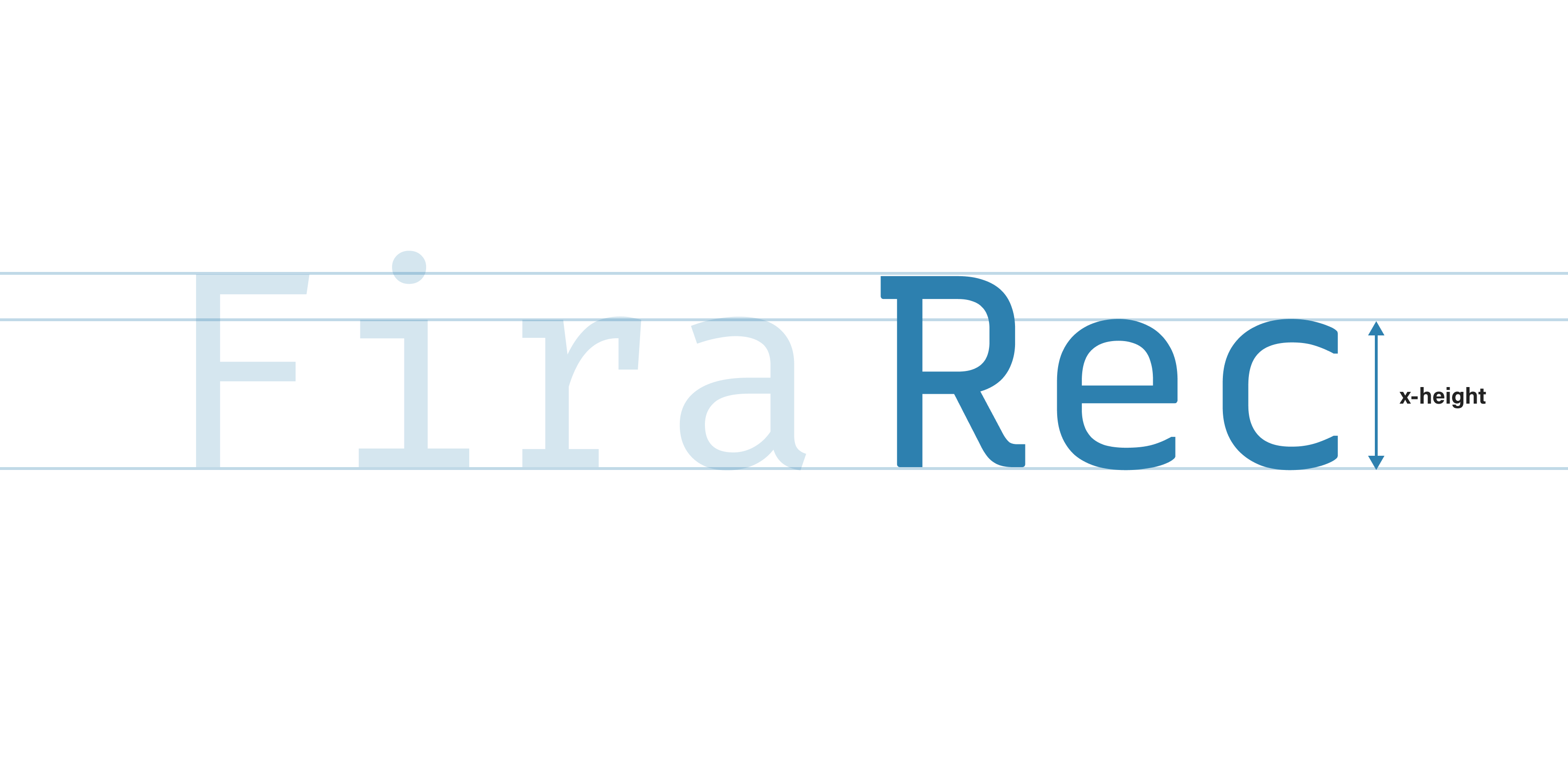
Fig 27: Side-by-side comparison of x-height — Recursive’s just a bit smaller than that of Fira Code.
Legibility
Recursive also has a potential legibility problem, as SF mono does (Fig 28). The number “1” looks similar to the lowercase “l.” They could be confused with each other. Other than that, Recursive’s legibility score is ok.

Fig 28: Recursive has a similar potential legibility problem because the number “1” looks similar to lowercase “l.”
Recap & comparison
Here’s a quick recap of all the fonts and their features:
| Font | Coding ligatures | X-height | Legibility | Extras |
|---|---|---|---|---|
| Fira Code | Widest range | Regular | High | / |
| Commit Mono | Basic range | Regular | High | Smart kerning |
| Cascadia | Wide range | Regular | High | Cursive style |
| Victor Mono | Wide range | Slightly larger | Ok | / |
| SF Mono | Widest range | Slightly smaller | Some concerns | / |
| Recursive | Basic range | Regular | Some concerns | Variable cursive style |
And here’s a gallery of all of them for easier comparison:
Should you even use coding ligatures?
Matthew Butterick from Practical Typography wrote an article sharing his strong-held opinion against coding ligatures. He even argues that using them isn’t a matter of taste because they can cause confusion. Butterick brings up two main reasons against using coding ligatures: They contradict Unicode, and they’re guaranteed to be wrong sometimes.
Ligatures in programming fonts are a terrible idea.
— Matthew Butterick (Source)
Should you use coding ligatures? I think this is a personal choice after all. I use them, and I love them. But I’m not a hardcore programmer and I work on my code by myself. Make sure you read Butterick’s article to make an informed decision, especially if you collaborate on code with others.
To get back to the question from the beginning of this article — which font do you use for coding? My favourite remains JetBrains Mono. What do you think about the ones in my examination? Did you find your new favourite one? Did I miss any? Let me know in the comments below! 👇
Better Web Typography for a Better Web
Free Course
Join 30,000+ designers and developers, get 7 free lessons and unlock your better web typography skills.
Learn more →Just cool web typography stuff, no spam.