5 Keys to Accessible Web Typography
~ 14 min read
I think it’s safe to claim that a large part of website accessibility falls on typography, after all, web still is 95% typography[^1]. Viewers come to a website to read its content or just to find specific information they’re looking for. And most of that information and most of the content is communicated through text. This is one of the few constants on the web that hasn’t changed through the years. So how do we make sure that everyone can read the content of our website? And by everyone, I mean absolutely everyone. This includes people with impaired vision, reading disorders, colour blindness or anything that can often prevent them from reading comfortably.
Designers and developers of websites often forget about these people or come up with excuses like “blind people don’t drive cars so they don’t need to shop for one on our website”. This was literally what someone said when I worked for a huge online car marketplace company back in the UK. This is a closed-minded, egoistic and a disgusting comment. Web was created for everyone and it’s our job to make it accessible to everyone. Here are a few of the best practices of accessible web typography.
1. Set your base font size in relative units
What is base font size, how do we set it and how do we then use it? Let’s start with the what. Base font size is simply the font size that all other font sizes will be derived from. If we correctly use relative units of course (more on that later). We set it by assigning a font size to the html in CSS. It’s as simple as the following:
html {
font-size: 100%; // In most browsers, this defaults to 16 pixels
}
Then we can use other relative units (em or rem) to set font sizes for other elements. This is crucial because it means that changing the base font size will also change all other font sizes. Let’s take a look at an example. Our base font size is set to 100%, let’s set the heading 1 size to 4rem and heading 2 to 2rem (the result of this can be seen on the left side of FIG 1).
h1 {
font-size: 4rem;
}

h2 {
font-size: 2rem;
}
But now, we want to adjust the font sizes for larger screen widths so we introduce a media query. We can increase all font sizes by adjusting the base font size alone. We increase it to 112.5% and our two headings font sizes increase as well (right side of FIG 1).
html {
font-size: 100%; // In most browsers, this defaults to 16 pixels

@media (min-width: 768px) {
font-size: 112.5%; // = 18 pixels in most browsers
}
}
Please note that I use SCSS for all my code examples that‘s why I can nest the media query like that.
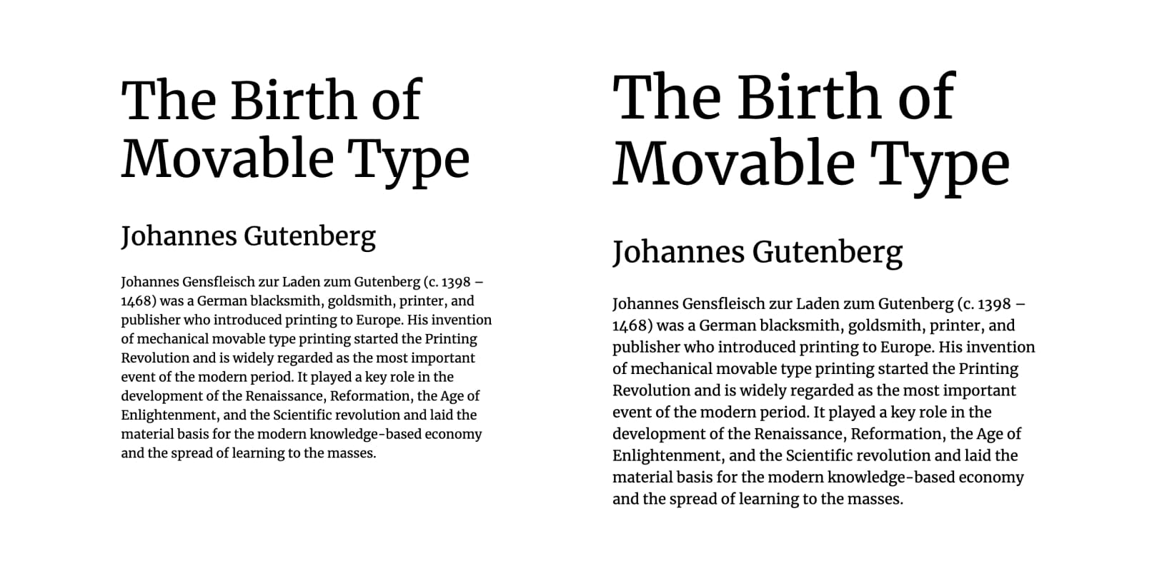
FIG 1: Base font size and heading sizes as we originally set them (left) and after the increase of the base font size (right). Heading 1 and 2 are still set to 4rem and 2rem respectively.
In the example on the left, the body font size is 16px (browser default), heading 1 is 64px (4 × 16) and heading 2 is 32px (2 × 16). In the example on the right, the body font size is 18px (changed it to 112.5% with a media query), heading 1 is 72px (4 × 18) and heading 2 is 36px (2 × 18). Rem units are especially useful and very clear to use in such cases because they always relate to the base font size.
Take a look at this example on CodePen and try resizing the screen. That’s how the base font size works, but now let’s take a look at why it’s important for accessibility.
Base font size and accessibility
Why is it so important to set the base font size in relative units? I have to be honest, for a long time, I thought: what’s the point of setting the base font size to 100%? It usually just defaults to 16px anyway, so why not just set it to that? I later learned that it’s for one simple reason—the browser default font size. There’s still a lot of bad advice when it comes to setting the base font size out there. Take a look at the following:
Generally speaking (and there are a lot of exceptions) the most common best practice is to set the
font-sizeon thebodyusingpx(CSS pixels), and then set all the other elements toem, which will be relative to thebodysize (1em= 100% of the inherited size)[^2].—Adam Wood
This is the opposite of what we must do! Do not set your base font size in pixels. Doing so will overwrite the browser’s default font size. But what exactly is the browser’s default font size? In the code examples above we set our base font size to 100% and I wrote a comment next to it: In most browsers, this defaults to 16 pixels. That’s what I mean when I say browser’s default font size. But here’s the tricky part. Yes, most browsers agreed on the default size of 16 pixels, but the user can change that. Let’s say someone has an impaired vision and sets their browser’s default font size to something larger. Setting the base font size in our CSS to pixels will overwrite their browser default font size setting. Instead of seeing most of the text at a larger font size, we now force them to read it at 16 pixels size. That’s because pixels are an absolute unit, not a relative one. To correct the instructions for setting the base font size by Adam Wood from above, let’s rewrite them like this:
The best practice is to set the
font-sizeon thehtmlusing%(or any other relative unit), and then set all the other elements to eitheremorremwhich will be relative to the body size.
This, along with zooming in and out options in browsers not working correctly, was the main reason for accessibility problems with most approaches to fluid web typography. They mostly rely on viewport units to achieve the fluidity of type size but the viewport units aren’t relative units. I know they’re listed under relative units and described as such, but they don’t always act like relative units (resizing font sizes set with viewport units worked for me in Safari but not in Chrome and Firefox).
2. Check the colour of your type and only then its contrast
Checking the contrast of a text versus its background isn’t enough. A lot of web designers and developers just use a tool to check if the contrast of the two is high enough but it’s not that simple. We also need to make sure that the colour of our type is dark enough. This means that the font shouldn’t be too thin and that we should limit the font smoothing only to certain cases. Let’s take a look at both.
Type colour and contrast
When typographers talk about the colour of the type, they don’t simply mean what colour our fonts are set to. They’re actually talking about how dense and heavy the type looks on the page[^3]. And most of the time, this isn’t considered by web designers and web developers. They simply put the text colour and the background colour into the contrast checker which says that the contrast is high enough. But that may not be the case. Take a look at the following example.

FIG 2: The contrast checker says that the combination of this font colour and background is perfectly fine. But it’s clear that this could cause problems when reading it.
In the example above (FIG 2), the contrast between the font colour and the background is perfectly fine as they provide a contrast of 16:1. But we need to look at this from another perspective—type colour. The font is clearly too light and therefore doesn’t actually provide enough contrast. Light fonts are generally very hard to read and should be avoided for paragraph text. Sometimes, a font comes in many weights and we can simply use one that’s heavier. But often that’s not an option and a different font should be used.

FIG 3: The paragraph on the left is set in a font that is much too light so we rectified that in the example on the right by using a weight more appropriate for paragraphs.
So don’t just check the contrast in a contrast checking tool, make sure that the type actually has enough contrast. Contrast isn’t as simple as mathematically checking if the difference is large enough, we also need to check if the contrast is high enough optically.
Font smoothing
Interfering with the way fonts are rendered became popular among designers a while ago when -webkit-font-smoothing became available in CSS. They would switch from subpixel rendering to antialiased to make the fonts on their websites look lighter and smoother, especially for the light fonts[^4].

FIG 4: Neither of these is ok. The font is too light already and changing the font smoothing to antialiased makes it even worse.
Changing font smoothing to antialiased isn’t meant for that. Dmitry Fadeyev explains it best[^5]:
Subpixel rendering gives us optimal font clarity for your typical dark text on light background. However, on Mac OS X, when this is reversed and you set light text on a dark background, you get a fairly ugly effect where the text becomes overly bold, spilling out of its lines. Switching away from subpixel rendering to antialiasing for light text on dark backgrounds makes it look lighter, countering the bolding effect.
Based on that, changing font-smoothing to anti-aliased makes most sense for light text on a dark background (FIG 5). Don’t misuse it just to make the text lighter and softer.

FIG 5: Properly used antialiased font-smoothing (Right). Notice how crispier the type on the right looks? It looks much better compared to the example on the left which is too heavy.
3. Use highly legible fonts
Or at least don’t use the ones that have been known to have problems with legibility. But what makes the difference? What makes a font legible? First, let’s make it clear what legibility actually is. A lot of people confuse legibility with readability but the two are not the same. Legibility is about how easy it is to distinguish one letter from another and readability is about how easy a block of text is to read. Let’s take a look at a few examples.
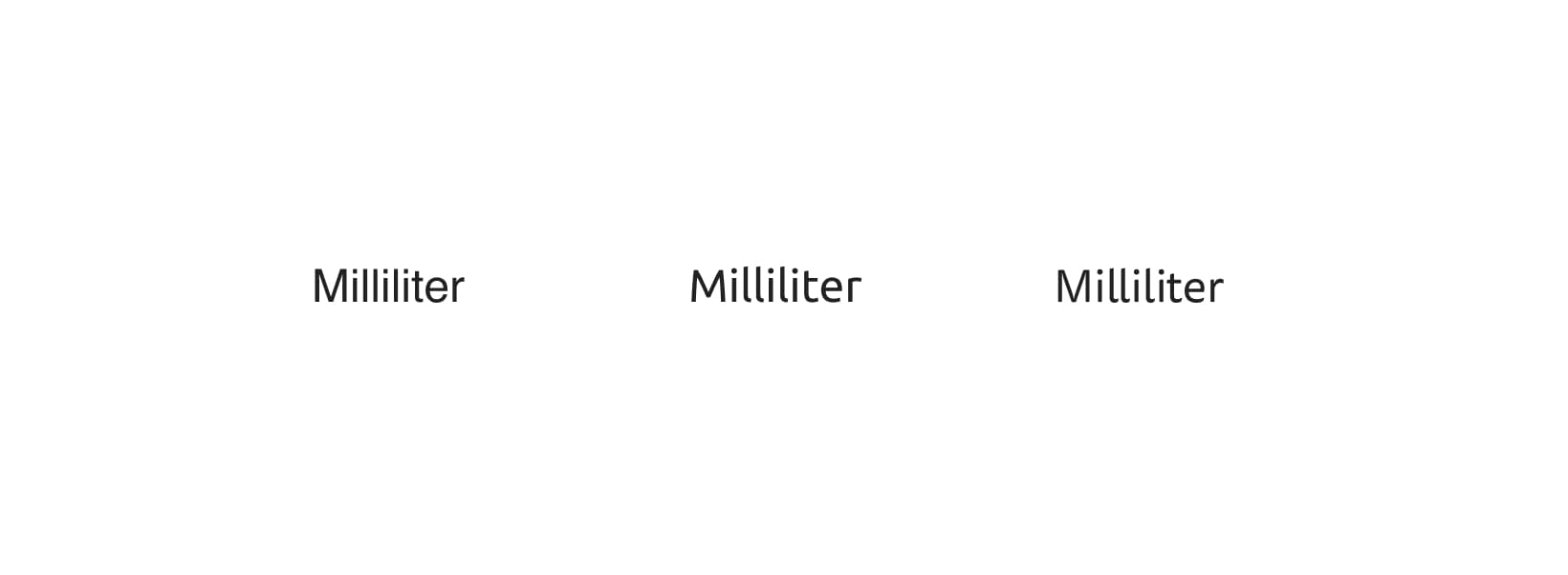
FIG 6: Left to right, word “Milliliter” in Helvetica, Ubuntu and Tisa Sans Pro. I intentionally left the font sizes in this example relatively small so that you can notice the difference in legibility.
Take a good look at the image above (FIG 6). Do you notice how the legibility improves when the same word is set in Ubuntu and Tisa Sans Pro? Helvetica is notoriously bad at legibility and should be avoided. Let’s take a closer look at the letters “Iil1” of each of the fonts shown above (legibility problems are usually the most obvious at these letters).

FIG 7: Left to right, Helvetica, Ubuntu, Tisa Sans Pro.
Take a look at the dot on the “i”. Notice how obvious and pronounced it is in Ubuntu and Tisa Sans Pro? In Helvetica it’s just a square of the same width as the rest of the letter. Now take a look at the “I” and “l” (first and third letters). Is there a way to tell them apart in Helvetica? No, not really the uniformity in shapes makes them undistinguishable. But you can clearly recognise them in the other two. It’s these small details in typeface designs that make the difference between a legible font and one that has legibility problems. Be on the lookout for these details when you’re choosing a font to be used on the web. At the very least, try to stay away from fonts like Helvetica and its bad twin Arial. Ideally, try to use a humanist style font if you’re planning on using a sans serif font. Serif fonts, generally don’t have such legibility problems.
Quick tip: Adobe Fonts has a filter for fonts recommended to be used for paragraphs.
Better Web Typography for a Better Web
Free Course
Join 30,000+ designers and developers, get 7 free lessons and unlock your better web typography skills.
Learn more →Just cool web typography stuff, no spam.
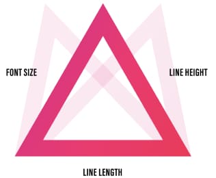
4. Shape your paragraphs well
I wrote about this extensively in the article titled The Equilateral Triangle of a Perfect Paragraph and even more in my book. To recap in one sentence: don’t decide on the line height, line length, and font size independently; all three need to be in perfect balance.
Line height
The recommended line height for paragraphs of text is usually between 1.3 and 1.7. Of course, this depends on many factors but that’s as close as I can get to a general recommendation. If the font you chose looks quite light and its x-height is small, then the line height will need to be closer to the lower end of that recommendation. The opposite is true if it’s a heavy or optically large font. It may also depend on the language. German language uses capital letters more than others so it’s recommended to use a larger line height. When it comes to readability, it’s better to have a line height that’s a bit tighter than one that is too loose. If lines of text seem to be drifting apart it’s hard to keep track which ones we read already and which one’s next (FIG 8).

FIG 8: Line height too large (left) it looks like lines of text are starting to drift apart. Correctly adjusted line height (right).
Oh yeah, let’s not forget about the line length. It also should have an effect on line height—the longer the lines of text, the larger the line height should be (FIG 9).

FIG 9: We increased the line height for the example on the right because the lines of text in that paragraph are longer.
Line length
Getting line lengths right is very simple but sadly, most websites still have it wrong. The ideal length of a line of text is from 45 to 75 characters—including spaces. Anything that reaches far from that range becomes hard to read. Too much line switching when lines are too short and too few breaks for the eyes when they’re too long.
Reading very long lines of text is tiring for our eyes. Our eyes need constant pauses which are provided by the line breaks. In that instance of switching to the next line, they get that short pause. Long lines of text are very hard to read alone, put impaired vision or reading disorders on top of that and it becomes nearly impossible.
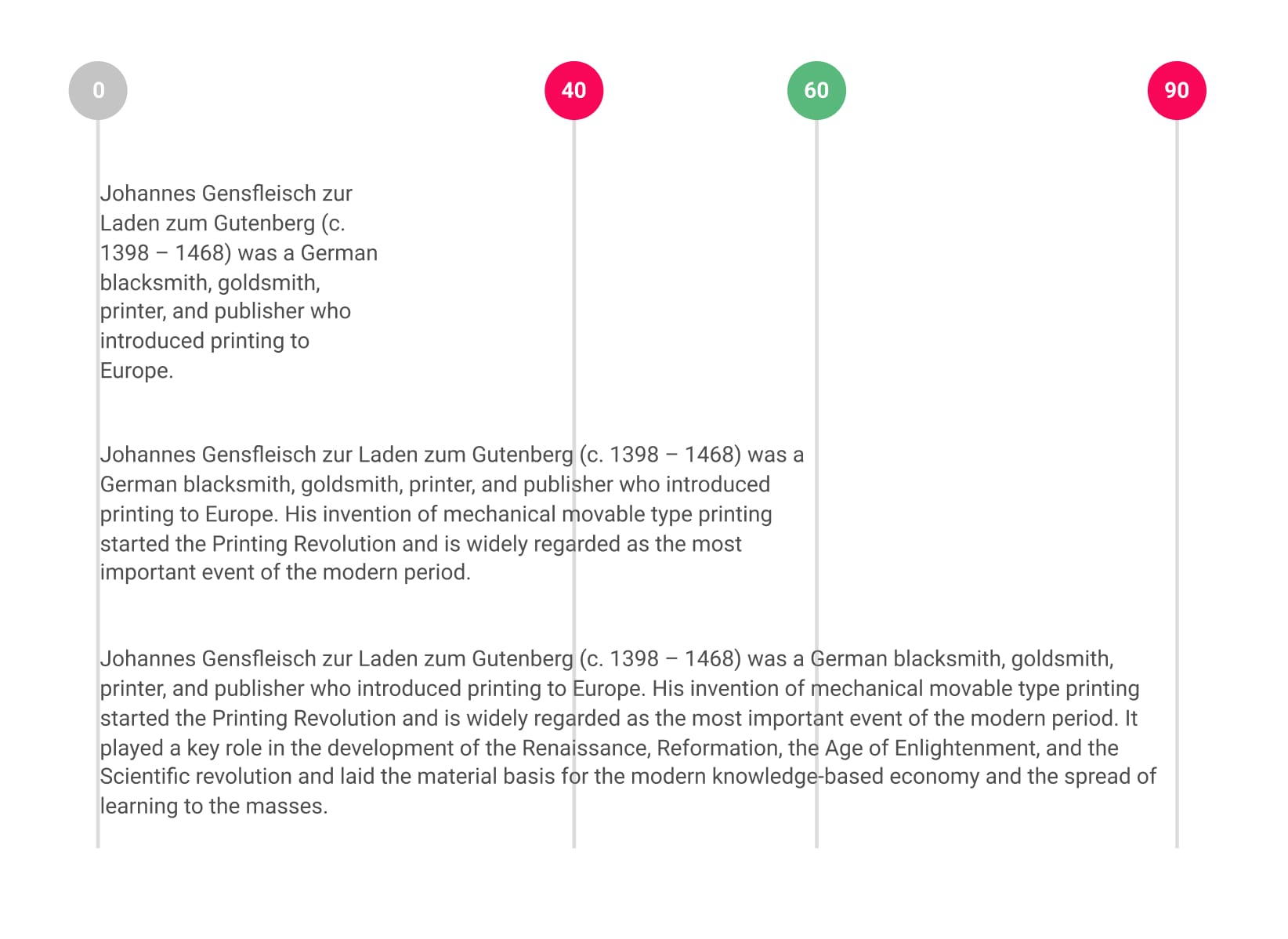
FIG 10: Line length too short (top), ideal at around 60 characters (middle) and too wide (bottom).
This can be solved very easily, apply a max-width property to paragraphs in your content on the website then count the number of characters (including spaces). Adjust if needed, aim for 55–65 characters per line. Something like this should be a good starting point.
.post-content p {
max-width: 33em;
}
Other recommendations
Font size
Font size is actually the third part of the Equilateral Triangle Theory I mentioned above. You can read more about it in the original article, I just wanted to remind here again that bigger is generally better when it comes to font sizes for paragraphs. Don’t be scared of setting your font size to a size that is equivalent to 20 pixels or more. This will also depend on the design of the font of course, so definitely experiment with sizes a bit.
Don’t use justified alignment
I shouldn’t even have to write about this any longer but warning against these can’t hurt. Justifying text on the web results in “rivers of white space between words” which has a hugely negative impact on readability. Avoid justifying text altogether, or at least enable hyphenation or make it work with JavaScript.

FIG 11: Left to right: justified alignment, justified alignment with hyphenation enabled, left-aligned. The example on the right is the easiest to read.
Don’t centre-align long paragraphs
The other problem is long paragraphs that are center-aligned. When we have lines of text that are of unequal length and they’re center-aligned it makes it extremely hard to find the beginning of the next line. Again, put impaired vision or reading disorders on top of that and it becomes nearly impossible to read. Don’t center-align paragraphs that are longer than 2 or 3 lines of text.
Divide your content into easily-digestible paragraphs
Long paragraphs are hard to read for people with reading disorders. Try to divide your content into short paragraphs, avoid really long paragraphs or what’s even worse—long sentences in long paragraphs.
5. Correctly use the heading levels
This is one of those things that are trickier than most people realise. I’ve seen a lot of web designers assign the heading level solely based on what heading size they needed. So if they needed the largest heading size, they used h1, if they needed the second largest they used h2 etc. Nothing may seem wrong with doing this because we’re establishing visual hierarchy when we correctly use heading sizes. Someone that’s skimming through an article immediately gets an idea of how it’s structured. But what about those that use screen readers? They can’t see how we structured our article so they rely on a tool to tell them that. So let’s say our document is structured like this:
<h1>Game of Thrones</h1>
<p>First paragraph</p>

<h2>Season 1</h2>
<p>Paragraph</p>

<h3>Episode 1</h3>
<p>Paragraph</p>

<h2>Episode 2</h2> // This one is incorrect
<p>Paragraph</p>
<h3>Episode 3</h3>
Listing out episodes of a cool TV series (with a disappointing ending) can be a great example here. Let’s say, that for some reason, the authors of the website wanted the episode 2 to stand out so an h2 was used. The screen reader will now think that the episode 2 is equal to season 1 and that episode 3 heading marks the beginning of a subsection of episode 2. The semantics of the headings structure is completely wrong because it’s dictated by style. You see how quickly this can go wrong? This is a simplified example but you get the idea.
The code example above would result in a document structure like this:
Game of Thrones
  Season 1
    Episode 1
  Episode 2
    Episode 3
Separating semantics from style
The best way to solve this problem in a way that enables us to control the headings structure is by separating the semantics from the style. It sounds fancy and complicated but it’s really simple. Use the HTML headings tags (h1, h2, …) for defining the semantics and CSS for defining the styles (.h1, .h2, …). With a little bit of CSS like the following:
h2,
.h2 {
font-size: 3rem;
}

h3,
.h3 {
font-size: 2rem;
}
we can then do something like this:
<h2>Season 1</h2>
<p>Paragraph</p>

<h3>Episode 1</h3>
<p>Paragraph</p>

<h3 class="h2">Episode 2</h3>
<p>Paragraph</p>
This way, the semantics don’t dictate the style and the style doesn’t dictate the semantics. The content that we wanted to stand out still does but the web page is now correctly structured. Users relying on screen readers will now also understand the structure of the article.
Game of Thrones
  Season 1
    Episode 1
    Episode 2
    Episode 3
You can use the HeadingsMap plugin to generate an outline of the headings on your website. It will also help you recognise errors in your structure and mark them with a red background.
Establish a sense of visual hierarchy
Now we can properly establish a sense of visual hierarchy without compromising the structure of our article. The thing that is most important when it comes to visual hierarchy is to establish a limited range of font sizes to pick from. So instead of randomly assigning font sizes to our headings levels, use something like a modular scale. Assign font sizes to all the headings levels and stick to them. The fewer sizes you use, the clearer the structure of a page/article is.
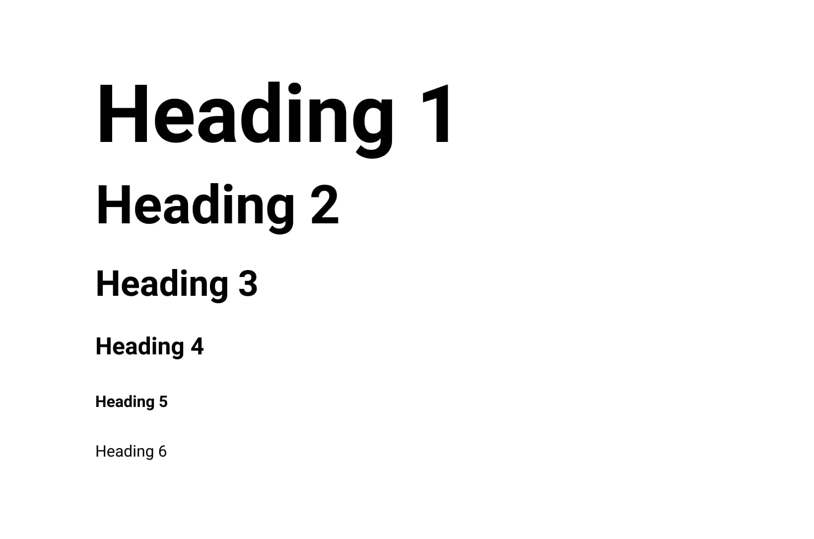
FIG 12: Try sticking to only 6 headings sizes (defined by a scale) and try using the least amount of heading levels possible, aim for 3–4. This is a popular approach to heading levels. Notice that heading 5 and 6 are the same size but different weight/style.
You can use CSS Stats to scan and analyse your website to see how many font sizes and font families you’re using.
I hope this helps you design and build websites with better and accessible web typography. If you have any questions you’re welcome to post them in the comments section below.

“Incredibly informative, wonderfully written.”
A web typography book for designers and web developers.
Learn more[^1]: Web is 95 typography by Oliver Reichenstein (Source).
[^2]: The right way to set a base font size by Adam Wood (Source).
[^3]: Type Colour (Source).
[^4]: -webkit-font-smoothing by Tim Van Damme (Source).
[^5]: Please stop “fixing” font smoothing by Dmitry Fadeyev (Source).