How to choose a font for a project
![]()
~ 7 min read
He told me that he works for a design agency and choosing fonts for websites they work on is something he does all the time. It’s also something that frustrates him a lot since he never studied design and typography, so he mostly does it by his “gut feeling”. That, or he copies a font from a website he likes. He’s aware of his limitations when it comes to making original font choices and his frustration grows every day. And he’s not alone.
Since I launched my free web typography course in 2017, I tend to receive a couple of similar emails every month. I wrote about choosing fonts more in details in my web typography book and I also explained my process with a concrete example. But not everyone buys the book so I decided to explain my process again, with another example—a new personal project I recently started working on.
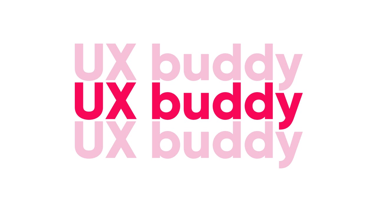
UX Buddy
UX Buddy will be an online course for UX and product designers that are looking to take the next steps in their careers. I had to switch a lot of jobs before I found the one that aligns with what I want to do and what I get to do. So I want to share my experience and help guide designers with less experience towards finding a better UX job.
I work for GitLab where we assign a UX buddy to newly-joined designers to help them get started (the UX buddy is simply another designer on the team tasked to help out the new designer). The first few months are overwhelming for new designers so UX buddies help out by guiding them, explaining how stuff works and encouraging them to do certain things. With this course, I want to do the same for the designers that got stuck in their UX career. But instead of being their buddy only after they join a company, I want to help out with everything that comes before that—finding good UX companies, writing case studies, interviewing, support etc.
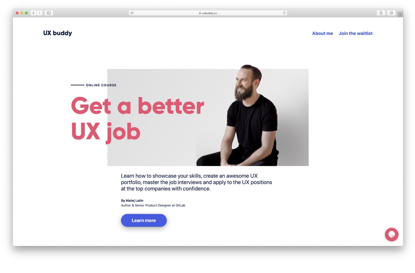
The finished website for UX Buddy (Source)
So this is where the idea for UX Buddy came from and what its goals are. These are really good starting points for defining the branding. Because the course revolves around my experience as a job seeker, and also as an interviewer in the hiring process, I wanted the branding to reflect my personality. I wanted it to be minimalistic but not sterile. Warm but not unprofessional. To the point instead of beating around the bush. I then did a two-day design sprint to come up with the value proposition of the course and some content for the website. The goal was to present the course on a single web page. What I came up with was:
Get a better UX job
for the title of the page, and:
This course is not just about creating your UX portfolio, it’s about you getting an awesome UX job where you’ll do the best work of your life.
for the value proposition. This was great and more than enough to start working on the website and, with it, choosing the font.
Choosing the font
Ok, now how do we go about actually choosing a font for our project? In my web typography book, I recommend seven things to consider, the key three are the following:
The goal of the website and its content
The goal here is to present my new course and myself as a credible and capable person to teach about the topic. The website is not about reading long articles, it needs to get a visitor’s attention quickly.
Body text or headings
Are we choosing a font for body text or for headings? Since the goal is to captivate visitors, I wanted to focus on choosing the right font for the headings.
The text
Reading the text we’re designing for is fundamental—how can you choose a font for something you have no idea what it’s about? Reading samples of text should be right at the start of the process. Don’t use Lorem Ipsum, if you can’t get samples of content, try to find a similar website and “borrow” its content until you do get them.
For UX Buddy, I already had the title, the value proposition and the name. So I was good to go.
What I was looking for
At this point, I had some text to work with, I knew what its goal was and I also knew I was focusing on finding the perfect font for headings. That, combined with the branding that reflects my personality, led me towards using a geometric sans serif font, my favourite style. If you don’t know the basic font styles and how to tell them apart, check out my guide to recognising font styles. It’s the very first step in making original font choices.
I first looked through the fonts of this style on Google Fonts and Adobe Fonts but couldn’t find a match. For example, I knew I wanted the font to have single-storey “a” and “g” lowercase letter styles.
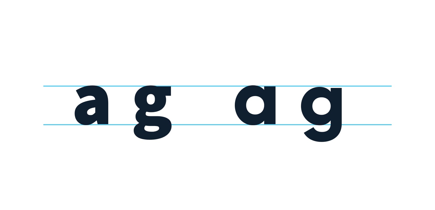
Double-storey “a” and “g” on the left, single-storey “a” and “g” on the right
I just love the simplicity of them and I thought it aligns well with the minimalistic and simplistic branding I was after. I couldn’t find any fonts like that on those font providers so I went on to look on myfonts.com. I found a couple of great matches there: Larsseit, Nexa, Axiforma, Mont, Sofia Pro and Gilroy. I also knew I wanted to use the bold weight as the primary style, to help evoke that feeling of friendliness. Here they are, already set in the primary colour I was planning to use.
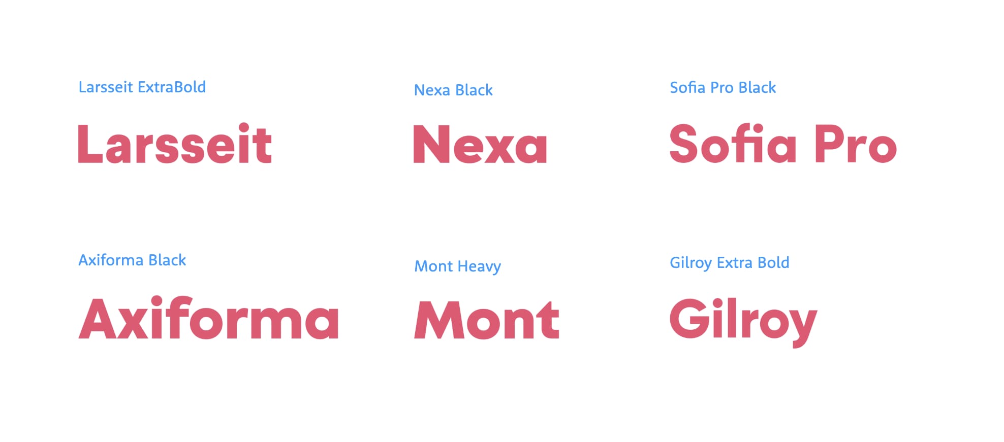
Note that Larsseit uses the double-storey style for the letter “a” but it’s possible to switch to the single-storey style with OpenType alternative styles feature.
Interestingly, all these fonts came in numerous weights and had good OpenType and language support. Fonts from myfonts.com can also be loaded as web fonts straight away so I knew there wouldn’t be any problems with their size in kilobytes. With those reassurances, I focused on the styles of the fonts. I went on to set the text I had to work with to each of these fonts and examined them closely. I started with the name of the project.
Side note: I knew from the start that I wanted to make the logo extremely simple as well. So I was aiming at a type-only logo.
Let’s recall the guidelines I established for the branding of the project:
- Minimalistic but not sterile
- Warm but not unprofessional
- To the point instead of beating around the bush These were great for the next step of narrowing down and making a choice.
Narrowing down
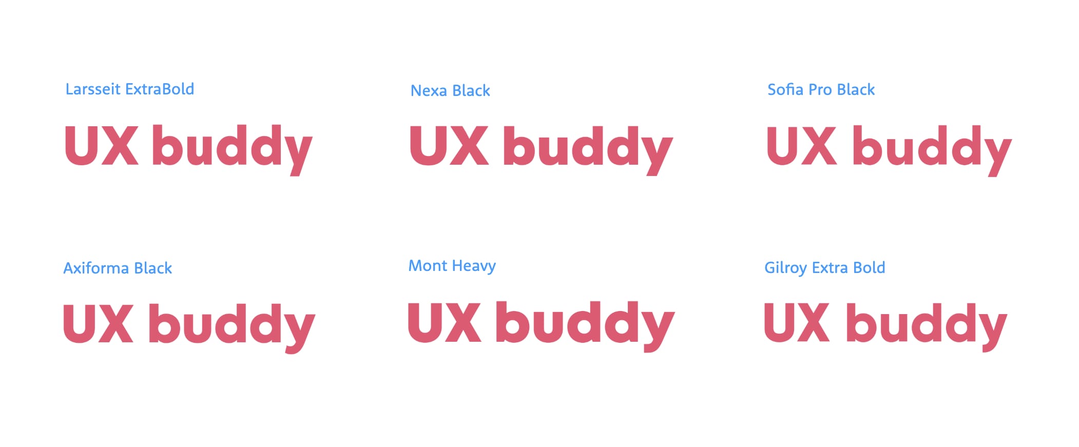
Take a look at the UX buddy name set in Larsseit, Nexa and Sofia Pro below. Do you notice anything they have in common?
Do you notice a reoccurring pattern in the letter “y”?
Take a closer look at the letter “y”. See how abrupt and sharp it seems? It looks cold and formal. Even sterile maybe, especially when compared to the other three fonts where the descenders are slightly curled (Gilroy on the right in the image below).
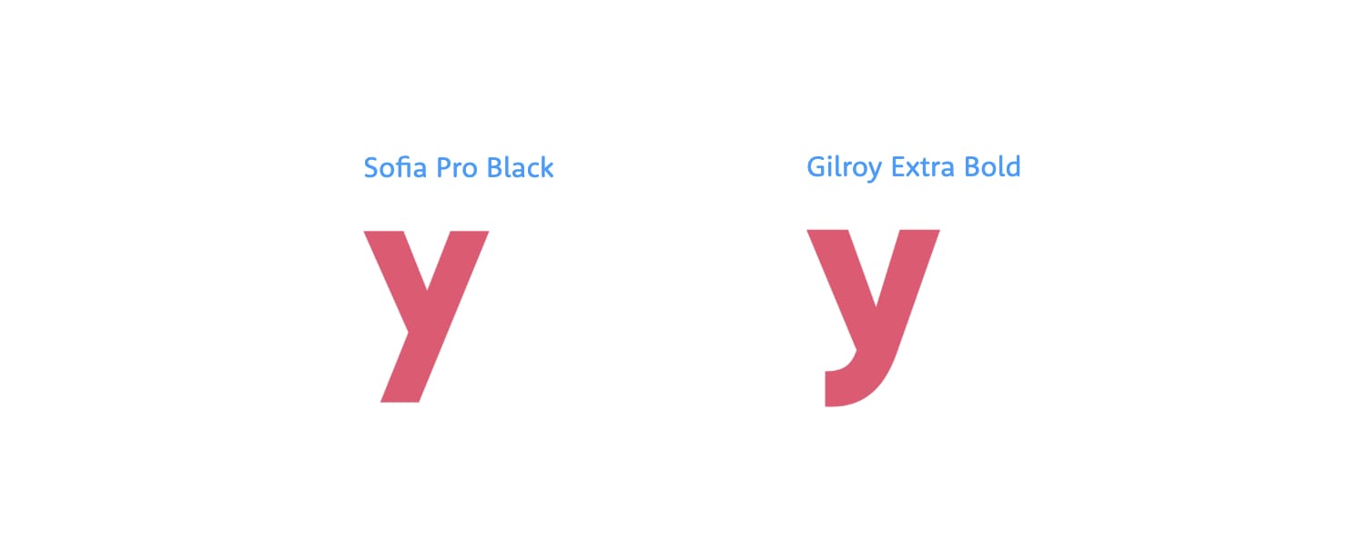
Two styles of descenders: very sharp, abrupt and cold on the left, curled and thus slightly warmer and more pleasant on the right.
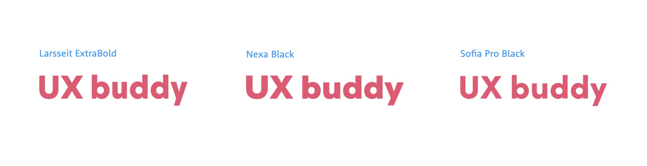
It didn’t align with the branding I had in mind so I eliminated these three fonts straight away. Now, I was left with Axiforma, Mont and Gilroy. Let’s take a look at how the title of the page looks when set with them.
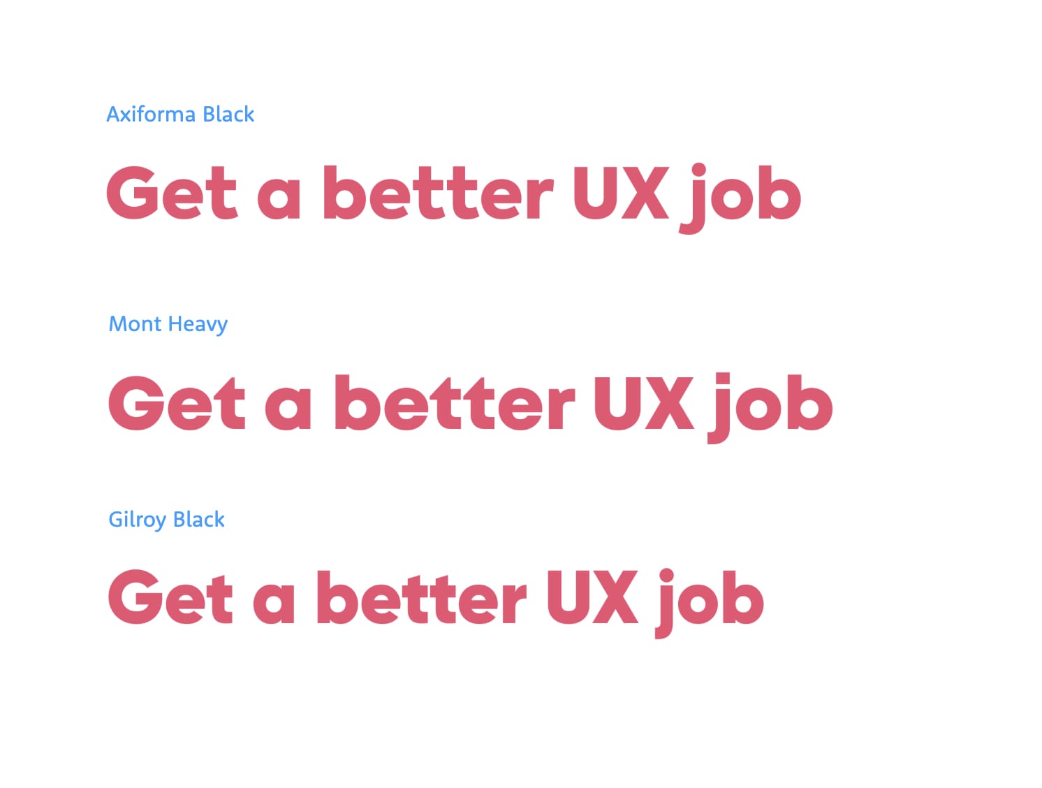
Do you notice the triangular shape in lowercase letter “t” in Mont? It stands out too much.
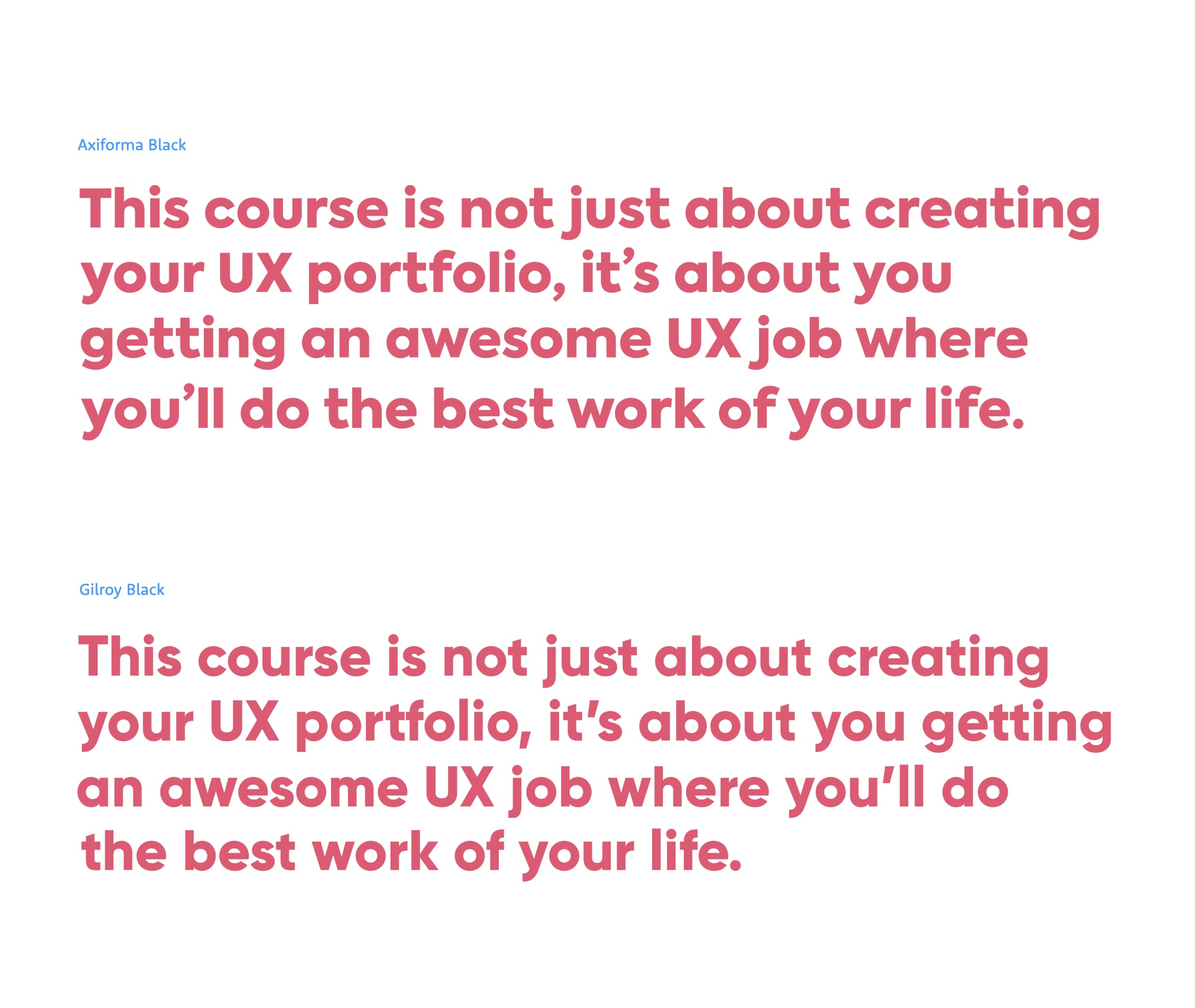
I immediately noticed something interesting about the Mont: the lowercase letter “t” has a very specific style (take a look at the word “better” in the image above). So much that it stands out. I didn’t like that so I eliminated Mont. Axiforma and Gilroy seemed both like really good options so I examined them even more. I decided to set the one-sentence value proposition of the course in each of them and make a side-by-side comparison.
Making a choice
At first, I loved how the lowercase letter “f” in Axiforma aligned with other letters in words (“Portfolio” in the image below). But now it also became apparent that it looks a bit weird when it’s at the end of a word (“of” in the image below). It looks unbalanced and strange.
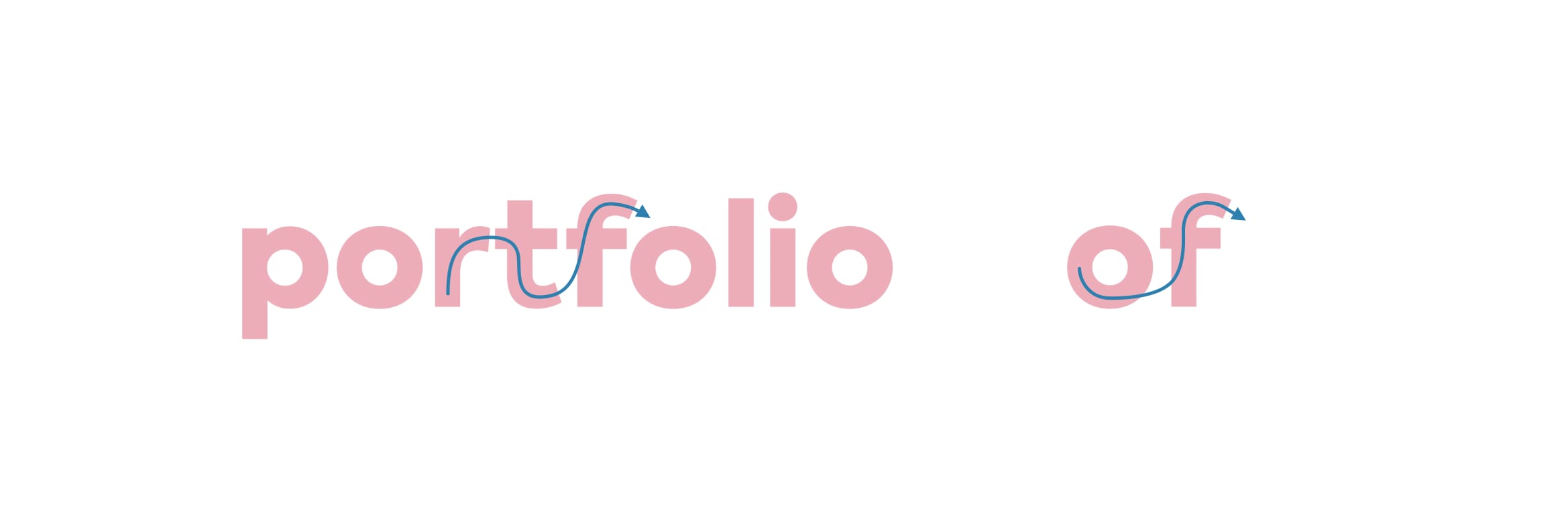
I love the flow of the letters “rtf” but it looks unbalanced in other words.
Something else became clear at this point. Some of the descenders in Axiforma curled upwards which starts to stand out in a longer text like this. Take a look at the lowercase letters “j” and “y”.
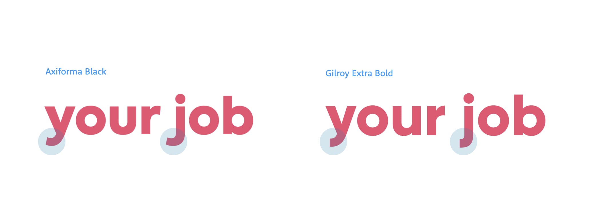
Descenders in Axiforma curl upwards at the very edge while they’re cut off somewhat abruptly in Gilroy.
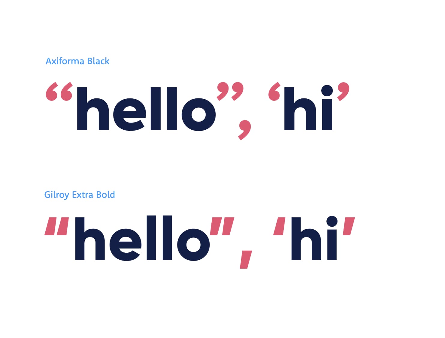
Gilroy isn’t perfect either, I don’t really like the quotation marks and the comma. The style from Axiforma looks a lot friendlier and warm.
But overall, I love how well-balanced Gilroy looks. It also aligns well with what I wanted to achieve for the branding of the project so I decided to use it. I wanted it to stand out on the website so I decided to combine it with a system font for the body text. The system font is a perfect companion in this case because what font is more generic than the font that the user sees everywhere on their computer? Apple’s San Francisco in Mac OS and Microsoft’s Segoe UI in Windows both look good next to Gilroy and these are the fonts most visitors will see. Here’s the final combination as it looks on Mac OS:
This concludes this practical example of choosing a font. I established branding guidelines from the start and came up with the content I could work with. From there on, I went looking for suitable fonts and kept narrowing down until I was left with the best option. With this approach, I get a font choice that’s well-aligned with the goal of the project and its branding but also works well with its content. It’s much better than using a font that just looks good on a website I stumbled upon.
Btw, if UX Buddy sounds like an interesting course, you can already join the waitlist and you’ll be among the first to learn when it launches!
Better Web Typography for a Better Web
Free Course
Join 30,000+ designers and developers, get 7 free lessons and unlock your better web typography skills.
Learn more →Just cool web typography stuff, no spam.