A Guide to Recognising Font Styles
![]()
~ 8 min read
This guide is an excerpt of chapter 3 from the book Better Web Typography for a Better Web by Matej Latin. The book consists of 13 chapters through which the reader designs and builds an example website.
Now I know why recognising the style of a font is so hard. When it comes to typography, and especially when it comes to typefaces, it’s all in the details. It’s hard to even imagine how much work goes into designing a typeface and how much focus type designers put into tiny details that remain invisible to most people. So to find the clues to tell font styles apart, we need to learn to see these details. But first, why would anyone want to be able to recognise font styles? Why not just choose and combine fonts based on our gut feeling?
Well, you can do that. In fact, that’s what I did for a long time, especially at the beginning of my career. But I had a huge problem. I was never confident in my font decisions and I was never sure if the font combination that I designed works well together. Sure, you can copy others or use the most popular fonts based on classifications such as Typewolf’s Top 10 most popular typefaces of 2019. But doesn’t that lead to fonts being overused? Look at what happened to Helvetica, Gotham and Futura. These are the fonts that have been used so much that you can literally see them everywhere. And when that happens, they lose their identity. They become bland. Using a font that is very popular is a safe choice, but safe choices will only get you so far in terms of originality. When it comes to quality, do you want your typography to stand out or blend in?
This is where being able to recognise font styles comes in. When you’re able to do that, and when you know what the story behind a particular style is, then you can make better decisions. You can make an educated decision for your next font choice for the web design project you’re working on. You can better combine 2 or more font styles because you know which styles work well together and which don’t. Let’s take a look at the most common font styles as they appeared throughout history and see what defines these styles and the stories behind them.
Serif font styles
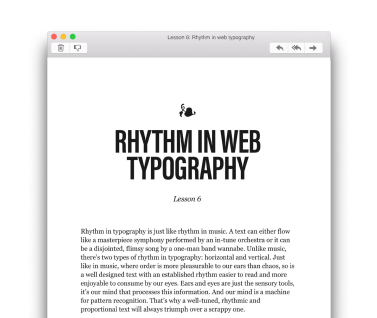
Old style
The first old-style typefaces appeared in the 15th century and it was the most fundamental change in style because they moved away from the blackletter style which was first introduced by Johannes Gutenberg and his movable type printing machine. Better tools and mostly improved skills of the punchcutters allowed the birth of this more refined style.
FIG 1: The main characteristics of the old-style typefaces.
The contrast of strokes is low (1) and the hairlines are heavier than what we would see in high-contrast typefaces. Head serifs are angled (2), serifs are bracketed (3), the axis of curved strokes shifts to the left (4), and the x-height is relatively small. These styles are still very common in books as they’re traditional and evoke feelings of warmth and familiarity. Garamond, Caslon and Bembo are typical examples of this style.

FIG 2: Garamond (or in this particular example Adobe Garamond) is a typical example and one of the most iconic old-style typefaces.
Transitional
This is a style that moved further away from the styles mimicking the handwritten letterforms (Humanist and Old style). It was born in France in the 18th century, mostly defined by an Englishman John Baskerville but first became popular in the modern-day United States. A post on I Love Typography describes the Romain du Roi typeface (King’s Roman, the very first typeface of this style) like this1:
The Romain du Roi marked a significant departure from the former Old Style types and was much less influenced by handwritten letterforms. Remember, this is the Age of the Enlightenment, marked by resistance to tradition, whether that be art, literature, philosophy, religion, whatever; so it’s no surprise that this same era should give birth to radically different types.
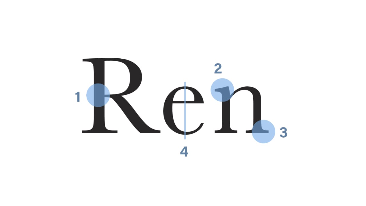
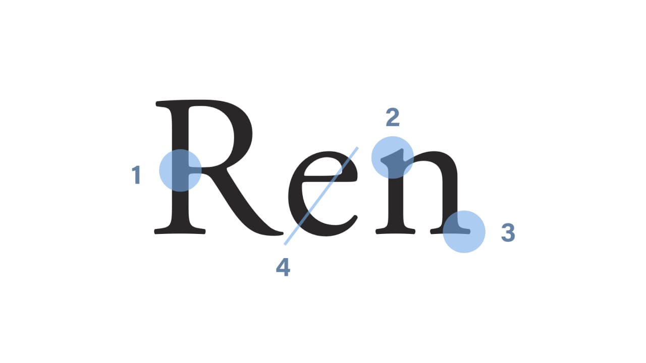
FIG 3: The main characteristics of the transitional typefaces.
The contrast in strokes is noticeably higher (1), the head serifs are oblique (2), the serifs are still bracketed (3), and the strokes have vertical stress (4)—this is where the departure from the handwritten letterforms is the most obvious. Baskerville is by far the most iconic example of a transitional typeface.
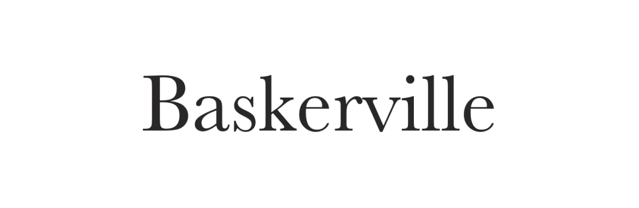
FIG 4: Baskerville is a perfect example of the transitional style of typefaces.
Better Web Typography for a Better Web
Free Course
Join 30,000+ designers and developers, get 7 free lessons and unlock your better web typography skills.
Learn more →Just cool web typography stuff, no spam.
Neoclassical & Didone
This style first appeared in France (again) in the 18th century. The first typeface of this style was designed by Firmin Didot, hence the name. After that, Giambattista Bodoni took over and produced typefaces that defined this style. He drew inspiration from Baskerville’s work but took it to the extremes.
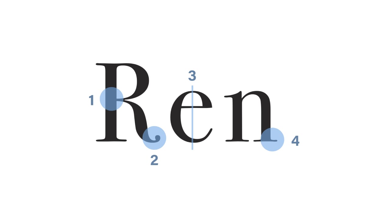
FIG 5: The main characteristics of the didone typefaces.
The contrast between thick and thin strokes is abrupt and dramatic (1), stroke terminals are “ball” shapes (2), the axis of curved strokes is vertical (3), and there’s little or no bracketing for serifs (4). Bodoni, by the before mentioned Giambattista Bodoni, is the most famous typeface of this style.

FIG 6: Bodoni is the most iconic example of the didone style.
Slab
This style was born in Britain along with the industrial revolution in the early 19th century. This is the first style that had a completely different purpose from the styles that preceded it. Old style, transitional, Didone were all styles meant for being used in books. They were meant for long texts so they were designed for that. The slab was the first style that was meant for advertising, it was meant to stand out. The typefaces of this style generally look good in big sizes but generally shouldn’t be scaled down and used for body text.
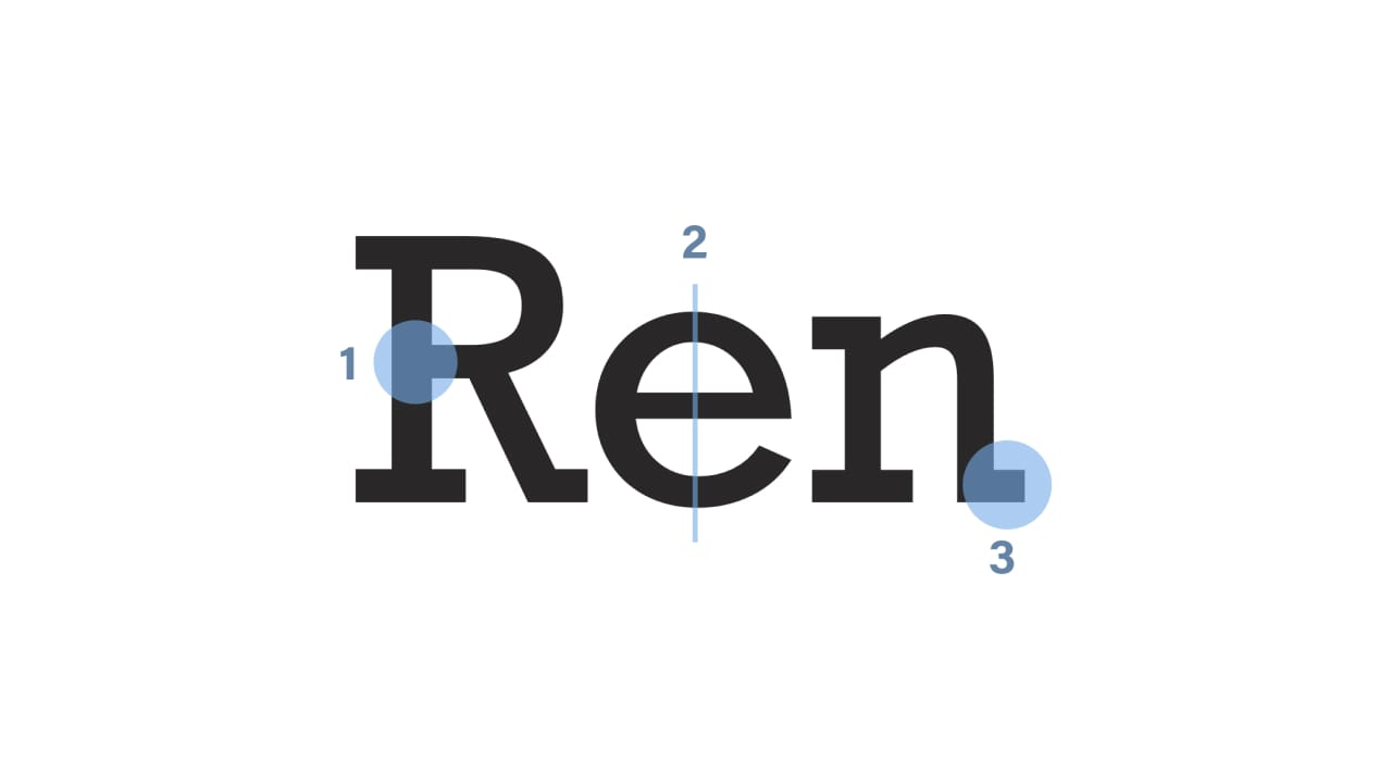
FIG 7: The main characteristics of the slab typefaces.
Changes in stroke weight are imperceptible (1), the axis of curved strokes is vertical (2) and the serifs are very heavy and without bracketing (3). Roboto Slab is a cool example of a modern interpretation of the slab style and a font that can also be used in smaller sizes and for body text (unlike most of the original Slab fonts).

FIG 8: Roboto Slab is a great example of a modern slab typeface that is easier on the eye but still has that “industrial” feel to it.
Clarendon
The Clarendon style originated in the middle of the 19th century as a way of trying to make the Slab serif style work on smaller sizes. Comparing the Clarendon to the Slab style, the similarity in their construction is noticeable but it’s the small details that divide them. Clarendon is clearly “softer” and more pleasing to the eye.
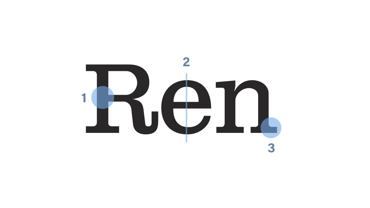
FIG 9: The main characteristics of the clarendon typefaces.
The contrast in strokes is noticeable (1), the axis is vertical (2), and the serifs are short to medium length, thinner and bracketed (3). Clarendon is by far the most iconic and famous typeface of this style (even the name of the style is named after it).

FIG 10: Clarendon as the main representative of this style.
Sans-serif font styles
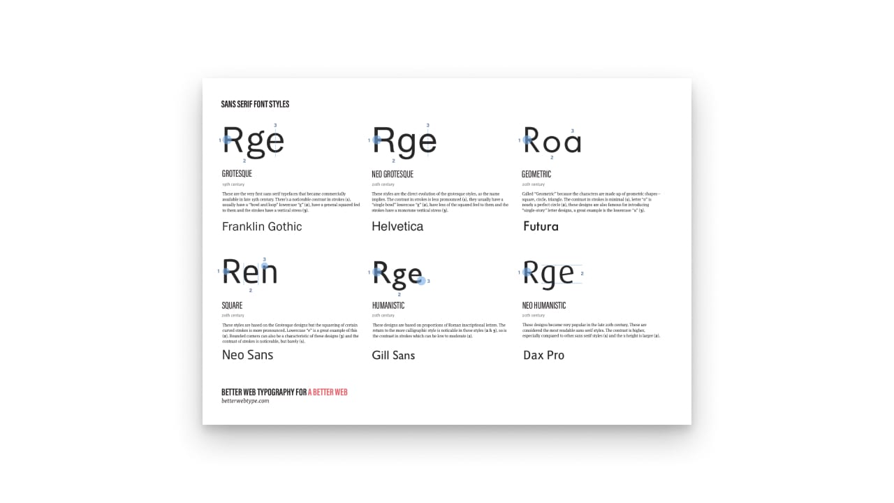
Grotesque
The Grotesque typefaces were not the first sans-serif styles but the first that became commercially popular. The first ones were designed at the end of the 18th century but they only started being used in the 19th century. They were initially called grotesque because they were seen as ugly typeface styles compared to the earlier modern styles (Transitional, Didone etc.).
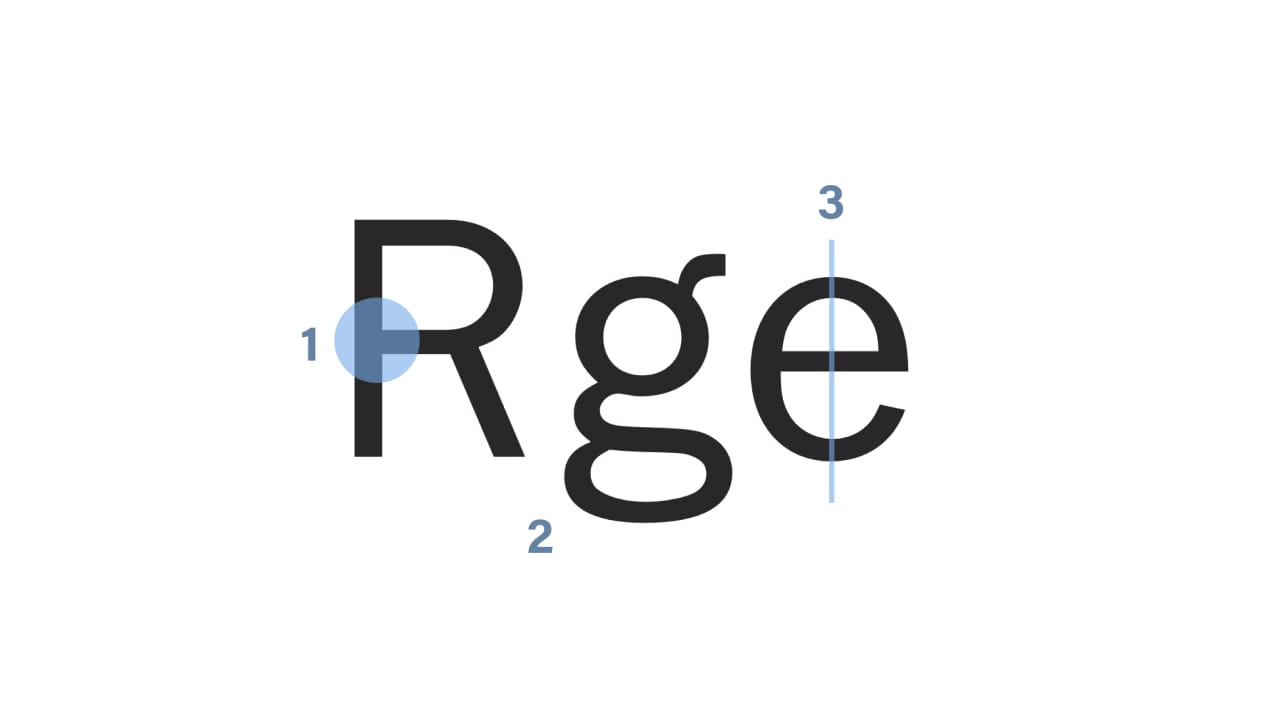
FIG 11: The main characteristics of the grotesque typefaces.
There’s a noticeable contrast in strokes (1), usually have a “bowl and loop” lowercase “g” (2), have a general squared feel to them and the strokes have vertical stress (3). Franklin Gothic and Akzidenz Grotesk are typical Grotesque styles.

FIG 12: Franklin Gothic is a good example of the grotesque style.
Neo grotesque
The neo-grotesque style is a more refined and sleek version of the Grotesque style. Born in the middle of the 20th century and inspired by the original Grotesque style (most notably by the Akzidenz Grotesk typeface) the goal of type designers was to make neutral and rational typefaces.
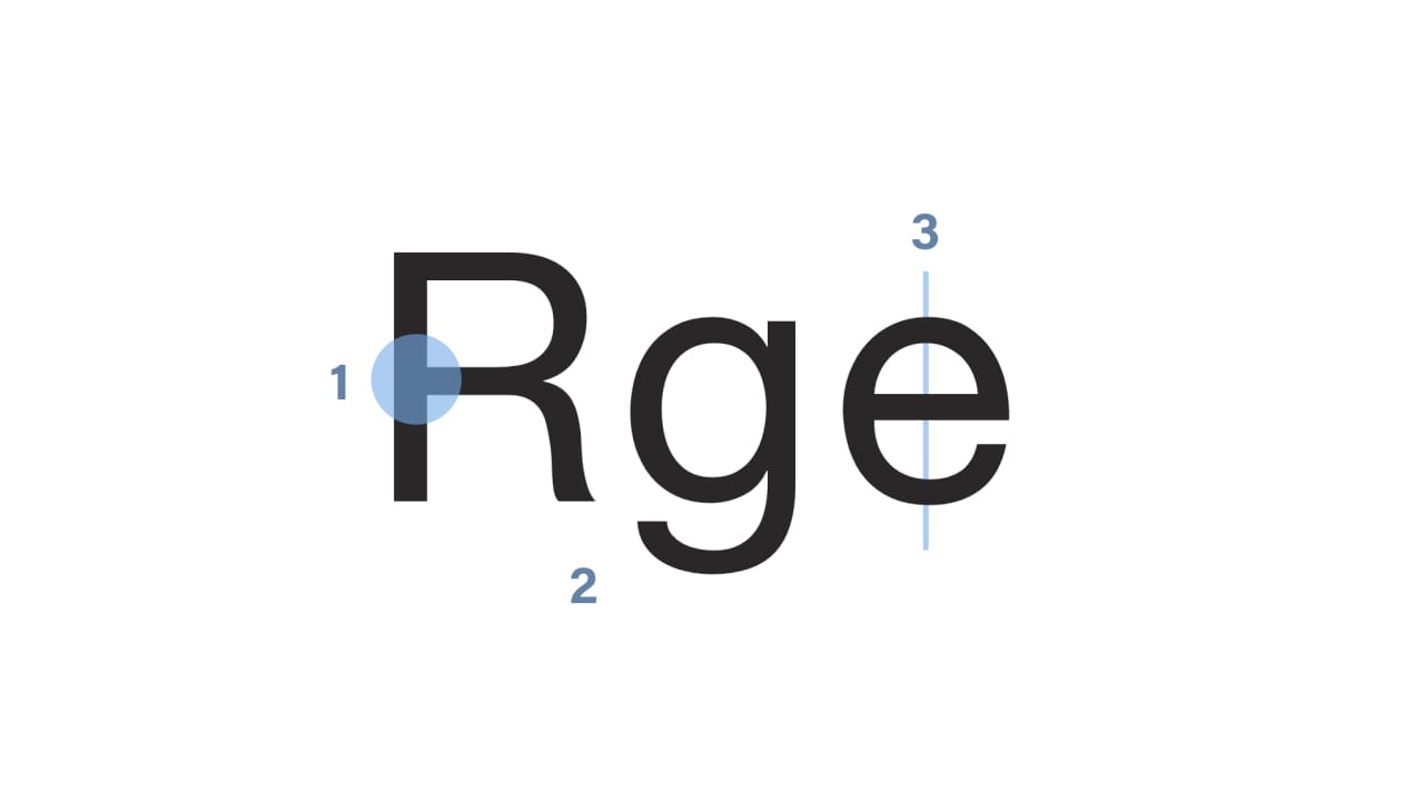
FIG 13: The main characteristics of the neo grotesque typefaces.
The contrast in strokes is less pronounced (1), they usually have a “single bowl” lowercase “g” (2), have less of the squared feel to them and the strokes have a vertical stress (3). Helvetica is by far the most iconic and common Neo grotesque typeface.

FIG 14: Helvetica is by far the most known neo grotesque typeface.
Geometric
The Geometric sans-serif style originated in Germany in the 1920s. Very much influenced by the Bauhaus movement, these typefaces were based on the basic geometric shapes—the triangle, the square and the circle. The letter “O”, for example, is often a perfect circle in the Geometric sans-serif styles.
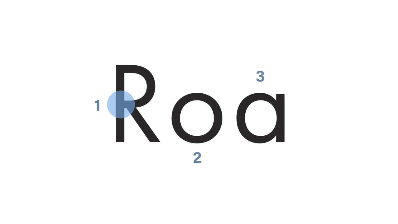
FIG 15: The main characteristics of the geometric typefaces.
The contrast in strokes is minimal (1), letter “o” is nearly a perfect circle (2), these designs are also famous for introducing “single-story” letter designs, a great example is the lowercase “a” (3).

FIG 16: Futura is the most well-known geometric typeface.
Humanist
This is a sans-serif style that takes inspiration from the traditional letterforms, mostly the serif font styles and even calligraphy. The earliest humanist typefaces were designed at the beginning of the 20th century, Johnston in 1916 and Gill Sans in 1928. Edward Johnston (who designed the Johnston typeface) was a calligrapher and drew inspiration in classic letterforms, including the Roman capital letters.
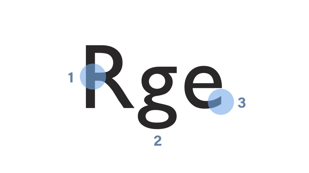
FIG 17: The main characteristics of the humanist typefaces.
The return to the more calligraphic style is noticeable in these styles (2 & 3), so is the contrast in strokes which can be low to moderate (1).

FIG 18: Gill Sans is a good example of a humanist typeface.
Neo humanist
The Frutiger typeface (by Adrian Frutiger) marked the beginning of the new, modern humanist style. The main focus of these designs was legibility. The style gained more support and traction in the 1970s and 1980s as a reply to the demand for highly-legible fonts on the early (and low-resolution) computer screens.
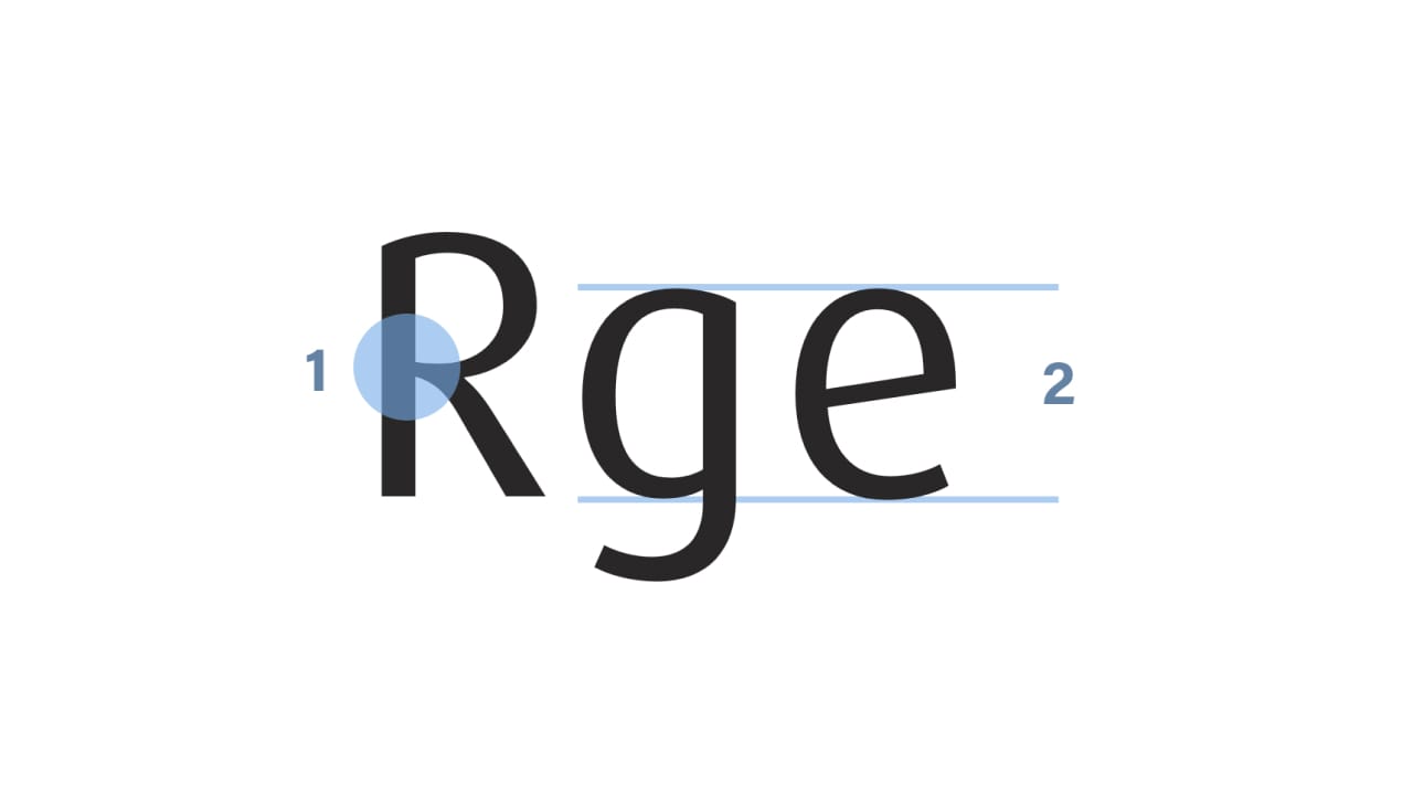
FIG 19: The main characteristics of the neo humanist typefaces.
The contrast is higher, especially compared to other sans serif styles (1) and the x-height is larger (2). Dax Pro is a good example of a neo humanist typeface.

FIG 20: Dax pro is a great example of a neo humanist typeface.
Font styles cheat sheet
There they are, the most common styles of typefaces. This might be quite a lot to process, so I created a 2-sided printable cheat sheet of all the styles from this post. There, you’ll find short stories about the styles and descriptions of the features that define them. It’s completely free to download, if you like it, consider buying my book where you get more cheat sheets, lots of practical examples, source code, Sketch files and more cool stuff about web typography.
More about better web typography in the book
From here on, the book explores rhythm in web typography, modular scales and what “meaningful typography” means, composing pages, responsive web typography and also dives into 4 additional chapters about micro typography. This is the live example website that gets built as your progress through the chapters.
Did you enjoy what you just read? Great, I have much more of this stuff in my book about web typography that I wrote. It’s very popular with web designers and developers, you should definitely check it out.